Imagegrid is a presentation component for the Adapt framework based on adapt-hotgrid. It displays a set of images in a grid layout, but without interactivity.
This can be useful for visual bullet lists where a set of labelled images is required but no further information necessary.
This component must be manually installed.
The attributes listed below are used in components.json to configure Imagegrid, and are properly formatted as JSON in example.json.
core model attributes: These are inherited by every Adapt component. Read more.
_component (string): This value must be: imagegrid. (One word.)
_classes (string): CSS class name to be applied to Imagegrid’s containing div. The class must be predefined in one of the Less files. Separate multiple classes with a space.
_layout (string): This defines the horizontal position of the component in the block. Acceptable values are full, left or right.
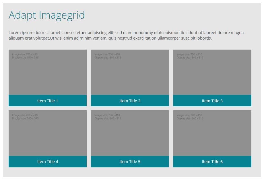
_columns (number): This value determines the number of columns within the grid. Any number of columns can be set however keep in mind the more columns there are the smaller the items will be.
Imagegrid has a dynamic layout system. If you have 5 items but set the columns to 3, imagegrid will put 3 items in the first row and 2 on the second. The second row then will be automatically centred. This works with any amount of items and columns - ie that last row will always be centred for you.
_items (string): Multiple items may be created. Each item represents one grid item for this component and contains values for title, body, _graphic and _itemGraphic.
_graphic (string): This is the image that displays for each grid item. This graphic requires three state src values, with additional values alt and title.
src (string): File name (including path) of the image. Path should be relative to the src folder (e.g., course/en/images/c-15.png).
alt (string): This text becomes the image’s
altattribute.
title (string): This is optional text which is displayed under the grid item image.
_itemClasses (string): Allows for individual styling of each grid item.
Imagegrid has a label assigned using the aria-label attribute: ariaRegion. These labels are not visible elements. They are utilized by assistive technology such as screen readers. This label is included within the example.json and will need adding to the _globals in course.json.
Currently not tested in Adapt Authoring Tool. Imagegrid automatically switches to 2 columns in mobile mode for the best user experience however this can be overridden in the css.
Version number: 1.0.0
Framework versions: 2.0
Author / maintainer:
Accessibility support: WAI AA
RTL support: yes
Cross-platform coverage: Chrome, Chrome for Android, Firefox (ESR + latest version), Edge, IE11, IE Mobile 11, Safari 10+11 for macOS+iOS, Opera