-
Notifications
You must be signed in to change notification settings - Fork 480
New issue
Have a question about this project? Sign up for a free GitHub account to open an issue and contact its maintainers and the community.
By clicking “Sign up for GitHub”, you agree to our terms of service and privacy statement. We’ll occasionally send you account related emails.
Already on GitHub? Sign in to your account
Javalab backpack dropdown #40785
Merged
Merged
Javalab backpack dropdown #40785
Changes from all commits
Commits
Show all changes
5 commits
Select commit
Hold shift + click to select a range
File filter
Filter by extension
Conversations
Failed to load comments.
Jump to
Jump to file
Failed to load files.
Diff view
Diff view
There are no files selected for viewing
This file contains bidirectional Unicode text that may be interpreted or compiled differently than what appears below. To review, open the file in an editor that reveals hidden Unicode characters.
Learn more about bidirectional Unicode characters
| Original file line number | Diff line number | Diff line change |
|---|---|---|
| @@ -0,0 +1,181 @@ | ||
| import React, {Component} from 'react'; | ||
| import PropTypes from 'prop-types'; | ||
| import Radium from 'radium'; | ||
| import color from '@cdo/apps/util/color'; | ||
| import onClickOutside from 'react-onclickoutside'; | ||
| import JavalabButton from './JavalabButton'; | ||
| import javalabMsg from '@cdo/javalab/locale'; | ||
|
|
||
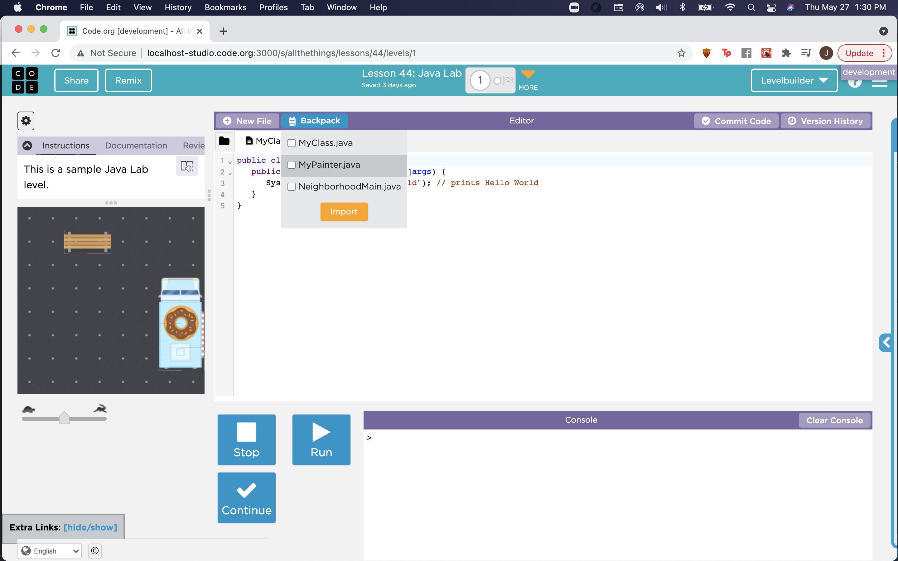
| const placeholderFiles = [ | ||
| 'MyClass.java', | ||
| 'MyPainter.java', | ||
| 'NeighborhoodMain.java' | ||
| ]; | ||
|
|
||
| /** | ||
| * A button that drops down to a set of importable files, and closes itself if | ||
| * you click on the import button, or outside of the dropdown. | ||
| */ | ||
| export class Backpack extends Component { | ||
| static propTypes = { | ||
| isDarkMode: PropTypes.bool.isRequired | ||
| }; | ||
|
|
||
| state = { | ||
| dropdownOpen: false | ||
| }; | ||
|
|
||
| expandDropdown = () => { | ||
| this.setState({dropdownOpen: true}); | ||
| }; | ||
|
|
||
| collapseDropdown = () => { | ||
| this.setState({dropdownOpen: false}); | ||
| }; | ||
|
|
||
| handleClickOutside = () => { | ||
| if (this.state.dropdownOpen) { | ||
| this.collapseDropdown(); | ||
| } | ||
| }; | ||
|
|
||
| toggleDropdown = () => { | ||
| if (this.state.dropdownOpen) { | ||
| this.collapseDropdown(); | ||
| } else { | ||
| this.expandDropdown(); | ||
| } | ||
| }; | ||
|
|
||
| render() { | ||
| const {isDarkMode} = this.props; | ||
| const {dropdownOpen} = this.state; | ||
|
|
||
| return ( | ||
| <div> | ||
| <JavalabButton | ||
| icon={ | ||
| <img | ||
| src="/blockly/media/javalab/backpack.png" | ||
| alt="backpack icon" | ||
| style={styles.backpackIcon} | ||
| /> | ||
| } | ||
| text={javalabMsg.backpackLabel()} | ||
| style={{ | ||
| ...styles.buttonStyles, | ||
| ...(dropdownOpen && styles.dropdownOpenButton) | ||
| }} | ||
| isHorizontal | ||
| onClick={this.toggleDropdown} | ||
| /> | ||
| {dropdownOpen && ( | ||
| <div | ||
| style={{...styles.dropdown, ...(isDarkMode && styles.dropdownDark)}} | ||
| ref={ref => (this.dropdownList = ref)} | ||
| > | ||
| {placeholderFiles.map((filename, index) => ( | ||
| <div | ||
| style={{ | ||
| ...styles.fileListItem, | ||
| ...(isDarkMode && styles.fileListItemDark) | ||
| }} | ||
| key={`backpack-file-${index}`} | ||
| > | ||
| <input | ||
| type="checkbox" | ||
| id={`backpack-file-${index}`} | ||
| name={filename} | ||
| /> | ||
| <label | ||
| htmlFor={`backpack-file-${index}`} | ||
| style={styles.fileListLabel} | ||
| > | ||
| {filename} | ||
| </label> | ||
| </div> | ||
| ))} | ||
| <JavalabButton | ||
| text="Import" | ||
| style={styles.importButton} | ||
| onClick={this.collapseDropdown} | ||
| /> | ||
| </div> | ||
| )} | ||
| </div> | ||
| ); | ||
| } | ||
| } | ||
|
|
||
| export default onClickOutside(Radium(Backpack)); | ||
|
|
||
| const styles = { | ||
| dropdown: { | ||
| position: 'absolute', | ||
| top: 30, | ||
| backgroundColor: color.lightest_gray, | ||
| color: color.darkest_gray, | ||
| zIndex: 20, | ||
| paddingTop: 5, | ||
| paddingBottom: 5, | ||
| borderRadius: 2, | ||
| display: 'flex', | ||
| flexDirection: 'column', | ||
| alignItems: 'center' | ||
| }, | ||
| dropdownDark: { | ||
| backgroundColor: color.darkest_gray, | ||
| color: color.light_gray | ||
| }, | ||
| buttonStyles: { | ||
| cursor: 'pointer', | ||
| float: 'right', | ||
| backgroundColor: color.light_purple, | ||
| margin: '3px 3px 3px 0px', | ||
| height: 24, | ||
| borderRadius: 4, | ||
| borderWidth: 0, | ||
| fontSize: 13, | ||
| color: color.white, | ||
| padding: '0px 12px', | ||
| fontFamily: '"Gotham 5r", sans-serif', | ||
| lineHeight: '18px', | ||
| display: 'flex', | ||
| flexDirection: 'row', | ||
| alignItems: 'center', | ||
| ':hover': { | ||
| backgroundColor: color.cyan | ||
| } | ||
| }, | ||
| dropdownOpenButton: { | ||
| backgroundColor: color.cyan | ||
| }, | ||
| fileListItem: { | ||
| display: 'flex', | ||
| flexDirection: 'row', | ||
| padding: '5px 10px 5px 10px', | ||
| width: '90%', | ||
| ':hover': { | ||
| backgroundColor: color.lighter_gray | ||
| } | ||
| }, | ||
| fileListItemDark: { | ||
| ':hover': { | ||
| backgroundColor: color.black | ||
| } | ||
| }, | ||
| fileListLabel: { | ||
| marginLeft: 5 | ||
| }, | ||
| importButton: { | ||
| backgroundColor: color.orange, | ||
| color: color.white, | ||
| fontSize: 13, | ||
| padding: '5px 16px' | ||
| }, | ||
| backpackIcon: { | ||
| height: 15, | ||
| paddingRight: 8, | ||
| opacity: 1 | ||
| } | ||
| }; | ||
This file contains bidirectional Unicode text that may be interpreted or compiled differently than what appears below. To review, open the file in an editor that reveals hidden Unicode characters.
Learn more about bidirectional Unicode characters
This file contains bidirectional Unicode text that may be interpreted or compiled differently than what appears below. To review, open the file in an editor that reveals hidden Unicode characters.
Learn more about bidirectional Unicode characters
Sorry, something went wrong. Reload?
Sorry, we cannot display this file.
Sorry, this file is invalid so it cannot be displayed.
Add this suggestion to a batch that can be applied as a single commit.
This suggestion is invalid because no changes were made to the code.
Suggestions cannot be applied while the pull request is closed.
Suggestions cannot be applied while viewing a subset of changes.
Only one suggestion per line can be applied in a batch.
Add this suggestion to a batch that can be applied as a single commit.
Applying suggestions on deleted lines is not supported.
You must change the existing code in this line in order to create a valid suggestion.
Outdated suggestions cannot be applied.
This suggestion has been applied or marked resolved.
Suggestions cannot be applied from pending reviews.
Suggestions cannot be applied on multi-line comments.
Suggestions cannot be applied while the pull request is queued to merge.
Suggestion cannot be applied right now. Please check back later.
There was a problem hiding this comment.
Choose a reason for hiding this comment
The reason will be displayed to describe this comment to others. Learn more.
does this work for both light and dark mode?
There was a problem hiding this comment.
Choose a reason for hiding this comment
The reason will be displayed to describe this comment to others. Learn more.
Now it does!