You signed in with another tab or window. Reload to refresh your session.You signed out in another tab or window. Reload to refresh your session.You switched accounts on another tab or window. Reload to refresh your session.Dismiss alert
I think the dot approach is a little easier to read since the eye doesn't have to move as much for the edges. Also, shorter paths will result in faster rendering. This is actually a bug in dagre itself.
Hello again!
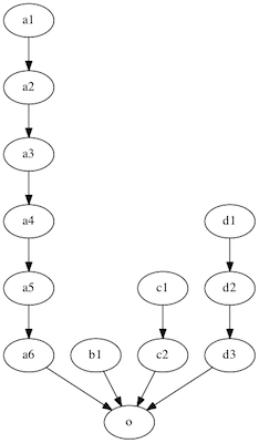
I've run into this situation where it seems to be snapping parts of the tree to the top of the screen resulting in long edges:
Here's the same graph on graphviz's dot command:

It's not entirely sure which approach is better, but it seems like the 'b1' node should be at the top, or the rest should aligned to the bottom.
Thanks for your time.
The text was updated successfully, but these errors were encountered: