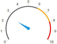
A simple circular gauge indicator component.
$ npm install component-gauge
Or use standalone browser version gauge.min.js, using global Gague class.
Don’t forget to include index.css and arrow.svg.
var Gauge = require('component-gauge');
var q = require('query');

var gauge = new Gauge(q('.gauge'), options);Create a new Gauge component.
Update gauge rings, marks & labels position.
Current gauge percent value, 0..100.
| Param | Default | Description |
|---|---|---|
angle |
[150, 390] |
Start and end angles defining gauge’s aperture |
values |
{0: 'start', 100: 'end'} |
Dict of labels corresponding to percentage values |
colors |
{0:'gray', 70:'orange', 90:'red'} |
Dict of colors corresponding to percentage values |
marks |
[0,10,..100] |
List of marks, corresponding to percentage |
value |
0 |
Initial value |
There are a bunch of styles you can tack to adjust gauge view. Look into index.css. For example, you can adjust arrow shape and visibility, inset/outset of values and marks.


