-
Notifications
You must be signed in to change notification settings - Fork 14
New issue
Have a question about this project? Sign up for a free GitHub account to open an issue and contact its maintainers and the community.
By clicking “Sign up for GitHub”, you agree to our terms of service and privacy statement. We’ll occasionally send you account related emails.
Already on GitHub? Sign in to your account
Extension Logo Bazaar #99
Comments
|
Here are some variations of the Bazaar logo. Works nicely with the "Marketplace" functionality as well. I think that #6 is the best one here as it's clear and simple. Adding some fruit or a person makes it more like an illustration instead of an icon/symbol. Also as a note the style here (lines + white opacity fill). Will be also used for other logos/symbols like Masquerade so we consistency between our things. |
|
I think 6 or 7 will render better when they are small. My favorite is 6 as well @darisi . I find the color combination between the logo and the text very strange... |
|
The variants with striping are best. My favorite was actually 1, but I can see that 6 is better for rendering too. |
|
6 (even though the pattern on the logo(the tarp?) brings in the main focus) but 7 makes me look at the entire logo from the icon to the text. |
|
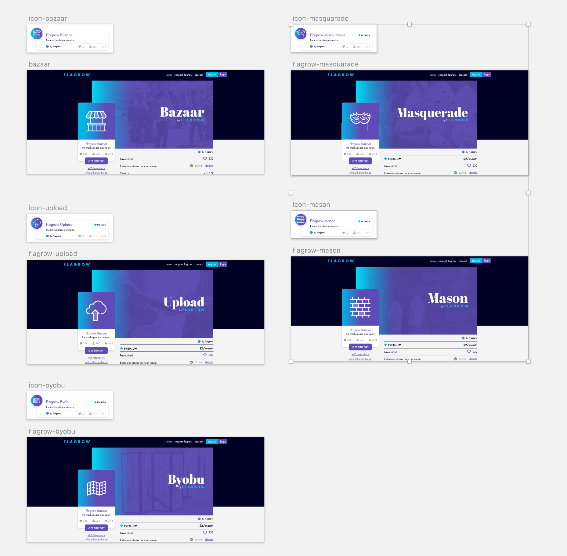
Thanks, everyone for the help. Some good points there. Redid the Bazaar one and created the logos for other extensions. I think this style will work really well for our premium extensions. I actually like the ones that are on the white background + have a bit of blue in them the best. Did I use the Mason one ok? Bricks as in custom fields that you put together. But I don't know if they look the best on the purple background which we may use on the flagrow site. I may tweak the line width for these a bit, which should improve them. Unless we just use the white ones. |
|
Will ad some more detail to make it byobu better :)
…On Sun, 3 Dec 2017 at 20:53, Daniël Klabbers ***@***.***> wrote:
I really, really love these. Except for the Byobu one (also note it's
officially byōbu), because it now looks like a map, but it's in fact a
privacy screen, like this:
[image: image]
<https://user-images.githubusercontent.com/504687/33529093-f2bbddbe-d86b-11e7-9512-afd6bc78cd6a.png>
—
You are receiving this because you were mentioned.
Reply to this email directly, view it on GitHub
<#99 (comment)>, or mute
the thread
<https://github.com/notifications/unsubscribe-auth/AFxVOQ1-saErWW3NWeq4L5hGLITu0wvtks5s8vwngaJpZM4Qqw1W>
.
|
|
I prefer the right versions but they look really good. Nice job @darisi ! |
|
Updated the logos/extension pages - Full view (just use right/left to scroll through them) - https://invis.io/YZAYHTHK7#/259671208_icon-Bazaar Here's a small preview as well. I've also tested the version where the logos have a blue element in them, but they didn't work well when they were small etc. So The lighter whites were the way to go. Added also some images for the extension but some may need changing. |
|
Looking good @darisi can we get them added to the design repo for further processing? If you do (logos as svg at least) we can pick them up for the upcoming release 🤤 |
|
Looks good ! I find a bit disturbing that the icons seem to be more related to the name than the purpose of the extension. From the icons alone it makes me think Masquerade is a privacy/anonymous extension of some kind and Byobu some kind of paywall 💩 Mason is also a bit strange in that sense. The background image for Byobu is really useful to show what the icon is supposed to represent. I still think it's a map otherwise 😇 |
|
Oh totally didn't see that, Byobu still isn't a privacy screen.. |
|
@darisi misposted the following #84 (comment) |
|
@darisi I'm missing a SVG DARK variant SYMBOL for MASON. |
|
@luceos pushed a commit. It was there It was just named "icon" instead of "symbol" fixed all of these now. |
|
These look great! |


It's time we profesionalised this extension a bit more. For Bazaar we need;
Migrated from #84
The text was updated successfully, but these errors were encountered: