ref(settings): improve padding and layout consistency with spacing scale #7660
Conversation
 Chrissy
force-pushed
the
fix/settings/durpdowns
branch
4 times, most recently
from
Chrissy
force-pushed
the
fix/settings/durpdowns
branch
4 times, most recently
from
a63c90b
to
6b4ec5b
Compare
Chrissy
changed the title
Chrissy
force-pushed
the
fix/settings/durpdowns
branch
from
a943d4a
to
7f049ee
Compare
| export default ` | ||
| import {css} from 'react-emotion'; | ||
|
|
||
| export default css` |
There was a problem hiding this comment.
I would say... no default exports in styles if we're going to do this, otherwise it'll be impossible to determine when to use a default import or named import.
There was a problem hiding this comment.
check out how I import this in index.jsx. this may resolve your concern or it may not. I'm fine with either tbh but it is a lil different now.
| @@ -232,6 +232,7 @@ const AutoCompleteItem = styled('div')` | |||
| } | |||
|
|
|||
| &:hover { | |||
| cursor: pointer; | |||
There was a problem hiding this comment.
Is this needed now that cursor: pointer is default?
There was a problem hiding this comment.
yeah sorry. sometimes i get thrown off by my computer which frequently breaks my cursor (legend has it photoshop is to blame)
| @@ -1,3 +1,5 @@ | |||
| import {css} from 'react-emotion'; | |||
There was a problem hiding this comment.
ugh sorry some of this is sloppy. I had a somewhat crazy rebase last week and missed some of this stuff. Thanks for catching it.
i think we should keep it and use it on line 1. that way it can be used as a standalone class if needed.
| @@ -223,7 +223,7 @@ const StyledInput = styled(Input)` | |||
| const AutoCompleteItem = styled('div')` | |||
| background-color: ${p => | |||
| p.index == p.highlightedIndex ? p.theme.offWhite : 'transparent'}; | |||
| padding: 10px; | |||
| padding: 4px 8px; | |||
There was a problem hiding this comment.
I think we should have more consistent default here irt vertical padding. I think 10px is a good default here (or maybe 8px)

vs (10px)
There was a problem hiding this comment.
yeah i'm in on that. I might just change small to be 10px and keep extra small at 4px.
also on a side note: not really sure why i didn't use the helper here lol
There was a problem hiding this comment.
I do wanna point out that if we do the multiplier thing (as discussed below) and we ALSO wanna use a scale of 4px => 10px => 16px > 20px we might need to use a case switch unless there is some secret golden-rule pattern behind it all.
There was a problem hiding this comment.
Not sure what the correct scale is but it doesn't have to be a multiplier, the inputs could just be the index to an array of sizes (or a case statement). As long as all that logic is in a utility function, then it's fine.
There was a problem hiding this comment.
yeah i've installed a couple of scales that have worked OK but none I've been 100% happy with.
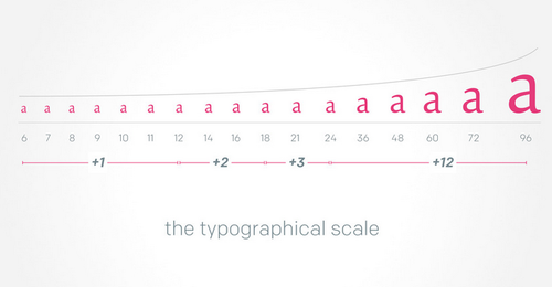
The golden ratio (1.61803398875) run through some kind of rounding mechanism works ok but it starts jumping too high too quickly after 16 and then by 30 isn't jumping quickly enough.
There is also the bringhurst modular scale which is inspired by music. it's perfect for typography but doesn't make as much sense for padding / margin / grid.
This medium article is kind of cool and goes over a few of them (tho it is written in terrible designer language lol). I'll probably reference back to it.
I'm just gonna go with something like 2 -> 4 -> 6 -> 10 -> 16 -> 20 -> 24 -> 36 -> 60 -> 100 -> 100*(n-8) for now. If we can tease some sort of math out of it later so be it.
| @@ -18,7 +15,9 @@ const StyledPanelHeader = styled(({disablePadding, hasButtons, ...props}) => ( | |||
| border-radius: ${p => p.theme.borderRadius} ${p => p.theme.borderRadius} 0 0; | |||
| background: ${p => p.theme.offWhite}; | |||
| line-height: 1; | |||
| ${getPadding}; | |||
|
|
|||
| ${p => (p.hasButtons ? padding.verticalSmall : padding.vertical)}; | |||
There was a problem hiding this comment.
I think we should adopt a grid-emotion-inspired API in regards to padding and margin where we use p/m+(direction)=(relative unit)
I think it's better because it's 1) less typing and 2) more intuitive. We normally define padding/margin in terms of numerical units and I think it will be easier to use if we keep it numerical. Thoughts? cc @getsentry/workflow
${p => (p.hasButtons ? styles.py(0.5) : styles.py())}
${p => !p.disablePadding && styles.px()};
There was a problem hiding this comment.
I've gotta say: I don't like the api for grid-emotion or any atomic styles really.
That said, I think there is a compromise which you can just scroll down to, but I'm gonna plop my soapbox down for a minute so hang with me if you feel like some justification for my dislike 😬
We wouldn't write js like this:
var s = f(() => p(q))and react/angular didn't write their style api to look like this
<div style={{pl: '10px', pr: '10' m: '10px'}}></div>Truncating property names to one or two letters for the sake of brevity is generally discouraged in any language. So to turn around and say it will work with css seems ill-advised, especially given that almost any web developer can read and understand css in it's current form.
proposal:
I'm fine using numeric values, so my only (humble) request is that we ditch the atomic api and go for something more akin to the react style api:
${p => (p.hasButtons ? styles.paddingVertical(0.5) : styles.paddingVertical(1))}
${p => !p.disablePadding && styles.paddingHorizontal(1)};
And while, yes, padding-horizontal is not a real css property I would challenge you to find someone who couldn't figure out what the heck that means lol. And even if it wasn't obvious I would still argue reading real words is better than reading a css regular expression!
But as always, I am an agreeable person and If everyone else prefers the grid-emotion thing I will comply. At least I will get to bail on constantly creating mysterious Box elements everywhere.
There was a problem hiding this comment.
Truncating property names to one or two letters for the sake of brevity is generally discouraged in any language.
I can't disagree with this.
I like the compromise. Let's go with that. We'll additionally also want:
- - A utility function that accepts a number/multiplier and returns a unit
- - The equivalent for margins
There was a problem hiding this comment.
agree on both. I'll add em.
| })); | ||
|
|
||
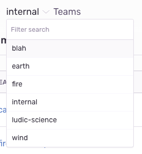
| let menuHeader = ( | ||
| <StyledTeamsLabel> | ||
| {t('Teams')} | ||
| <StyledCreateTeamLink to={`/organizations/${orgId}/teams/new/`}> | ||
| <Link to={`/organizations/${orgId}/teams/new/`} style={{float: 'right'}}> |
There was a problem hiding this comment.
Why remove the styled component?
There was a problem hiding this comment.
yeah... I went back and forth on this. It just seemed silly to make a component for two-lines of css, but ultimately good design matters most (I always tell myself that and then forget it lol) so I'm gonna revert this change.
| })} | ||
| </PanelBody> | ||
| ); | ||
| return this.state.projectTeams.map(team => { |
There was a problem hiding this comment.
We should keep <PanelBody> (or add it in renderBody) so that all the <Panel>s are structured the same
There was a problem hiding this comment.
good catch. i was a little confused by the changes coming from master on this one ty for the heads up!
There was a problem hiding this comment.
this is resolved below.
| float: right; | ||
| text-transform: none; | ||
| const TeamDropdownListElement = styled('div')` | ||
| ${padding.verticalSmall} ${padding.horizontalExtaSmall}; |
There was a problem hiding this comment.
I would use a ; after each to force a newline between them.
Chrissy
force-pushed
the
fix/settings/durpdowns
branch
from
7f049ee
to
4a1ac9c
Compare
| export default size => { | ||
| if (size > 9) return (size - 9) * 100; | ||
|
|
||
| switch (size) { |
There was a problem hiding this comment.
i'm using a case/switch here mostly because i started with an array and found myself writing out a long comment that looked exactly like a case switch...If folks prefer the array that's fine but we'll need something that makes it easy for people to figure out exactly what each number spits out
| @@ -6,6 +6,7 @@ import styled from 'react-emotion'; | |||
|
|
|||
| import AutoComplete from './autoComplete'; | |||
| import Input from '../views/settings/components/forms/controls/input'; | |||
| import styles from '../styles/index'; | |||
| margin: (size, horizontal, bottom, left) => | ||
| css` | ||
| ${styles.marginTop(size)}; | ||
| ${styles.marginRight(horizontal || size)}; |
There was a problem hiding this comment.
This won't work as expected if horizontal is 0
| @@ -0,0 +1,28 @@ | |||
| export default size => { | |||
| if (size > 9) return (size - 9) * 100; | |||
There was a problem hiding this comment.
it's for big numbers. basically if you do something like width: spacingScale(10) it would return 100 and if you did spacingScale(12) it would return 300 and so on.
I'm not attached to this, in fact most of the time i like to just keep big numbers close to home. we could just throw an error if someone puts in a number that is too big?
| return 24; | ||
| case 8: | ||
| return 36; | ||
| case 9: |
There was a problem hiding this comment.
I'm concerned this is too many options.
There was a problem hiding this comment.
that's fine. i went to 10 mostly because it seems like a nice place to stop.
two questions:
- where should we stop? 6? 5?
- what should we do if a developer adds something over the limit? right now i just multiply it by ten but we could also throw an error.
| @@ -181,7 +182,7 @@ class ProjectTeams extends AsyncView { | |||
| .map(team => ({ | |||
| value: team.id, | |||
| searchKey: team.slug, | |||
| label: <TeamDropdownElement>#{team.slug}</TeamDropdownElement>, | |||
| label: <div className={styles.padding(2, 1)}>#{team.slug}</div>, | |||
There was a problem hiding this comment.
I'd prefer a styled component for this, I think reading a component name is a win over a class names.
There was a problem hiding this comment.
ok. if that is the case I'll probably just bail on helpers completely. the primary benefit of helper classes is to avoid making up names for functionless styled components. otherwise, it's just an extra layer of stuff.
Instead, i'll replace it with direct calls to scale, something like:
margin: 0 ${scale(2)};
padding: ${scale(3)} ${scale(1)};
Chrissy
changed the title
Chrissy
force-pushed
the
fix/settings/durpdowns
branch
3 times, most recently
from
b3e8f9f
to
2da10dd
Compare
| @@ -237,7 +238,7 @@ const AutoCompleteItem = styled('div')` | |||
| `; | |||
|
|
|||
| const StyledLabel = styled('div')` | |||
| padding: 2px 8px; | |||
| padding: ${space(3)}; | |||
There was a problem hiding this comment.
having trouble believing this is right... looking into it now
| @@ -2,9 +2,10 @@ import {Flex} from 'grid-emotion'; | |||
| import PropTypes from 'prop-types'; | |||
| import React from 'react'; | |||
| import styled, {css} from 'react-emotion'; | |||
| import space from '../../styles/spacingScale'; | |||
There was a problem hiding this comment.
Can we make the file name == default import name?
There was a problem hiding this comment.
yep. I would prefer calling is just space so that lines like margin: space(3) space(0.5) don't get super long. I think since space.jsx is in the styles directory it should all be fairly clear.
There was a problem hiding this comment.
we could do scale but we would need to make sure it also works for type, otherwise it's ambiguous.
with type we've gotta have low-increment values, especially around the base unit (12px, 18px, 24px) etc so it might be best to do a second scale for that.
also who doesn't love talking about space?

|
Ah the padding here doesn't match up (PanelItem probably needs to be updated):
|

…e they exactly mimic css
…here are no conflicts
Chrissy
force-pushed
the
fix/settings/durpdowns
branch
from
649f980
to
433fa90
Compare
…ale (#7660)

* first commit

* second commit

* 4 billy

* use spacing functions that add unitless numbers

* couple small fixes

* use simple margin and padding shorhand functions when possible because they exactly mimic css

* don't need index

* just interpolate the spacing scale for now rather than mixing in full lines

* decrease number of options in spacing scale

* return of getPadding

* bettar diff

* re-add missing text transform line

* fix import in panel header

* reset these snapshots in some hairbrained scheme to convince github there are no conflicts

* use fewer values for our scale and set it to a base of 8

* fix alignment issues by adding scale values for fieldWrapper

* spacingScale => space

* team members padding was too small
This pull fixes a bunch of padding inconsistencies by adding a basic scale system.
Currently, we use
grid-emotionto help standardize values, but it is limited to use cases where a block-level containing element is appropriate, and therefore only get's partial adoption.This proposal would move us towards something that will always work across multiple-use cases: be it a styled component, an inline-style, a layout utility component like
grid-emotion, or an extendable chunk of css.This system will work for
margin,padding,line-height,left,right, etc. It also allows us to move down to 2px and 4px values, and because it is just a ten-line file maintained by us, there is zero mystery.Finally, it opens up a door towards typography and white-space scales that work together in harmony. This will make it easier to compose combinations of font-size, line-height, and margin + padding.