feat(toast): add header and custom toast buttons #17147
Conversation
 zakton5
changed the title
zakton5
changed the title
|
Thanks a lot :) I have not checked it yet, but seems good! |
update to latest 1-22-19
Update master 2-1-19
Now that v4 is officially out, I guess you should keep them, transform and push into the buttons array if set, and add a note that they are deprecated. Introducing a breaking change might not be the best choice at the moment. The props can be dropped once a v5 release is close I guess. |
|
@simonhaenisch @brandyscarney I've implemented your suggestion. Let me know what you think. |
|
@liamdebeasi I made those changes. Let me know if anything else needs to change. |
adds the padding to content no matter if buttons are there
remove deprecated button properties
|
This is so great! Sorry it took me so long to look at this. I made some minor changes:
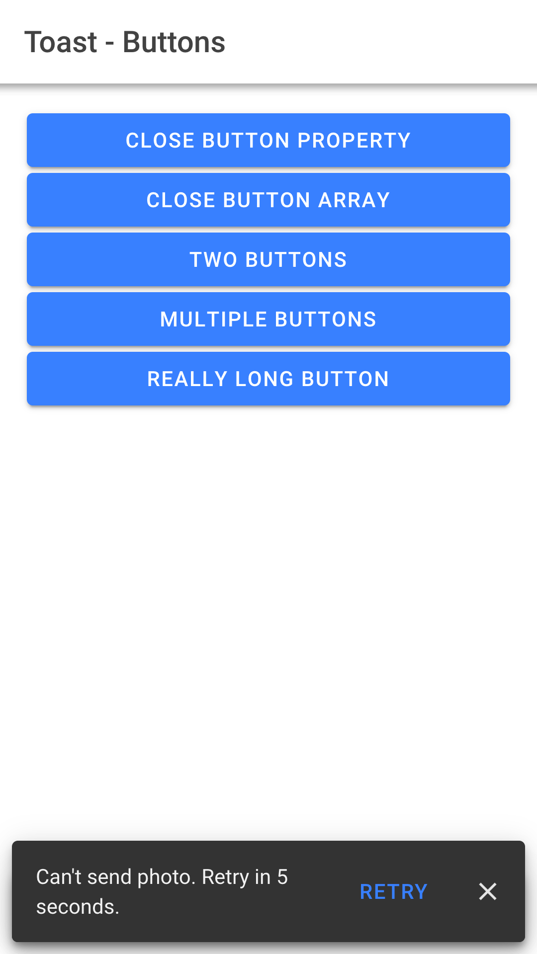
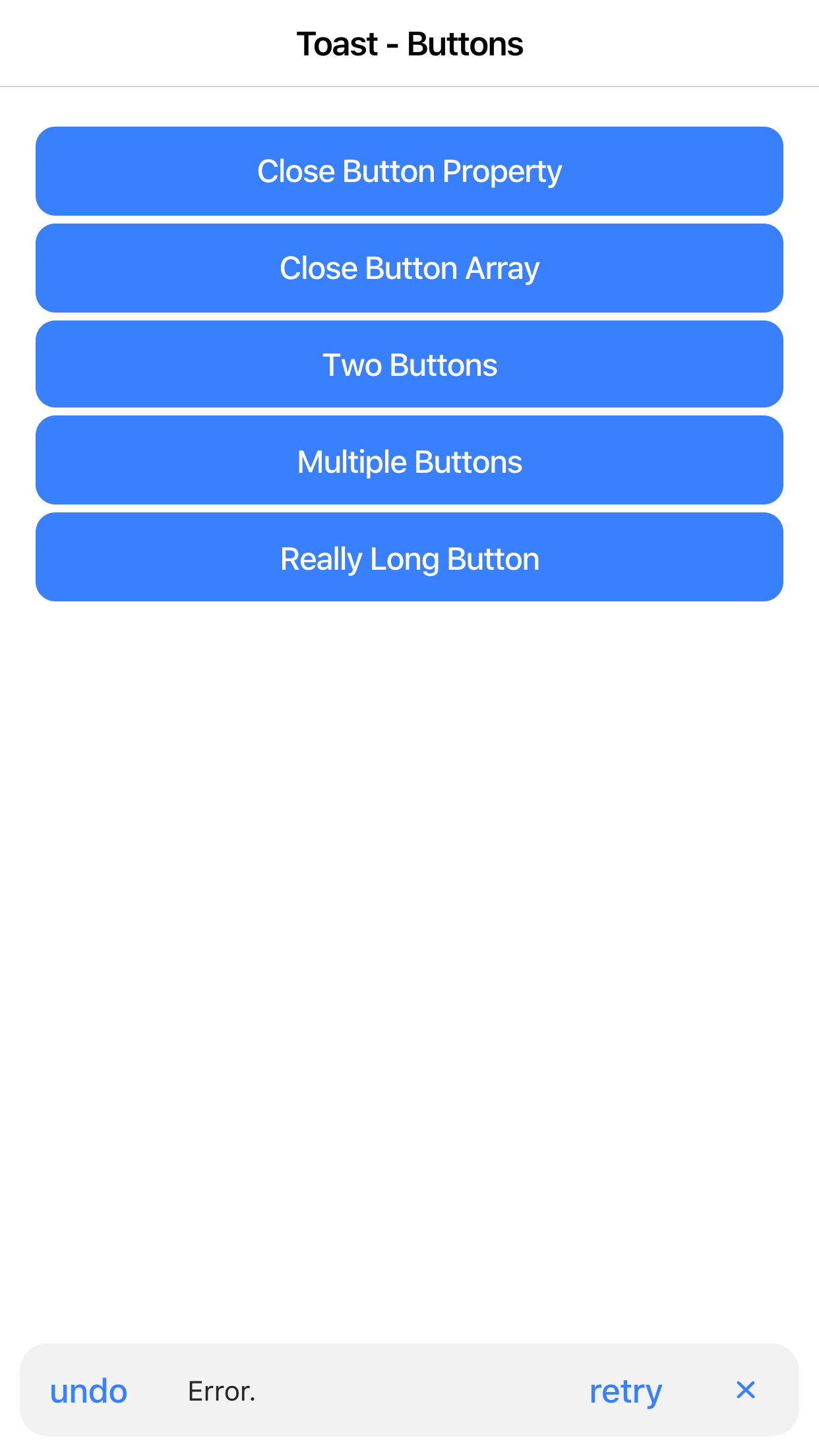
Unless there are any complaints, this looks good to merge to me. @liamdebeasi did you want to take another look at this? Here are some screenshots of latest:
|


- adds a background color that is a transparent layer of the text color in md
- adds opacity to the button in ios
|
Okay pushed a few more changes:
The only other thing I can find is the icon-only buttons should be rounded on hover/ripple but it could possibly be pushed to a separate PR? |
|
Okay last change sorry. 😂 I updated the icon-only buttons so they have the 50% border-radius and will be rounded on hover. Good to go now!
|

|
@brandyscarney Looks great! Nice changes. It'll be nice to finally use these haha |
|
Yay! Merged. 🎉 @simonhaenisch I tried adding us as co-authors but for some reason it didn't work. I actually sent a support message to GitHub about this as I've used the same syntax before without any issues and I'm curious why it didn't work. |
|
Thanks @brandyscarney, looking forward to try this out soon. I'm pretty sure you're supposed to have two blank lines before the |
|
@simonhaenisch Yeah I'm not sure what's going on. The last time I did it was similar and it worked: a7f1f4d Maybe adding the fixes after broke it? 🤷♀️ |
|
Hm actually I think the issue might be that the "closes ..." comments are below the Thanks for trying, however I didn't do all too much here anyway ;) |
|
Yeah, maybe. I didn't read it that well. 😂 I'm not upset to not be added either but I still want to know what I did wrong. 😭 Maybe they'll message me back, haha we'll see. |
|
Probably after this PR buttons always use primary colour (with icons and just closeButtonText). I didn't change anything in my project - just updated to the newest version. Should I add some variables into "/** Ionic CSS Variables **/" ?
Also please update docs to this pr 🚀 |

|
@rafalschmidt97 this should be fixed with PR #18133 I am waiting for that PR merged, too ;) |
…am#17147)

Adds a `header` and `buttons` property to toast. This allows for a toast header to be passed and multiple buttons including action buttons and icon only buttons which matches the Material Design spec. Adds hover states to the button to match the spec. Updates usage section to recommend the new way of passing a close button using the buttons array and `cancel` role. If a button is passed using the cancel role default the color to match the spec. Buttons will default to the `end` side but have the option of being placed on the `start` side.

Co-authored-by: Simon Hänisch <simonhaenisch@users.noreply.github.com>
Co-authored-by: Brandy Carney <brandy@ionic.io>

closes ionic-team#16791 closes ionic-team#16237 closes ionic-team#17611
Short description of what this resolves:
Allows more complex toasts to be utilized by allowing a header and custom buttons as discussed here: #16791
With this new feature, is
showCloseButtonandcloseButtonTextneeded? I would opt for removing these properties entirely in favor ofChanges proposed in this pull request:
Ionic Version:
Fixes: #16791, possibly #16268, #16237