Right to left support (Arabic, Hebrew, ...) #5359
Comments
A basic keyboard is actually a great place for just about anyone to contribute. You can copy the English layout (or one closer to your goals if applicable) and start changing characters.
Unless someone's "secretly" working on it, all we've got right now are a few promising libraries (FriBiDi, raqm). |
|
Well, I'm currently playing with fribidi/harfbuzz on the crengine side (EPUB rendering). Technical notes in koreader/crengine#307. I can't promise anything on the UI/filename side, but I'll probably have a look at it. But deeper, there are many more tedious things. A keyboard might be easy (but to be done by some arabic users), but the textbox editing/cursor/insertion/wrapping feels like a nightmare, and it would fragilize the already complicated code we have for left-to-right... Anyway, @hgrain86 (and others reading this, that read arabic or hebrew), just a few questions so I get to understand the importance of each step - I don't read at all arabic, I'm just playing with libraries that are supposed to do things right - and visually comparing with how Firefox displays the same Wikipedia page. First, just to have an early confirmation, are these screenshots readable/correct/perfect (with various western fonts I have, might not have the best arabic glyphs - and discarding the fact that some titles and list bullets should be right aligned, that will be fixed later):
A) are these readable, and how would you rate the quality of that on a scale of 0 to 10 :) That nice arabic (I hope :) is achieved thanks to Harfbuzz, that shapes the individual characters into correct cursive display. E) Even if it's probably not as nice as the first screenshots, are these still readable? This is where it gets complicated: this is the current UI code, that doesn't re-order chars, so this is probably reversed and unreadable: F) Is that totally unreadable? Or is your brain able to re-order it and decypher it ? :) And about the UI (menu, filenames): J) would you be willing to handle the strings (english to arabic) translation work ? :) In case some hebrew reader passes by, here's some rendering of a hebrew wikipedia epub page (source). same questions as above :) is it readable/perfect? |


|
I will try to read your reply leisurely and answer the questions that I can answer because I am not a developer or experience in programming at all, but I am a regular user of this special program Thank you very much for all this interest, even if I can support you financially for your gift all I have |
|
Another question (still just thinking how much complexity this would add): K) How should the following UI sentence be rendered when translated to arabic:
In the following, assume the uppercase are the arabic letters making the translated words from their lowercase counterpart in english:
K1) when @Frenzie : related technical question: in Transiflex, or other translation tools, are there tools to isolate/override the directionality, or would the translators have to insert the unicode chars mentionned at http://unicode.org/reports/tr9/#Directional_Formatting_Characters - or would us developpers need to take care of that in our translatable strings (?!). |
|
Wouldn't that depend on the filename? It doesn't really strike me as something you can translate in advance. |
|
I think all the strings/translation/templace substitutions would be done with the logical order of all strings. Give these to fribidi, and we would get the visual order: I guess the Or the translators would need to add them: (or LEFT-TO-RIGHT OVERRIDE, the distinction between isolate and override was clear to me for about a few minutes last week, but I've already forgotten... :) Really nothing specific/additional for arabic in translation tools? |
|
There is bidirectional isolation in https://projectfluent.org/ They list it as an advantage over gettext. In our case I would think Edit: interestingly, just the other day someone posted about a Lua implementation https://discourse.mozilla.org/t/work-started-on-a-lua-implementation/44963 Edit 2: whoa, Pontoon works quite well. |
|
@poire-z
yes, right aligned is better but left aligned is ok.
depends, for example TOC would be more expected to be right aligned in a totally hebrew book than the file browser with hebrew and english entries
i don't mind helping out with integrating hebrew support in strings/code, I just need someone to point me in the right direction as i am not familiar with the codebase/lua
the render is readable for comparison i will show good screenshots courtesy of RTL in crengine do you need me to test any specific features, it is quite easy for me to generate a hebrew epub with specific features, lists bullets footnotes etc.
K1) a i use an english locale (english speaker), but read hebrew books also please implement this, (you will make a great program much better) |


|
Thanks for the nice feedback!
So, not perfect ? :) anything missing to make it perfect?
Well, you probably have to use "best" for anything a bit complex to show correctly. "good" is really just a hack that may work on some simple western text. "fast" is pure freetype, and similar to how our UI renders text (but without the RTL support). That's why we'd need to use Harfbuzz for the UI too... (Hebrew without diacritics might be fine with Freetype, but we might as well want cursive like arabic and scripts with heavy glyph substitution like indic to work).
Thanks, but for now, I'm ok with EPUBs made out of HE or AR wikipedia articles.
Well, that's on Transiflex, and @Frenzie knows more about that than I do. But best to wait before starting translations until we have at least an idea on how to do it and have started the work :)
It's quite all contained in a few modules: font.lua font list and simple selection, and wrapper to Freetype textboxwidget.lua would be the more complex to adapt to using something more complex than simple Freetype (that maps 1 char => 1 glyph and just stack them on the line) - and it currently needs a lot of memory with long text (like long dict entries or Wikipedia articles shown from the UI). |
|
Transifex is just a workflow aid; at the core we simply work with GetText PO/POT files. So you can either use the Transifex online interface or download the relevant translation file locally, work on it in your favorite editor, and upload it. You can do that manually through the web interface or assisted by the Nice ways to edit PO files:
Transifex automatically switches to an RTL interface when appropriate (which can be disabled); I don't know the details with regard to the programs I mentioned. From here:
The primary advantage of working on Transifex is when you've got a lot of strings to localize and you're working on it with multiple people simultaneously. In a regular Git scenario, it'd be easy to accidentally duplicate efforts, leading to doubly wasted time because then there would also be merge conflicts to resolve. @poire-z For implementation considerations, this post about wxWidgets might be of interest. Wordpress has an is_rtl() function. |
|
Would something like raqm help for the UI side of things? |
|
I had a look at raqm again, and even if I like its simplicity, I don't think we'd be able to use it as is. Had thoughts (because of its simplicity) about how much we would need to patch/extend it (and get involved in upstream development) - but there are quite a few things that we would need to tie to how our frontend does things, that relate to:
(One thing I noticed in libraqm and that I missed/forgot in the crengine bidi stuff is that we should split measureText() segment on "unicode script" change, and not only on direction change (so mixed hebrew and arabic in a single text node are split into different segments - while they are currently only one and harfbuzz uses the script of the first kind of text it meets). So, although there are wishes for these features on libraqm's github, and many closed and not merged PRs that tried at them (and none that went using libunibreak) , it might be easier and quicker to just go at doing something a bit similar to how it is/what it does, but really just targeted at what we need. Mainly, the C code would be fed the Lua text string, and we would get back a ShapedText object, with enough methods to get the cumulative width, send current line wished width, get the slice that fit in, set slices as lines, shape a line, get the glyphs (face, glyph index and positions) for that line back, so our Lua side can cache and blit the glyphs from that. Anyway, could be fun, many of the tough harfbuzz (clusters/glyph/chars walking) and fribidi stuff is already done and could be copied&pasted from crengine - but I would miss the help all the lvArray/lvString/lv*... helpers that crengine provides (*). Not sure yet how to start on that... Lua library (like cre.cpp), or some plain C lib wrapped by ffi? (*) just wondering, if I would need some array/hash/collection facilities, what's the most easily available? Depending on GLib would suck I think - and I guess all the |
|
We do pull glib for sdcv already, so you could theoretically use it. (I don't recall, we might currently be building it static, but that can easily be corrected). The std is indeed C++, not C ;). |
djvulibre and k2pdfopt are the most important users; there's some other stuff that uses it too. |
i just don't like that font, nothing on your end. however after using hebrew for a few days i noticed harfbuzz can be aggressive on the kerning, bring letters too close together, they usually don't touch but are too close for comfortable reading Is there any way i can tweak how aggressively harfbuzz does kerning, in the setting or code and i can test what is the best value for hebrew kerning? a screenshot with tight kerning highlighted. (they are the same, one with highlights)
|

I don't think there are any tweaks about that, except a on/off toggle by enabling kerning or not. You would need to recompile crengine by setting Because I think Harfbuzz makes no decision: it just follows the instructions the font creator has put in his font. We can just tell Harfbuzz to follow or not these instructions. You could try to hack your prefered font with FontForge and tweak/kill the kerning table (I know really nothing about how that work...) Or try another font, see if that aggresive happens with it too. |
did not help.
i will try another font later, but i don't think it is only the font. when using the stock kindle reader with the font hack (for details what it is doing ask @NiLuJe ) i get very nice hebrew: compared to koreader with auto hinting, i get the cramped letters: and koreader with native hinting: however the stock kindle reader without the font hack totally fails with the diacritics (i don't have a screenshot) |


|
I assume that's on a KF8, not a KFX, right? Checking with the exact same font would be a helpful comparison, because, yeah, IIRC, the KF8 renderer uses pango/cairo, but I don't completely recall how well it actually honors kerning/ligatures. (i.e., I don't read the language, but it almost looks unkerned...). EDIT: Oh. Also, try with no hinting, instead of auto/native ;). |
yes
i am using the same font for both (SBL_hebrew), i agree the kindle one looks unkerned, however turning off kerning with harfbuzz does not solve the problem in koreader
no hinting does the same for the spacing harfbuzz has this issue (both regular and light), freetype and no kerning have good spacing but the diacritics are off |
|
@poire-z is there a way to tweek letter_spacing, where is it controlled? |
So, what's the result with other fonts?
Via CSS. Just create a style tweak containing
You can try to disable other opentype features, see some examples in the next section used for good/harfbuzz light at https://github.com/koreader/crengine/blob/fe6efab20a759df26e2823d55be4b56ec3ad879a/crengine/src/lvfntman.cpp#L1043-L1074 Also, does it happen with the same letters when there are no diacritics around? Also, can you check how that snippet would do with other renderers that use harfbuzz? I think Chrome/Chromium use harfbuzz. |
|
@hgrain86 (and others reading this, that read arabic): could you comment about the arabic screenshots above? Are they ok, or do you notice some letter spacing issues too? |
similar, some fonts more than others, some fonts naturally have more spacing so it is less of an issue.
thanks, it helps alleviate the symptoms but on the other hand some letters get too spaced out, so not a real solution
i tried that, but it happens with harfbuzz light also. harfbuzz in general.
yes
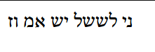
attached <html>
<body>
<p>ני לששל יש אמ וז</p>
</body>
</html>
i did that and did not see anything helpful, also that only works with harfbuzz so does not help me for comparing to freetype.
firefox: libreofffice: the block sytle fonts (noto) dont kern as much but are not very nice to read, they do not capture the full letter shapes. the end result so far: harfbuzz has this issue (both regular and light), freetype and no kerning have better spacing but the diacritics are off |

Not sure if crengine supports it properly, but on higher DPI displays you'll need a value like |
|
Some issue noticed with Arabic (which should probably happen also with other complex scripts like Indic ones) when our text widgets wants to truncate some string so it fits in a specific fixed width: The way we do it is: if the text does not fit in width But with Arabic, where letters have different shapes whether they are at start, at end, in the middle of a word, or standalone, if we truncate a word, the letter that used to be "medial" (with usually a small shape) is now "final" (with usually a longer shape) - or a "initial" letter could become "isolated" - and we may overflow the width:
Here are some of the above truncated words, untruncated: I have no obvious idea how to solve this issue. (Looping with one char less until it fits would not solve the medial/final incorrect form issue.) But I have some questions for Arabic/Persian readers, pinging @WaseemAlkurdi @Zeyadas @Monirzadeh (I would also like some answers to these questions from Indic scripts readers): A) is it ok to truncate an arabic word, like we can do in English? or would you prefer to not see any part of the word at all (so, possibly not seeing anything but "...") ? B) when truncating such a word, do you use the generic ellipsis, or are there some other specific indicator to mark that there is a truncation? C) if truncating (with or without an ellipsis), do you expect to see the last character (originally in the middle of the word) in its "final form", or in its original "medial form" (as a more obvious way to see it's not right, and so it is probably truncated). And if seeing it in its medial form, is that enough to indicate it is truncated, or is an ellipsis after it needed/better? D) any other idea on how this kind of problem is generally solved with Arabic? Any special Unicode character we could insert before the ellipsis that would magically make it work ? :) |


|
I'm not at all familiar with Arabic, but it seems to me that the following logics should work:
The functioning of the ZWJ is to be a place holder to force the preceding character to be in medial form, which is exactly what you need. If truncating a word is ok for latin scripts, I see no reason why it wouldn't be reasonable for a script using arabic glyphs. Doing this strategy would also have the advantage that you will not get any overflow because of change of character. |
|
Hello! :)
This would mean having to do something I didn't need until now: detecting words/punctuations, categorizing chars (which feels quite painful and full of special cases :)
Also, (I may be wrong), it feels that even medial form glyphs can be different depending on its neighbours and the font Opentype rules, it feels some glyphs can be merged, and if I truncate into that, I won't get the same glyphs, so different widths, and risks of overflow. Unless such morphed glyphs all end up into a single cluster, and so, by working with clusters, I'm just fine hacking around the compound glyphs. I would also need to care for substituting 2 chars and not overflow my buffers if I'm just truncating out the last char :/ I'll give all this a try :) |
|
Ok, a quick try with the unsafe_to_break flag seems to work ok ! Various truncations (random, by having various widths for the chapters rectangles): In Arabic, mixed of 2-dots and 3-dots ellipsis, but mostly 3-dots (still a feeling of mis-centering with the 3 dots which should be centered correctly...):
Do these look ok/better than the screenshots in previous post ? Is this the right thing to do? In Hebrew, only 2 dots ellipsis: In English, mostly 2 dots, but we can get 3 dots ones (!): The trucated words in green are "Foreword" and "Turkish", so may be Harfbuzz marked these chars as "unsafe to break" because some kerning is involved. If that's what is really happening, we could may be still overflow, as I guess "letter1 + kerning-negative-advance | + ellipsis" may have fit, but now "letter1 (+ 0 kerning I guess with ZWJ) + ZWJ + ellipsis" might be larger. But I guess this is a really minor overflow that we could ignore :) |


|
Although it feels this ZWJ is just a hack that would have some benefit with Arabic only - and could possibly be worse with other scripts.
I'll wait for some Arabic reader to say which set of screenshots looks better/saner:
|


I think that's OK to truncate Arabic words, we do that sometimes.
We use dots for that to indicate that the word is missing some letters.
When truncating I would like to see the medial form but if you can add this (ـ) after the letters.
|
|
And by the way th (D) option I mean the ZWJ seems fine to me. |
|
Thanks for the feedback.
This char is: E) are you/Arabic readers still ok seeing a western ellipsis after an arabic word to indicate it is truncated ? :) Anyway, I had a try by just hardcoding using this U+0640 instead of our ellipsis, and this would give:
I can even less appreciate how this looks :) Does adding this U+0640 somehow makes sure the previous letter keeps its medial form? Btw, playing with your word at removing chars at end:
This word looks (to me :) like it's 3 words, 3 cursives unlinked parts - what I think makes 3 "clusters" for text shaping (or at least, 3 parts with "unsafe-to-break" inside each, but not between them). My experiment at #5359 (comment) was to truncate only at cursive-linked-subpart boundaries, and so it would simplify things in that the subparts form are assured to not change at all. Btw, still curious about Arabic :) here is your word, and then with added spaces between the subparts: |


That's exactly what it's for, it's for making the words a little (longer) for text justification.
Right, but if I/we (I mean Arabic reader) see it in an incomplete word we know that it's truncated.
Yes, it's totally understandable.
Yes, Arabic word can't be broken, I don't know how to describe it but it's written (connected), the letters (no all but most of it) can't be written separately. You can't add spaces between letters.
No, now it's one word, it's three words and (some of it) could be read as something else, but surprisingly we can read it. But it's not comfortable. |
|
Another thing I just noticed... In RTL text, italic (at least, fake italic because I don't have a NotoSomethingArabic-Italic, dunno if there exists any) is rendered oblique in the LTR direction...
With Hebrew:
A) is italic/oblique used with Arabic and Hebrew ? Or never ? Looks like Firefox doesn't do it differently:
|


|
Firefox uses more or less the same combination of libraries I think (or in any case FriBiDi and HarfBuzz). I guess it can't be too wrong, because it'd be hard to miss. |
|
OK. I'll try my best here so..
Yes for Arabic, italic fonts is used in Arabic texts but sometimes it's not (clear) depending on the font type.
In your screenshot above, the (underlined) words are in italic, and personally I hate the font but I think it's a standerd font for writing in Arabic websites and nobody cares about changing it.
No, it's just fine. |
|
@poire-z Hello, just noticed the activity on this issue! |
|
@WaseemAlkurdi : thanks for popping in. I also would like a 2nd feedback on the things above (starting at #5359 (comment)) about truncation, ellipsis, and using https://en.wikipedia.org/wiki/Kashida (tatweel / taṭwīl) instead of ellipsis with Arabic (and if you know, is it valid for Persan/Urdu too ?) |
|
For Hebrew, and I assume for Arabic as well, it is a font design issue.
Both directions are used in Hebrew fonts. See e.g. the following "view
sample" link for the GPL licensed Culmus sets of Hebrew fonts:
https://culmus.sourceforge.io/culmus.pdf , where you can see that both
directions are used for different fonts.
This makes a lot of sense since the role of the render engine is just to
apply the glyph shapes and positioning information for choesen font. As far
as the rendering engine is concerned, there is no such thing as italic, but
only different glyph shapes in a different font.
Regards,
…On Sat, Jan 15, 2022 at 10:13 PM poire-z ***@***.***> wrote:
@WaseemAlkurdi <https://github.com/WaseemAlkurdi> : thanks for popping in.
Do you also agree that the italic/oblique direction goes in the same
direction as for LTR ? For us, the top of the italic letters run forward.
For you RTL, is using the same italic slant as us (as in the screenshots
above), the top of the italic letters would run backward ! I'm a bit
surprised, just want a 2nd confirmation that this is not an issue :)
I also would like a 2nd feedback on the things above (starting at #5359
(comment)
<#5359 (comment)>)
about truncation, ellipsis, and using
https://en.wikipedia.org/wiki/Kashida (tatweel / taṭwīl) instead of
ellipsis with Arabic (and if you know, is it valid for Persan/Urdu too ?)
—
Reply to this email directly, view it on GitHub
<#5359 (comment)>,
or unsubscribe
<https://github.com/notifications/unsubscribe-auth/AACSSOZQD2A64IGIRHAZWNTUWHIQJANCNFSM4IVONQ6A>
.
Triage notifications on the go with GitHub Mobile for iOS
<https://apps.apple.com/app/apple-store/id1477376905?ct=notification-email&mt=8&pt=524675>
or Android
<https://play.google.com/store/apps/details?id=com.github.android&referrer=utm_campaign%3Dnotification-email%26utm_medium%3Demail%26utm_source%3Dgithub>.
You are receiving this because you were mentioned.Message ID:
***@***.***>
|
|
@dov: that would indeed be left to the font (didn't even think about that :), if we were shipping Arabic and Hebrew font with other styles that regular (Hebrew uses our FreeSerif that ships only in regular). So, when no italic font, we do fake italic by applying some transformation with FreeType. I assume Firefox left it to the font (dunno which it picks), but just asking: what's the most commonly expected direction (or, how do real Hebrew fonts do it) for content wrapped in a html |
|
Italic is very seldom, almost never used in Hebrew. But I'm far from an
expert on the subject. The following link tries to give some introduction
about Hebrew type setting.
***@***.***/an-introduction-to-hebrew-type-98933e2fcb17
Regards,
…On Sat, Jan 15, 2022 at 11:02 PM poire-z ***@***.***> wrote:
@dov <https://github.com/dov>: that would indeed be left to the font
(didn't even think about that :), if we were shipping Arabic and Hebrew
font with other styles that regular (Hebrew uses our FreeSerif that ships
only in regular). So, when no italic font, we do fake italic by applying
some transformation with FreeType.
So, in our case, if we don't fake-italicize in the right direction, it's
our rendering engine issue :)
I assume Firefox left it to the font (dunno which it picks), but just
asking: what's the most commonly expected direction (or, how do real Hebrew
fonts do it) for content wrapped in a html <i> or <em>?
—
Reply to this email directly, view it on GitHub
<#5359 (comment)>,
or unsubscribe
<https://github.com/notifications/unsubscribe-auth/AACSSOYHSGQV5JXMR7DVXRTUWHOGDANCNFSM4IVONQ6A>
.
Triage notifications on the go with GitHub Mobile for iOS
<https://apps.apple.com/app/apple-store/id1477376905?ct=notification-email&mt=8&pt=524675>
or Android
<https://play.google.com/store/apps/details?id=com.github.android&referrer=utm_campaign%3Dnotification-email%26utm_medium%3Demail%26utm_source%3Dgithub>.
You are receiving this because you were mentioned.Message ID:
***@***.***>
|
|
@uroybd : can you read through the last posts above, starting at #5359 (comment) I still have this on my todo/tothinkabout list, the issue of truncating arabic cursive words - and I wonder how it is with Bengali (and any other Indic script you may know about) which is cursive too, and may have different forms/widths depending on how we truncate/stop drawing, and if an ellipsis is OK or if you have other ways to hint that text is truncated. Or if what we currently have is all just fine with Bengali :) |
|
Bengali is a relatively easy-going language. A. It is okay. While normal truncating is just fine for Bengali we prefer some visual grouping. For example, if you truncate Question is, how you should define the boundary? Here's a regex to do just that in JS which you can port if you wish to: var bengaliRegex = /(র্){0,1}([অ-হড়-য়](?:্[অ-মশ-হড়-য়])*)((){0,1}(্[য-ল])){0,1}([া-ৌ]){0,1}|[্ঁঃংৎ০-৯]/g;The full match of this regex will be one such unit. |
|
Thanks. So, what we have is rather good. We don't really do any kind of script specific check/processing ourselves. We trust harfbuzz for the brain put into it about scripts and doing the right things. So, we give it unicode chars, it gives us widths of clusters/grapheme/glyphs, putting combined chars into a single cluster. So, currently, we'll keep a whole cluster (with as many followup combining chars it has) if it fits, or drop it all and display only the previous cluster. |
It is equally bad in Arabic as it is in English (i.e. it is a last resort measure).
Generic ellipsis.
For Arabic the last letter should use the positional form it had before truncation (i.e. if it had initial or medial form it should keep, not become final or isolated form as this will give the misleading impression the word is complete and not truncated), it also make sure truncated string is actually shorter, since changing letter form can make the truncated string wider. The simplest way to achieve this if you are going to reshape the string, is to add ZWJ before the ellipsis unless the string is truncated before a dual or right joining character (Unicode Character Database is to be consulted for this). However, I think web browsers don’t reshape and simply truncate the glyph output and append ellipsis to it. This should be faster and also makes sure the glyph width remains the same, reshaping even when using ZWJ can give different width depending on the font (e.g. if it were using ligatures or different contextual alternates at the position of the truncation). |
|
|
Getting back to this issue of Arabic forms and truncation with ellipsis.
Thought about this, but it might be a tad more complicated when bidi is involved, and the truncation/ellipsis at end in logical order ends up being in the middle of the line (in visual order) after BiDi has reordered everything... It would not be as simple as "append", I would have to shove the right side to "insert/prepend" the ellipsis, so some more tricky dedicated code...
So, went with this. Showing Before | After of my unique test case with various truncation points:
Do the right parts feel less wrong than the left parts ?
I guess there's nothing complex in my sample text bits, but at least, on the screenshots above, there is no longer any overflow, so that's rather an improvement, if nothing else :) Still feels a bit strange to get displayed |


|
The right preview is better than the left one. |
Issue
Duplicate topic but I wrote for the importance
Will we see support for Arabic soon?
In the keyboard
And in writing the names of files and folders
Finally in the menus and settings
Thank you very much for this wonderful support and this extraordinary effort
The text was updated successfully, but these errors were encountered: