DOC: new plot gallery #19703
DOC: new plot gallery #19703
Conversation
7caa11f to
8683873
Compare
|
This needs a bit off work to pass but here is the general idea: https://54955-1385122-gh.circle-artifacts.com/0/doc/build/html/ Click on |
|
My bias is to organize by mark type/base artist - marker, line2d, patch...but that might confuse folk...I'm really liking it on a first pass, but is the plan to keep all the cheatsheat code or simplify to just the data/plot? |
|
Random thought: A flow-chart approach to organization could also be nice e.g. something like https://twitter.com/jamiejgriffin/status/1179758518427107328 but I don't think one can easily create that. |
|
So, I don't think we should workshop this to death yet. If we think a third gallery like this is a good idea, then let us add it. We can then discuss how its styled, exactly what is plotted, how it is organized etc after, preferably as PRs on the already existent gallery. FWIW, I think copying the styling from the cheatsheet is a good strategy to keep the overviews parallel. These all should have links added to them over the next little while, but that is pretty good First-Issue fodder if the scaffolding is in place. |
|
I like the cheat-sheet style. However, the styling heavily clutters the actual command. Can we make https://54953-1385122-gh.circle-artifacts.com/0/doc/build/html/plot_types/A_basic/a_plot.html#sphx-glr-plot-types-a-basic-a-plot-py something like Then again, while the defaults are not as pretty, it would make some sense to show the plots like the users would see them without heavy styling. |
|
The biggest issue isn't particularly the defaults but the labels - they detract from the bare images, hence the manual axes placement. I tried to make the preamble and postamble as similar as possible so they would be easy to change... |
|
We can't remove the labels using styles, can we?
Thinking of it, 3. seems the reasonable choice. |
|
Some version of 3, where the cheatsheet code is used to generate the figure + label for the gallery landing page, but the displayed figure + code on the actual plot page is the default styled bare minimum one? Which I think maybe is more suited to potentially growing the entry to all the configs? |
|
I'm not convinced we should have some complicated solution here. The point of these in my mind is to give the user an idea of what is available and the name so they have. something to google or search the docs for. I don't feel some boilerplate styling around that info on the clicked page is all that distracting from the goal. I also don't know that demonstrating the default style is a particular goal. Certainly we can add a style to help encapsulate, but I wouldn't let perfect get in the way of good here, particularly if it means hard-to-maintain extra workarounds. |
|
My goal w/ this was
and my experience has been that any extra line of code ends up being a place folks can trip up, especially since lots of users wholesale copy the whole example w/o really sorting out the parts they need. |
e864aac to
ce3e40e
Compare
|
Encapsulated the style changes in a style sheet. Happy to make private if necessary, but I'm not sure what the point of that would be. I feel this is an improvement as-is, but if I were doing anything more to it, I'd include "see-also" blocks for each of them to act as an index to the gallery. But again, that can be done after the fact, and is easy for new contributors. |
435ac6f to
20fbf36
Compare
| axes.grid: True | ||
| axes.axisbelow: True # grid/ticks are below elements (e.g., lines, text) | ||
|
|
||
| xtick.color: 555555 |
There was a problem hiding this comment.
why do you need to set x/ytick rcs?
(also, quite a few other rcs seem to just match the default value?)
There was a problem hiding this comment.
Can't we have fully transparent color for the ticks ? On the gallery, I can see part of them (on the left here for example.
There was a problem hiding this comment.
Sure, I've made their length 0
plot_types/A_basic/a_plot.py
Outdated
| with plt.style.context('cheatsheet_gallery'): | ||
| fig, ax = plt.subplots() | ||
|
|
||
| ax.plot(X, Y, color="C1", linewidth=2.0) |
There was a problem hiding this comment.
Any reason for using C1 (orange)? just from the peanut gallery, C0 (blue) may perhaps look better, and it's the default too?
There was a problem hiding this comment.
OK, so I tried changing the color order. Guess what - a bunch of artists do not respect the the rcParam when changed in the context manager. i.e. most of the stats ones.
WRT to orange, that is for consistency with the cheatsheet. You can argue with @rougier about what looks better ;-)
There was a problem hiding this comment.
OK, the issue with the colororder not sticking was if plt.show() was inside the context manager or outside. Some artists delay assigning the color until draw time. I think we should stomp out any delayed state in the library as it almost always makes things confusing....
There was a problem hiding this comment.
I think "C0" might do, it mostly depends on the matplotlib website main color.
plot_types/A_basic/a_plot.py
Outdated
| ax.plot(X, Y, color="C1", linewidth=2.0) | ||
|
|
||
| ax.set_xlim(0, 8), ax.set_xticks(np.arange(1, 8)) | ||
| ax.set_ylim(0, 8), ax.set_yticks(np.arange(1, 8)) |
There was a problem hiding this comment.
either ax.set(xlim=(0, 8), xticks=range(1, 8), ylim=(0, 0, yticks=range(1, 8)) or split over 4 lines or at least use a semicolon (a comma happens to work too, but is rather unidiomatic)
|
Some minor nits, but I like this very much. |
72f35a4 to
a9f82c8
Compare
|
... removed the context manager.. @story645 I really do think it is better with some styling:
|
|
Blue looks fine: https://55085-1385122-gh.circle-artifacts.com/0/doc/build/html/plot_types/index.html But could go back to orange: https://55073-1385122-gh.circle-artifacts.com/0/doc/build/html/plot_types/index.html |
|
Here is how this looks with no styling (except note I manually specified the colormap in
|

|
Aspect should be set to 1 and tick labels could be bigger. |
What is being proposed is linked here which is almost aspect=1 and has no labels: https://55085-1385122-gh.circle-artifacts.com/0/doc/build/html/plot_types/index.html This snapshot above was because @story645 was suggesting no styling - so if we go that route, then we get what the default style gives us, or we add a bunch of bespoke code. |
|
@jklymak I really like what you are doing here! Thanks for taking this on. I'm undecided concerning styling. The styled version clearly looks better, but has more distracting boilerplate code. Possibly either one is fine for a start. We can always tune later. |
|
Suggest we go with "looks good" and make simpler if there are complaints of confusion. |
| @@ -0,0 +1,19 @@ | |||
| # from the Matplotlib cheatsheet as used in our gallery: | |||
There was a problem hiding this comment.
Do we want to make this public then?
There was a problem hiding this comment.
We could? Whichever is easiest - I'm not sure about user examples that don't have a public stylesheet....
There was a problem hiding this comment.
IMHO it's ok to make the style public. If somebody wants to use that style, that's ok.
Is "cheatsheet_gallery" a good public name? I'm not sure if "cheatsheet" is a helpful term here, in particular also because the style looks a bit like the cheatsheets but is not used there. What about "mpl_plot_gallery"?
There was a problem hiding this comment.
I guess it's okay to leave public, but I'm not sure we want to say that it will follow any API guarantees. It's tied very much with out documentation style, which may change at any time.
There was a problem hiding this comment.
Well, thats a good point. Happy to do a follow up to fix that...
plot_types/A_basic/README.rst
Outdated
| @@ -0,0 +1,6 @@ | |||
| .. _basic_plots: | |||
There was a problem hiding this comment.
Do we want this in the top-level (of the repo, not the docs site) instead of in doc?
There was a problem hiding this comment.
The other galleries are at the top level...
plot_types/A_basic/e_step.py
Outdated
| # plot | ||
| fig, ax = plt.subplots() | ||
|
|
||
| ax.step(X, Y, linewidth=2.5) |
There was a problem hiding this comment.
Weird to have where= in the page title, but not shown.
There was a problem hiding this comment.
This is just a gallery, not documentation for the functions. So the title provides useful keywords the user may be interested in, but we aren't necessarily trying to demo those kwargs.
There was a problem hiding this comment.
See my proposal above for leaving parameters out of the title and optionally add them to the body.
plot_types/A_basic/f_pie.py
Outdated
| @@ -0,0 +1,31 @@ | |||
| """ | |||
| ==================== | |||
| pie(X, explode, ...) | |||
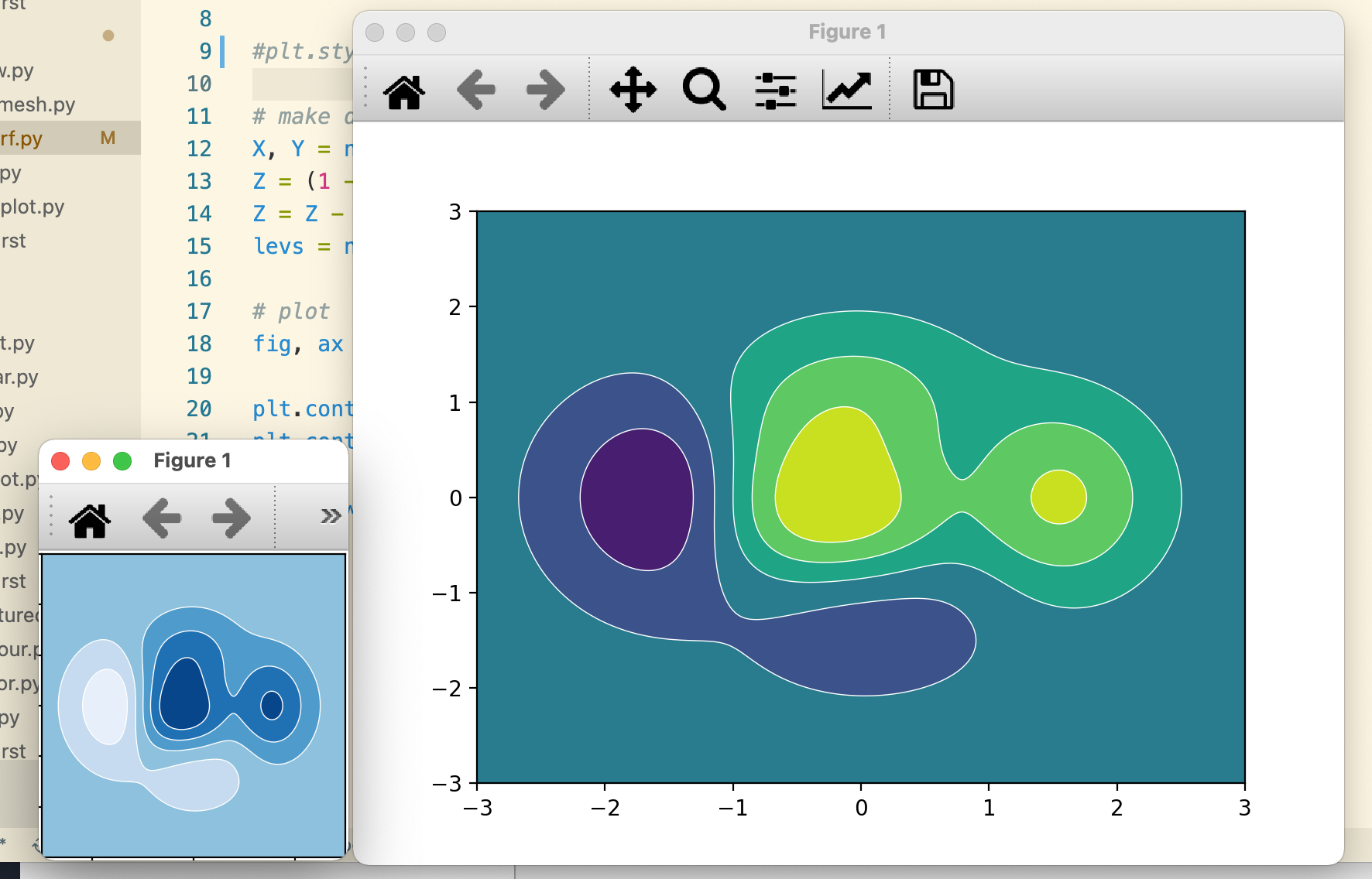
plot_types/B_arrays/c_contourf.py
Outdated
| fig, ax = plt.subplots() | ||
|
|
||
| plt.contourf(X, Y, Z, levels=levs) | ||
| plt.contour(X, Y, Z, levels=levs, colors="white", linewidths=0.5) |
There was a problem hiding this comment.
At first, this looked like the bug with alpha and multiple filled contours to me. I don't know if you want to use a different colour for the contours, but I'm not sure which colour matches the theme.
There was a problem hiding this comment.
I'm not following this concern.... what is wrong with just adding white contours on top of the contourf?
There was a problem hiding this comment.
When I first saw it, I thought it was #4419 and not on purpose.
plot_types/A_basic/a_plot.py
Outdated
| """ | ||
| ====================== | ||
| plot([X], Y, [fmt]...) | ||
| ====================== | ||
| """ |
There was a problem hiding this comment.
I'd leave out the parameters in the title. They are a bit cluttered.
We should however add a bit of info inside the example, e.g.
- What this plot is. In the simplest case, this is just a repetition of the title line of the function documentation. But one might also give a little more context.
- Prominent link to the docs
- Optional: You could add the pseudo-signature from the title if you think that is helpful.
| """ | |
| ====================== | |
| plot([X], Y, [fmt]...) | |
| ====================== | |
| """ | |
| """ | |
| ====== | |
| plot() | |
| ====== | |
| """ | |
| .. code-block:: none | |
| plot([X], Y, [fmt]...) | |
| Plot y versus x as lines and/or markers. | |
| Documentation: `matplotlib.axes.Axes.plot()` / `matplotlib.pyplot.plot()` |
There was a problem hiding this comment.
This was basically copying the cheatsheet, which I think was pretty good. If you would like to simplify it later, and add more info to the main text, I think we could do as follow-ups.
plot_types/A_basic/e_step.py
Outdated
| @@ -0,0 +1,25 @@ | |||
| """ | |||
| ===================== | |||
| step(x, y, where=...) | |||
There was a problem hiding this comment.
We want to have stairs() as well. Two alternatives:
- name this "step-like" and show both here
- or make a separate entry and link between the two.
There was a problem hiding this comment.
As above, we can add more, or modify as wanted after this is merged.
plot_types/A_basic/e_step.py
Outdated
| # plot | ||
| fig, ax = plt.subplots() | ||
|
|
||
| ax.step(X, Y, linewidth=2.5) |
There was a problem hiding this comment.
See my proposal above for leaving parameters out of the title and optionally add them to the body.
There was a problem hiding this comment.
Basically, good to go. As discussed there is still room for improvement, but that doesn't have to be part of this PR.
One last request from my side: I don't quite like the letter prefixes in the filenames. I assume that's for sorting? Can we configure that in gallery_order.py instead? Trying to sort by prefix will break if we want to change something later. We'd have to re-index, which breaks links (or needs redirects). Also the prefixes look ugly.
|
I agree if there is a reasonable way to order gallery entries. I wasn't aware one existed. |
PR Summary
Start on a new simple plot gallery just for plot types. Heavily based on the cheatsheet @rougier, and suggested by @story645
Closes #18277
PR Checklist
pytestpasses).flake8on changed files to check).flake8-docstringsand runflake8 --docstring-convention=all).doc/users/next_whats_new/(follow instructions in README.rst there).doc/api/next_api_changes/(follow instructions in README.rst there).