Spurious values when using plot_topomap #5315
Comments
|
yes it's an interpolation issue. I don't really see a way out here.
Interpolation is bad outside the data domain...
does eeglab or fieldtrip have the same pb?
|
|
one could use monotonic interpolation like pchip ... |
|
not sure it will fix the pb but you can try...
|
|
EEGLAB produces a very similar output. Would it be possible to plot the image only within the outermost electrodes, that is, without extrapolation? Would that solve the problem? Basically if some kind of skirt can be defined (yellow lines), don't draw the map outside:
|

|
feel free to try
|
|
Please add this to the list of things for the open issue about topomap
deficiencies (there might even be a WIP PR by me on it? In any case the
issue should already be assigned to me if that helps you find it). This
problem should be probably be tackled at the same time, keeping in mind the
related considerations.
… |
|
Alright, I assume you mean #5085 - I've added an item to the list. |
|
Moved to #5085. |
|
Reopening so I don't forget to add this since I closed the currently linked PR |
|
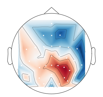
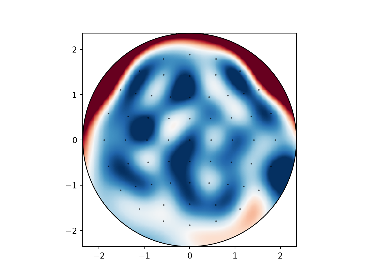
This issue is exacerbated especially in cases where electrodes are missing from a data set. Note the dark blue area on the right outside the convex set of the available sensor locations.
This is probably caused predominantly by the smoothness assumption of the used
|
|
does it lead to a topomap more similar to what you would get with other
software?
|
|
When using https://github.com/bbci/bbci_public (a matlab toolbox), I can choose how to extrapolate outside of the hull of the electrodes, e.g. extrapolate to zero. I can upload a plot on Monday when I have access to the matlab installation. |
|
Can you also try my example from the initial comment? |
|
For reference, when using the option to extrapolate to zero, with the matlab toolbox, my plot looks like this:
@cbrnr I generated the random numbers in python with the same seed you used and plotted it against the biosemi64 layout. Only the contour lines were set differently, but I do not know how the levels are calculated in either mne or bbci.
|
|
I assume you also used the MATLAB toolbox and interpolate to zero? This looks much better than what MNE currently produces, because there are no red patches (positive values) anywhere. I think extrapolating to zero might be great to have - can anyone think of when this could go wrong? @jsosulski can this be implemented in Python? The square look from your previous post doesn't look too appealing to me. |
|
Yes I used the matlab toolbox for the second plot as well. |
|
How difficult would it be to switch to a grid-based approach? |
|
Yes, |


|
We can do better by, say, taking the convex hull of points and expanding it outward (by the median electrode distance?) to use as the boundary condition instead of just a large square. Done variant like this should alleviate the problems |
|
Or can we mimic the approach that's implemented in this MATLAB toolbox? |
|
@larsoner I was thinking about something like that. I first started by changing just the mask outline to the convex hull of all points but it seemed to also change how these extra boundary points are set: |

|
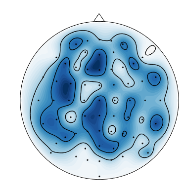
https://github.com/scot-dev/scot includes a topoplot function that uses a grid (I think). With the data above, I get this image:
So obviously this extrapolates to positive values on the head border. I think what we really need is an option to specify the value on the head border (by default this value could be 0). |
|
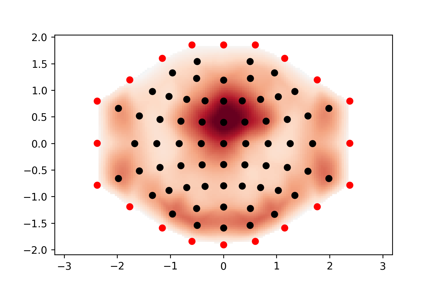
I have tested the approach with adding zero points based on extended convex hull vertices, but it is not ideal (I'd have to play with convhull parameters to get more points): |

|
It is a bit better if I add more external points (red dots) where the distance between them is too high: |
|
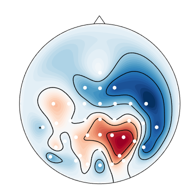
@mmagnuski Does your example data have higher positive values on the outer electrodes on the left/right and back or is this again an interpolation artefact? (due to the smoothness requirement) |
|
Visbrain also has a topoplot object. I tried to plot the random data from above, but didn't succeed (the resulting plot looked rather strange). In addition, I got a message saying that VisPy is not yet compatible with Matplotlib 2.2+, whatever that means. Anyway, maybe we can still have a look what they do. There is also the R package eegUtils, which also includes a topoplot function. |
|
Yes, the values are higher around the edges: |

|
@cbrnr I didn't know about visbrain, thanks! |
|
@mmagnuski I like your second example. We just need to think about how to generalize it. Maybe take the convex hull and subdivide each edge by the (rounded) number of "average distance"s it is? I think it would produce something a lot like you have but be pretty general. |
|
By average distance do you mean some function of distance between the channels (like the median you previously mentioned)? If so - I was thinking about something like that, but it was quicker to just divide the lines that were too long. I can try to hack some code into mne this evening just to open a PR where we can discuss this further. @cbrnr - let me know if you get some insight from how the other libs you've checked do topos, we can implement multiple options and compare (some may be better visually and some in terms of performance - and that makes a difference when plotting tens of topos like during inspection of ICA components(it is usually too slow for me)). |
Yes
Yeah it worked to demonstrate that it looks better if the lines are not too long
Great. Hopefully with your changes and #5472 (and someday #5471) everyone will finally be happy with the |
We need to profile the calls to see what is actually slow. I did some work a while ago and IIRC the limitation was matplotlib / the number of effective points used in |
Sure, I even imagine a future where one could change the nose of the topo head with a kwarg (with the current option being named 'pinokio' ;) ).
Right, compared to plotting time all the interpolation steps might not matter much. Do you know if matplotlib is seriously considering using openGL? As far as I know Bokeh has it on one of their priorities now. |
|
I'm going to close this one as fixed with #5754. We can open another issue concerning possible differences stemming from the interpolation method used. |
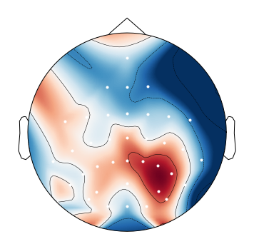
When I plot negative values using
mne.viz.plot_topomap, I get spurious positive values near the boundary:This is likely an interpolation artifact, with possibly serious consequences when interpreting scalp maps. Or maybe it is specific to the
biosemimontages.The text was updated successfully, but these errors were encountered: