Skip to content
This repository has been archived by the owner on Apr 18, 2024. It is now read-only.

Fix title alignment #75

Closed
royuen opened this issue Aug 26, 2020 · 4 comments
Closed

Fix title alignment #75

royuen opened this issue Aug 26, 2020 · 4 comments
Assignees

Comments

@royuen
Copy link
Contributor

royuen commented Aug 26, 2020

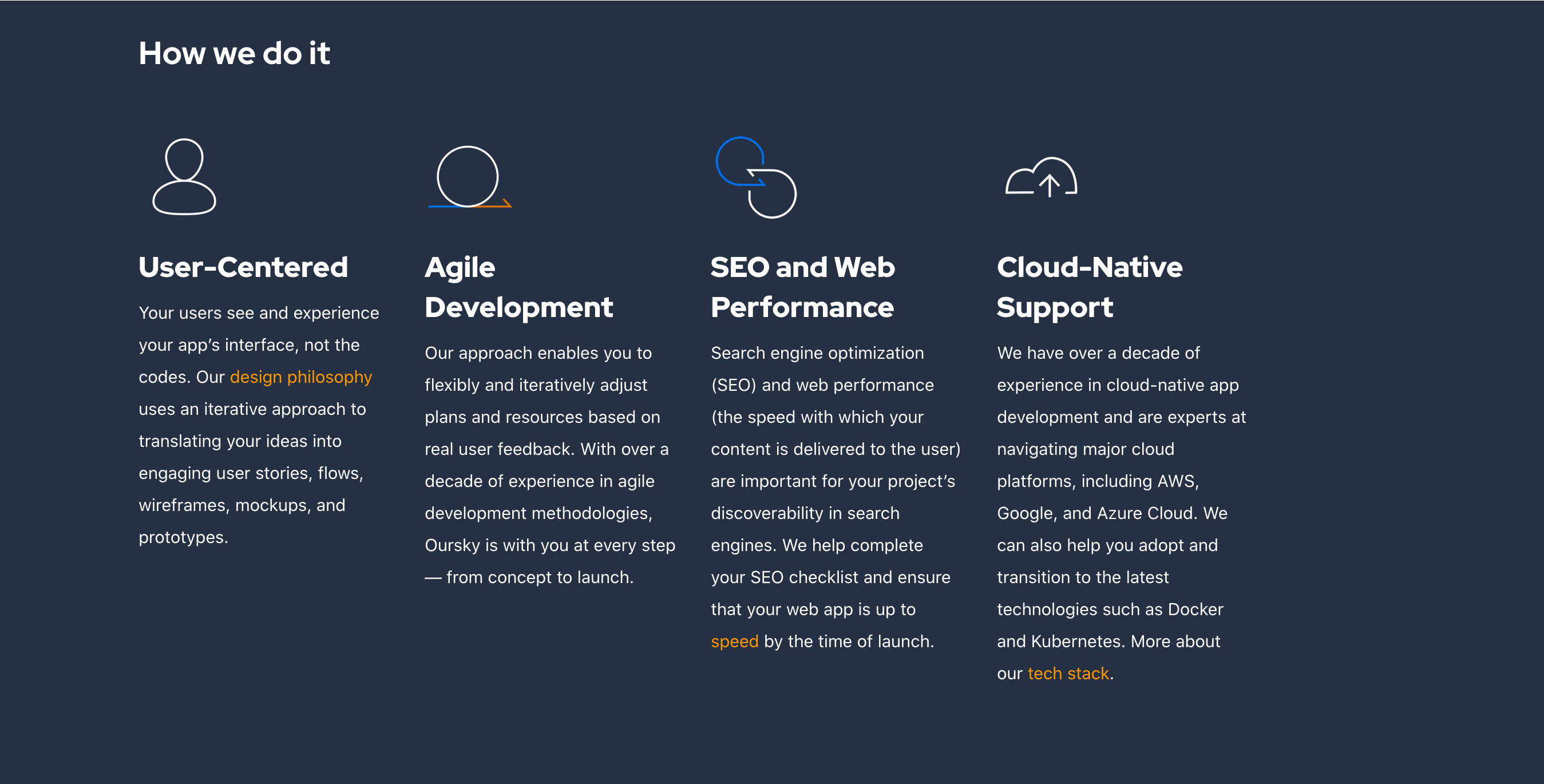
Let's align the title for iOS section

https://oursky2020.netlify.app/mobile
Screenshot 2020-08-26 at 11.06.12 PM.png

https://oursky2020.netlify.app/web
Screenshot 2020-08-26 at 11.08.32 PM.png

https://oursky2020.netlify.app/design

Screenshot 2020-08-26 at 11.09.28 PM.png

https://oursky2020.netlify.app/microservice

Screenshot 2020-08-26 at 11.11.21 PM.png

@royuen royuen changed the title [Mobile dev page] Update title alignment Fix title alignment Aug 26, 2020
@hochiw
Copy link
Contributor

hochiw commented Aug 27, 2020

potential fix: https://codepen.io/Chiffie/pen/EdaEpW

@hochiw
Copy link
Contributor

hochiw commented Aug 27, 2020

Tried different approaches that seems like separating heading and content into two groups work the best. While it works on desktop browsers, the layout breaks when it comes to smaller devices. so worst case we would need two different layouts for the same contents. Will continue trying.

@koskosm
Copy link
Collaborator

koskosm commented Aug 27, 2020

@hochiw for this foundation framework has a plugin tool called equalizer:

https://get.foundation/sites/docs/equalizer.html

Add the data attribute to the dom element and it will make them equal height, and also can specify it for medium screen size only.

@hochiw
Copy link
Contributor

hochiw commented Aug 27, 2020

damn that helps a lot :adore2x:

Sign up for free to subscribe to this conversation on GitHub. Already have an account? Sign in.
Labels
None yet
Projects
None yet
Development

No branches or pull requests

3 participants