DualListBox
This widget is not included into LibAddonMenu and needs to be separately download from www.esoui.com:
https://www.esoui.com/downloads/info3434.html
This widget needs the library LibShifterBox as depencency: https://www.esoui.com/downloads/info2444-LibShifterBox.html LibShifterBox API and callbacks: https://github.com/klingo/ESO-LibShifterBox#api-reference
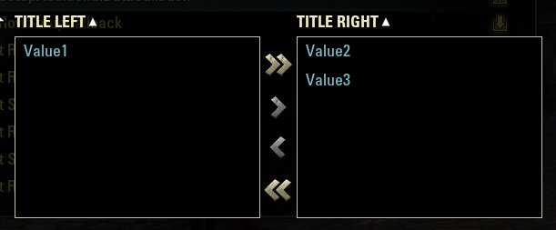
- Button to move all selected entries to the right
- Button to move all selected entries to the left
- Button to move all entries to the right
- Button to move all entries to the left
- Drag drop selected entries(left/right)
- Sort left / right list with a header button
- Callbacks upon move, highlight, mouseOver of entries, according to documnetation of LibShifterBox
| property | type | default | required | description |
|---|---|---|---|---|
| type | string | - | yes | The widget type of this control ("duallistbox") |
| reference | string | nil | no | A unique global reference to the control |
| width | string | "full" | no | "full" or "half" width in the panel |
| minHeight | number | 26 | no | number for the minimum height of this control. Standard is (rowMinHeight = 25) multiplied by 5 |
| maxHeight | number | 4*minHeight | no | number for the maximum height of this control. Standard is (minHeight) |
| getFuncLeftList | function | - | yes | function() return db.leftListTable, -- returning a table of the left list entries. The table returned MUST BE CHANGABLE via this pointer! |
| getFuncRightList | function | - | yes | function() return db.rightListTable, -- returning a table of the right list entries. The table returned MUST BE CHANGABLE via this pointer! |
| setFuncLeftList | function | - | yes | function(listEntries) db.leftListTable = listEntries end -- Saving a table for the left list entries, where table uses a unique number (accross left & right list!) key and a String as value, |
| setFuncRightList | function | - | yes | function(listEntries) db.rightListTable= listEntries -- Saving a table for the right list entries, where table uses a unique number (accross left & right list!) key and a String as value, |
| defaultLeftList | table | - | yes | { [1] = "Test", [2] = "Test2" } --table or function returning a table with the default entries at the left list (optional). Left and right list's keys must be unique in total! |
| defaultRightList | table | - | yes | { [3] = "Value1", [4] = "Value2" } --table or function returning a table with the default entries at the right list (optional). Left and right list's keys must be unique in total! |
| resetFunc | function | - | no | function(customControl) our code to reset the 2 listBoxes now. customControl.dualListBox provides functions ClearLeftList(), ClearRightList(), AddEntriesToLeftList(listEntries), AddEntriesToRightList(listEntries) end , |
| refreshFunc | function | - | no | function(customControl) end -- function to call when panel/controls refresh (optional) , |
| disabled | boolean, function | false | no | Determines if the duallistbox is disabled and its entries cannot be changed |
| setupData | table | { ... see below at "SetupData description" ... } | yes | The overall dual list box control setup data, containing name, width/height, and other parameters of LibShifterBox API/callbacks in a subTable customSettings |
| property | type | default | required | description |
|---|---|---|---|---|
| name | string | - | yes | My DualListBox", string id or function returning a string |
| width | number | 50 | yes | number or function returning a number for the width of both list boxes together. If > the width of the LAM control container then the width will be the LAM control container's width. |
| height | number | 26 | yes | number or function returning a number for the height of both list boxes together. minHeight of the LAM control needs to be >= this value! If > maxHeight then maxHeight of the LAM contro will be used. |
| customSettings | table | { ... see below at "customSettings description" ... } | yes | The custom setup parameters of LibShifterBox API/callbacks |
| property | type | default | required | description |
|---|---|---|---|---|
| showMoveAllButtons | boolean | yes | no | the >> and << buttons to move all entries can be hidden if set to false (default = true). (optional) |
| dragDropEnabled | boolean | yes | no | entries can be moved between lsit with drag-and-drop (default = true) |
| sortEnabled | boolean | yes | no | sorting of the entries can be disabled (default = true) |
| sortBy | string | "value" | no | sort the list by value or key (allowed are: "value" or "key") (default = "value") |
| leftList | table | { ... see below at "leftList description" ... } | yes | The custom setup parameters of LibShifterBox left list |
| rightList | table | { ... see below at "rightList description" ... } | yes | The custom setup parameters of LibShifterBox right list |
| callbackRegister | table | { ... see below at "callbackRegister description" ... } | yes | The custom setup parameters of LibShifterBox callbacks |
| property | type | default | required | description |
|---|---|---|---|---|
| title | string | "" | no | the title/header of the list (default = "") |
| rowHeight | number | 32 | no | the height of an individual row/entry (default = 32) |
| rowTemplateName | string | "ShifterBoxEntryTemplate" | no | an individual XML (cirtual) control can be provided for the rows/entries (default = "ShifterBoxEntryTemplate"). (optional) |
| emptyListText | string | GetString(LIBSHIFTERBOX_EMPTY) | no | the text to be displayed if there are no entries left in the list (default = GetString(LIBSHIFTERBOX_EMPTY)) |
| fontSize | number | 18 | no | size of the font (default = 18) |
| rowDataTypeSelectSound | Sound | "" | no | an optional String for an internal soundName to play when a row of this data type is selected (default = SOUNDS.ABILITY_SLOTTED). |
| rowOnMouseRightClick | function | nil | no | function(rowControl, data) end --an optional callback function when a right-click is done inside a row element (e.g. for custom context menus) |
| rowSetupCallback | function | nil | no | function(rowControl, data) end -- function that will be called when a control of this type becomes visible |
| rowSetupAdditionalDataCallback | function | nil | no | function(rowControl, data) end -- an optional function to extended data table of the row with additional data during the 'rowSetupCallback' |
| rowResetControlCallback | function | nil | no | function(rowControl, data) end -- an optional callback function when the datatype control gets reset |
See leftList description, the parameters at the rightList subtable are the same.
| property | type | default | required | description |
|---|---|---|---|---|
| LibShifterBox.EVENT_LEFT_LIST_ROW_ON_MOUSE_ENTER | function | nil | no | function(rowControl, shifterBox, data) d("LSB: LeftListRowOnMouseEnter") end |
| LibShifterBox.EVENT_RIGHT_LIST_ROW_ON_MOUSE_ENTER | function | nil | no | function(rowControl, shifterBox, data) d("LSB: RightListRowOnMouseEnter") end |
For a complete list of the events please visit the LibShifterBox documentation: https://github.com/klingo/ESO-LibShifterBox#api-reference Search for "ShifterBox:RegisterCallback"
--SavedVariables example: Defaults
local defaults = {
    --Attention: Left and right list MUST have unique keys in combination: Means same key cannot be in both tables!
    --If you use resetFunc at the widget to clear the left list and right list manually make sure to always clear both tables
    --before trying to add new entries! Else the keys might still be in rightList as you try to add default keys (with same key) in leftList e.g.
   leftList = { [1] = "Test 1", [2] = "Test 2" },
   rightList = { [3] = "Test 3", [4] = "Test 4"}
}
--SavedVariables example: SV table
local settings = ZO_SavedVars:NewAccountWide(MyAddonSVTableName, 1, "settingsForAll", defaults, GetWorldName())


--settings.testLeftList = {} --If SavedVariables are empty: should be filled from defaults SV "defaults" via entry defaultLeftList
--settings.testRightList = {} --If SavedVariables are empty: should be filled from defaults SV "defaults" via entry defaultRightList


--For the LAM optionsData at you panel's data
{
            type        = "duallistbox",
            name        = "MyAddonCustomControlName",
            reference   = "MyAddonCustomControl", -- unique name for your control to use as reference (optional) The <reference>.dualListBox is the direct reference to the dual list box control then
            refreshFunc = function(customControl) end, -- function to call when panel/controls refresh (optional)
            width       = "full", -- or "half" (optional)
            minHeight   = function() return 26 end, --or number for the minimum height of this control. Default: 26 (optional)
            maxHeight   = function() return 300 end, --or number for the maximum height of this control. Default: 4 * minHeight (optional)

            getFuncLeftList = function() return settings.testLeftList end,
            setFuncLeftList = function(values) settings.testLeftList = values end,
            getFuncRightList = function() return settings.testRightList end,
            setFuncRightList = function(values) settings.testRightList = values end,
            defaultLeftList =  defaults.leftList, --table or function returning a table with the default entries at the left list (optional). Left and right list's keys must be unique in total!
            defaultRightList = defaults.leftList, --table or function returning a table with the default entries at the right list (optional). Left and right list's keys must be unique in total!
            resetFunc = function(customControl) your code to reset the 2 listBoxes now. customControl.dualListBox provides functions ClearLeftList(), ClearRightList(), AddEntriesToLeftList(listEntries), AddEntriesToRightList(listEntries)  end, (optional)
            --======================================================================================================================
            -- -v- The dual lists setup data                                                                                -v-
            --======================================================================================================================
            setupData   = {
                --The overall dual list box control setup data
                name                 = "LAM_DUALLISTBOX_EXAMPLE1",
                width                = 580, --number of function returning a number for the width of both list boxes together
                height               = 200, --number of function returning a number for the height of both list boxes together. minHeight of the LAM control needs to be >= this value!
                --======================================================================================================================
                ----  -v- The custom settings for the dual lists                                                            -v-
                --======================================================================================================================
                --The setup data for the lists
                -->The custom settings are defined via the library LibShifterBox. You can find the documentation here:
                -->https://github.com/klingo/ESO-LibShifterBox#api-reference    Search for "customSettings"
                customSettings       = {
                    enabled            = true, -- boolean value or function returning a boolean to tell if the dual list box widget is enabled (default = true)? (optional)
                    showMoveAllButtons = true, -- the >> and << buttons to move all entries can be hidden if set to false (default = true). (optional)
                    dragDropEnabled    = true, -- entries can be moved between lsit with drag-and-drop (default = true). (optional)
                    sortEnabled        = true, -- sorting of the entries can be disabled (default = true). (optional)
                    sortBy             = "value", -- sort the list by value or key (allowed are: "value" or "key")  (default = "value"). (optional)
                    disabled = function()
                        FCOUS.disabledLSB = FCOUS.disabledLSB or false
                        return FCOUS.disabledLSB
                    end,

                    --======================================================================================================================
                    leftList           = {                -- list-specific settings that apply to the LEFT list
                        title                          = "Title left", -- the title/header of the list (default = ""). (optional)
                        rowHeight                      = 32, -- the height of an individual row/entry (default = 32). (optional)
                        rowTemplateName                = "ShifterBoxEntryTemplate", -- an individual XML (cirtual) control can be provided for the rows/entries (default = "ShifterBoxEntryTemplate"). (optional)
                        emptyListText                  = GetString(LIBSHIFTERBOX_EMPTY), -- the text to be displayed if there are no entries left in the list (default = GetString(LIBSHIFTERBOX_EMPTY)). (optional)
                        fontSize                       = 18, -- size of the font (default = 18). (optional)
                        --[[
                        rowDataTypeSelectSound         = "ABILITY_SLOTTED", -- an optional sound to play when a row of this data type is selected (default = "ABILITY_SLOTTED"). (optional)
                        rowOnMouseRightClick           = function(rowControl, data)
                            -- an optional callback function when a right-click is done inside a row element (e.g. for custom context menus) (optional)
                            d("LSB: left OnMouseRightClick: " .. tostring(data.tooltipText))   -- reading custom 'tooltipText' from 'rowSetupAdditionalDataCallback'
                        end,
                        rowSetupCallback               = function(rowControl, data)
                            -- function that will be called when a control of this type becomes visible (optional)
                            d("LSB: left RowSetupCallback")                      -- Calls self:SetupRowEntry, then this function, finally ZO_SortFilterList.SetupRow
                        end,
                        rowSetupAdditionalDataCallback = function(rowControl, data)
                            -- an optional function to extended data table of the row with additional data during the 'rowSetupCallback' (optional)
                            d("LSB: left SetupAdditionalDataCallback")
                            data.tooltipText = data.value
                            return rowControl, data                         -- this callback function must return the rowControl and (enriched) data again
                        end,
                        rowResetControlCallback        = function()
                            -- an optional callback function when the datatype control gets reset (optional)
                            d("LSB: left RowResetControlCallback")
                        end,
                        ]]
                    },

                    --======================================================================================================================
                    rightList          = {               -- list-specific settings that apply to the RIGHT list
                        title                          = "Title right",
                        --rowHeight = 32,
                        --rowTemplateName = "ShifterBoxEntryTemplate",
                        --emptyListText = GetString(LIBSHIFTERBOX_EMPTY),
                        --fontSize = 18,
                        --rowDataTypeSelectSound = "ABILITY_SLOTTED",
                        --[[
                        rowOnMouseRightClick           = function(rowControl, data)
                            -- an optional callback function when a right-click is done inside a row element (e.g. for custom context menus) (optional)
                            d("LSB: right OnMouseRightClick: " .. tostring(data.tooltipText))   -- reading custom 'tooltipText' from 'rowSetupAdditionalDataCallback'
                        end,
                        rowSetupCallback               = function(rowControl, data)
                            -- function that will be called when a control of this type becomes visible (optional)
                            d("LSB: right RowSetupCallback")                      -- Calls self:SetupRowEntry, then this function, finally ZO_SortFilterList.SetupRow
                        end,
                        rowSetupAdditionalDataCallback = function(rowControl, data)
                            -- an optional function to extended data table of the row with additional data during the 'rowSetupCallback' (optional)
                            d("LSB: right SetupAdditionalDataCallback")
                            data.tooltipText = data.value
                            return rowControl, data                         -- this callback function must return the rowControl and (enriched) data again
                        end,
                        rowResetControlCallback        = function()
                            -- an optional callback function when the datatype control gets reset (optional)
                            d("LSB: right RowResetControlCallback")
                        end,
                        ]]
                    },

                    --======================================================================================================================
                    --Callbacks that fire as a list is created, filled, cleared, entry is slected, unselected, row mouseOver, row mouseExit, dragDropStart, dragDropEnd, etc. happens
                    callbackRegister   = {                                    -- directly register callback functions with any of the exposed events
                        [LibShifterBox.EVENT_LEFT_LIST_ROW_ON_MOUSE_ENTER]  = function(rowControl, shifterBox, data)
                            d("LSB: LeftListRowOnMouseEnter")
                        end,
                        [LibShifterBox.EVENT_RIGHT_LIST_ROW_ON_MOUSE_ENTER] = function(rowControl, shifterBox, data)
                            d("LSB: RightListRowOnMouseEnter")
                        end,
                    }
                },

                --======================================================================================================================
                ----  -^- The custom settings for the dual lists                                                            -^-
                --======================================================================================================================
            }
},
The LAM reset to defaults will start to work as LibAddonMenu-2.0 will integrate the needed changes to panel.lua, function ForceDefaults(panel): Add new widegt.data.resetFunc support: https://github.com/sirinsidiator/ESO-LibAddonMenu/pull/130