Using ggplot2 animations to demonstrate several parallel numerical experiments in a single layout
Note: The ggplot2 wiki is no longer maintained, please use the ggplot2 website instead!
In my eyes, the literature of statistical computation and simulations is full of mathematical derivations and computer algorithms, and usually our focus is on the results rather than the process. However, the process of the computation/simulation might also be of interest at least for pedagogical reasons; under certain cases, we can also learn lessons from it in a very straightforward way. Besides, to examine one process might still be insufficient -- we can show multiple parallel processes in one time.
The package ggplot2 has provided the convenient faceting approach to arrange several plots in a single layout, as well as the group argument to draw graphical elements by groups. Note that faceting also has a natural connection to the parallel computation -- the "sub-plots" are "parallel" to each other. In this case study, we show how to make use of these two specific features in demonstrating parallel simulations with animations.
The Brownian Motion might not be a really insightful example, but it does show the basic idea of parallel computation: we divide our job into several smaller parts which are independent of each other, and do them in parallel (e.g. on different computing clusters). In this example, we can simulate the Brownian Motion in different "panels":
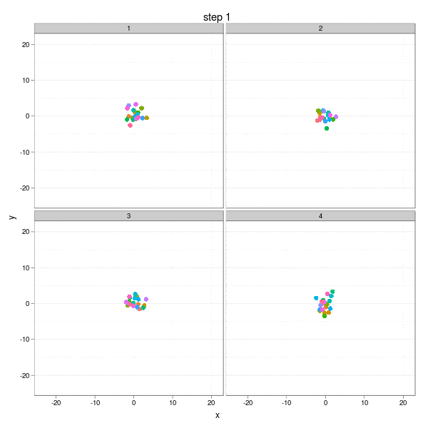
The complete code to reproduce the animation is below:
library(animation)
library(ggplot2)

## Brownian Motion: the 'parallel' version
generate_bm_data = function(n = 20, grp = 4) {
    nmax = ani.options("nmax")
    bm.data = NULL
    x = rnorm(n * grp)
    y = rnorm(n * grp)
    for (i in 1:nmax) {
        bm.data = rbind(bm.data, cbind(x = x <- x + rnorm(n * grp), y = y <- y + rnorm(n * grp),
                               step = i, group = rep(1:grp, each = n), id = rep(1:n, grp)))
    }
    bm.data = as.data.frame(bm.data)
    bm.data$id = factor(bm.data$id)
    bm.data$group = factor(bm.data$group)
    bm.data
}

## generate the data
set.seed(123)
ani.options(nmax = 50)
n = 20; grp = 4
bm.data = generate_bm_data(n, grp)

## save images and convert them to a single GIF
saveMovie({
    for (i in unique(bm.data$step)) {
        print(qplot(x, y, facets = ~group, geom = "line", colour = id, alpha = I(0.1),
                               data = subset(bm.data, step <= i), main = paste("step", i)) +
              xlim(range(bm.data$x)) + ylim(range(bm.data$x)) +
              geom_point(aes(x = x, y = y, facets = ~group, size = I(rep(3, n * grp))),
                               data = subset(bm.data, step == i)) +
              theme_bw() + opts(legend.position = "none"))
    }
}, interval = 0.2, movie.name = "ggplot2-brownian-motion.gif", ani.width = 600, ani.height = 600)
Two critical steps are:
- Generate the data in the right format;
- Plot the points by grouping and faceting;
The computation is nothing but:
[ x_{k+1} = x_k + \text{rnorm}(1); y_{k+1} = y_k + \text{rnorm}(1) ]
When we want to solve for the root of an equation ( f(x) = 0 ), we may choose an initial guess and iterate until certain stopping conditions are met:
[ x_{k+1} = x_k - f(x_k)/f'(x_k) ]
This iteration has a very intuitive interpretation: go a step towards the direction of the negative derivative with the length being the distance between the current root and the place on the x-axis at which the derivative line crosses with the x-axis. So take a look at the animation below, which shows the process of 4 different iterations from 4 initial guesses respectively. The current root is denoted by large solid points, and roots from past iterations are denoted by small points. For each step, we draw the tangent line of the function curve and let it cross with the x-axis, and that is just the place to go in the next step. Here I didn't really draw the tangent lines since it is a somewhat tedious task to manipulating single elements in ggplot2, but the purpose is only to get a sense of how the Newton-Raphson method works.
The maximum number of iterations was set to be 30. We can easily see from the process that some iterations are "successful", while some "failed". For example, the big red points disappeared after the 27th iteration in the 2nd group, and the reason is clear: it reached a flat area (i.e. ( f'(x) ) near 0) on the curve, which resulted in a huge step forward (to the left or right?), and this gives us a lively impression that we need to be careful about the flat areas when using Newton's method. The 29th iteration of group 3 has the similar phenomenon. While the 1st and 4th group behaved well: for the 1st group, the initial guess was already near to the real root, and there are no flat areas.
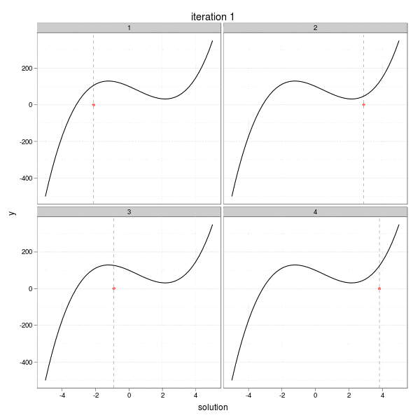
In one graph we have seen the parallel progresses for each group of iterations. The complete code is as below:
## record the solutions in each iteration for each group
generate_newton_data = function(FUN = function(x) x^2 - 4, init = runif(4,
    0, 10)) {
    grp = i = 1
    nmax = ani.options("nmax")
    nms = names(formals(FUN))
    grad = deriv(as.expression(body(FUN)), nms, function.arg = TRUE)
    sol.data = NULL
    for (s in init) {
        x = c(s, s - FUN(s)/attr(grad(s), "gradient"))
        for (k in 1:(nmax - 2)) {
            x = c(x, x[k + 1] - FUN(x[k + 1])/attr(grad(x[k + 1]), "gradient"))
        }
        sol.data = rbind(sol.data, data.frame(solution = x, iter = 1:nmax,
            group = grp))
        grp = grp + 1
    }
    sol.data = as.data.frame(sol.data)
    sol.data$group = factor(sol.data$group)
    sol.data
}

## generate the data
set.seed(123)
ani.options(nmax = 30)
FUN = function(x) 5 * x^3 - 7 * x^2 - 40 * x + 100
newton.data = generate_newton_data(FUN, runif(4, -5, 5))
x0 = seq(-5, 5, length = 50)
y0 = FUN(x0)
newton.data$zero = 0

p = qplot(x0, y0, data = data.frame(x0, y0), geom = "line") + xlim(range(x0)) + ylim(range(y0))

## convert to GIF
saveMovie({
    for (i in unique(newton.data$iter)) {
        ann.col = rep(c("history", "current"), c(i - 1, 1))
        with(newton.data, {
            print(qplot(solution, zero, facets = ~group, color = ann.col,
                                data = subset(newton.data, iter <= i), ylab = "y", main = paste("iteration", i)) +
                         xlim(range(x0)) + ylim(range(y0)) + ylab("y") +
                         geom_vline(aes(xintercept = solution, facets = ~group), colour = "gray", linetype = 2,
                                data = subset(newton.data, iter == i)) +
                         geom_point(aes(size = rep(c(1, 2), c(i - 1, 1)))) +
                         geom_line(aes(x = x0, y = y0), color = "black", data = data.frame(x0, y0)) +
                         theme_bw() + opts(legend.position = "none"))
        })
    }
}, interval = 5, movie.name = "ggplot2-newton-method.gif", ani.width = 600, ani.height = 600) The above GIF animations were created by ImageMagick from a sequence of image frames generated by ggplot2. There is a wrapper saveMovie() in the animation package to produce GIF animations from R.
We used two simple demos to show how we can show the results in parallel with animations, which enables us to gain a larger vision when looking at the data. This page is only an outline, and the idea can be applied to real data applications. Imagine, for instance, we want to know how the relationship between two variables x and y changes when a third continuous variable z changes. In this case, it might be a good idea to categorize z into a number of classes and then facet the graph (because the number of categories cannot be too large); instead, we can subset the data according to the values of z, say, from minimum to maximum, and show a ggplot2 animation as z changes.