Skip to content
New issue

Have a question about this project? Sign up for a free GitHub account to open an issue and contact its maintainers and the community.

By clicking “Sign up for GitHub”, you agree to our terms of service and privacy statement. We’ll occasionally send you account related emails.

Already on GitHub? Sign in to your account

Aesthetic mappings not consistent with ggplot2 #86

Closed
eduardflorinescu opened this issue Oct 31, 2013 · 8 comments
Closed

Aesthetic mappings not consistent with ggplot2 #86

eduardflorinescu opened this issue Oct 31, 2013 · 8 comments
Assignees

Comments

@eduardflorinescu
Copy link

Aesthetic mappings not consistent with ggplot2 see: http://docs.ggplot2.org/0.9.3.1/geom_point.html

Steps to reproduce:

from ggplot import *
ggplot(aes(x="wt", y="mpg", color = "qsec"), data=mtcars) + \
geom_point()
plt.show(1)

Actual outcome
image

Expected outcome
image

Also using other data If I give a column with many different values("Volts" column) as an input for color I get the error at the end of this report.

Code here:
https://github.com/eduardflorinescu/ggplot/blob/master/examples/test_aestheticmappings.py
CSV here:
https://github.com/eduardflorinescu/ggplot/blob/master/examples/pandas_generated.csv

Notice that if I use the "category" column for color it works, if I use "Volts" I should get an aesthetic mapping instead I get the following error:

Traceback (most recent call last):
  File "PythonApplication5.py", line 128, in <module>
    ylab("Watts")
  File "C:\PYTHON27\lib\site-packages\ggplot\ggplot.py", line 209, in __repr__
    callbacks = geom.plot_layer(layer)
  File "C:\PYTHON27\lib\site-packages\ggplot\geoms\geom_point.py", line 21, in plot_layer
    plt.scatter(**layer)
  File "C:\PYTHON27\lib\site-packages\matplotlib\pyplot.py", line 3087, in scatter
    linewidths=linewidths, verts=verts, **kwargs)
  File "C:\PYTHON27\lib\site-packages\matplotlib\axes.py", line 6278, in scatter
    colors = mcolors.colorConverter.to_rgba_array(c, alpha)
  File "C:\PYTHON27\lib\site-packages\matplotlib\colors.py", line 380, in to_rgba_array
    "Cannot convert argument type %s to rgba array" % type(c))
ValueError: Cannot convert argument type <type 'numpy.ndarray'> to rgba array
@jankatins
Copy link
Contributor

Could you add the code which produces the error (and the wrong plot)? There is non visible in the bugreport.

@eduardflorinescu
Copy link
Author

Updated issue with the requested info.

@zachcp
Copy link

zachcp commented Nov 5, 2013

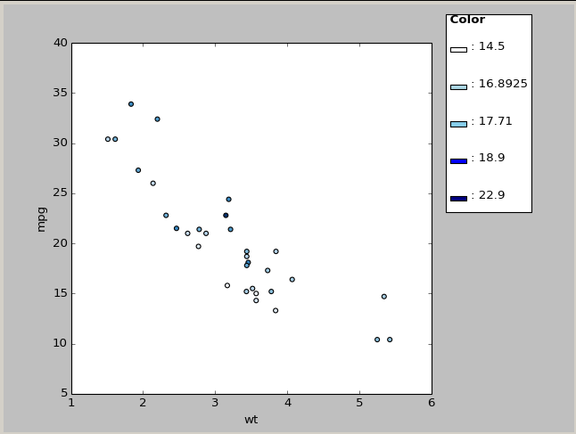
Looks like the column is being treated as a text column and not numerical so it is getting a discrete scale instead of a continuous one. i would check your pandas dataframe and see if it is using the first line as a column or if it is making the entire column into a string.

something like:
spowd = pd.read_csv(INPUT_FILE, header=TRUE)

@zachcp
Copy link

zachcp commented Nov 5, 2013

This is a mishandling of continuous color scales. The error is reproducible here:

from ggplot import *
 ggplot(diamonds, aes('carat', 'price', color='price')) + \
    geom_point(alpha=1/20.) + \
    ylim(0, 20000)
#line 334 ggplot.oy
  if 'color' in mapping._get_numeric_data().columns:
                    mapping['cmap'] = self.colormap

I don't see mapping.cmap get used again. I think the colormap needs to be put back into the mapping.color value to be picked up by ggplot.__repr__. This would require using the values held in 'mapping.color' to use the 'cmap'. I'm not sure how to do this. Is anyone familiar with matplotlib colormaps?

@zachcp
Copy link

zachcp commented Nov 5, 2013

walking through the code, I think the color mapping is fine. The color differences in python vs. R are due to an inverted scale and a legend that is displayed as quantile instead of as a continuous variable. I don't think either of those have been implemented yet in this version of ggplot. Your specific error I couldn't track down but it believe it is due to some cross talk between aes groupings. Coloring by voltage, by itse,f for example , works jsut fine. It is only when bothcolor and shape are used that there is an issue:

## Single Values: These all wor
ggplot(aes(x='TIME', y='Watts', color="Volts", ymin=YMIN, ymax=YMAX), data=spowd) + geom_point()
ggplot(aes(x='TIME', y='Watts', color="category", ymin=YMIN, ymax=YMAX), data=spowd) + geom_point()
ggplot(aes(x='TIME', y='Watts', shape="Volts", ymin=YMIN, ymax=YMAX), data=spowd) + geom_point()
ggplot(aes(x='TIME', y='Watts', shape="category", ymin=YMIN, ymax=YMAX), data=spowd) + geom_point()

#Shape and Color where Color is category: These work
ggplot(aes(x='TIME', y='Watts', shape="category", color="category", ymin=YMIN, ymax=YMAX), data=spowd) + geom_point()
ggplot(aes(x='TIME', y='Watts', shape="Volts", color="category", ymin=YMIN, ymax=YMAX), data=spowd) + geom_point()

## Shape and Color where color is Volt. These fail
ggplot(aes(x='TIME', y='Watts', shape="category", color="Volts", ymin=YMIN, ymax=YMAX), data=spowd) + geom_point()
ggplot(aes(x='TIME', y='Watts', shape="Volts", color="Volts", ymin=YMIN, ymax=YMAX), data=spowd) + geom_point()

The plot_layer function is only being passed a single color value for the last two. Why? I'm not sure why the color values are correctly assigned in most cases but not the last two.

@eduardflorinescu
Copy link
Author

The below case where shape="Volts" doesn't work for me:

ggplot(aes(x='TIME', y='Watts', shape="Volts", color="category", ymin=YMIN, ymax=YMAX), data=spowd) + geom_point()

gives:

Traceback (most recent call last):
  File "test_aestheticmappings.py", line 39, in <module>
    ylab("Watts")
  File "C:\PYTHON27\lib\site-packages\ggplot\ggplot.py", line 206, in __repr__
    for layer in self._get_layers(self.data):
  File "C:\PYTHON27\lib\site-packages\ggplot\ggplot.py", line 318, in _get_layers
    mapping['marker'] = mapping['shape'].replace(shape_mapping)
  File "C:\PYTHON27\lib\site-packages\pandas\core\series.py", line 2741, in replace
    _rep_dict(result, to_replace)
  File "C:\PYTHON27\lib\site-packages\pandas\core\series.py", line 2735, in _rep_dict
    _rep_one(rs, sset, d)
  File "C:\PYTHON27\lib\site-packages\pandas\core\series.py", line 2715, in _rep_one
    com._maybe_upcast_putmask(s.values,mask,v,change=change)
  File "C:\PYTHON27\lib\site-packages\pandas\core\common.py", line 813, in _maybe_upcast_putmask
    return changeit()
  File "C:\PYTHON27\lib\site-packages\pandas\core\common.py", line 767, in changeit
    om = other[mask]
TypeError: only integer arrays with one element can be converted to an index

@ghost ghost assigned glamp Nov 24, 2013
@naught101
Copy link

Here's the same graph as above, with a more recent version of ggplot:

python

Main problems remaining:

  • Axis ticks go right to the ends of the axis (uneccessary rounding, also makes it more likely for x/y axis ticks to clash).
  • There isn't a continuous colourbar
  • The default colourscheme is inverted, and the contrast is too high

Everything else is looking pretty good though :)

@eduardflorinescu
Copy link
Author

@naught101 Thanks for updating, I think the spectrum color-bar is the greatest visual inconsistency.

@glamp glamp closed this as completed May 31, 2016
Sign up for free to join this conversation on GitHub. Already have an account? Sign in to comment
Labels
None yet
Projects
None yet
Development

No branches or pull requests

5 participants