- What is a Design System? 6 different types of design systems.
A design system is a comprehensive set of guidelines, principles, and components that ensure consistency and efficiency across a company’s digital products.
- 2024-01-09 — A Global Design System
- 2023-10-23 — Ship Faster by Building Design Systems Slower | Big Medium
- 2023-09-21 — The Design System Ecosystem
- Awesome Design Systems
- Design Systems Gallery
- Design Systems Repo A frequently updated collection of Design System examples, articles, tools
- Design Systems Resources (via Brad Frost)
- Design Systems List Maintained by Marcin Treder and talks.
- Design Systems For Figma Curated by Josh Cusick, the site is a growing repository of freely available Figma kits
- Design Systems: Useful Examples and Resources
- The Ultimate Design Systems Resources List
- ★★★★☆ Reshaped Design System in React & Figma
- ★★★★☆ Untitled UI v4 by Jordan Hughes (Australia)
- ★★☆☆☆ UI Prep
Specify helps you generate design tokens that are always updated so you can transform them with Style Dictionary. Specify doesn’t replace Style Dictionary. It enhances it.
-
Gossmann, T. (2022, April 21). The Primary/Secondary Controversy in Design Systems
-
Naming in Nord Design System
n-color-{role}-{modifier}-{theme}
/* Default text color. Used as the main text color throughout the UI. Provides good and legible contrast for our content. */
--n-color-text: unset;
/* Weak text color for Nordhealth. Used for e.g. introduction paragraphs and help texts that are coupled with form elements. */
--n-color-text-weak: unset;
/* Weaker text color for Nordhealth. Used for e.g. disabled buttons, footers, table headings, captions and placeholder texts. */
--n-color-text-weaker: unset;
/* Weakest text color for Nordhealth. Used for e.g. disabled input text and placeholder text in focused inputs. */
--n-color-text-weakest: unset;
/* Default border color for Nordhealth. */
--n-color-border: unset;- Naming in Netlify Mineral Design System
[target]_[property]_[variation]_[state] - Naming in Lightning Design System
$color-text-destructive-hover
/* Body text color */
$color-text-default: unset;
/* Inverse text color for dark backgrounds */
$color-text-inverse: unset;
/* Color for text that is purposefully de-emphasized to create visual hierarchy. */
$color-text-weak: unset;
/* Color for texts or icons that are related to warnings on a dark background. */
$color-text-warning: unset;
/* Text color for field labels. */
$color-text-label: unset;- Naming in CleverCloud Design System
--cc-color-bg-primary-weaker
/* Usage: regular text. */
--cc-color-text-default: var(--color-grey-90);
/* Usage: Opposite of default text color - use this with plain backgrounds like primary / success / danger, etc. For instance: text inside primary cc-button. */
--cc-color-text-inverted: var(--color-white);
/* Usage: info, main color used through the application. For instance: text color inside outlined primary cc-button. */
--cc-color-text-primary: var(--color-blue-60);
/* Usage: information that need to stand out a little bit more than the rest of the text. For instance: links. */
--cc-color-text-primary-highlight: var(--color-blue-70);
/* Usage: More contrasted text than primary. For instance: percentage chart value. */
--cc-color-text-primary-strong: var(--color-blue-80);
/* Usage: Very contrasted text but not black and not default text color. For instance: headings. */
--cc-color-text-primary-strongest: var(--color-blue-100);
/* Usage: bold text that needs to stand out from normal / light variants. For instance: text inside <strong> tags. */
--cc-color-text-strongest: var(--color-grey-100);
/* Usage: success or valid feedback. For instance: text saying an app is running correctly */
--cc-color-text-success: var(--color-green-100);
/* Usage: cautionnary text. For instance: text saying an app is stopped. */
--cc-color-text-warning: var(--color-orange-100);
/* Usage: text less important than normal text. For instance: sidenotes, the required mention inside forms. */
--cc-color-text-weak: var(--color-grey-80);- Naming in Auro Design System
--ds-color-text-primary-default)
--ds-color-text-primary-default: #222222;
--ds-color-text-secondary-default: #626b79;
--ds-color-background-lightest:	#ffffff;
--ds-color-background-lighter:	#f8f8f8;
--ds-color-background-darker:	#01426a;
--ds-color-background-darkest: #00274a;$color-text: unset;
$color-text-weak: unset;
$color-text-weaker: unset;
$color-text-weakest: unset;
$color-text-link: unset;
$color-text-icon: unset;
$color-background-success-weakest: unset;
$color-border-destructive: unset;- Naming in Polaris Design System
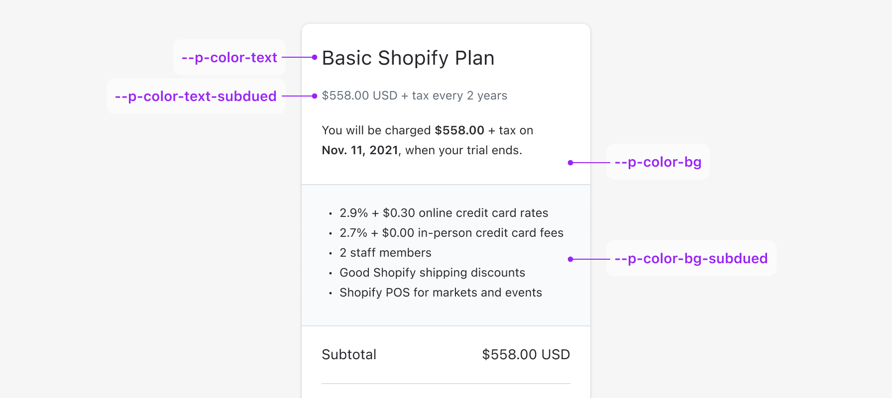
--p-color-{element}-{role}-{variant}-{state}(--p-color-bg-critical-subdued-hover)

--p-color-text-brand-on-bg-fill-active: #ccc;
--p-color-text-brand-on-bg-fill-disabled: #fff;
--p-color-text-brand-on-bg-fill-hover: #e3e3e3;
--p-color-text-brand-on-bg-fill: #fff;
--p-color-text-caution-active: #1f1c00;
--p-color-text-caution-hover: #332e00;
--p-color-text-caution-on-bg-fill: #332e00;
--p-color-text-critical-on-bg-fill: #fffbfb;
--p-color-text-emphasis-on-bg-fill-active: #d5dcff;
--p-color-text-emphasis-on-bg-fill-hover: #e2e7ff;
--p-color-text-emphasis-on-bg-fill: #fcfdff;
--p-color-text-info-active: #002133;
--p-color-text-info-hover: #003a5a;
--p-color-text-magic-on-bg-fill: #fdfdff;
--p-color-text-success-active: #092a1b;
--p-color-text-success-hover: #083d25;
--p-color-text-success-on-bg-fill: #f8fffb;
--p-color-text-warning-active: #251a00;
--p-color-text-warning-hover: #412d00;
--p-color-text-warning-on-bg-fill: #251a00;
--p-color-bg-surface: var(--p-color-bg);
--p-color-bg-surface-hover: #f7f7f7;
--p-color-bg-surface-active: #f3f3f3;
--p-color-bg-surface-disabled: rgba(0,0,0,.05);
--p-color-bg-surface-emphasis-active: #e2e7ff;
--p-color-bg-surface-emphasis-hover: #eaedff;
--p-color-bg-surface-emphasis: #f0f2ff;
--p-color-bg-surface-inverse: #303030;
--p-color-bg-surface-brand: #e3e3e3;
--p-color-bg-surface-brand-hover: #ebebeb;
--p-color-bg-surface-brand-active: #f1f1f1;
--p-color-bg-surface-brand-selected: #f1f1f1;
--p-color-bg-surface-magic-active: #e4deff;
--p-color-bg-surface-secondary-selected: #ebebeb;
--p-color-bg-surface-tertiary-active: #e3e3e3;
--p-color-bg-surface-tertiary-hover: #ebebeb;
--p-color-bg-surface-warning-active: #ffe4c6;
--p-color-bg-surface-warning-hover: #ffebd5;
--p-color-bg-surface-secondary: var(--p-color-bg-subdued);
--p-color-bg-surface-secondary-hover: var(--p-color-bg-subdued-hover);
--p-color-bg-surface-secondary-active: var(--p-color-bg-subdued-active);
--p-color-bg-surface-tertiary: var(--p-color-bg-secondary-experimental);
--p-color-bg-fill-success: var(--p-color-bg-success-strong);
--p-color-bg-fill-success-hover: var(--p-color-bg-success-strong-hover-experimental);
--p-color-bg-fill-success-active: var(--p-color-bg-success-strong-active-experimental);
--p-color-bg-fill-success-secondary: var(--p-color-bg-success);
--p-color-bg-surface-success: var(--p-color-bg-success-subdued);
--p-color-bg-surface-success-hover: var(--p-color-bg-success-subdued-hover);
--p-color-bg-surface-success-active: var(--p-color-bg-success-subdued-active);
--p-color-bg-fill-critical: var(--p-color-bg-critical-strong);
--p-color-bg-fill-critical-hover: var(--p-color-bg-critical-strong-hover);
--p-color-bg-fill-critical-active: var(--p-color-bg-critical-strong-active);
--p-color-bg-fill-critical-secondary: var(--p-color-bg-critical);
--p-color-bg-fill-tertiary: var(--p-color-bg-strong);
--p-color-bg-fill-tertiary-hover: var(--p-color-bg-strong-hover);
--p-color-bg-fill-tertiary-active: var(--p-color-bg-strong-active);
--p-color-bg-fill-brand: #303030;
--p-color-bg-fill-brand-hover: #1a1a1a;
--p-color-bg-fill-brand-active: #1a1a1a;
--p-color-input-bg-surface: var(--p-color-bg-input);
--p-color-input-bg-surface-hover: var(--p-color-bg-input-hover-experimental);
--p-color-input-bg-surface-active: var(--p-color-bg-input-active-experimental);

--pc-button-color: var(--p-color-bg-primary);
--pc-button-text: var(--p-color-text-on-color);
--pc-button-color-hover: var(--p-color-bg-primary-hover);
--pc-button-color-active: var(--p-color-bg-primary-active);
--pc-button-color-depressed: var(--p-color-bg-primary-active);
'headingXs' | 'headingSm' | 'headingMd' | 'headingLg' | 'headingXl' | 'heading2xl' | 'heading3xl' | 'heading4xl' | 'bodySm' | 'bodyMd' | 'bodyLg'
- Naming in Adobe Spectrum Design System
--spectrum-alias-text-color-invalid
--spectrum-alias-text-color-invalid: unset;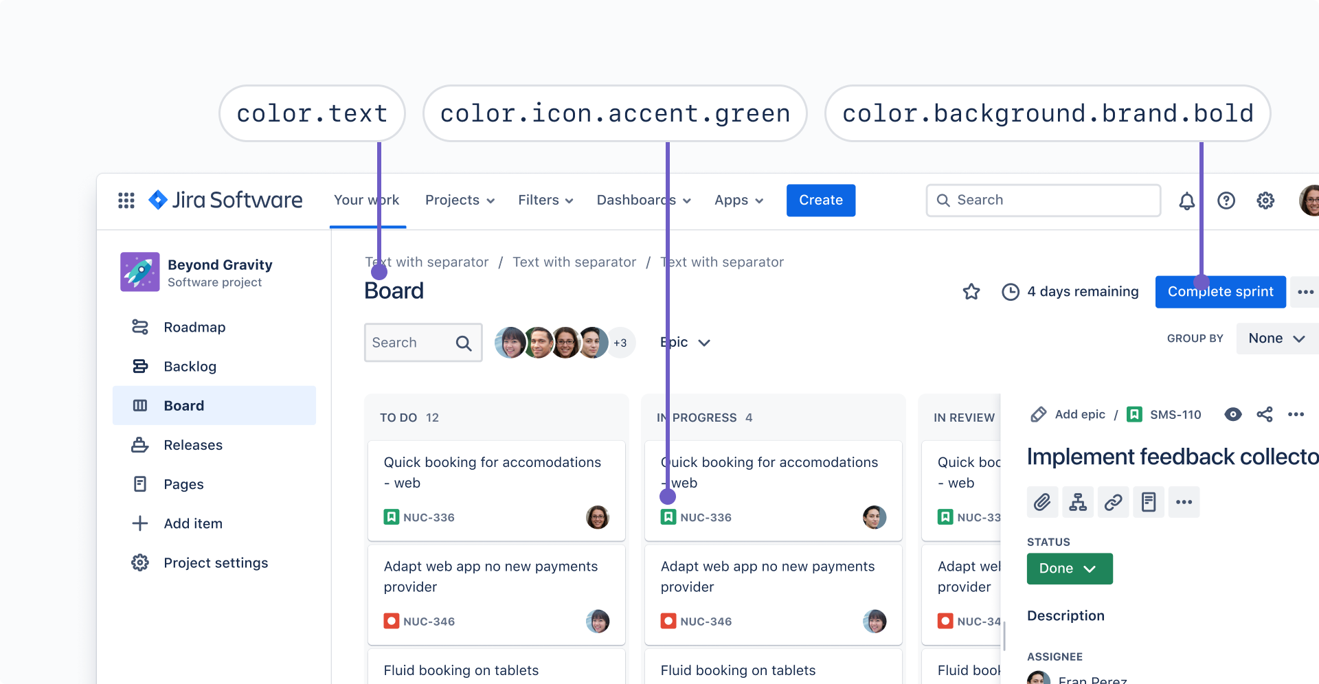
# Use for primary text, such as body copy, sentence case headers, and buttons.
color.text
# Use for text on bold backgrounds.
color.text.inverse
# Use for secondary text, such as navigation, subtle button links, input field labels, and all caps subheadings.
color.text.subtle
# Use for tertiary text, such as meta-data, breadcrumbs, input field placeholder and helper text.
color.text.subtlest
# Use for text that reinforces our brand.
color.text.brand
# Use for informative text or to communicate something is in progress, such as in-progress lozenges.
color.text.information
# Use for text to communicate a favorable outcome, such as input field success messaging.
color.text.success
# Use for green text on subtlest and subtler green accent backgrounds when there is no meaning tied to the color.
color.text.accent.green# Main color used across screens and components
md.sys.color.primary
# Standout container color for key components
md.sys.color.primary-container
# Text and icons shown against the primary color
md.sys.color.on-primary
# Contrast-passing color shown against the primary container
md.sys.color.on-primary-container
# Displays opposite of the primary color
md.sys.color.inverse-primary
# Accent color used across screens and components
md.sys.color.secondary
# Less prominent container color, for components like tonal buttons
md.sys.color.secondary-container
md.sys.shape.corner.full
md.sys.typescale.display-large.font
md.sys.elevation.level1/* Background */
--vtmn-semantic-color_background-primary: unset;
--vtmn-semantic-color_background-secondary: unset;
--vtmn-semantic-color_background-tertiary: unset;
--vtmn-semantic-color_background-accent: unset;
/* Content */
--vtmn-semantic-color_content-primary: unset;
--vtmn-semantic-color_content-secondary: unset;
--vtmn-semantic-color_content-tertiary: unset;
--vtmn-semantic-color_content-action: unset;
--vtmn-semantic-color_content-active: unset;
--vtmn-semantic-color_content-inactive: unset;
--vtmn-semantic-color_content-negative: unset;
--vtmn-semantic-color_content-accent: unset;
/* Borders */
--vtmn-semantic-color_border-primary: unset;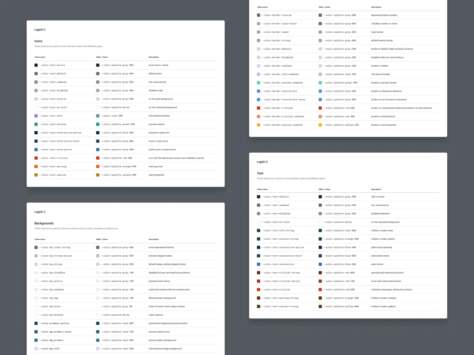
-
Backlight Design systems, code-side
-
- Chromatic
- Chromatic is a cloud-based toolchain for Storybook that helps teams ship UI components faster. It’s made by the team behind Storybook.
- Chromatic
- Sidebar, Category: Design Systems
- ROI Calculator
- Config 2024: The broken promises of design systems (Cam Worboys, Head of Design, OS at Cash App)
body {
  color: CanvasText;
  background-color: Canvas;
}
By default, CanvasText results in a color close to black and Canvas is a color that's close to white. The actual implementation depends on the browser. For example, CanvasText in Chrome results in #121212 whereas Safari has it specified as the slightly lighter #1e1e1e.