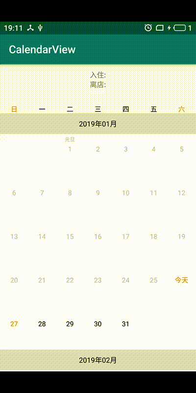
- 日历选中和不可选样式
- 行间距以及颜色设置
- 当选择模式为范围选择时,支持最大可以选择多少天
- 只展示设置的日期范围
- 月份布局是否悬停展示
- 单选和范围选择
- 单选和范围选择自定义样式

    <!--星期-->
    <com.sunyuan.calendarlibrary.MonthLableView
        android:layout_width="match_parent"
        android:layout_height="wrap_content"
        android:background="#FAFAFA"
        android:paddingTop="10dp"
        android:paddingBottom="10dp"
        sy:cl_lableArr="@array/month_view_lable_arr"
        sy:cl_lableTextColor="#333333"
        sy:cl_lableTextSize="13sp"
        sy:cl_lableWeekendTextColor="#FF6E00" />
    <!--日历-->
    <com.sunyuan.calendarlibrary.CalendarView
        android:id="@+id/calendar_view"
        android:layout_width="match_parent"
        android:layout_height="wrap_content"
        android:background="#FFFFFF"
        sy:cl_bottomTextSize="10sp"
        sy:cl_disTextColor="#BBBBBB"
        sy:cl_firstSelectDayText="出发"
        sy:cl_firstTopMargin="8dp"
        sy:cl_rowHeight="62dp"
        sy:cl_sameTextColor="#333333"
        sy:cl_secondTopMargin="4dp"
        sy:cl_selectBgDrawable="@drawable/drawable_calendar_select_bg"
        sy:cl_selectTextColor="#FFFFFF"
        sy:cl_textColor="#333333"
        sy:cl_textSize="16sp"
        sy:cl_textStyle="bold"
        sy:cl_thirdTopMargin="4dp"
        sy:cl_topTextColor="#FF6E00"
        sy:cl_topTextSize="10sp"
sy:cl_weekendTextColor="#FF6E00" />MonthLableView(星期)
| 属性 | 类型 | 描述 |
|---|---|---|
| cl_lableWeekendTextColor | color | 周末字体颜色 |
| cl_lableTextColor | color | 周一到周五字体颜色 |
| cl_lableTextSize | color | 字体大小 |
| cl_lableArr | reference | 星期展示的文案 |
CalendarView(日历)
| 属性 | 类型 | 描述 |
|---|---|---|
| cl_textColor | color | 日历天字体颜色 |
| cl_selectTextColor | color | 选中字体颜色 |
| cl_weekendTextColor | color | 周末字体颜色 |
| cl_disTextColor | color | 不可选字体颜色 |
| cl_sameTextColor | color | 今天字体颜色 |
| cl_topTextColor | color | 节日字体颜色 |
| cl_selectMaxRange | integer | 限制最大可选多少天 |
| cl_monthPaddingLeft | dimension | 月份paddingLeft |
| cl_monthPaddingTop | dimension | 月份paddingTop |
| cl_monthPaddingRight | dimension | 月份paddingRight |
| cl_monthPaddingBottom | dimension | 月份paddingBottom |
| cl_textSize | dimension | 日历天字体大小 |
| cl_textStyle | flags | 日历天字体样式 |
| cl_topTextSize | dimension | 节日字体大小 |
| cl_bottomTextSize | dimension | 选中底部文案字体大小 |
| cl_firstTopMargin | dimension | 节日距离顶部距离 |
| cl_secondTopMargin | dimension | 天距离节日底部距离 |
| cl_thirdTopMargin | dimension | 选中文案距离天底部距离 |
| cl_dividerHeight | dimension | 日历每一行间距 |
| cl_dividerColor | color | 日历每一行间距颜色 |
| cl_firstSelectDayText | string | 第一次选中底部文案 |
| cl_lastSelectDayText | string | 最后一次选中底部文案 |
| cl_selectBgDrawable | reference | 选中样式 |
| cl_selectRangeBgDrawable | reference | 选中范围样式 |
| cl_rowHeight | dimension | 日历行高 |
  CalendarViewWrapper.wrap(calendarView)
                //设置展示的日期范围
                .setDateRange(minDate, maxDate)
                //设置默认选中的日期
                .setCalendarSelectDay(calendarSelectDay)
                //选中模式-单选
                .setSelectionMode(SelectionMode.SINGLE)
                //设置日历选中事件
                .setOnCalendarSelectDayListener(new OnCalendarSelectDayListener<CalendarDay>() {
                    @Override
                    public void onCalendarSelectDay(CalendarSelectDay<CalendarDay> calendarSelectDay) {
                        CalendarDay firstSelectDay = calendarSelectDay.getFirstSelectDay();
                        if (firstSelectDay != null) {
                            String firstSelectDateStr = formatDate("yyyy-MM-dd", firstSelectDay.toDate());
                            tvCurrentSelectDate.setText(firstSelectDateStr);
                        }
                    }
                })
                //月份头是否悬停
                .setStick(false)
                //是否展示月份布局
                .setShowMonthTitleView(true)
                //设置月份布局回调
                .setMonthTitleViewCallBack(new MonthTitleViewCallBack() {
                    @Override
                    public View getMonthTitleView(int position, Date date) {
                        View view = View.inflate(SingleSelectActivity.this, R.layout.layout_month_title, null);
                        TextView tvMonthTitle = view.findViewById(R.id.tv_month_title);
                        tvMonthTitle.setText(formatDate("yyyy年MM月", date));
                        return view;
                    }
                })
                .display();
        //根据指定日期得到position位置
        int position = calendarView.covertToPosition(calendarSelectDay.getFirstSelectDay());
        if (position != -1) {
            //滚动到指定位置
            calendarView.smoothScrollToPosition(position);
        }