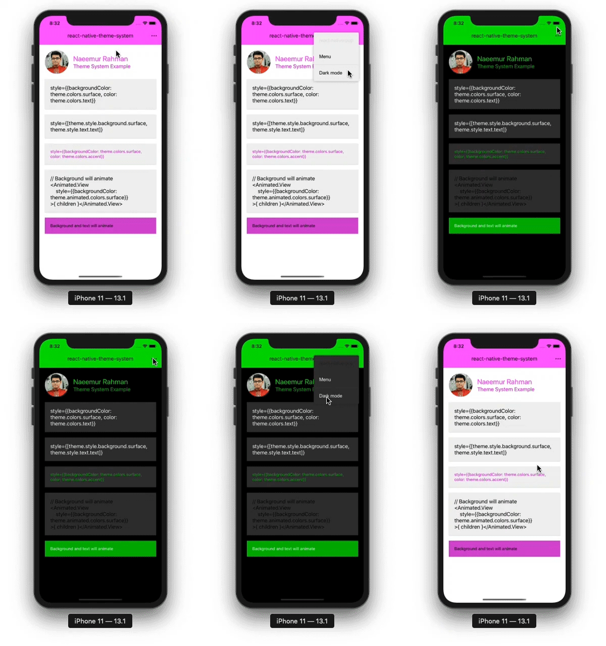
Theme system for react native, with dark mode, colors, fonts and roundness. Developed with material design in mind and works great with react-native-paper.
- Pure JS, lightweight, works on Android, iOS and Web
- Dark and light mode with same or different color pallete
- Works well in provider-consumer contexts
- Animated transition between dark and light mode
- Automatic creation of StyleSheet objects
npm install react-native-theme-system
import { Component } from 'react'
import { View, Text, Animated } from 'react-native'

import { SomeProvider } from 'some-context'
import Theme from 'react-native-theme-system'

const theme = new Theme({
	dark: false,
	colors: {
		primary: '#ff00ff',
		accent: '#cc00cc',
		surface: '#f0f0f0',
	},
	darkColors: {
		primary: '#00ff00',
		accent: '#00cc00',
	},
}, t=>{
	console.log('Theme changed')
})

class App extends Component {
	render() {
		return (
			<View style={[theme.style.background.surface,theme.style.rounded]}>
				<Text style={theme.style.text.primaty}>Hello One</Text>
				<Text style={{color:theme.colors.accent}}>Hello Two</Text>
				<Animated.Text
					style={{color:theme.animated.colors.accent}}
				>
					{`Hello Three`}
				</Animated.Text>
				<SomeProvider value={theme}>
					{ ... }
				</SomeProvider>
			</View>
		)
	}
}

export default AppThis class creates a Theme object. options param extends default theme properties, onChanged(theme) is called when theme changes between dark and light mode.
const theme = new Theme(options:Object [, onChanged:function])options = {
dark:boolean // to use dark mode
colors:object // an object with color properties (see defalult theme)
darkColors:object // an object with color properties for dark mode (see defalult theme)
fonts:object // an object with font properties (see defalult theme)
roundness:number // a number to use for border radius etc
variables:object // an object with custom names-values color properties that are not in theme colors. can be used like theme.variables.colorName
}The default theme is
defaultTheme = {
	colors: defaultLightColors, // see default light colors
	dark: false,// (boolean): whether this is a dark theme or light theme.
	fonts: {
		light: "Roboto-Light, Roboto, \"Helvetica Neue\", Helvetica, Arial, sans-serif",
		medium: "Roboto-Medium, Roboto, \"Helvetica Neue\", Helvetica, Arial, sans-serif",
		regular: "Roboto, \"Helvetica Neue\", Helvetica, Arial, sans-serif",
		thin: "Roboto-Thin, Roboto, \"Helvetica Neue\", Helvetica, Arial, sans-serif",
	},
	roundness: 4,// (number): roundness of common elements, such as buttons.
}
The default light colors are
defaultLightColors = {
	primary: '#00ffff',// - primary color for your app, usually your brand color.
	accent: '#00cccc',// - secondary color for your app which complements the primary color.
	background: '#ffffff',// - background color for pages, such as lists.
	surface: '#ffffff',// - background color for elements containing content, such as cards.
	text: '#000000',// - text color for content.
	error: '#b00020',// - error.
	notification: "#f50057",// - notification.
	backdrop: 'rgba(0, 0, 0, 0.50)',// - color for backdrops of various components such as modals.
	disabled: 'rgba(0, 0, 0, 0.26)',// - color for disabled elements.
	placeholder: 'rgba(0, 0, 0, 0.54)',// - color for placeholder text, such as input placeholder.
	onBackground: '#000000',
	onSurface: '#000000',
}
The default dark colors are
defaultDarkColors = {
	primary: '#00ffff',// - primary color for your app, usually your brand color.
	accent: '#00cccc',// - secondary color for your app which complements the primary color.
	background: '#000000',// - background color for pages, such as lists.
	surface: '#333333',// - background color for elements containing content, such as cards.
	text: '#ffffff',// - text color for content.
	error: '#b00020',// - error.
	notification: "#f50057",// - notification.
	backdrop: 'rgba(255, 255, 255, 0.50)',// - color for backdrops of various components such as modals.
	disabled: 'rgba(255, 255, 255, 0.26)',// - color for disabled elements.
	placeholder: 'rgba(255, 255, 255, 0.54)',// - color for placeholder text, such as input placeholder.
	onBackground: '#ffffff',
	onSurface: '#ffffff',
}dark (Boolean) true if dark mode is enabled
colors (Object) theme colors (see `defaultTheme.colors```)
lights (Array) 10 shades of light colors from #ffffff to `#afafaf```
darks (Array) 10 shades of dark colors from #000000 to `#aaaaaa```
transition Animated.Value() (0=dark to 1=light) that is interpolated for color animations
fonts (Object) theme fonts (see `defaultTheme.fonts```)
roundness (Number) theme roundness value
variables (Object) custom color variables provived during instantiation
shades (Array) this equals theme.darks on dark mode, theme.lights on light mode
tints (Array) this equals theme.lights on dark mode, theme.darks on light mode
animated (Object) contains interpolated light mode to dark mode color transition animation style values `{ colors:Object, shades:Array, tints:Array }```
style (Object) this contains styles objects { font, rounded, background, text } they can be used as style objects like
<Text style={theme.style.text.primary}>{ ... }</Text>
<Text style={theme.style.text.accent}>{ ... }</Text>
<Text style={theme.style.text.shades[0]}>{ ... }</Text>
<Text style={theme.style.text.tints[1]}>{ ... }</Text>
<Text style={theme.style.background.primary}>{ ... }</Text>
<Text style={theme.style.background.surface}>{ ... }</Text>
<Text style={theme.style.background.shades[1]}>{ ... }</Text>
<Text style={[theme.style.font.meduim,theme.style.rounded]}>{ ... }</Text>darkMode(enable:Boolean) enables dark mode if enable=true and does the color transition animation
variable(name:String, color:String) sets custom variable named name to value `color```
The MIT License (MIT)
Copyright (c) 2020 Md. Naeemur Rahman (https://naeemur.github.io)
Permission is hereby granted, free of charge, to any person obtaining a copy of this software and associated documentation files (the "Software"), to deal in the Software without restriction, including without limitation the rights to use, copy, modify, merge, publish, distribute, sublicense, and/or sell copies of the Software, and to permit persons to whom the Software is furnished to do so, subject to the following conditions:
The above copyright notice and this permission notice shall be included in all copies or substantial portions of the Software.
THE SOFTWARE IS PROVIDED "AS IS", WITHOUT WARRANTY OF ANY KIND, EXPRESS OR IMPLIED, INCLUDING BUT NOT LIMITED TO THE WARRANTIES OF MERCHANTABILITY, FITNESS FOR A PARTICULAR PURPOSE AND NONINFRINGEMENT. IN NO EVENT SHALL THE AUTHORS OR COPYRIGHT HOLDERS BE LIABLE FOR ANY CLAIM, DAMAGES OR OTHER LIABILITY, WHETHER IN AN ACTION OF CONTRACT, TORT OR OTHERWISE, ARISING FROM, OUT OF OR IN CONNECTION WITH THE SOFTWARE OR THE USE OR OTHER DEALINGS IN THE SOFTWARE.
