Editor UI refactor with draggable selection box #20226
Conversation
openra-selection-box.webm |
|
Area and Actor selection is now integrated with the history so you can undo/redo your selections. |
|
Obviously a few things to address before this would be ready:
So there's a lot of work to be done before it's viable. I'm really just looking for evaluation at this stage to see if people are happy with the new behavior. I know the additional tab bar at the top is likely to be unpopular but it sure frees up a lot of screen real-estate for new editor features in the future. |
|
Here's a few thoughts
IMO 1. should be moved down to the bottom left corner like it is with most editors and then also a few features added to it. It should display selection box size, both on X and Y axes. It should appear as soon as you start selecting so that you'd be able to get a selection of a specific size. It currently displays the coordinates of a cursor and the ID of the tile. IMO in 1st generation games it shouldn't display the Z axis, and it should also display hovered over actor name. This could be done in a follow up though it's easy enough to include here. 3rd should be moved into the panel itself, and 2nd should be in the exactly the same place the 3rd currently is. Tabs should always be next to the panel they are manipulating
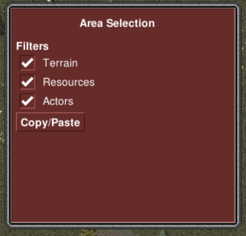
I think it would look better if filters switched places with the button. Now that we're adding selection boxes this desperately needs a delete button. It should respect the filters and when tiles are deleted it would replace with the default tile. Grass being the default in vanilla ora mods. This ofc could be added in a follow up but should not be hard to do here as well |
|
I've updated it to look like this:
This design has the benefit that the palette background/border doesn't change size when you switch between tabs. No changes to the coordinates/map value labels yet. I like it; I think it's better. "Display" is probably going to have to be something else like "Settings" |

|
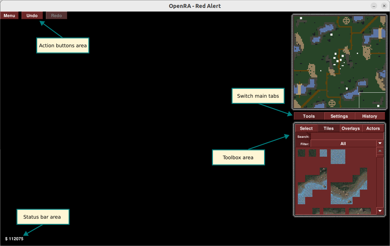
@drogoganor This is going in the right direction 👍 Here are some of my thoughts: Action buttons areaThis is the place for buttons that trigger an action regardless of any other UI state (undo, redo, save). Status bar areaThis is the area to display information, usually related to the cursor position. Switch main tabsTo conserve space this area hides behind tabs some of the less frequently used panels. Toolbox areaThis is where the most interesting stuff happens. I imagine this as a toolbox similar to what is found in image editing software. Clicking on a tool displays the options for that tool in the panel below. Currently there are 4 tools:
I imagine the tools having nice icons and being better laid out but for now a simple tab look would also do. In the future other tools may be added (e.g. a measuring tool). The selection tool is not clearly defined at the moment - I think it does too many things and in a somewhat non-intuitive way. Perhaps it should be split into an "actor selection tool" and "area selection tool". The actor selection tool is pretty much what we have now and the area selection tool is what you added. The copy/paste mechanic is also not great. It is part of the selection tool (as opposed to being an "action button") which I guess is OK but it needs some enhancements (easily selecting a single tile by clicking on it, keep displaying the outline of the copied area while pasting). I'm also not too fond of moving the floating actor edit panel to the toolbox. But I'm still not sure what to do with it - it depends on how the selection tool (or tools) shape up. |
They should be separated code wise but not visually / in tabs. We didn't have box selection in the past, and now we do. I think it's intuitive for it to work like it does in the PR |
|
Thanks @dragunoff appreciate it! I should probably clarify what I intended with a couple things: Select tool as a tab button: Originally I did have a separate [Select] tab button, but I decided to remove it and have it be an "implicit mode" entered into by dragging a selection or selecting an actor. You do have a point that it's not easily discoverable, but on the other hand, it requires one less click to select an area or an actor. It will add up to a whole lot less clicks in developing a map, especially at the start where you might do a lot of bulk copy-pasting of water or land tiles to create the basic map outline. Also, we'll have just that little much extra space on that tab button bar without it... Regarding the copy+paste behavior: Currently the PR's copy-paste behavior isn't what I want. The user should be able to copy a dragged-out area with Ctrl+C, and then paste it any time later with Ctrl+V (multiple times if necessary). I should probably get on to that now... Tools/Paint tab: I named the tab Paint because I anticipated a Tools tab button being added after the paint tab row (after Actors) at some point in the future. People have talked about various editor tools to paint shorelines, ridges, roads, rivers, etc, and an extra Tools tab in the Paint group might be a really good place to put them. The lack of single-tile selection: I decided to make it so a left-click and release on a single tile doesn't create a selection box. I thought this might be confusing for a user if they accidentally right-click and dismiss their brush, then left click on the map to try and paint again, and suddenly they're presented with the area selection panel instead of the tiles palette they were just using. I'm easy either way though - copy and pasting a single tile is something mappers do a fair bit, I think. The actor edit panel: I'm actually the perpetrator of the floating actor edit panel - well, the skeleton of it, at least. There were questions raised on whether it was a good idea to have a UI panel attached to the map viewport - no other UI element in OpenRA behaves like it (I think). My argument for putting it in the toolbox area is that the controls to adjust the properties will always be in the same place, and if the user is doing some very tedious property adjustments on a whole lot of actors, it might make it easier to rely on muscle memory for some of it. Anyway that's my reasoning behind things anyway, hopefully I've explained myself well enough. |
I suggest taking inspiration from excel / google sheets |
|


|
If you copy one selection, then create another selection, the paste selection will be of the size of the new selection, rather than of the one you actually copied. I also advise copying excel style. When pasting, keep the selection on the place you copied from (you see 2 selections of different colors). That way you'd see from where you copied and where you will paste |
|
I think that copy/pasting as a global action has some problems (what is copyable?, pasting is an action but actually changes the active cursor?). I think it would work better as a separate tool similar to a clone stamp tool in an image editor. I have a lot more thoughts to share here but will do so in a few days when I'm back at a keyboard. |
|
I think it's fine to have it global if it uses clipboard. It will obviously malfunction when pasting between different mods but that should be expected by the user |
|
Oh yeah, by "global", I mean, it's just at the top level editor logic, and intercepts all hotkeys no matter what toolbox is shown. It doesn't use the OS clipboard. In addition, you can only copy if you have a valid selection. Thanks for pointing out those bugs Pun, I think it's a good idea to display both the copy grid and the paste grid at the same time. I'll refactor for that behavior. I admit I didn't quite know what you meant by "excel style" at first. |
Open up excel or if you aren't on windows, google sheets and play around with copy paste. I think it mirrors quite a lot of issues we have here and solves them very well |
openra-selection-box-2.webmopenra-selection-box-ts.webm |
|
@drogoganor Great work with the selection grid and thanks for elaborating on your ideas. I agree with you on the general direction but I'll try to highlight where I disagree and I'll try to explain a few ideas in greater detail.
The behavior you're describing is more akin to a "selection mode" than a "selection tool" and I'm not a fan of that for reasons of discoverability (where is that selection panel? why does it keep disappearing?) and clarity (how do I switch to selection mode? am I already in selection mode?). Working with modes can be powerful but I think in this case an explicit tool is more appropriate. It will be tied to a hotkey so switching to it should not be difficult (assuming mappers get used to the hotkeys).
The existing tiles, overlays and actors tabs are essentially painting tools. I think everything belongs in the same toolbox.
This highlights one of the problems with implicit selection mode. But the real reason why I pointed out that is because I think it's a good example of why actor selection should be separate from area selection. The actors are a separate layer that operates differently than the map area (terrain). It should be easy to independently select a single tile, a group of tiles or single actor (that may occupy several tiles). Furthermore I think it would be nice to be able to select multiple actors (with dragging, just like in-game) so that their common properties can be edited (e.g. owner) or so they can be deleted en masse. Here's a screen cap that illustrates this problem (I'm trying to select an area but I end up selecting an actor): Peek.2022-09-07.21-17.webm
I think it's fine to remove the floating panel and use a fixed one for the actor properties. This would tie nicely with editing props of multiple actors. However I think this doesn't belong in the toolbox panel. These are the properties of the selected objects and not options for the selection tool. A separate "Properties" panel can be added below the toolbox.
The buttons are global but the action is not global as it is tied to the area selection - if there's no area selection the copy button is disabled. And the only thing that can be copied is a selected area (i.e. a selected actor can't be copied). The other problem with the way it works now is that it's not a true copy-paste mechanism. What I mean by that is that the copied area is not stored in a clipboard - it is actually cloning what is in the selected area at the moment of pasting. And this is really how a cloning stamp tool works. Here's a video that illustrates this: Peek.2022-09-07.22-31.webmI think adding a separate cloning stamp tool might be a good solution here - to decouple the selection tool from any other actions. The clone stamp tool would work with the current selection and it's job would be to simply do the "paste" part. So really this won't add any extra clicks or key presses. Here's a workflow:
This post is already rather long so I'm wrapping it up. I'll present some more ideas in detail I'll expand on some of the ideas above in a separate post. But in a nutshell what I'm envisioning is a rich toolbox with various selection, painting and other tools (that don't yet exist). |
|
Hey man, thanks for the look at the latest build and your points on a few things. Mostly I will stand firm behind the "implicit select mode" idea. I will branch off and try out a couple of things you're suggesting. There are some things I wanted to say in reply though:
That's true about new users perhaps dragging a selection and wondering where their tile palette went, or how to get back to that mode again once they've seen it. I have actually added a Cancel button to the area selection palette for an additional way for the user to dismiss an area selection:
I think you have a point though; it might be a bit of an imposition on the user to have that area selection palette come up that they need to dismiss if they accidentally left-click and drag a little bit on the map. However, I would argue that users who open up the map editor are a particularly motivated lot and might not be too scared of an additional mode if you drag out a selection. I would also argue that an area selection drag on the default left click is a common feature in editors, and that it has a discoverability of its own. Left clicking and dragging without any brush selected is something that a new user is likely to do when presented with their big empty map they've just created. I think having this functionality behind a tab button with hotkey tooltip is easy to discover visually, but it's an extra click or key to press to get there. Mappers wanting to switch between painting and copying/pasting will find it easier if they can right-click to select default brush and then left-click and drag right there without having to move their mouse far or press a hotkey. The extra labor will be annoying. Side-node: Admittedly, the area selection palette currently has a bunch of checkboxes but nothing useful for a user creating a brand new map. In the future, if this goes ahead, this panel might have options to fill or clear tiles, which will be a useful thing right at the start of map creation.
That's OK; I could name it "Tools" instead of "Paint", and name any future tab for shorelines, ridges, roads, etc. "Paint", instead. My reasoning behind this was that "Tools" might encompass bulk operations or maybe even map flipping that might not be reflected by the label "Paint".
I have actually altered this now so that you can click and drag on cells containing an actor to drag a grid, or just click and release without dragging to select the actor: openra-selection-box-3.webmDefinitely undesirable behavior previously; appreciate that you took the time out to try out the behavior. Definitely agree that multiple actor select/delete would be really cool - what if you could hold Ctrl and click multiple actors? I think that would be good. But, it will need a fair bit of work. I'd be happy to work on that feature in the future if this PR comes to pass.
I can't really do that - there's not enough space for it. You can see in my screenshots at the minimum supported rez of 1024x720 that there's not enough room for it. The blank area below the toolbox palette is also reserved for FPS counters and whatnot. That could be moved elsewhere for extra room, but I suspect it would still be a very tight space there requiring a scrollbar. To really free up space for a separate properties panel you'd have to hide the minimap. But, that would raise separate usability concerns like "dude, where's my map?" I wouldn't really be willing to mess with the minimap for those reasons.
Yes, that's definitely sucky that it works like a clone stamp! I could probably change it to actually copy into memory at the time of copying; though there won't be a preview display of the copied segment's tiles/actors/resources when pasting. That's a really big job. Regarding the Copy Paste buttons being "global": You're right; they are actually context dependent. I originally had them on the Area Selection palette, but I realized I couldn't use Ctrl+V to paste without an area selected (the panel needs to be visible). Maybe the Copy button should be on the area selection panel, but the Paste button should remain on the toolbar at the top so it can be pressed or Ctrl+V'd at any time the user has something copied? In general, I stick by the notion of the "implicit select mode". The existing actor selection allows the user to bring up the edit dialog by just left-clicking and releasing on an actor somewhere on the map. This isn't really a "mode", per-se, but like the area selection, the user may have to dismiss it if they click an actor by accident. I've often done a little bit of map work then switched back to the default brush to admire what I've done, then clicked around idly and selected a tree by accident and had to click Cancel before I can get back to painting shoreline. That isn't to say this is optimal UI design either; only to suggest that this is a kind of "implicit select mode" we already have, even if it is something that obstructs painting on the map just sometimes, rather than obscuring the entire tool palette. I also argue that manipulation of an area of the map should be initiated by an interaction with the map first instead of a menu or hotkey. Anyway, a couple of things to do based on what you mentioned:
|
|
With the way you implemented it you could do away with copy button entirely. This is reminiscent of stamping, or in other words duplicating (ctrl + D). Also standard practice. When duping you may also want to change the colour of the place you are duping from, white -> yellow perhaps. With copying you want to save what you have selected such as until the next time you click copy contents can't change. I may have mislead you there a bit, sorry |
I'm not against the clone behavior - I was just pointing out how it works. I actually think it's better to keep it instead of making a clipboard copy. Because then you can see precisely what you're copying instead of having to remember what's in the clipboard. Of course the paste preview can show it but it may be different from the source so displaying a source grid no longer makes sense. |
|
I also firmly stand behind the idea of "explicit tools" :--) I've drafted a more detailed description of the tools and ideas that I have in mind. I think we can have some of that "implicitness" by auto-switching to the selection tool when right-clicking with any of the paint tools. This may not work for other types of tools though. Read on to see the examples I came up with. Core toolsThis is the core toolbox that I imagine for OpenRA. I've drawn inspiration mostly from image and vector editing software but also from Tiled. Some clarifications:
I was trying to imagine different use cases and so some of the descriptions contain a lot of stuff. But it's not necessary to implement all of the features and options right away. A tool can do a good job even in a more basic version. These are here so we can think of the possibilities.
Ideas for other toolsAnd here are a few ideas for other tools. I included them so that we can think ahead and consider some other scenarios and interactions. The "magic wand" tool for example is also an area selection tool but it doesn't work by mouse dragging. So in this tool we couldn't fit an "actor selection" mode and that's a good case for why actor selection is better off separate - it's simply about interacting with objects and not selecting tiles from the grid. The measurement tool and tile picking tool are here as examples of different use of the secondary button - not dismissing the tool and not going into an implicit selection mode.
P.S.: I may be theorizing a bit too much. I'll play around with the editor some more (with and without this PR) to get a better sense of where we're going. 😛 |
This feature could be added to scroll wheel button, like in minecraft. While using the respective "paint" tool with middle lick you'd set your current brush to hovered over actor / tile |
I thought about attaching the "pick" action to the paint tool but the main problem is that the active brush obscures the tile underneath. I also deliberately didn't assign any actions to the middle mouse button because it's usually used for panning the map. |
|
I tried it out and actually it works just fine. I guess I was exaggerating the necessity of having it as a default brush left-click and drag action. Once you have the tool selected you can select and copypaste/clone multiple times without dropping the tool. Not quite sure why I was so adamant that it was necessary the other way. Well, either way it still needs some chrome changes for CNC. Only D2K, RA, and TS will work for now. |

|
@drogoganor I still think it's better to make actor and area selection separate tools. Now they are in the same tool but need to be activated which adds an extra click to the workflow - e.g. "1. Activate Select tool > 2. Activate Actor mode" instead of just "1. Activate Actor selection tool". I guess they can still live in the same tool but one of them should be active by default (could be the last used one). Another thing is that I think that placing actors (or drawing a bunch of tiles) and then wanting to immediately select them is a common and practical workflow. That's why I suggest a secondary click while holding a paint tool to activate the corresponding selection tool. Now it simply dismisses the active brush which doesn't seem very useful. I don't know if you've noticed but there's a hidden actor eraser tool in the existing editor - using secondary click while in selection mode erases actors under the cursor. I guess people are using this when making maps and we should provide it somehow with this new setup. One way to deal with that is to add an explicit eraser tool but the problem is that we have different layers to erase - terrain, overlays, actors so the tool has to account for them (with something like layer filters) or we add separate eraser tools for each layer. That's why my thoughts were to attach the erase function to the corresponding paint tool (as a mode, see #20226 (comment)). So when you're holding an actor brush you can switch to erase mode to erase actors, same for terrain and overlays. |
|
@dragunoff Cheers - I have updated that now to behave as you suggested. It's ok but a bit annoying. I have a habit of de-selecting my actor or tile after I'm done painting with it, so I always bump myself to the select tab with this behavior. Consider the situation where you want to clear the actor brush after placing a large building (so you can see the whole area without obscuration) before you choose your next actor to place. Doing this bumps you to the Select tab and is a bit of a "huh?" moment. I actually did go a step further and make it so a right-click with a selector brush active (after having come from tiles/actors/resources) will switch you back to the appropriate tab you came from, but not re-select the previous paint brush. It mitigates it a little but not really. Try it and see what you think anyway. Cheers |
|
I played around a bit. Right click deletes resources, but it doesn't delete actors. And deletes them not at the moment you click, but when you release the button. Meaning you can accidentally delete a resource in the wrong cell. When you right click to deselect a tool, you become toolless. Which just feels wrong. The only thing you can do is delete resources and move around with your camera |
I have not tested the changes yet but I think there should always be a tool active (imagine the toolbox as a group of radio buttons).
Perhaps it was not a great idea to tie secondary clicks to automatic tool switching. It may be better to have the user change the tool manually when they want. |
|
I'll get onto this one soon, hopefully this weekend. |
|
Sorry I haven't gotten on to this one. One item I intend to complete is improved copy-paste functionality - when pasting a chunk of map, a copy of the tiles/actors/resources should be shown on a separate layer(s) above the map as you hover the mouse. That's long been complained about so it would be really good to fix. Most requiring some love is the Clear Tiles selector which can probably be done in a better way. Requesting some design input on how this should work. |
c22e5fa
to
3e7f06c
Compare
|
This has been rebased and will run for all mods now. Please note that I still want to improve the copy-paste behavior so this isn't complete yet - but any comments or suggestions you have on the overall behavior of this feature would be welcome. Two items still need to be addressed:
|
There was a problem hiding this comment.
Overall looks pretty good, however there's quite a few bugs
Copy button should be moved to the selection panel, as it's weird for it to not be clickable when up top. Clear button should go there as well, everything that isn't usable without the selection. Though perhaps duplicating the button to the pannel is an option as well
copy paste allows me to put actors outside of bounds

when deselecting a selection it can jitter the menus
gitter.mp4
Could you also move the delete button to the right?
In TS I managed to crash it when copy-pasting a small base
Exception of type System.IndexOutOfRangeException: Index was outside the bounds of the array.
at OpenRA.Mods.Common.Widgets.CopyPasteEditorAction.Do() in OpenRA/OpenRA.Mods.Common/EditorBrushes/EditorCopyPasteBrush.cs:line 145
at OpenRA.Mods.Common.Widgets.CopyPasteEditorAction.Execute() in OpenRA/OpenRA.Mods.Common/EditorBrushes/EditorCopyPasteBrush.cs:line 140
at OpenRA.Mods.Common.Traits.EditorActionManager.Add(IEditorAction editorAction) in OpenRA/OpenRA.Mods.Common/Traits/World/EditorActionManager.cs:line 45
at OpenRA.Mods.Common.Widgets.EditorCopyPasteBrush.HandleMouseInput(MouseInput mi) in OpenRA/OpenRA.Mods.Common/EditorBrushes/EditorCopyPasteBrush.cs:line 80
at OpenRA.Mods.Common.Widgets.EditorViewportControllerWidget.HandleMouseInput(MouseInput mi) in OpenRA/OpenRA.Mods.Common/Widgets/EditorViewportControllerWidget.cs:line 84
hotkeys for paint tabs don't work when you aren't in the paint tab, this should definitely be fixed.
Clear button doesn't allow you to redo properly. It makes each tile change as a separate action
OpenRA.Mods.Common/Widgets/Logic/Editor/MapEditorMainTabsLogic.cs
Outdated
Show resolved
Hide resolved
OpenRA.Mods.Common/Widgets/Logic/Editor/MapEditorSelectionLogic.cs
Outdated
Show resolved
Hide resolved
OpenRA.Mods.Common/Widgets/Logic/Editor/MapEditorSelectionLogic.cs
Outdated
Show resolved
Hide resolved
|
A better long term plan would be to have icons for the buttons instead of words. Then they would take up much less space, be easier recognisable at a glance, and would not need to be hidden behind tabs. It's the industry standard for a reason |
|
Thanks for the review Pun, I'll get onto those issues you've identified. There's still quite a few more issues lurking. |
|
copy/paste is bugged. Paste doesnt replace resource overlay. Also do Clear Tiles actually do anything? If the intension was to clear selected area, that doenst work too. 2023-11-29.12-38-22.mp4 |
|
Thanks Porenutak for giving it a go. |
95f38b7
to
da5a310
Compare
|
The issue with pasting over resources has now been fixed. |
|
I've put all the tab buttons in the same row like the existing design and the hotkeys work again.
Pun has commented that it would be better to have icons for these tab buttons and I agree. We don't have those icons yet. I still need to do some work on the UI to make it pixel-perfect. |

|
Tab buttons were incorporated into the toolbox - looks like this now: |

|
Replaced the tab button text with icons: Two behaviors still need to be corrected:
|

There was a problem hiding this comment.
Functionality overall is pretty good, but there's still a bit of polish left to be done. Many of the commits should be squished as well
This PR also requires an update rule as it is changing trait infos
the addition of icons will require a PR towards https://github.com/OpenRA/ArtSrc
There was a problem hiding this comment.
When you are pasting the selection filters are ignored. I propose to disable the checkboxes when paste is active
this is a bit scope creep, but could you make tile search and actor search yield keyboard focus when panels change? That is change by picking other tabs or by other means such as new selection
OpenRA.Mods.Common/UpdateRules/Rules/20231010/RemoveEditorSelectionLayerProperties.cs
Outdated
Show resolved
Hide resolved
OpenRA.Mods.Common/UpdateRules/Rules/20231010/RemoveEditorSelectionLayerProperties.cs
Outdated
Show resolved
Hide resolved

|
Incoming commit squash, please hold off on any review |
d2f83ac
to
b9eaccb
Compare
fd288bd
to
94ab78a
Compare
94ab78a
to
fd8295d
Compare
Summary
Screenshots
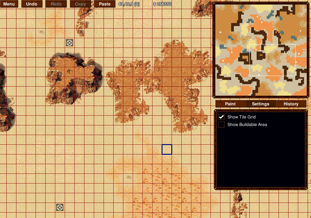
Default editor view:
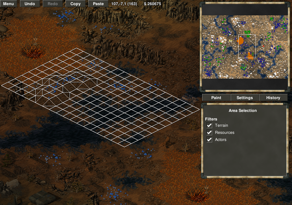
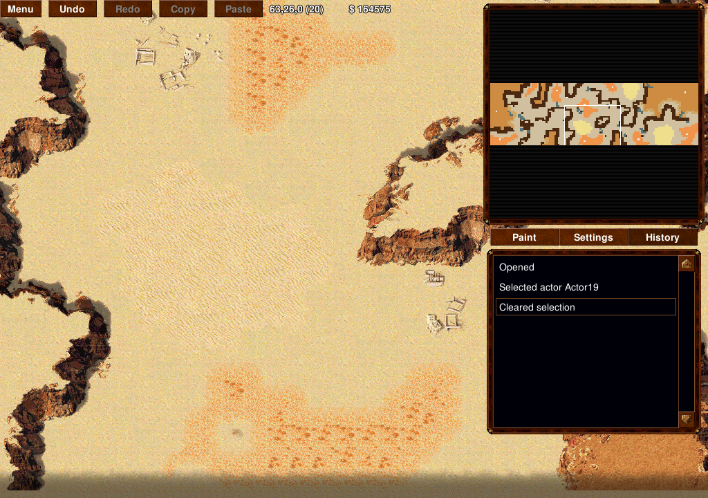
Copying and pasting:
The selection grid renders a second grid below it offset by 1,1 in black so it will always be visible even with snow maps.
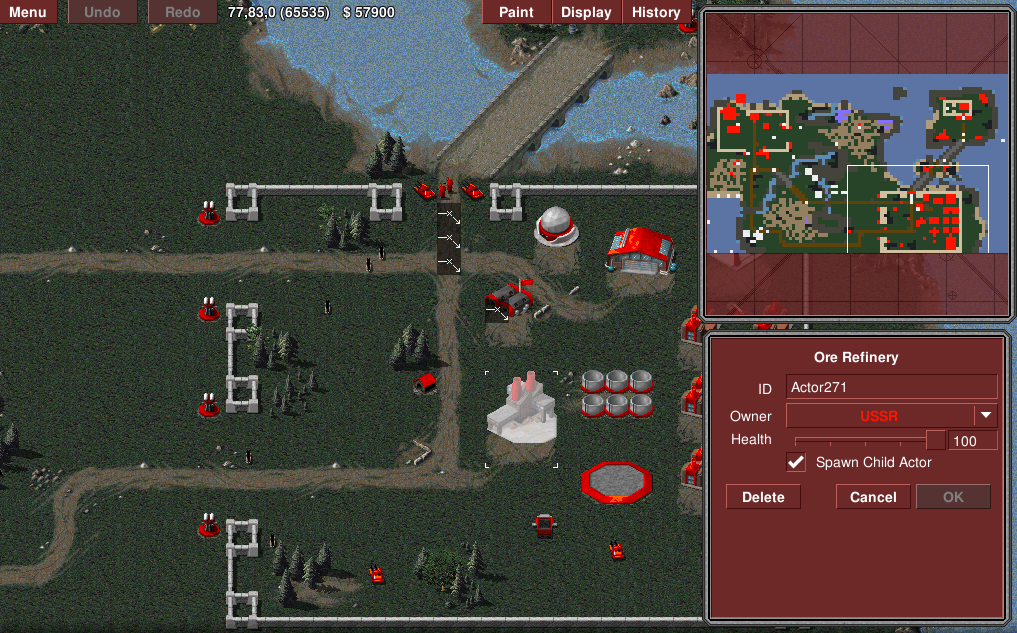
Actor select/edit:
Settings view:
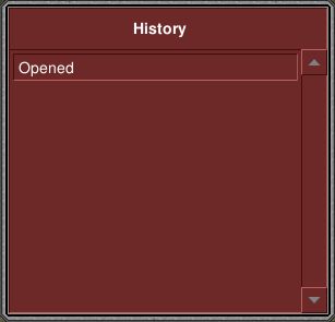
History view:
Original post follows:
I wanted to gain some more screen real-estate in the editor so I can have some more detailed grid overlay settings.
I ended up changing quite a few things to shift various settings at the top of the screen off to their own panels, and adding a new tab bar at the top with [Paint][Display][History]:
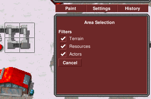
If you click on Display you'll get this in place of the Tiles/Overlays/Actors panel:

If you click on History you'll get this:
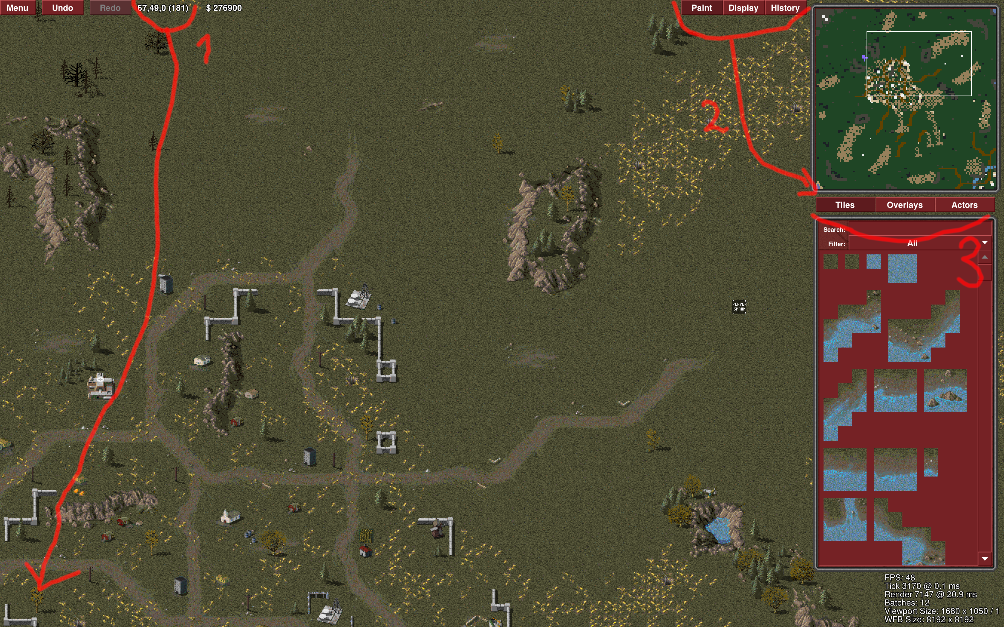
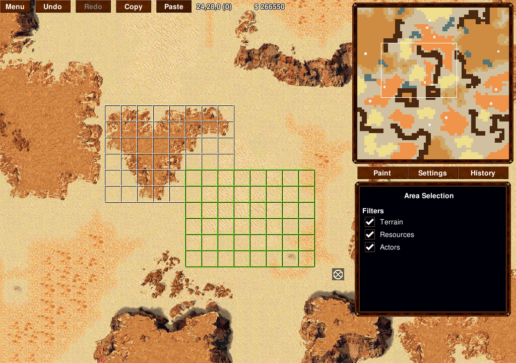
This PR also changes the way selection works for dragging out a box to copy-paste. Now, the default brush will permit the user to drag out a selection box by left-clicking without an actor selected.
If the user drags out a selection box, the side panel will show the Copy Filter checkboxes and the Copy/Paste button.
If the user left-clicks anywhere or clicks the Paint button, the user will go back to the usual Tiles/Overlays/Actors view.
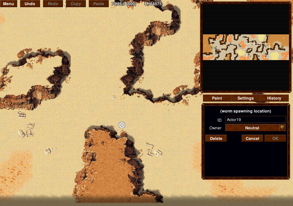
In addition, the floating actor edit box has been removed, and instead moved to the sidebar when an actor is selected:
It's a bit hard to explain how it all fits together but it behaves nicely and I think you guys might like it.
Currently, all the editor chrome is broken for CNC, but it will run. Also, the selection box drawing doesn't function correctly in TS.
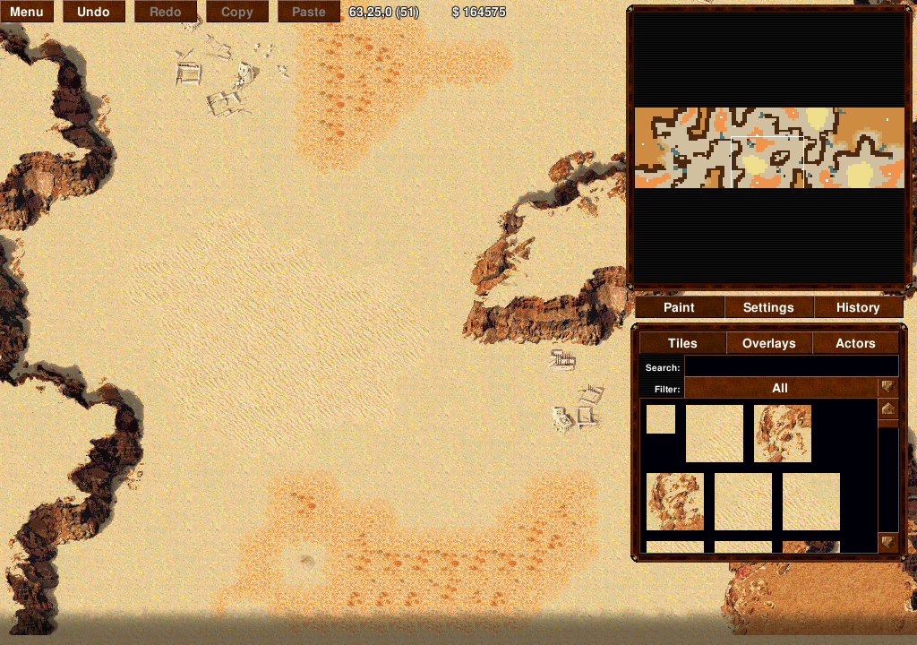
Here's what the standard Paint view looks like:
Give it a go in RA and let me know what you think.