[Navigation] support multiple secondary actions for Navigation Item #7817
Conversation
size-limit report 📦
|
|
/snapit |
|
🫰✨ Thanks @henryyi! Your snapshots have been published to npm. Test the snapshots by updating your yarn add @shopify/plugin-polaris@0.0.0-snapshot-release-20221201131343yarn add @shopify/polaris-icons@0.0.0-snapshot-release-20221201131343yarn add @shopify/polaris-migrator@0.0.0-snapshot-release-20221201131343yarn add @shopify/polaris@0.0.0-snapshot-release-20221201131343 |
 henryyi
changed the title
henryyi
force-pushed
the
navigation/multi-secondary-actions
branch
2 times, most recently
from
henryyi
changed the title
henryyi
force-pushed
the
navigation/multi-secondary-actions
branch
2 times, most recently
from
82b5dc8 to
1e05208
Compare
|
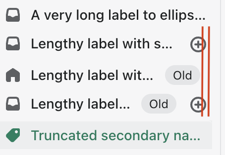
I've tightened the spacing a bit on desktop. |
|
/snapit |
|
🫰✨ Thanks @henryyi! Your snapshots have been published to npm. Test the snapshots by updating your yarn add @shopify/plugin-polaris@0.0.0-snapshot-release-20221201153701yarn add @shopify/polaris-icons@0.0.0-snapshot-release-20221201153701yarn add @shopify/polaris-migrator@0.0.0-snapshot-release-20221201153701yarn add @shopify/polaris@0.0.0-snapshot-release-20221201153701 |
 henryyi
force-pushed
the
navigation/multi-secondary-actions
branch
from
henryyi
force-pushed
the
navigation/multi-secondary-actions
branch
from
1e05208 to
dfcfc77
Compare
I adjusted the spacing to work better with the badges now:
|
|
/snapit |
|
🫰✨ Thanks @henryyi! Your snapshots have been published to npm. Test the snapshots by updating your yarn add @shopify/plugin-polaris@0.0.0-snapshot-release-20221201161632yarn add @shopify/polaris-icons@0.0.0-snapshot-release-20221201161632yarn add @shopify/polaris-migrator@0.0.0-snapshot-release-20221201161632yarn add @shopify/polaris@0.0.0-snapshot-release-20221201161632 |
henryyi
force-pushed
the
navigation/multi-secondary-actions
branch
from
dfcfc77 to
353b127
Compare
|
I've made SecondaryAction |
|
/snapit |
|
🫰✨ Thanks @henryyi! Your snapshots have been published to npm. Test the snapshots by updating your yarn add @shopify/plugin-polaris@0.0.0-snapshot-release-20221201184844yarn add @shopify/polaris-icons@0.0.0-snapshot-release-20221201184844yarn add @shopify/polaris-migrator@0.0.0-snapshot-release-20221201184844yarn add @shopify/polaris@0.0.0-snapshot-release-20221201184844 |
 henryyi
force-pushed
the
navigation/multi-secondary-actions
branch
from
henryyi
force-pushed
the
navigation/multi-secondary-actions
branch
from
353b127 to
c6286fc
Compare
|
/snapit |
|
🫰✨ Thanks @henryyi! Your snapshots have been published to npm. Test the snapshots by updating your yarn add @shopify/plugin-polaris@0.0.0-snapshot-release-20221206190151yarn add @shopify/polaris@0.0.0-snapshot-release-20221206190151 |
henryyi
force-pushed
the
navigation/multi-secondary-actions
branch
from
c6286fc to
ae4695e
Compare
I'll give it some thought but we might lose some conformity. We could potentially create and expose subcomponents like |
henryyi
force-pushed
the
navigation/multi-secondary-actions
branch
from
ae4695e to
f425c7e
Compare
|
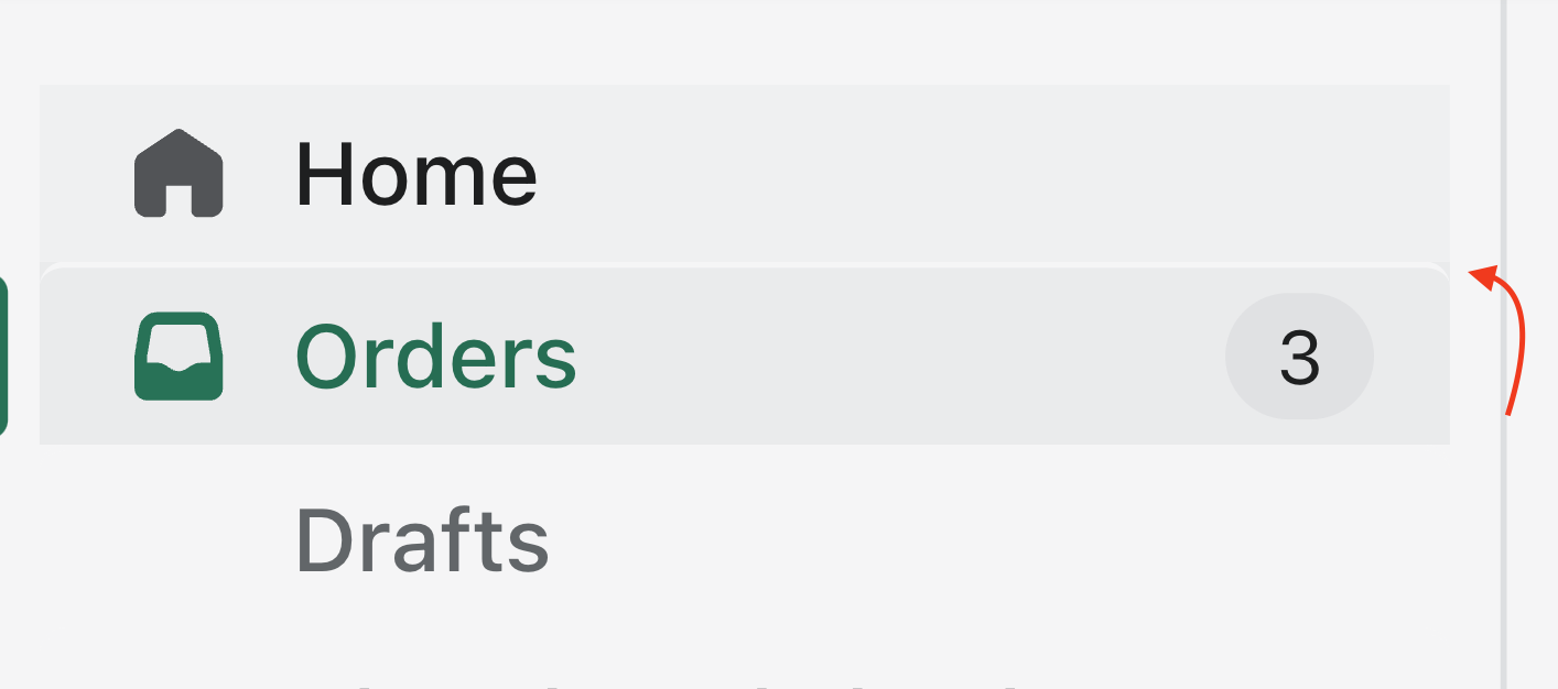
This also address a highlighting issue found in the latest release: |
 henryyi
force-pushed
the
navigation/multi-secondary-actions
branch
from
henryyi
force-pushed
the
navigation/multi-secondary-actions
branch
from
f425c7e to
1140565
Compare
| @include nav-item-icon-attributes; | ||
| } | ||
|
|
||
| .ExternalIcon { |
There was a problem hiding this comment.
external was removed in this PR so this is no longer needed.
|
/snapit |
|
🫰✨ Thanks @henryyi! Your snapshots have been published to npm. Test the snapshots by updating your yarn add @shopify/plugin-polaris@0.0.0-snapshot-release-20221207145313yarn add @shopify/polaris@0.0.0-snapshot-release-20221207145313 |
| const actions = secondaryActions || (secondaryAction && [secondaryAction]); | ||
|
|
||
| if (actions && actions.length > MAX_SECONDARY_ACTIONS) { | ||
| actions.length = MAX_SECONDARY_ACTIONS; |
There was a problem hiding this comment.
oh nice! This seems more efficient than slicing out everything after the 2nd item
polaris-react/src/components/Navigation/components/Item/tests/Item.test.tsx
Show resolved
Hide resolved
 henryyi
force-pushed
the
navigation/multi-secondary-actions
branch
from
henryyi
force-pushed
the
navigation/multi-secondary-actions
branch
from
1140565 to
4f8ddbb
Compare
 henryyi
force-pushed
the
navigation/multi-secondary-actions
branch
from
henryyi
force-pushed
the
navigation/multi-secondary-actions
branch
from
4f8ddbb to
26815e4
Compare
| ); | ||
| if (secondaryAction && process.env.NODE_ENV === 'development') { | ||
| // eslint-disable-next-line no-console | ||
| console.warn( |
There was a problem hiding this comment.
If you are able to replace the deprecated prop usage in web that would be super, to avoid unnecessary noise for devs
There was a problem hiding this comment.
Yup I'll be sure to do that post update in web.
This PR was opened by the [Changesets
release](https://github.com/changesets/action) GitHub action. When
you're ready to do a release, you can merge this and the packages will
be published to npm automatically. If you're not ready to do a release
yet, that's fine, whenever you add more changesets to main, this PR will
be updated.


# Releases
## @shopify/polaris@10.19.0

### Minor Changes

- [#7817](#7817)
[`6c310101d`](6c31010)
Thanks [@henryyi](https://github.com/henryyi)! - Added
`secondaryActions` prop in Navigation.Item to support up to two actions

### Patch Changes

- [#8018](#8018)
[`2620b0a20`](2620b0a)
Thanks [@kyledurand](https://github.com/kyledurand)! - Fixed modal
scroll bug

## @shopify/stylelint-polaris@5.1.0

### Minor Changes

- [#7993](#7993)
[`128f147d1`](128f147)
Thanks [@aaronccasanova](https://github.com/aaronccasanova)! - Created
`polaris/declaration-property-value-disallowed-list` rule to ignore
failures in `@font-face` at-rules

### Patch Changes

- [#8006](#8006)
[`6404b1638`](6404b16)
Thanks [@aaronccasanova](https://github.com/aaronccasanova)! -
Temporarily disabled `border-radius-base` error

## @shopify/plugin-polaris@0.0.26

### Patch Changes

- Updated dependencies
\[[`fad3809ef`](fad3809),
[`56b0bc2dc`](56b0bc2)]:
    -   @shopify/polaris-migrator@0.10.3

## @shopify/polaris-migrator@0.10.3

### Patch Changes

- [#7997](#7997)
[`fad3809ef`](fad3809)
Thanks [@aaronccasanova](https://github.com/aaronccasanova)! - Updated
`styles-tokenize-font` to ignore `@font-face` at-rules


- [#7783](#7783)
[`56b0bc2dc`](56b0bc2)
Thanks [@aaronccasanova](https://github.com/aaronccasanova)! - Improve
robustness of the `react-replace-text-components` migration

- Updated dependencies
\[[`6404b1638`](6404b16),
[`128f147d1`](128f147)]:
    -   @shopify/stylelint-polaris@5.1.0

## polaris.shopify.com@0.28.3

### Patch Changes

- Updated dependencies
\[[`2620b0a20`](2620b0a),
[`6c310101d`](6c31010)]:
    -   @shopify/polaris@10.19.0

Co-authored-by: github-actions[bot] <github-actions[bot]@users.noreply.github.com>
…hopify#7817)

### WHY are these changes introduced?

Resolves Shopify/core-workflows/issues/559

The Navigation item for apps and channels were adapted to allow for a
"pin" button. In order to support this natively we should allow for
multiple `secondaryActions`. Since there is not a lot of space we should
start with an initial limit of 2 actions. There is a [separate
task](https://github.com/Shopify/core-workflows/issues/634) to allow the
secondary actions to "float" above the text along with tighter margins
which could allow for additional actions.
If there is a desire for more actions they can potentially overflow into
a popover in the future but currently there doesn't seem to be a lot of
usage.

### WHAT is this pull request doing?

This PR deprecates `secondaryAction` in favour of `secondaryActions` so
that more than one action is supported. The actions are place in one row
after the badge. The actions are capped to 2 for now.
The icons have tighter spacing on desktop to provide more room for the
label and badge but retains the 40x40px touch size on mobile.

The outcome of these changes should have no impact on the current state
and appearance of the admin navigation while it will allow to address
some accessibility concerns where app pinning was implemented.

Desktop
<img width="300"
src="https://user-images.githubusercontent.com/1307190/205093459-e54835b1-2211-4ec3-86ce-0b04b7aaf9c8.gif">

Mobile
<img width="300"
src="https://user-images.githubusercontent.com/1307190/205093515-a956c8d5-e096-4d8d-94a5-12a031cacd75.gif">


<!--
  Summary of the changes committed.

Before / after screenshots are appreciated for UI changes. Make sure to
include alt text that describes the screenshot.

If you include an animated gif showing your change, wrapping it in a
details tag is recommended. Gifs usually autoplay, which can cause
accessibility issues for people reviewing your PR:

    <details>
      <summary>Summary of your gif(s)</summary>
      <img src="..." alt="Description of what the gif shows">
    </details>
-->

<!-- ℹ️ Delete the following for small / trivial changes -->

### How to 🎩

🖥 [Local development
instructions](https://github.com/Shopify/polaris/blob/main/README.md#local-development)
🗒 [General tophatting
guidelines](https://github.com/Shopify/polaris/blob/main/documentation/Tophatting.md)
📄 [Changelog
guidelines](https://github.com/Shopify/polaris/blob/main/.github/CONTRIBUTING.md#changelog)

1. Open
[Storybook](https://polaris.pnav.jita-yi.us.spin.dev/?path=/story/all-components-navigation--with-multiple-secondary-actions-for-an-item)
2. Check `Navigation` -> `With Multiple Secondary Actions...`


<!--
  Give as much information as needed to experiment with the component
  in the playground.
-->


### 🎩 checklist

- [x] Tested on
[mobile](https://github.com/Shopify/polaris/blob/main/documentation/Tophatting.md#cross-browser-testing)
- [x] Tested on [multiple
browsers](https://help.shopify.com/en/manual/shopify-admin/supported-browsers)
- [x] Tested for
[accessibility](https://github.com/Shopify/polaris/blob/main/documentation/Accessibility%20testing.md)
- [x] Updated the component's `README.md` with documentation changes
- [ ] [Tophatted
documentation](https://github.com/Shopify/polaris/blob/main/documentation/Tophatting%20documentation.md)
changes in the style guide
This PR was opened by the [Changesets
release](https://github.com/changesets/action) GitHub action. When
you're ready to do a release, you can merge this and the packages will
be published to npm automatically. If you're not ready to do a release
yet, that's fine, whenever you add more changesets to main, this PR will
be updated.


# Releases
## @shopify/polaris@10.19.0

### Minor Changes

- [Shopify#7817](Shopify#7817)
[`6c310101d`](Shopify@6c31010)
Thanks [@henryyi](https://github.com/henryyi)! - Added
`secondaryActions` prop in Navigation.Item to support up to two actions

### Patch Changes

- [Shopify#8018](Shopify#8018)
[`2620b0a20`](Shopify@2620b0a)
Thanks [@kyledurand](https://github.com/kyledurand)! - Fixed modal
scroll bug

## @shopify/stylelint-polaris@5.1.0

### Minor Changes

- [Shopify#7993](Shopify#7993)
[`128f147d1`](Shopify@128f147)
Thanks [@aaronccasanova](https://github.com/aaronccasanova)! - Created
`polaris/declaration-property-value-disallowed-list` rule to ignore
failures in `@font-face` at-rules

### Patch Changes

- [Shopify#8006](Shopify#8006)
[`6404b1638`](Shopify@6404b16)
Thanks [@aaronccasanova](https://github.com/aaronccasanova)! -
Temporarily disabled `border-radius-base` error

## @shopify/plugin-polaris@0.0.26

### Patch Changes

- Updated dependencies
\[[`fad3809ef`](Shopify@fad3809),
[`56b0bc2dc`](Shopify@56b0bc2)]:
    -   @shopify/polaris-migrator@0.10.3

## @shopify/polaris-migrator@0.10.3

### Patch Changes

- [Shopify#7997](Shopify#7997)
[`fad3809ef`](Shopify@fad3809)
Thanks [@aaronccasanova](https://github.com/aaronccasanova)! - Updated
`styles-tokenize-font` to ignore `@font-face` at-rules


- [Shopify#7783](Shopify#7783)
[`56b0bc2dc`](Shopify@56b0bc2)
Thanks [@aaronccasanova](https://github.com/aaronccasanova)! - Improve
robustness of the `react-replace-text-components` migration

- Updated dependencies
\[[`6404b1638`](Shopify@6404b16),
[`128f147d1`](Shopify@128f147)]:
    -   @shopify/stylelint-polaris@5.1.0

## polaris.shopify.com@0.28.3

### Patch Changes

- Updated dependencies
\[[`2620b0a20`](Shopify@2620b0a),
[`6c310101d`](Shopify@6c31010)]:
    -   @shopify/polaris@10.19.0

Co-authored-by: github-actions[bot] <github-actions[bot]@users.noreply.github.com>
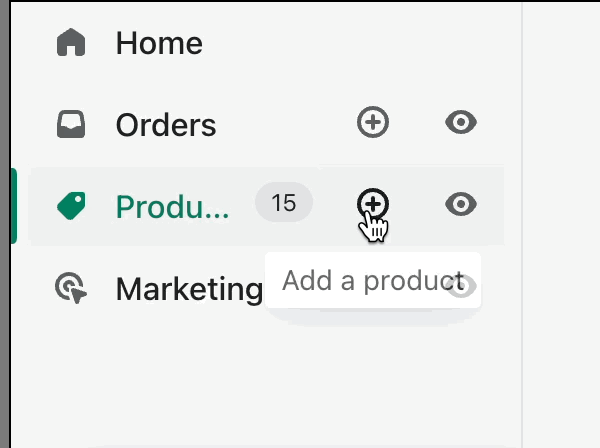
WHY are these changes introduced?
Resolves Shopify/core-workflows/issues/559
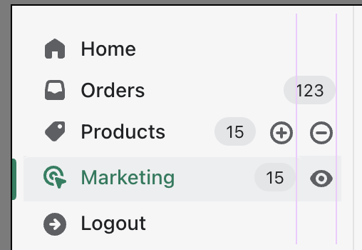
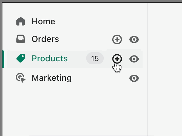
The Navigation item for apps and channels were adapted to allow for a "pin" button. In order to support this natively we should allow for multiple
secondaryActions. Since there is not a lot of space we should start with an initial limit of 2 actions. There is a separate task to allow the secondary actions to "float" above the text along with tighter margins which could allow for additional actions.If there is a desire for more actions they can potentially overflow into a popover in the future but currently there doesn't seem to be a lot of usage.
WHAT is this pull request doing?
This PR deprecates
secondaryActionin favour ofsecondaryActionsso that more than one action is supported. The actions are place in one row after the badge. The actions are capped to 2 for now.The icons have tighter spacing on desktop to provide more room for the label and badge but retains the 40x40px touch size on mobile.
The outcome of these changes should have no impact on the current state and appearance of the admin navigation while it will allow to address some accessibility concerns where app pinning was implemented.
Desktop

Mobile

How to 🎩
🖥 Local development instructions
🗒 General tophatting guidelines
📄 Changelog guidelines
Navigation->With Multiple Secondary Actions...🎩 checklist
README.mdwith documentation changes