Skip to content
New issue

Have a question about this project? Sign up for a free GitHub account to open an issue and contact its maintainers and the community.

By clicking “Sign up for GitHub”, you agree to our terms of service and privacy statement. We’ll occasionally send you account related emails.

Already on GitHub? Sign in to your account

[Enhancement] User Interface. #157

Closed
arnolanglade opened this issue Jun 12, 2013 · 12 comments
Closed

[Enhancement] User Interface. #157

arnolanglade opened this issue Jun 12, 2013 · 12 comments
Labels
Enhancement Minor issues and PRs improving the current solutions (optimizations, typo fixes, etc.). RFC Discussions about potential changes or new features.

Comments

@arnolanglade
Copy link
Contributor

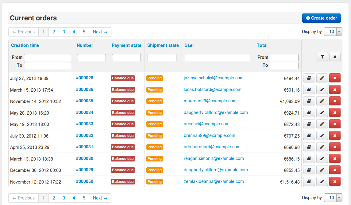
I worked a litlle bit on the Sylius interface, look screen shots below :

Before :
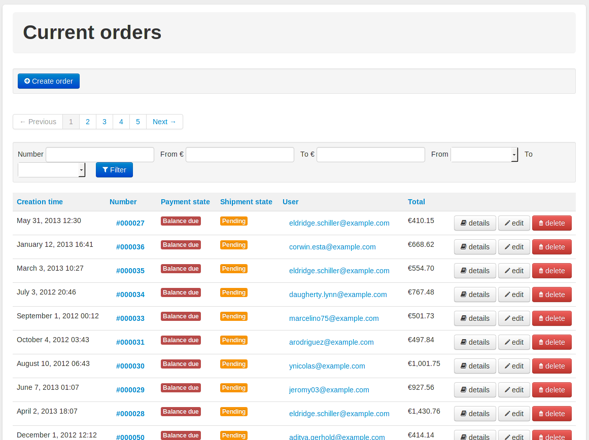
crud-list-init

After :
crud-list-proposal

It is only the list of orders but it can be applied to all crud lists, this interface is more compact... With it :

  • All labels of the button are removed, replaced by tooltips.
  • The filters are displayed like magento, we could add a button to reset filters (button with cross on the screen shot).
  • We could add select to choose the number of line that you want to print

Not on the screen shot :

  • Delete action : we could ask to the user if he really wants to do that with a confirmation popin (like a confirm in javascript but we can do it with boostrap).

I think the menu on the left on the left could be removed because it is the same as the top menu, on the small screen it take space for nothing.

What do you think about that?
Thank

@umpirsky
Copy link
Contributor

Looks cool!

What is "menu on the menu"?

@arnolanglade
Copy link
Contributor Author

The big menu on the left of the page ;)

@umpirsky
Copy link
Contributor

I would add more space below page header and around pagination.

@norberttech
Copy link
Contributor

Looks awesome! The only thing that I dont like in this mock is column header with filters filelds ; /
One column can contain data from many db fields and if it does there are few filters at very small space and grid looks awful.
Filters can be moved above the grid or on the right of it, what do you think? Also possibility to hidde filters panel will be a nice addition :)

@umpirsky
Copy link
Contributor

Just to mention that we must think twice before accepting this since propagating it to all templates is not a small task.

@arnolanglade
Copy link
Contributor Author

@umpirsky : I know, for the moment I just want to speak about it.

I will try to do an other mock up tomorrow. We can put filters above pagination or on the right of the page. If you can add the possibility to hide them because you do not need them all the time!

@umpirsky
Copy link
Contributor

Yes, we can. We will iterate on this for sure.

Thanks for your work @Arn0d!

@umpirsky
Copy link
Contributor

It would be also useful to put old design screenshot above the new one, so people can compare.

@jjanvier
Copy link
Contributor

@Arn0d 👍 for the awesome work

  • it's better for me without all this unused space
  • +1 for the buttons (create..) on the top
  • +1 for removing the text on the rows buttons
  • +1 for the select to choose the number of lines
  • +1 for confirmation popin before deleting a resource

@norzechowicz +1 for the filters on the right side or below the title

@arnolanglade
Copy link
Contributor Author

If we keep the filter above the table, I found two solutions :

  • You have to click on the arrow icon to open filters :
    crud-list-filter-sasa-1
  • You have to click on "open filter" to poepn filters, this solution take less space :
    crud-list-filter-sasa-2

@arnolanglade
Copy link
Contributor Author

Some observations :

  • Sometimes, we can find the column "ID" on the grid, I think we can remove this column. It don't give any information to the user (who is not a developer).
  • On the show/edit page, it miss sometime the button "back"
  • The resource bundle don't manage the limit (the select Display by above), do you think it is a good idea to add the functionality to this bundle ?
  • There are lot of "resource" which have less than 5 fields, perhaps you can show/edit them in a popin?

@pjedrzejewski
Copy link
Member

Closing as quite a lot has changed and if we want some more improvements, we should revisit this.

pamil pushed a commit to pamil/Sylius that referenced this issue Mar 21, 2016
Sign up for free to join this conversation on GitHub. Already have an account? Sign in to comment
Labels
Enhancement Minor issues and PRs improving the current solutions (optimizations, typo fixes, etc.). RFC Discussions about potential changes or new features.
Projects
None yet
Development

No branches or pull requests

5 participants