Added show icon labels option #15830
Conversation
 nicolad
added
[Feature] UI Components
nicolad
added
the
[Priority] High
nicolad
changed the title
nicolad
added
[Feature] UI Components
nicolad
added
the
[Priority] High
nicolad
changed the title
|
@mapk, this is ready for design review:
|

|
Please note that text from labels is reused from |
|
Thank you for working on this. How does this scale to mobile? Are the labels optional or always there? |
Good question, on mobile it doesn't scale well: This needs further refinements since it does make sense to have labels on desktop, but not on mobile, because there isn't enough space for them. But in this case the option to show labels would lead to some confusions since it will be enabled, but user will not see labels on mobile. @mapk any thoughts on how to deal with this issue on mobile from UX perspective? |
|
@jasmussen, I see that you also have design/UX super-powers :) |
|
Curious: there was a bit of a lack of progress on #10524. What makes it suddenly a high priority? Not that I necessarily disagree, just want to understand it better 🙂 |
You are too kind. There are a few options on our table, which include rephrasing the labels to be shorter, and using the smallest font size that's still legible. But in addition to this having to work on mobile and with all translations, in the top right hand area there is the spot where plugins can add additional buttons, and the labels here could be arbitrarily long as a plugin can type in any label they want. In order to solve this problem in a way that acknowledges this extensibility, it's hard to think of a way forward that doesn't involve hiding the labels until the desktop breakpoint, and even then perhaps hides them for extensions, sidebar button, and ellipsis menu. Creative thinking can help here. For example, is there any inspiration we can take from #13688? |
@swissspidy initially I wanted to start working on this issue, but thanks to this comment I needed first do this issue in order to start the other one. From what I understand a11y audit is a high priority project for the GB at the moment, this is why I placed that label. Correct me if I am wrong. |
| display: block; | ||
| &::after { | ||
| display: block; | ||
| content: attr(aria-label); |
There was a problem hiding this comment.
This is an interesting approach. I like it keeps the components relatively clean.
There was a problem hiding this comment.
I'd like to get some A11y feedback on this, as support for content in CSS differs a bit among assistive technologies. We don't wanna end up with a screen reader reading the label out loud twice.
There was a problem hiding this comment.
I found that @afercia already had an opinion on this: #10524 (comment)
Will change the approach to meet a11y requirements.
There was a problem hiding this comment.
@swissspidy thanks Pascal for raising this concern. You're right that some screen readers read out CSS generated content but in this case the whole content of the buttons is overridden by the aria-label so that only the aria-label is announced. To be 100% sure, I tested it also with NVDA and JAWS on Windows Firefox / Chrome.
There was a problem hiding this comment.
Wouldn't it be easier to inline this label inside HTML when showIconLabels prop is set to true? it also feels like injecting showIconLabels prop should be part of the IconButton component which is the one which actually renders those icons.
 mtias
removed
the
[Priority] High
mtias
removed
the
[Priority] High
There was a problem hiding this comment.
Thanks for exploring this as it's been raised so often by the accessibility team in the past. I'm super excited to see progress here. My understanding was that all icon buttons should be able to show the label when necessary. This PR covers only the header region, can you explain what's the reason?
The initial implementation has covered only header region because that's how I perceived the scope of related issue: #10524 |

I discussed it with @afercia at WordCamp EU and he confirmed that expectation from the accessibility standpoint is to have all interactive icons to have visible labels. |
|
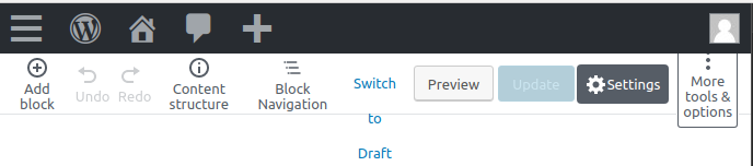
Testing the responsive view, seems to me there's something to address: When labels are not visible, the responsive view displays a reduced set of the toolbar buttons:
E.g. undo / redo disappear, etc. Instead, when the icon labels are visible, looks like all the toolbar buttons are visible:
Ideally, the responsive view shouldn't hide important features so I'd argue the current behavior should be reconsidered. However, there's just not enough space. I guess this should be addressed separately, exploring new ways to make all controls available also in the responsive view. For now, I'm guessing this is not the intended behavior? On a side note, I wouldn't be opposed to review all the names of these buttons. An effort should be made to find shorter, still meaningful, names. Worth considering in some languages these strings are longer than in English. I'd strongly recommend to find a way to inform translators to keep their translations as short as possible. Maybe using translators comments would be a good first step. Screenshots with the admin set to Italian and German (two languages that typically have longer translations):
|


|
To clarify, once the issue mentioned above will be solved, I'm all for merging this improvement! Thanks everyone for working on this 🙂 A few quick things I'd like to recommend:
For the future:
|
|
@ewaccess hey there 👋 This change is going to be implemented soon in the Gutenberg plugin. When you have a chance, would you mind having a look? Any suggestions and feedback for further improvements are very welcome! For example: wondering if a control to toggle the labels visibility that can be activated at any time with a direct voice command e.g. "Click show labels" would be valuable. Still not 100% sure how to implement it, just an idea for now. |
|
It still seems a bit weird to me to see the labels / titles rendered to the right instead of the bottom. @jasmussen what do you think? |
|
For the record, I prefer the labels on the right. I think the style of the buttons in the ellipsis menu needs to be tweaked some more. I think the button text should all be left-aligned. The buttons with centered text look really awkward. |
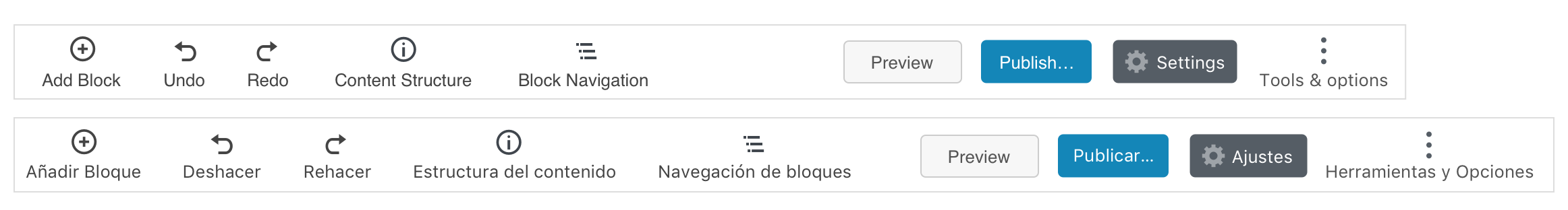
The weirdness gets especially weird in #15830 (comment) when there's a mix of icons and no icons. Here's with small font, that could be better if things like "Content structure" was renamed "Structure", and "Block navigation" into something else, shorter. Or if those two buttons were merged entirely:
Text-only is also an option:
|


|
The text at the bottom definitely seems more what I expect from this feature:
I agree shorter names should be preferred in general, including the tooltip as long as they retain contextual clarity. I think the "i" could be "Content" or "Details" (I know we are still looking at possibly combining). We've discussed using "List View" for the navigator, but "Outline" could also work. I think the "Add block" should be outside the blue square. It might also be fine if it just said "Add"? Just text might be a nice option to offer as well. |

|
I'd expect text at the bottom as well. On other apps, the various translations are clearly crafted to respect a maximum length. See screenshots with examples from the Android UI posted on the issue 14 months ago: #10524 (comment). Quoting from the issue:
|
|
Thank you @nicolad for all your work in this PR! |
Thank you @paaljoachim for the update on this. |
|
In my opinion, it's a mistake to put the FSE controls in the middle of the top bar. Semantically, they don't belong there, and of course they conflict with ideas like this PR. |
|
Hey Zeb. This is something that will need a more through discussion, so that we can work on finding an even better solution. Thanks! |
It's a shame for all this work to go to waste and the problem no closer to being solved. It would make sense to build in the ability to label all icons, and then adjust whatever new designs are needed keeping in mind they have to work with labels. The editor UI changes so frequently that if we sit around waiting for the next change, we'll never get anything done 😅 |
|
@nicolad perhaps we should reopen this PR? Or create a version 2 at a later time and bring what was learned here over to the version 2 PR. As FSE becomes more landed and the top bar is more in place then one also understands a lot more on how to proceed. |
|
Update: I agreed with @nicolad to take on this issue while he deals with other pending work. Going to have a play with this branch and see how we can best go from here. |
|
I've just done #24234 and will be following with more PRs to add the actual labels. Hoping that breaking up the work a bit will help with reviewing and getting this in quicker. |
 nicolad
added
the
[Status] Not Implemented
nicolad
added
the
[Status] Not Implemented
Description
Fixes: #10524
Mockups:
How has this been tested?
Screenshots
Types of changes
Checklist: