If you are old enough to have browsed the web in the 90s or early aughts, you'll remember an old technology called Flash. Flashe used to allow us to do animations within the browser; from making a button wiggle slightly, to full cartoons with audio!
Flash has unfortunately bit the dust. And although we still have Javascript that can help us animate things around on our pages, we can actually make things move and shake using purely CSS.
Using CSS, we essentially can tell an element to transition from one style to another. We can even specify how long this will take, whether or not it will repeat, and a lot more.
This will be the most basic type of CSS animation. Essentially, we will use the transition propery on an element to allow for us to change another property smoothly, over a given time. Consider the following CSS rule:
.button {
    background-color: blue;
    transition: background-color 1s;
}
With just this code, we'll see no transition or animation at all! To make a transition effect, we'll need to supply it will two things:
- The CSS property you want to affect
- The duration (in seconds) of the transition
So now, if for any reason that background-property changes, it will slowly change over the course of 1 second. Let's go ahead and add a hover pseudo-class to our button:
.button:hover {
    background-color: red;
}
Nice! Our first CSS animation! But a transition from red to blue isn't that great. Let's assume we have a nav bar, full of many menu items. We can apply a cool looking hover effect by using transition on the height and width of the element.
.menu-item {
    border: 1px solid black;
    width: 200px;
    height: 50px;
    margin: 2px;
    transition: width 0.1s, height 0.1s;
}

.menu-item:hover {
    width: 222px;
    height: 22px;
}
We can also use transition to effect the css transform property:
.spinning-div {
    width: 100px;
    height: 100px;
    background-color: green;
    transition: transform 5s;
}

.spinning-div:hover {
    transform: rotate(360deg);
}
For more info on the
transitionproperty, have a look at the W3Schools Transitions
This is the bread and butter of CSS animations (obviously). The animation property lets us change an elements style over the course of a stretch of time. We can effect numerous style properties within one animation, and are free to control the speed, direction, pace, and duration of the animation, all from one rule!
In order to properly define an animation rule, we need to actually define the animation. This is done using something called @keyframes. Let's start with the most basic of keyframes:
@keyframes basic {
    from {background-color: yellow;}
    to {background-color: red;}
}
In this animation, we start by giving it a name, basic. This is how it will be called by an elements animation property. We've also given it a from and a to, which will essentially tell the element where to start, and where to finish. To actually get this animation working, we need to apply it to an element.
.color-change {
    animation: basic;
    animation-duration: 5s;
    animation-iteration-count: infinite;
}
In the above rule, we've passed in the name of our animation, basic, told it to animate for 5 seconds, but to loop over the animation an infinite amount of times. The only issue is, at the end of the 5 seconds, the element will "snap" back to it's original color. There's a couple ways we could get around that. First, and most simple, is by changing the animation-direction. We can pass in different things in here:
normal(default)reversealternate- First played forwards, then backwardsalternate-reverse- First played backwards, then forwards
If we give it an animation-direction of alternate, it will essentially transition from one color back to the initial, and repeat.
We can also effect the speed curve of the animation with the animation-timing-function property. The default animation speed is ease, which will start slow, speed up, and then end slowly. We can also use:
linear- Same speed from start to finishease-in- Starts slowease-out- Ends slowease-in-out- Starts slow, and ends slowcubic-bezier(n, n, n, n)- Lets you define your own values
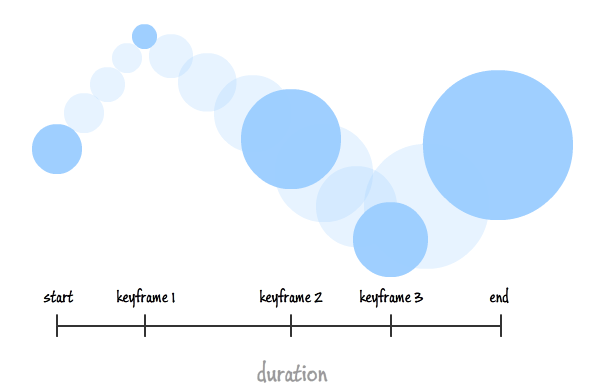
Time to do some more advanced keyframes. We can actually specify points through the cycle of the animation that we want to hit with percentages! Let's say we want a ball to bounce around a square. Let's go ahead and write some css for that:
/* Our Elements: */
.ball-container {
    border: 1px solid black;
    width: 250px;
    height: 250px;
}

.ball {
    width: 25px;
    height: 25px;
    border-radius: 50%;
    background-color: blueviolet;
    /* The animation bits: */
    animation: bounce;
    animation-duration: 1s;
    animation-timing-function: ease-in-out;
    animation-iteration-count: infinite;
}

/* Our Keyframes: */

@keyframes bounce {
    0% {
        margin: 0 113px;
    }
    25% {
        margin: 113px 225px;
    }
    50% {
        margin: 225px 113px;
    }
    75% {
        margin: 113px 0;
    }
    100% {
        margin: 0 113px;
    }
}
With everything applied, we should see our happy little ball bouncing around our div.
