I gave the file browser the same look as the Finder and iTunes sidebar. #53
Conversation
…(blue/grey). This is easier on the eyes when using a dark theme and is arguably more consistent with the rest of the OS.
|
While I get your point regarding it being easier on the eyes when using a dark theme, this is actually not more consistent with the rest of the OS, see #22. For example, you can’t compare the file drawer to the Finder’s sidebar, because the Finder’s sidebar doesn't allow you to drill down in the file hierarchy. The part of a Finder window that actually does allow you to drill down has the traditional style (white background). Maybe a different background color might be enough? I dunno, I’m still on the fence of coloring it differently than ‘standard’… |
|
I'm with tobia on this one. The white bg next to the black is pretty hard. A lot of of the newer Text Editors are using the blue sidebar for the file browser and I think it easier on the eyes. Would it be too much to have this in the preferences ? |
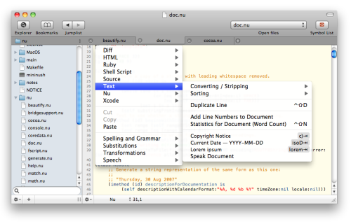
Can you post some screenshots of these Text Editors? |
|
I know both Vico and Sublime Text use source lists, but that doesn't change the fact that they are in violation of the HIG. A file browser is simply not a source list. I’m open to adding an option to set colors that work with a dark theme, but it can't be the ones used by a source list. Please try some other combinations and let us know which works good for most dark themes. |
|
Apple's own Preview app uses a source list to show the document outline (pdf bookmarks) which can be many levels deep. Selecting an element in MacVim's file browser changes the scope, or "source" of the main editing panel, just as selecting something in the Finder or Mail sidebar sets the scope for the main panel. So it would seem to me this application of a file browser does fit the purpose of a source list. Plus, one usually changes VIM's working directory to the root of the current project, and uses wildignore wisely, so that the file browser becomes a source list of the current project, not a generic file browser for the entire computer. That's how I use it anyway. |
|
I have never seen many levels of nesting in Preview in the same way as occurs in a file browser, can you show me? Btw, the current location of this topic in the HIG:
Anyways, like I said, I’m open to suggestions for colors that could work, but not the source list style. |
|
Here is a preview from Vico http://cl.ly/3P0v2O2D0h1O0O1N1U3Q showing for levels there. (BTW, Vico is in the appstore, for at least 2 or 3 versions now, so it's passed through the Apple All Seeing Eye a few times) You could make an argument is is the primary nav for the whole app since the app is editing documents and this is how you can go about finding and opening files to edit. I prefer the blue over the white, especially with the dark background. |
This is easier on the eyes when using a dark theme and is arguably more consistent with the rest of the OS.