Interruption card #27
Comments
 govuk-design-system
created this issue from a note
in GOV.UK Design System Community Backlog
(Agreed)
govuk-design-system
created this issue from a note
in GOV.UK Design System Community Backlog
(Agreed)
|
We first introduced this pattern on Verify: This post includes the iteration of the design that was in the A/B test. We then iterated to the simpler white on blue design, with fewer images. |
|
Guidance looks good, I think I'd make more of the 'unusual' aspect. So maybe move
to the first section 'When to use' Or something like 'Start with normally styled content. If you find users are not taking in important or unexpected content, try changing the content, then try this pattern.' but maybe worded better |
|
@joelanman If I keep the bit in to warn people not to overuse the pattern and add this to the 'when to use' -
|
|
In order to provide reusable coded examples for this pattern we'll need to first do the following:
|
|
@timpaul We don't recommend using form elements in interruption cards but we could be wrong on that. Buttons and lists etc... for sure though. |
|
Verify uses radio buttons:
But I think an MVP approach might be good? We might not need radio buttons for an MVP. |

|
I think we recommended it for fear that people would start adding entire forms into them. MVP approach sounds good. |
|
We ran a quick naming session in our last X-Gov Design Meetup, using this pattern. Here is the full list of results. Common words to come out of the session were:
|
|
@timpaul I see 'page' was popular as well. I quite like 'focus page', 'attention page' and 'interruption page'. |
|
'page' sounds good to me - I don't think this would work with other content outside the blue |
|
We're testing this in our 'File your CIC report and accounts' service. Users are tending to skim read 'standard' pages that don't require any form of input - that is, any pages where the only thing they can do is read a bit of content and then click a green button to proceed. Presenting the information this way means users are taking the time to stop and read it.
|

|
Good to know @jfranciswebdesign - thanks for sharing |
|
I'm considering using this as a one-time guide for new users of my service (internal casework users). There's three key bits of information we'd like them to know, and I'm thinking of walking them through it with this style when they first sign in. Thereafter they get a dashboardy type page for the service. |
|
We're using this on our service. We've got 3 cards at the beginning of the service that give key info to users that we moved off the start page where it was consistently missed. Most users will now stop and read this during usability test. We've had comments on how useful it is, and that if they already knew it they'd just happily skip through.
|
|
We tested a 4 card intro shown after first login. I'd say it generally helped with comprehension. They seemed to absorb the headings, the body copy less so. I found they clicked through the first page rather quickly - so we may keep the first page as a 'hello and welcome to x' type thing, and make sure the key bits of info are on later pages. |
|
Just to re-open this one and show another use. We've recently included this in MOT and added to our Design System at the DVSA: We decided on naming it 'interrupt panel', mostly due to its context for our service: interrupting the users' habitual flow of adding vehicle defects where they might miss important information about the defect (leading to incorrect defects being added to a vehicle). We started calling it a 'speed bump' ;) So for us, the only elements we use inside are a heading, paragraph text and a button. Agreed it is worth specifying among ourselves the most common elements for this pattern and including them in the same CSS partial when used inside a parent class ;) |

|
I rewrote our sass for this over Christmas - using much of what the design system has, and adding stuff for some other elements we used. Can be found here. |
|
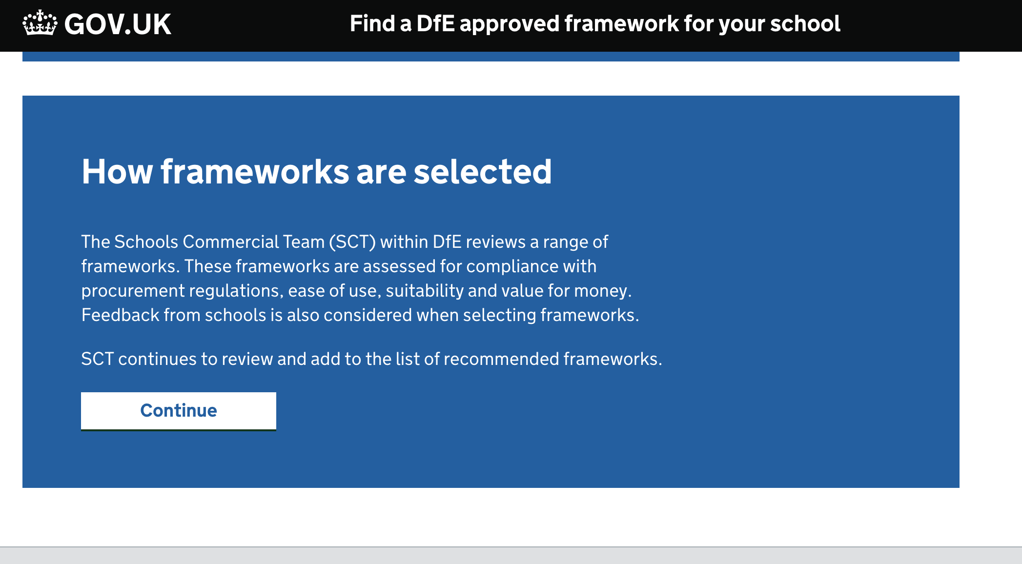
We are looking at implementing an interrupt card on the Claim service over at DfE. The idea is to show this interrupt card if you have already started a claim to get back your student loan repayments and then partway through you decide to start a claim to get a payment for teaching maths of physics. We felt that having a button then text link for the second option could be biasing the user to do what we think they should do, rather than what they want to do. If they chose to start a new claim, we will then be deleting the claim in progress so we needed a button rather than a link. Also if possible I'd like to avoid styling buttons like links. So radios felt like the correct decision, the only part I want to improve further is the text on the submit button. We some different options and ended up with submit. It's also worth noting we had a slightly darker blue background to make the white text a bit easier to read. If anyone is interested you can find the HTML here and the SCSS here.
|

Hi. Did you end up implementing this? If so, how did you display the error message if the user tries to continue without selecting a radio button? Not sure how the GDS error message pattern would work within an interruption card. |
|
Yeah we did implement the screenshot I popped on earlier. It was a while
ago and I no longer have access to the repo but I believe that if no option
was selected we used a modified GDS error state. With the border to the
left of the question group and a message telling them to pick an option.
When the claim window opens again you would be able to start claims for
both and test them. Or you might be able to pickup with someone at DfE
Manchester on the claims team to see if you can get access to the repo and
error messages.
…On Mon, Mar 8, 2021 at 4:09 PM jim-laney ***@***.***> wrote:
We are looking at implementing an interrupt card on the Claim service over
at DfE. The idea is to show this interrupt card if you have already started
a claim to get back your student loan repayments and then partway through
you decide to start a claim to get a payment for teaching maths of physics.
We felt that having a button then text link for the second option could be
biasing the user to do what we think they should do, rather than what they
want to do. If they chose to start a new claim, we will then be deleting
the claim in progress so we needed a button rather than a link. Also if
possible I'd like to avoid styling buttons like links.
So radios felt like the correct decision, the only part I want to improve
further is the text on the submit button. We some different options and
ended up with submit.
It's also worth noting we had a slightly darker blue background to make
the white text a bit easier to read.
If anyone is interested you can find the HTML here
<https://github.com/DFE-Digital/dfe-teachers-payment-service/blob/master/app/views/claims/existing_session.html.erb>
and the SCSS here
<https://github.com/DFE-Digital/dfe-teachers-payment-service/blob/master/app/assets/stylesheets/components/panel.scss>
.
[image: image]
<https://user-images.githubusercontent.com/13239597/74343449-fba29b80-4da2-11ea-813f-eacfbfe60325.png>
Hi. Did you end up implementing this? If so, how did you display the error
message if the user tries to continue without selecting a radio button?
Not sure how the GDS error message pattern
<https://design-system.service.gov.uk/components/error-message/> would
work within an interruption card.
—
You are receiving this because you commented.
Reply to this email directly, view it on GitHub
<#27 (comment)>,
or unsubscribe
<https://github.com/notifications/unsubscribe-auth/ADFAKLNV633ZK42QZOD33XTTCTZFNANCNFSM4ELRF7BQ>
.
|
|
Hi, apologies if this is dealt with elsewhere…. We are hoping to use an Interrupt card to help users with Service changes … the card is fine - my question is around the link states.
Thanks for any help .. G.
|


|
@Graeme-Laurenson The GOV.UK Design System contains styling for links on dark backgrounds, hopefully you can use these for your use case: https://design-system.service.gov.uk/styles/typography/#links-on-dark-backgrounds |
|
@hannalaakso thanks ... what is missing, is a 'hover & visited' state .. |

|
@Graeme-Laurenson Thank you for flagging this 👍 Our designers have created an issue to look at this: alphagov/govuk-design-system#1859 Feel free to add any additional thoughts to that issue and to subscribe to the issue to get updates about it. |
|
@Graeme-Laurenson have you also been able to update to the new link styles which improve the visibility of hover states on all links including the inverse options. We're currently looking into visited states and will add our updates to the issue Hanna mentioned. |
...idea for 'gate pages' based on alphagov/govuk-design-system-backlog#27
|
Some of the examples above use text at full width. Far too long for good readability of body text or even lead paragraph. |
|
Hi all, We are implementing the Interruption card approach on our dashboard for a new online digital account. In this example, we are providing information to the user that their account / profile is 'incomplete' and they won't be able to take full advantage of all online portal activities until they complete some further steps. The design & layout of the interruption card worked for us in this context as a way of clearly articulating something important, without blocking the user from proceeding with other online account activity.
We have also explored using the interruption card to inform users that they don't have permission to use some online transactions yet. By using the interruption card in this context, it should create more of a hard stop for our users and some copy to support how they can proceed.
Feedback from research so far has been mixed, with a lot of positives, but also some key challenging themes highlighted below:
We would love to know if anyone has used the pattern in a similar way or has had any additional feedback from implementing the design Thanks! |


|
Here’s an example from Emergency Alerts, and plenty more in these pull requests:
|

What
An alert that interrupts the user flow with important information and must be acknowledged before continuing.
Why
Anything else
Draft guidance here below:
When to use this pattern:
When not to use this pattern:
How to use this pattern:
Include a clear heading and use large body text at a minimum size of 24px.
Try to reduce the content down to the minimum amount the user needs. If the user needs to do more than one thing, use extra cards.
Anything else
Teams have found interrupting users’ flow with this pattern has increased understanding and retention of important information.
Evidence that the contrast levels of interruption cards help dyslexic users.
The text was updated successfully, but these errors were encountered: