fix(select): options panel theme supports dark mode #11198
Conversation
 Splaktar
added
ui: theme
pr: merge ready
Splaktar
added
ui: theme
pr: merge ready
 googlebot
added
the
cla: yes
googlebot
added
the
cla: yes
 Splaktar
added
the
needs: team discussion
Splaktar
added
the
needs: team discussion
|
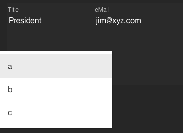
same problem as here: #11203 before: after: Please ensure that the light mode colors don't change. also darker hover background color in dark theme looks weird:
Also official material stylguide seems to recomend lighter hover selection: https://material.io/guidelines/components/buttons.html#buttons-toggle-buttons |


|
i think that for hover: in light mode its almost look the same as master build. |
Splaktar
added
in progress
Splaktar
force-pushed
the
fixSelectPopupTheme
branch
from
2333deb to
9c19496
Compare
Splaktar
added
pr: merge ready
|
@rudzikdawid thank you for looking into that! I did some further testing and settled on |
|
With |
|
Strange, it may be a monitor or OS difference then. I see the opposite where |
|
Using ColorZilla give me |
|
weird, on my fedora 27, chrome 65, firefox 59 master build: https://material.angularjs.org/latest/demo/select devtools on hover changes with i use converter rgba to rgb result of convert: master build: results of difference between at this moment the differences are really small, cosmetic :) |

|
0.18 I think we should use it. |
|
Looks good. |
 Splaktar
force-pushed
the
fixSelectPopupTheme
branch
from
Splaktar
force-pushed
the
fixSelectPopupTheme
branch
from
9c19496 to
1400bc4
Compare
PR Checklist
Please check that your PR fulfills the following requirements:
PR Type
What kind of change does this PR introduce?
What is the current behavior?
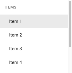
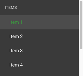
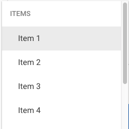
The select's option panel is always using light mode hues even when the theme is dark mode.
Issue Number:
Fixes #3379.
What is the new behavior?
The select's option panel use dark mode hues when the theme is set to dark mode.
Does this PR introduce a breaking change?
Other information
I'm going to try and presubmit this for 1.1.9, but I understand that this might trigger some screenshot failures in Google apps. If that happens, we'll need to evaluate pushing this to 1.2.0.
Dark Before:
Dark After with Item 1 selected:
Light Before:
Light After: