fix(switch): theming issues with focus in dark theme #11417
Conversation
 googlebot
added
the
cla: yes
googlebot
added
the
cla: yes
| background-color: '{{background-500}}'; | ||
| } | ||
|
|
||
| &.md-focused:not([disabled]) { |
There was a problem hiding this comment.
Based on https://material.io/archive/guidelines/components/selection-controls.html#selection-controls-switch, it seems like the thumb needs to be displayed when focused and disabled. This can't be done with tabbing, but it is possible to focus a disabled switch when using a screen reader or other assistive device.
We should probably remove this disabled check.
There was a problem hiding this comment.
I did some more testing and the following seemed to work best for me:
  &.md-focused {
    &:not(.md-checked) {
      .md-thumb:before {
        background-color: '{{foreground-4}}';
      }
    }
    &[disabled] {
      .md-thumb:before {
        background-color: '{{foreground-4}}';
      }
    }
}| } | ||
| } | ||
|
|
||
| &.md-checked { |
There was a problem hiding this comment.
We need to add :not([disabled]) to this rule so that disabled, focused switches don't get colored.
| .md-thumb:before { | ||
| left: -8px; | ||
| top: -8px; | ||
| right: -8px; |
There was a problem hiding this comment.
We need to remove :not([disabled]) from this rule as well so that the circle has a proper size when disabled switches are focused.
 Splaktar
added
the
in progress
Splaktar
added
type: bug
ui: theme
P4: minor
Splaktar
added
the
in progress
Splaktar
added
type: bug
ui: theme
P4: minor
|
@rudzikdawid I'd like to get this into the 1.1.11 release that is coming out soon. Can you please look at the PR review feedback and let me know if you can address it this week? |
|
@rudzikdawid I'm sure that you are busy, so I made the changes and opened PR #11459 with both your changes and the ones I suggested above. Can you please post in that PR that you approve the use of your commit so that the caretakers will be able to mark the |
Splaktar
removed
the
in progress
Closes #8518
PR Checklist
Please check that your PR fulfills the following requirements:
PR Type
What kind of change does this PR introduce?
What is the current behavior?
after focus on
switchcomponent using keyboard we can see darkripple inkon dark themelight theme before:
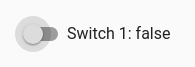
dark theme before:
Issue Number: #8518
What is the new behavior?
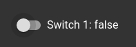
after focus on
switchcomponent using keyboard we can see brightripple inkon dark themelight theme after:

dark theme after:

Does this PR introduce a breaking change?
Other information