An autocomplete component for Om.
-
Bootstrap (source) demonstrates basic usage of the built-in Twitter Bootstrap components. The suggestions recommended are just variants of the input text.
-
Movies (source) uses a remote webservice to fetch suggestions. The service is down, so this demo doesn't currently work. Will update when I can replace it with another one.
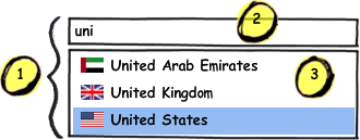
Here's a mockup of a basic autocompleter:
The arosequist.om-autocomplete namespace contains a single function, autocomplete, which is an Om component that handles the core autocomplete logic, but does not directly render any DOM elements. Instead, you give it three main components:
- The container view just holds the other two components. Typically, this will render a simple wrapper div.
- The input view is responsible for taking user input.
- The results view displays the suggestions that were generated based on the input.
Some important terms are:
- The input has focus that is either true or false, normally corresponding to the normal HTML focus. You'll often want to hide the results when the input loses focus.
- The input also has a value ("uni" in the example). When this changes, the list of suggestions will be refreshed.
- A suggestion can be anything. Your results view just needs to know how to display it. In the example, each suggestion contains the flag and country name.
- The highlighted suggestion is usually changed by hovering the mouse or pressing the up/down arrow keys. Here, "United States" is the highlighted suggestion.
- A suggestion can be selected, typically by clicking the mouse or pressing enter. This usually signals the end of the autocomplete workflow.
The options for autocomplete are (as keywords):
- result-ch: a channel that will receive an item once it's been selected.
- suggestions-fn: a function that calculates the suggestions for a given input. It takes three arguments: the input value, a channel to place the suggestions (as a single seq), and a channel that, when closed, indicates that the input changed and you should cancel fetching suggestions (when applicable).
- container-view: an Om component that will hold
input-componentandresults-component. - container-opts: any options that should be passed to the
container-view. - input-view: an Om component that will be responsible for taking user input. The state it receives will contain:
- focus-ch: a channel that you should put
trueon whenever the input receives focus, andfalsewhen the input loses focus. - value-ch: a channel that you should put the user-supplied value onto when it changes.
- highlight-ch: a channel that you should put the index of the highlighted item onto when it changes.
- select-ch: a channel that you should put the index of an item onto when it's selected.
- value: the current user-entered value.
- highlighted-index: the index of the suggestion that's currently highlighted.
- input-view-opts: any options that should be passed to the
input-view. - results-view: an Om component that will be responsible for displaying autocompleted results. The state it receives will contain:
- highlight-ch: a channel that you should put the index of an item onto when it's highlighted.
- select-ch: a channel that you should put the index of an item onto when it's selected.
- value: the current user-entered value.
- loading?: a boolean that indicates if the suggestions are currently being loaded.
- focused?: a boolean that indicates if the input is currently focused.
- suggestions: the suggestions, as provided by the
suggestions-fn. - highlighted-index: the index of the suggestion that's currently highlighted.
- results-view-opts: any options that should be passed to the
results-view.
om-autocomplete contains some convenience functions for pages that are using Twitter Boostrap. They are located in the arosequist.om-autocomplete.bootstrap namespace. TODO: More documentation here
Much of the code in this namespace isn't Bootstrap-specific, and I expect to create other helper namespaces for common use cases.
