Create displays
Eru displays are the main component for displaying graphical interfaces in Eru. You can create a display and add different components to it to build your HMI. The integration of JavaFX Scene Builder with Eru provides optimal development workflow.
- From the Eru project tree, select Display, click on the table, and then choose Add when right .
- In the new row of the Display table select the created display and right click it to open the context menu of the display. Selec Edit Graphic.
- When you select Edit, Eru automatically open an embedded Scene Builder and a window appears on top of the display table.
This guide introduces you to the JavaFX Scene Builder user interface (UI). JavaFX Scene Builder (Scene Builder) is a design tool for the JavaFX platform. You drag and drop UI components to a Content panel, and the FXML code for the layout that you are creating is automatically generated in the background. FXML is an XML-based declarative markup language for defining the user interface in a JavaFX application. To learn more about FXML, read Getting Started with FXML.
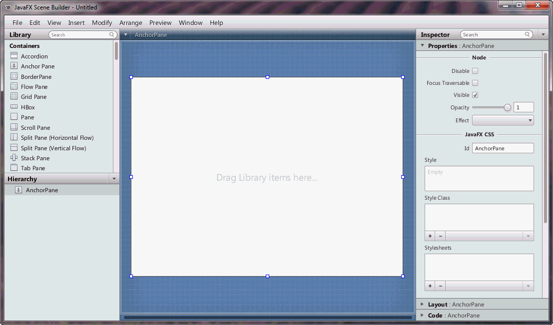
The initial window that you see is the main window, as shown in the next picture. It displays an untitled FXML file that contains the root AnchorPane element.
An element is a principal visual object that you can add to the Content panel and manipulate when editing an application's UI layout in JavaFX Scene Builder. An element can be dragged onto the Content panel from the Library panel of predefined UI elements. You can group elements by selecting multiple elements in the Content panel or the Hierarchy panel, and selecting Arrange and then the Wrap In command from the Menu bar to select the specific JavaFX container that you want to use.
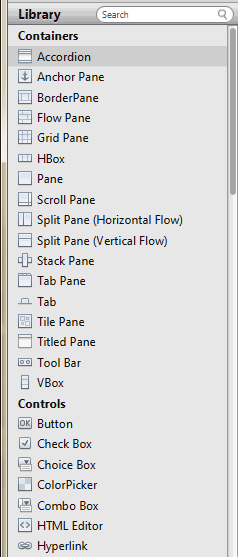
The Library panel, shown in the next figure, is located on the left side of the Main window. You can hide the Library panel by selecting View from the Main menu and then selecting Hide Library or Hide Left Side Panel to hide it along with the Hierarchy panel. The Library panel includes the list of Containers, Controls, Popup Controls, Menu Content, Shapes, and Charts elements that are available in JavaFX Scene Builder. These UI elements are the same UI elements that are delivered with the JavaFX platform.
As mentioned earlier, when you open a new FXML layout in Scene Builder, it contains an AnchorPane as the default root container. You can use other root containers as well. You can add onto that root container as many containers or UI elements as needed for your FXML layout.
To add one of the UI elements from the Library panel, you select an item from the list on the panel and drag it onto the Content panel. You can also press the Enter key or double-click a selected item in the Library panel to add it to the Content panel. Either of these actions is equivalent to choosing the Insert command from the Menu bar, or choosing Modify and then Add command if the highlighted element in the Library is a Popup Control.
Use the Search field, located at the top right corner of the panel, to filter the list of elements available in the Library. For example, typing button in the Search field displays all the button type elements.
There are a set of additional components in the library of the embedded Scene Builder. These components are used to create the industrial interface: Gauges, displays, alarms, leds, and more, will help you to build a custom interface using state of art graphics.
This is the base of any SCADA: Link graphics to values read from devices. You can easily achieve this using the field Tag Current Value Name. You can set a tag name here to listen changes on the tag and update this component subsequently.
The Content panel is the rectangular area that occupies the center of the JavaFX Scene Builder window. It is your design canvas, and it contains a view of what you are designing.
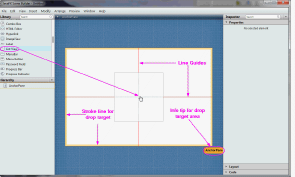
The Content panel enables you to directly manipulate the graphical elements used in your FXML layout. One of the ways to add a UI element to the Content panel is to drag the chosen UI control from the Library panel and place them in a chosen location on the Content panel. As you drag an object onto the Content panel, the golden stroke lines appears around the drop target area, as shown in the next picture. An info tip is also displayed at the bottom right corner to identify the drop target area. Guidelines help you align the component being dropped in relation to other UI elements that are already present in your FXML layout:
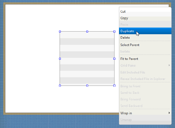
The selected elements have special handles that enable you to scale or resize the elements. You move the selected element by using your keyboard's arrow keys or by using the mouse to drag it to a different location. Right-clicking anywhere in the Content panel displays a contextual menu of commands that can be used on the currently selected element, as shown in Figure: