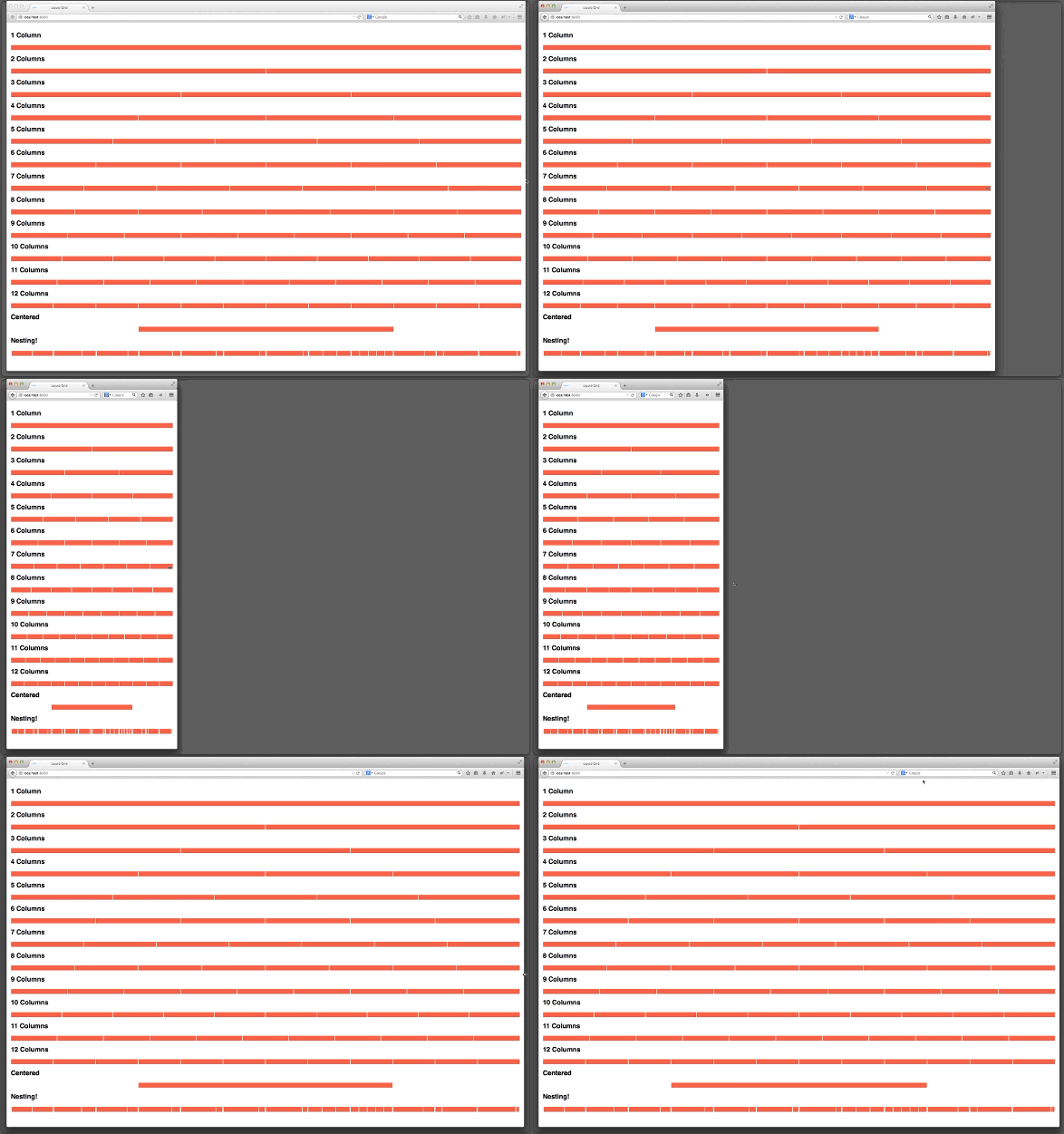
The Fliquid Grid system was to designed fill the viewport and to flex evenly with it. Rather than definining random breakpoints or set widths, Fliquid Grid aims get rid of the entire idea of fixed layouts. Fliquid Grid might is an alternative to Liquid Grid that utilizes Flexbox
Fliquid Grid is a side project of Atom Groom. I will to the best of my ability work to fix bugs and support requests. As an open-source project you are highly encouraged to contribute to the project. I wrote a blog article about this vision. Please read it to ensure your contributions and requests are inline with the goals of this project.
The Fliquid Grid highlights:
- Uses LESS
- Flexbox based layout.
- Semantic mixins - you decide the column ratios
- Nestable
- You control breakpoints
- Check out a live demo here.
- Clone or download Fliquid Grid LESS files locally
- Setup LESS Build (your choice on how you do this - Grunt, Gulp, CDN JS, etc.)
- Include the compiled LESS or CSS in your project's < head >
- Start coding!
In the first value we define amount of columns in a row. In the second value we define the total amount of colums in the row. In this case, 1 / 2 = flex-basis: 50%
.class-name {
	.grid-column(1,2);
}
	<div class="row">
		<section class="class-name"></section>
	</div>
Use a media query as mixin with the variables that I have setup to create your own unique set of breakpoints, per element. You can adjust the variables that I setup in the variables.less file. The ".grid-fill" mixin used to set flex grow and flex shrink to zero, thus setting the element to display like a block level element.
.class-name {
	.grid-column(1,2);
    @media(max-width:@breakpoint-xs){
      .grid-column(1,1);
      .grid-fill;
    }
}
By placing the class name "reverse" with a "row class" you can reverse the order of the columns within that element.
	<section class="row reverse">
	</section>
I have worked with a lot of different grid systems and one thing that I did not like is padding implementations. I discovered that I could easily make a mixin with variables and then add that semantically to each class as needed.
I found that any particular site or app that I was working on had similar uses of padding throughout project. Therefore, rather than repeating myself I could implement a set of variables with a mixin. This then speeds my work flow and the overall consistency of spacing.
.class-name {
	.grid-column(1,2);
	.b-padding--horz(@grid-max-value,@grid-max-value); // left,right
	.b-padding--vert(@grid-min-value,@grid-min-value); // top, bottom
}
Add the mixin as displayed below. I use the display: table and table cell technique to achieve vertical centering.
.class-name {
	.vertical-align;
}
Add the mixin as displayed below.
.class-name {
	.col--centered;
}
By placing an image within any of your markup that uses a grid mixin the image will automatically fill and flex with the width of the column.
	<section class="class-name">
		<img src="http://placehold.it/350x150" />
	</section>
To insert a flexible video into a column, place a containing DIV around the embeded iframe with the class "video-container".
	<section class="class-name">
      <div class="video-container">
          <iframe src="" frameborder="0" allowfullscreen></iframe>
      </div>
    </section>
To insert a flexible Google Map into a column, place a containing DIV around the embeded iframe with the class "google-maps".
	<section class="class-name">
      <div class="google-maps">
          <iframe src="" frameborder="0" allowfullscreen></iframe>
      </div>
    </section>
Check out a live demo here.
This project is maintained by Atom Groom
Copyright 2014 Atom Groom.
Licensed under the MIT License: http://opensource.org/licenses/MIT

