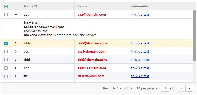
This is a table library ffor vue, you can use it in vue project and via script tag directly.
- General info
- Screenshots
- Setup
- Available props and functions
- Features
- Status
- Inspiration
- Contact
- Licence
The table is follow boostrap style, but all of the dependencies has been resolved in this components, you do not need to install any other library anymore.
npm install vue-my-table Or use script tag directly
<script src="vue.js"> </script>
<script src="vueMytable.umd.js"></script>
<link rel="stylesheet" type="text/css" href="vueMyTable.css">
Object for param
| Props/methods | Type | Default | Description |
|---|---|---|---|
| columns | Array | Column of the table, please refer to this table | |
| sortColumn | String | - | Default sort column name |
| sortOrder | String | - | Default sort type 'asc' or 'desc' |
| height | Int | - | If set height to the table, the header will be fixed and scrollbar will be shown in body of the table. |
| detailRowComponentName | String | - | component for the expand detail row |
| Striped | Boolean | false | Striped table makes it easier to distinguish different rows, false by default |
| mode | String | local |
'local' for use local data for table 'server' for get data from backend server |
| url | String | - | The url to get data from backend server for the table, only used in server mode |
| parameters for backend server | String | only used for server mode |
'rows' - how many records shows per page 'page' - current page number 'sidx' - sort by which column 'sord' - sort by which order asc or desc |
| response for backend server | Object | only used for server mode | ``` { rows:[{object},{object}], total:20 } ``` |
Object for columns
| Name | Type | Default | Description |
|---|---|---|---|
| index | String | - | index name for the tr in table, it should be a key in json data, such as 'id' |
| isCheckbox | Boolean | false | Show checkbox in the column, if it is set to true, there is no need to set value for the other parameters |
| isDetailRow | Boolean | - | Show expand icon in the column, if it is set to true, there is no need to set value for the other parameters |
| label | String | - | header of the column |
| sortable | Boolean | false | Support sort for this column |
| width | Int | - | width for this column, it is percent, not PX |
| callback | function | - | if set callback for this column, the content of this column will be return value of the callback function, and the html tag will be render in the return value, so to prevent XSS injection, make sure the html tags such as '<' and '>' have been escaped before return. |
| component_name | String | - | If callback can not match your requirement, you can pass a component to the column and do anything you want in this component |
For examples please refer to github
Support sort Support fix table header and scrollbar in table body Support expand detail row with component Support custom sort column Support local and server data mode Support I18
To-do list:
- to much
Init version
Feel free to contact me here github
MIT
