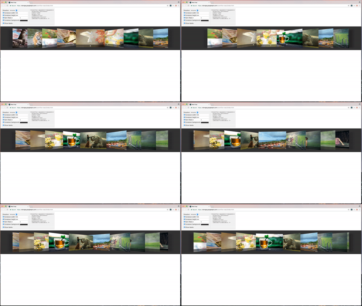
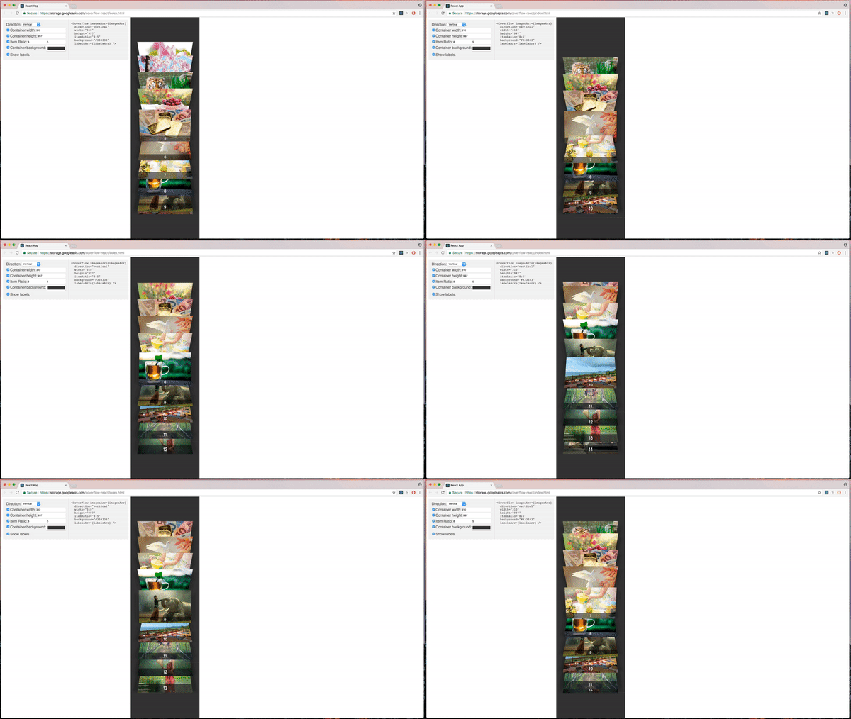
fork of https://github.com/leon-good-life/coverflow-react.
npm install --save coverflow-reacthttps://storage.googleapis.com/coverflow-react/index.html
There is a coverflow-react-demo repository on GitHub, that demonstrates features of this widget.
- Add coverflow-react package to your project using npm.
npm install --save coverflow-react- import CoverFlow
import CoverFlow from 'coverflow-react';- Create an array of path/URLs to the images.
const imagesArr = [
  'img/1.jpg',
  'img/2.jpg',
  'img/3.jpg',
  'img/4.jpg',
  'img/5.jpg',
];
(If you are using create-react-app, you can put the images in 'public' directory).
- Add CoverFlow Component to your project and pass images array.
<CoverFlow imagesArr={imagesArr} />- zIndex - by default it is 100. If there are conflicts with z-index in your project. You can pass zIndex you want.
- height - the height of coverflow container in pixels. The default is 300. The height of coverflow item is calculated automatically. It is 60px less than the height of the container.
- emptyMessage - a message the user see when there are no items. The default message is 'No items to show.'. This property allows to customize this message. It is particularly useful for internationalization and localization, by allowing coverflow to adapt to different languages.
- itemRatio - aspect ratio of coverflow items. The default is '8:5'.
- background - a css background property. The default is 'lightgray'. You can assign any valid css background.
- border - a css border property. The default is 'none'. You can assign any valid css border.
- boxShadow - a css box-shadow property. The default is 'none'. You can assign any valid css box-shadow.
- handleSelect - you can pass a callback function. The function has an index parameter.
<CoverFlow
  handleSelect={(index) => {
    alert(index);
  }}
  imagesArr={imagesArr}
/>- labelsArr - allows to add text labels at the bottom of the images, the array must be the same size of imagesArr.
- direction - the default is "horizontal", if passing "vertical", the CoverFlow will transform to vertical.
- defaultSelectedItem - select an image by index, default is middle image.
- Support for large amount of images, by rendering only some of them at a time, and with easy navigation and smooth animation, the user can see all the images.
- Vertical CoverFlow (In addition to Horizontal CoverFlow).
- Swipe support on touch devices (smartphones, tablets).
- Keyboard 'left' and 'right' keys support.
- Scroll support (mouse and trackpad).
Opening issues and code contributions are welcomed. See contributing guide.
Uncopyrited images from Pixabay and Pexels.


