
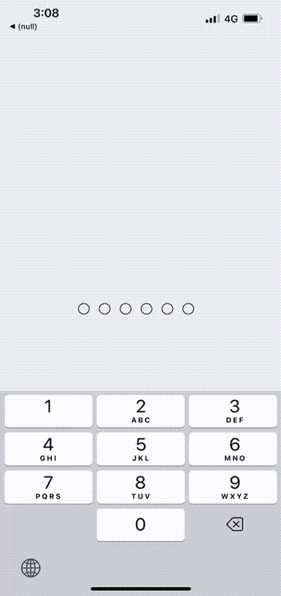
`PinInput` is a customizable React Native component for entering PIN codes.
You can install the @coder-shubh/react-native-pincode package using npm or yarn:
# with npm
npm i @coder-shubh/react-native-pincode

# with yarn
yarn add @coder-shubh/react-native-pincodeimport React, { useState } from "react";
import PinInput from "@coder-shubh/react-native-pincode";
import { SafeAreaView, StyleSheet } from "react-native";
export default function App() {
const [pin, setPin] = useState("");
const [isFirstPinSetupComplete, setIsFirstPinSetupComplete] = useState(false);
const whenPinEntered = (text: string) => {
setIsFirstPinSetupComplete(true);
setPin(text);
};
return (
<SafeAreaView style={styles.container}>
<PinInput
testID="pinInputTestId"
onPinEntered={whenPinEntered}
customDotStyle={{ backgroundColor: "red" }}
customFilledDotStyle={{ backgroundColor: "green" }}
customPinLength={6}
/>
</SafeAreaView>
);
}
const styles = StyleSheet.create({
container: {
flex: 1,
justifyContent: "center",
backgroundColor: "#ecf0f1",
padding: 8,
},
customDot: {
borderColor: "#000",
},
customDotFilled: {
borderColor: "red",
backgroundColor: "blue",
},
});| Prop | Type | Description | Default Value |
|---|---|---|---|
onPinEntered |
Function |
Callback function triggered when the PIN is fully entered. | - |
testID |
string |
Test identifier for testing purposes. | - |
customDotStyle |
object |
Custom styles for the empty PIN dot. | null |
customFilledDotStyle |
object |
Custom styles for the filled PIN dot. | null |
customPinLength |
number |
Custom length for the PIN. | -1 |
In this table:
Prop: Name of the prop.
Type: Type of the prop.
Description: Description of what the prop does.
Default Value: Default value of the prop, if any.
This project is licensed under the MIT License - see the LICENSE file for details.
In this version, I've added:
- Title and badges centered at the top.
- Descriptive text centered.
- Table of Contents for easy navigation.
- Stylish section headings.
- Usage code block with syntax highlighting.
- More visual appeal with horizontal lines and section separators.
Feel free to adjust the styles, colors, or any other aspects to better suit your preferences or project branding.