Layout
The layout API allows for controls to be grouped together and aligned to a specific position based on the window. These controls can be aligned to the left, the center, or the right part of a window horizontally. They can also be aligned to the top, the center, or the bottom vertically in a window. Multiple controls can be declared on the same line and the API will properly align the controls on the same line.
Controls can be aligned relative to the window through the AlignX, AlignY, and AlignRowY options.
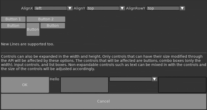
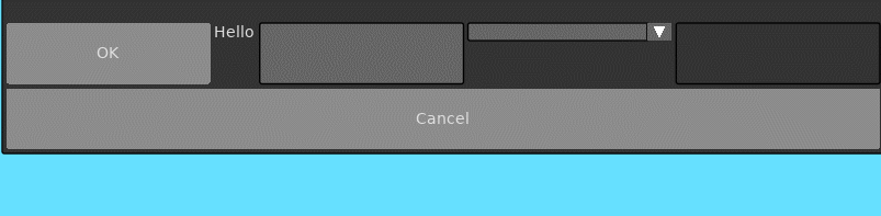
Controls can also be expanded in the width and height. Only controls that can have their size modified through the API will be affected by these options. The controls that will be affected are buttons, combo boxes (only the width), input controls, and list boxes. Non-expandable controls such as text can be mixed in with the controls and the size of the controls will be adjusted accordingly.
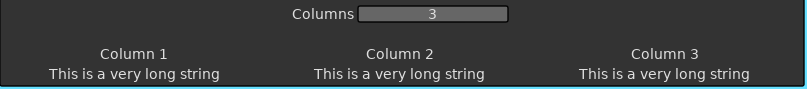
Controls can be layed out in columns. The 'Columns' option is a number that tells the layout how many columns to allocate for positioning the controls. The 'SetLayoutColumn' function sets the current active column and all controls will be placed within the bounds of that column.
Below is a list of functions associated with the Layout API.
Enables the layout manager and positions the controls between this call and EndLayout based on the given options. The anchor position for the layout is determined by the current cursor position on the Y axis. The horizontal position is not anchored. Layouts are stacked, so there can be layouts within parent layouts.
| Parameter | Type | Description |
|---|---|---|
| Id | String | The Id of this layout. |
| Options | Table | List of options that control how this layout behaves. |
| Option | Type | Description |
|---|---|---|
| AlignX | String | Defines how the controls should be positioned horizontally in the window. The available options are 'left', 'center', or 'right'. The default option is 'left'. |
| AlignY | String | Defines how the controls should be positioned vertically in the window. The available options are 'top', 'center', or 'bottom'. The default option is 'top'. The top is determined by the current cursor position. |
| AlignRowY | String | Defines how the controls should be positioned vertically within a row. The available options are 'top', 'center', or 'bottom'. The default option is 'top'. |
| Ignore | Boolean | Should this layout ignore positioning of controls. This is useful if certain controls need custom positioning within a layout. |
| ExpandW | Boolean | If true, will expand all controls' width within the row to the size of the window. |
| ExpandH | Boolean | If true, will expand all controls' height within the row and the size of the window. |
| AnchorX | Boolean | Anchors the layout management at the current X cursor position. The size is calculated using this position. The default value for this is false. |
| AnchorY | Boolean | Anchors the layout management at the current Y cursor position. The size is calculated using this position. The default value for this is true. |
| Columns | Number | The number of columns to use for this layout. The default value is 1. |
Ends the currently active layout. Each BeginLayout call must have a matching EndLayout. Failure to do so will result in an assertion.
Sets the current active column.
| Parameter | Type | Description |
|---|---|---|
| Index | Number | The index of the column to be active. |
Retrieves the size of the active layout. If there are columns, then the size of the column is returned.
| Return | Description |
|---|---|
| Number, Number | The width and height of the active layout. 0 is returned if no layout is active. |
Retrieves the index of current active column of the active layout.
| Return | Description |
|---|---|
| Number | The current index of the active column of the active layout. 0 is returned if no layout or column is active. |