Input
The input control allows the user to enter in text into an input box. This control is similar to input boxes found in other applications. These controls can be configured to return true upon every text entered or only when the user presses the 'Return' key. Below are some examples of how this control can be used.
Slab.BeginWindow('MyFirstWindow', {Title = "My First Window"})

Slab.Input('MyInput')

Slab.EndWindow()
The text of an input field can be stored to be referenced later. By default, the Input control will return true for every character entered.
Slab.BeginWindow('MyFirstWindow', {Title = "My First Window"})

if Slab.Input('MyInput', {Text = InputText}) then
	InputText = Slab.GetInputText()
end

Slab.EndWindow()
Input controls can also be set to only return true when the user presses the 'Return' key. If the control loses focus by either clicking outside the control or through other means, the text will be reverted back to what was previously used.
Slab.BeginWindow('MyFirstWindow', {Title = "My First Window"})

if Slab.Input('MyInput', {Text = InputText, ReturnOnText = false}) then
	InputText = Slab.GetInputText()
end

Slab.EndWindow()
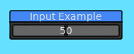
Input controls can also be configured to only accept numeric text.
Slab.BeginWindow('MyFirstWindow', {Title = "My First Window"})

if Slab.Input('MyInput', {Text = tostring(Value), ReturnOnText = false, NumbersOnly = true}) then
	Value = Slab.GetInputNumber()
end

Slab.EndWindow()
UTF8 characters are also supported within the control as well.

The input control has the ability to support multiple line editing similar to a standard text editor. Most key controls that are supported in text editors are supported in the input control. Contents of a file can be loaded and directly manipulated in the control.


The control also has an option to highlight words with a specific color through the Highlight option. This feature can be used to mimic syntax highlighting found in many text editors for various programming languages.


Input controls configured to accept numbers only have the ability for the user to click and drag the control to alter the number.

The control can also be double-clicked so that a number can be manually entered.

The visual representation of the control can also be configured using the UseSlider option.
The dragging behavior can be disabled with the NoDrag option. API functions have also been added to provide a wrap around the Input function.
Masks the input with the set password character (or string!).

local str = "sample pw"
local pw_char = "*"
local show_pw = true

function love.update(dt)
	Slab.Update(dt)
	Slab.BeginWindow("sample", {Title = "Sample"})
	Slab.Text("Password")
	Slab.SameLine()
	if Slab.Input("pw", {Text = str, IsPassword = show_pw, PasswordChar = pw_char}) then str = Slab.GetInputText() end
	Slab.Text("Password Char Mask")
	Slab.SameLine()
	if Slab.Input("pw_char", {Text = pw_char}) then pw_char = Slab.GetInputText() end
	if Slab.CheckBox(show_pw, "show pw") then show_pw = not show_pw end
endBelow is a list of functions associated with the Input API.
This function will render an input box for a user to input text in. This widget behaves like input boxes found in other applications. This function will only return true if it has focus and user has either input text or pressed the return key.
| Parameter | Type | Description |
|---|---|---|
| Id | String | A string that uniquely identifies this Input within the context of the window. |
| Options | Table | List of options for how this Input will behave. |
| Option | Type | Description |
|---|---|---|
| Tooltip | String | Text to be displayed if the user hovers over the Input box. |
| ReturnOnText | Boolean | Will cause this function to return true whenever the user has input a new character into the Input box. This is true by default. |
| Text | String | The text to be supplied to the input box. It is recommended to use this option when ReturnOnText is true. |
| TextColor | Table | The color to use for the text. The default color is the color used for text, but there is also a default multiline text color defined in the Style. |
| BgColor | Table | The background color for the input box. |
| SelectColor | Table | The color used when the user is selecting text within the input box. |
| SelectOnFocus | Boolean | When this input box is focused by the user, the text contents within the input will be selected. This is true by default. |
| NumbersOnly | Boolean | When true, only numeric characters and the '.' character are allowed to be input into the input box. If no text is input, the input box will display '0'. |
| W | Number | The width of the input box. By default, will be 150.0 |
| H | Number | The height of the input box. By default, will be the height of the current font. |
| ReadOnly | Boolean | Whether this input field can be editable or not. |
| Align | String | Aligns the text within the input box. Options are: left: Aligns the text to the left. This will be set when this Input is focused. center: Aligns the text in the center. This is the default for when the text is not focused. |
| Rounding | Number | Amount of rounding to apply to the corners of the input box. |
| MinNumber | Number | The minimum value that can be entered into this input box. Only valid when NumbersOnly is true. |
| MaxNumber | Number | The maximum value that can be entered into this input box. Only valid when NumbersOnly is true. |
| MultiLine | Boolean | Determines whether this input control should support multiple lines. If this is true, then the SelectOnFocus flag will be false. The given text will also be sanitized to remove controls characters such as '\r'. Also, the text will be left aligned. |
| MultiLineW | Number | The width for which the lines of text should be wrapped at. |
| Highlight | Table | A list of key-values that define what words to highlight what color. Strings should be used for the word to highlight and the value should be a table defining the color. |
| Step | Number | The step amount for numeric controls when the user click and drags. The default value is 1.0. |
| NoDrag | Boolean | Determines whether this numberic control allows the user to click and drag to alter the value. |
| UseSlider | Boolean | If enabled, displays a slider inside the input control. This will only be drawn if the NumbersOnly option is set to true. The position of the slider inside the control determines the value based on the MinNumber and MaxNumber option. |
| IsPassword | Boolean | If enabled, mask the text with another character. Default is false. |
| PasswordChar | Char/String | Sets the character or string to use along with IsPassword flag. Default is "*" |
| Return | Description |
|---|---|
| Boolean | Returns true if the user has pressed the return key while focused on this input box. If ReturnOnText is set to true, then this function will return true whenever the user has input any character into the input box. |
This is a wrapper function for calling the Input function which sets the proper options to set up the input box for displaying and editing numbers. The user will be able to click and drag the control to alter the value. Double-clicking inside this control will allow for manually editing the value.
| Parameter | Type | Description |
|---|---|---|
| Id | String | A string that uniquely identifies this Input within the context of the window. |
| Value | Number | The value to display in the control. |
| Min | Number | The minimum value that can be set for this number control. If nil, then this value will be set to -math.huge. |
| Max | Number | The maximum value that can be set for this number control. If nil, then this value will be set to math.huge. |
| Step | Number | The amount to increase value when mouse delta reaches threshold. |
| Options | Table | List of options for how this input control is displayed. See Slab.Input for all options. |
| Return | Description |
|---|---|
| Boolean | Returns true whenever this valued is modified. |
This is a wrapper function for calling the Input function which sets the proper options to set up the input box for displaying and editing numbers. This will also force the control to display a slider, which determines what the value stored is based on the Min and Max options. Double-clicking inside this control will allow for manually editing the value.
| Parameter | Type | Description |
|---|---|---|
| Id | String | A string that uniquely identifies this Input within the context of the window. |
| Value | Number | The value to display in the control. |
| Min | Number | The minimum value that can be set for this number control. If nil, then this value will be set to -math.huge. |
| Max | Number | The maximum value that can be set for this number control. If nil, then this value will be set to math.huge. |
| Options | Table | List of options for how this input control is displayed. See Slab.Input for all options. |
| Option | Type | Description |
|---|---|---|
| Precision | Number | An integer in the range [0..5]. This will set the size of the fractional component. |
| NeedDrag | Boolean | This will determine if slider needs to be dragged before changing value, otherwise just clicking in the slider will adjust the value into the clicked value. Default is true. |
| Return | Description |
|---|---|
| Boolean | Returns true whenever this valued is modified. |
Retrieves the text entered into the focused input box. Refer to the documentation for Slab.Input for an example on how to use this function.
| Return | Description |
|---|---|
| String | Returns the text entered into the focused input box. |
Retrieves the text entered into the focused input box and attempts to conver the text into a number. Will always return a valid number.
| Return | Description |
|---|---|
| Number | Returns the text entered into the focused input box as a number. |
Retrieves the position of the input cursor for the focused input control. There are three values that are returned. The first one is the absolute position of the cursor with regards to the text for the control. The second is the column position of the cursor on the current line. The final value is the line number. The column will match the absolute position if the input control is not multi line.
| Return | Description |
|---|---|
| Number, Number, Number | The absolute position of the cursor, the column position of the cursor on the current line, and the line number of the cursor. These values will all be zero if no input control is focused. |
Returns whether the input control with the given Id is focused or not.
| Parameter | Type | Description |
|---|---|---|
| Id | String | The Id of the input control to check. |
| Return | Description |
|---|---|
| Boolean | True if the input control with the given Id is focused. False otherwise. |
Returns whether any input control is focused or not.
| Return | Description |
|---|---|
| Boolean | True if there is an input control focused. False otherwise. |
Sets the focus of the input control to the control with the given Id. The focus is set at the beginning of the next frame to avoid any input events from the current frame.
| Parameter | Type | Description |
|---|---|---|
| Id | String | The Id of the input control to focus. |
Sets the absolute text position in bytes of the focused input control. This value is applied on the next frame. This function can be combined with the SetInputFocus function to modify the cursor positioning of the desired input control. Note that the input control supports UTF8 characters so if the desired position is not a valid character, the position will be altered to find the next closest valid character.
| Parameter | Type | Description |
|---|---|---|
| Pos | Number | The absolute position in bytes of the text of the focused input control. |
Sets the column and line number of the focused input control. These values are applied on the next frame. This function behaves the same as SetInputCursorPos, but allows for setting the cursor by column and line.
| Parameter | Type | Description |
|---|---|---|
| Column | Number | The text position in bytes of the current line. |
| Line | Number | The line number to set. |