Style
The style determines what colors to use for each type of control as well as default settings such as rounding on the corners of windows and controls. These styles can be modified at real-time and can also be defined in .style files. A light and dark style comes with Slab by default and are loaded at startup. New styles can also be added and loaded at runtime either by placing the new .style file in the Slab/Internal/Resources/Styles directory or loading the file through the API. The active style table can be retrieved by calling the Slab.GetStyle() function and can be modified. Currently there are only a few colors and settings to define but more will be added as more versions are released.
The current styles can be found in the Style module. The table below lists the current styles available as of version 0.3.0.
| Name | Type | Description |
|---|---|---|
| FontSize | Table | The point size of the font to use. |
| MenuColor | Table | The background color of the main menu bar along with menus. |
| ScrollBarColor | Table | The idle color of scroll bars. |
| ScrollBarHoveredColor | Table | The hovered color of scroll bars. |
| SeparatorColor | Table | The color of the horizontal separator. |
| WindowBackgroundColor | Table | The background color of all windows. |
| WindowTitleFocusedColor | Table | The background color of all window title bars when they are focused. |
| WindowCloseBgColor | The background color rendered behind the close button when the mouse is hovered. | |
| WindowCloseColor | The foreground color or the color of the cross primitive. | |
| ButtonColor | Table | The idle color of all buttons. |
| RadioButtonSelectedColor | Table | The color of the fill for radio buttons. |
| ButtonHoveredColor | Table | The hovered color of all buttons. |
| ButtonPressedColor | Table | The color of the button while the user is pressing the mouse button on a hovered button. |
| ButtonDisabledTextColor | Table | The color of the text for this button if it is disabled. |
| CheckBoxSelectedColor | Table | The color of the cross within an enabled check box. |
| TextColor | Table | The color of all text. |
| TextHoverBgColor | Table | The background color of a hovered text control if enabled. |
| TextURLColor | Table | The color of the text when the URL option is present. |
| ComboBoxColor | Table | The idle color of all combo boxes. |
| ComboBoxHoveredColor | Table | The hovered color of all combo boxes. |
| ComboBoxDropDownColor | Table | The idle color of the drop down section of all combo boxes. |
| ComboBoxDropDownHoveredColor | Table | The hovered color of the drop down section of all combo boxes. |
| ComboBoxArrowColor | Table | The color of the arrow within the drop down section of all combo boxes. |
| InputBgColor | Table | The background color of all input controls when not focused. |
| InputEditBgColor | Table | The background color of all input controls when focused. |
| InputSelectColor | Table | The background color of the selection rectangle of all input controls. |
| InputSliderColor | Table | The color of the slider for an input control configured with UseSlider. |
| MultilineTextColor | Table | The default color to use for text in a multiline input control. |
| WindowRounding | Number | The rounding of all corners of windows. |
| ButtonRounding | Number | The rounding of all corners of buttons. |
| CheckBoxRounding | Number | The rounding of all corners of check boxes |
| ComboBoxRounding | Number | The rounding of all corners of combo boxes. |
| InputBgRounding | Number | The rounding of all corners of input controls. |
| ScrollBarRounding | Number | The rounding of all corners of scroll bars. |
The .style file format follows similar patterns to the INI/Configuration file format found on Windows/Unix machines. The file contains a list of key-value pairs with each pair being on its own line.
FontSize = 14
MenuColor = (0.2, 0.2, 0.2, 1.0)
ScrollBarColor = (0.4, 0.4, 0.4, 1.0)
ScrollBarHoveredColor = (0.8, 0.8, 0.8, 1.0)
SeparatorColor = (0.5, 0.5, 0.5, 0.7)
WindowBackgroundColor = (0.2, 0.2, 0.2, 1.0)
WindowTitleFocusedColor = (0.26, 0.53, 0.96, 1.0)
WindowCloseBgColor = (0.64, 0.64, 0.64, 1.0)
WindowCloseColor = (0.0, 0.0, 0.0, 1.0)
ButtonColor = (0.55, 0.55, 0.55, 1.0)
RadioButtonSelectedColor = (0.2, 0.2, 0.2, 1.0)
ButtonHoveredColor = (0.7, 0.7, 0.7, 1.0)
ButtonPressedColor = (0.8, 0.8, 0.8, 1.0)
CheckBoxSelectedColor = (0.0, 0.0, 0.0, 1.0)
TextColor = (0.875, 0.875, 0.875, 1.0)
TextHoverBgColor = (0.5, 0.5, 0.5, 1.0)
ComboBoxColor = (0.4, 0.4, 0.4, 1.0)
ComboBoxHoveredColor = (0.55, 0.55, 0.55, 1.0)
ComboBoxDropDownColor = (0.4, 0.4, 0.4, 1.0)
ComboBoxDropDownHoveredColor = (0.55, 0.55, 0.55, 1.0)
ComboBoxArrowColor = (1.0, 1.0, 1.0, 1.0)
InputBgColor = (0.4, 0.4, 0.4, 1.0)
InputEditBgColor = (0.5, 0.5, 0.5, 1.0)
InputSelectColor = (0.14, 0.29, 0.53, 0.4)

WindowRounding = 2.0
ButtonRounding = 2.0
CheckBoxRounding = 2.0
ComboBoxRounding = 2.0
InputBgRounding = 2.0
ScrollBarRounding = 2.0The style editor can be accessed through the SlabDebug module. This allows the user to modify each setting in the Style table and save those changes to the current style. New styles can also be created and styles defined in the non-standard directory can be loaded as well. Currently, all default styles loaded from the Slab/Internal/Resources/Styles path cannot be saved due to restrictions with packaged builds. Styles loaded from other directories can be loaded/saved.
local SlabDebug = require 'Slab.SlabDebug'

function love.update(dt)
	SlabDebug.StyleEditor()
end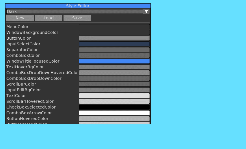
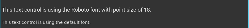
Fonts can be pushed to a stack to alter the rendering of any text. All controls will use this pushed font until the font is popped from the stack, using the last pushed font or the default font. Below is an example of font being pushed to the stack to render a single text control and then being popped before the next text control.
Below is a list of functions associated with the Style API accessed through the Slab API.
Retrieve the style table associated with the current instance of Slab. This will allow the user to add custom styling to their controls.
| Return | Description |
|---|---|
| Table | The style table. |
Pushes a Love font object onto the font stack. All text rendering will use this font until PopFont is called.
| Parameter | Type | Description |
|---|---|---|
| Font | Object | The Love font object to use. |
Pops the last font from the stack.
Below is a list of functions associated with the Style API that is important to the end user. These functions can be accessed through the API table in the Style table.
local Style = Slab.GetStyle()
local Result = Style.API.SetStyle("dark")Loads a .style file at the given path. This should be called after Slab.Initialize
| Parameter | Type | Description |
|---|---|---|
| Path | String | The full path to the .style file to load. |
| Set | Boolean | Flag to determine if the loaded style should be set automatically after being loaded. |
| Return | Description |
|---|---|
| Table | A table with the loaded settings from the .style file. This is not the actual Style table used for all controls in Slab. |
Sets the current style by name if it has been loaded.
| Parameter | Type | Description |
|---|---|---|
| Name | String | The name of the loaded style to set. The style must be loaded with a call to LoadStyle. The name is the base filename of the .style file. |
| Return | Description |
|---|---|
| Boolean | Returns true if the style has been set, false otherwise. |
Gets a list of all currently loaded styles.
| Return | Description |
|---|---|
| Table | A list of loaded style names. |
Gets the currently set style.
| Return | Description |
|---|---|
| String | The name of the set style. |