This promotional video covers the concept behind Hivemind, an overview of its features, and how to use the application.
See our wiki for more in depth information
Hivemind is a news aggregation application designed to provide a remote asynchronous solution for organising developing stories. Instead of curating a feed of posts which help develop one specific story - Hivemind aims to provide a solution wherein news articles can be linked together via user suggestions. Through this, the application allows users to view a peer assessed timeline of relevant articles to one particular topic, allowing the community to ensure that accurate and unsensationalised reporting is brought to the surface. As a result, we hope to provide a service which will enhance the community's understanding of world events in a greater context.
Hivemind was initially developed to address two key areas: Enriching news articles through meaningful research tools, and limiting the overexposure of biased and commercial content. We noticed that news had an unspoken expiry date - often becoming forgotten, despite its relevancy to current world events. In order to counter this, we aimed to develop a system that encompases previous news to outline relevance, and create a timeline of events over time. We also aimed to encourage community driven exposure to news, as well as providing a platform based around creating connections to expose extended news from outside singular articles.
The problem space that was chosen to be addressed was that often news is dispersed over multiple agencies and that the news reported can greatly vary for the same event. Hivemind provides a social platform for users to vote articles up and down a scale based on their relevancy to a certain topic or event, and ensure that articles reporting the wrong facts are pushed down the scale. The app also allows users to view a comprehensive timeline of events based on an article's publishing date, so that they are able to see past news associated with an article. This adpatility and voting system allows users to control the flow of news, making it easier for them to find what they're looking for.
The main idea behind the article was that we really wanted to create a platform for people to view the news as a linked series of events. For example, I as a user want to read news regarding the US Presidential Election. For the most part, I can search Google to find the most current news for this event, though I don't really see the big picture of what's happening. Hivemind allows users to see the news as linked by both relevancy to other articles, and also on a timeline of publishing date. This connectivity helps to bridge the gap between a missing piece of news for a certain event, and also helps to make the news more relevant and credible. When users vote up an article's relevancy rating, it goes to the top of the relevant articles list which is linked to each article. A relevancy link doesn't change its position in the news timeline, as these are ordered by publishing date. The user population will for the most part determine the fate of each rating list. Users can add articles which they believe contribute to the greater understanding of each particular story, which other users are then able to vote on.
The design process started with brainstorming ideas of how a soultuion could address an existing issue or dilemma in the domain of news or journalism. Building off the Inter concept (pictured below) we proposed an application which would build upon the foundations of other news aggregation sites (such as Reddit), and apply them in a manner which would reduce clutter for the user.
In order to refine this idea, we produced multiple stages of mockups for the purpose of determining how exactly users would interact with this specific concept. The prototyping that was undertaken for Hivemind proved to be a valuable source of research for the final stage of the project; completing the final design. The prototypes allowed an insight into the types of users who were most likely to use Hivemind, and where any flaws occurred in the design at any given time. Through both paper and digital prototyping we were able to continually improve the designs in order to meet our initial problem space and develop a proper solution.
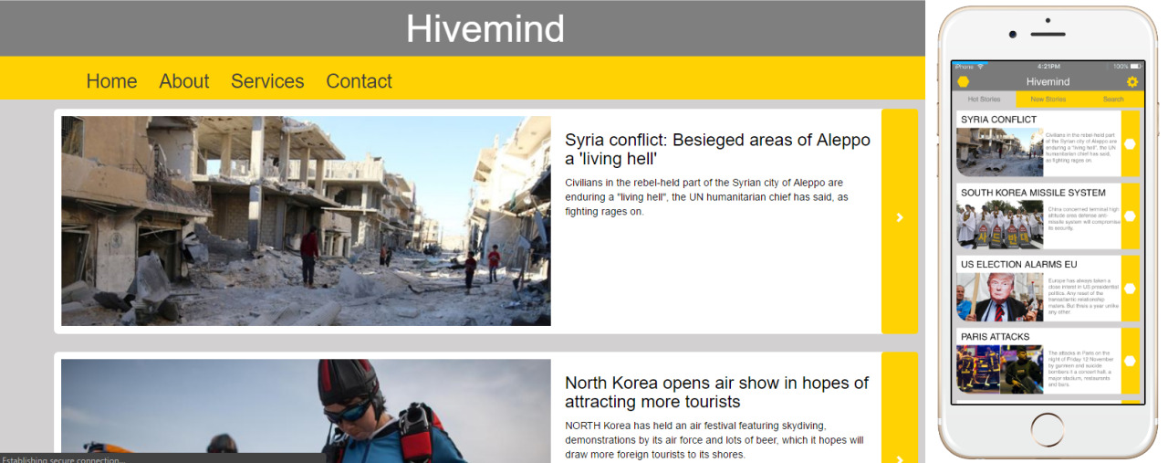
Reasonably early on in the development, we determined what the overall aesthetics of the application would be. We opted to style the application in a similar manner to that of an iOS news application, ensuring that we could rely somewhat on the already established visual language for that format (ultimately allowing us to more easily apply emotional design to the product).
We focused a fair bit on including the title of the application in the overall "feel" of the application. From featuring honeycombs in icons, to featuring a grey, white, and yellow colour scheme, we tried to ensure that we kept an almost playful reminder of the name of the application in each layer of the product.
The Hivemind project is currently designed using Marvel, an app prototyping platform. By initially designing the app using a prototyping platform, it is much easier and cheaper to find flaws in the application whilst completing a time sensitive project. We had intended to use a PHP site to demonstrate the concept with greater ease, but we learnt fairly quickly that we weren't going to be able to explain the concept to the same extent within the time restraint as we were able to with Marvel.
| Team Member | Student Number | Role |
|---|---|---|
| Naomi Mason | 43565337 | Prototype Designer. Produced homepages and transitional pages for Marvel application. Worked on documentation. |
| Melinda Piper | 42634375 | Prototype Designer. Produced the core Hivemind feature pages for Marvel application. Produced and tested paper prototype. |
| Kristi Grafton | 43545067 | Prototype Designer. Produced article pages for Marvel application. Did documentation and pleliminary user testing. |
| Ben Fowler | 43584972 | UI Designer. Produced promotional video and hi-fidelity mockups. Also provided pleliminary user testing. |


