-
-
Notifications
You must be signed in to change notification settings - Fork 17
SimpleFormDialog

extends CustomViewDialog
| API reference | Examples |
|---|
A Dialog that can be used to create simple or complex forms with a variety of input fields.
We suggest using fullscreen dialogs for this dialog type.
For general usage see SimpleDialog.
The following static build methods are provided for convenience (see examples below for screenshots)
-
SimpleFormDialog.build()- default -
SimpleFormDialog.buildEmailInput()- form with a single email input field (see also SimpleEMailDialog) -
SimpleFormDialog.buildPasswordInput()- form with a single password prompt -
SimpleFormDialog.buildPinCodeInput()- form with a single numeric password prompt (see also SimplePinDialog) -
SimpleFormDialog.buildNumberInput()- form with a single phone number prompt -
SimpleFormDialog.buildLoginEmail()- form with a email + password login prompt -
SimpleFormDialog.buildLogin()- form with a username + password login prompt
Additional methods are provided to auto focus the first element (autofocus) etc.
Please refer to the API reference for a comprehensive documentation of these methods.
It is also simple to use custom layout containers like FlexboxLayout by extending this dialog (see #17).
Add FormElements to the dialog by using the fields method:
SimpleFormDialog.build()
                .title(R.string.register)
                .msg(R.string.please_fill_in_form)
                .fields(
                        Input.name(NAME).required().hint(R.string.name),
                        Input.password(PASSWORD).required().max(20).validatePatternStrongPassword(),
                        Input.email(EMAIL).required(),
                        Input.plain(COUNTRY).hint(R.string.country)
                             .inputType(InputType.TYPE_CLASS_TEXT | InputType.TYPE_TEXT_FLAG_CAP_SENTENCES)
                             .suggest(R.array.countries_locale).forceSuggestion(),
                        Check.box(null).label(R.string.terms_accept).required()
                )
                .fullscreen()
                .show(this, REGISTRATION_DIALOG);
The fields method receives a list of FormElements.
Each form element (except hints) receives a key used to identify the value in onResult.
Additional methods allow to customize the form element behaviour.
Additional methods common to all elements:
Methods to set a label (label), specify if the element is required (required), etc.
Please refer to the API reference for a comprehensive documentation of these methods.
The following form elements are provided:
Text input field Input
The following static build methods are provided for convenience, they set the corresponding input types and hints/names for the input field
-
Input.plain(key)- default -
Input.email(key)- validates email format -
Input.name(key)- applies cap words style -
Input.password(key)- shows a button to toggle the passwords visibility -
Input.phone(key)- auto formats phone number while typing -
Input.pin(key)- shows numeric keyboard input -
Input.spinner(key, suggestions)- provides auto-complete suggestions
Additional methods are provided to set the inputType, hint, initial text, min/max length, suggestions, password visibility toggle button, input validation etc.
Please refer to the API reference for a comprehensive documentation of these methods.
If this element is required, it must contain non-whitespace text.
See also Input validation below.
Checkbox Check
The following static build method is provided for convenience
-
Check.box(key)- default
Additional methods are provided to set the label, initial state etc.
Please refer to the API reference for a comprehensive documentation of these methods.
If this element is required, it must be checked.
Color selector ColorField
The following static build method is provided for convenience
-
ColorField.picker(key)- default
Additional methods are provided to set the label, initial color, color palette, custom color mode etc.
Please refer to the API reference for a comprehensive documentation of these methods.
If this element is required, a color must be chosen.
Date and/or time picker DateTime
The following static build methods are provided for convenience
-
DateTime.picker(key)- default -
DateTime.date(key)- date input -
DateTime.time(key)- time input -
DateTime.datetime(key)- date and time input
Additional methods are provided to set the label, initial date and time, date range etc.
Please refer to the API reference for a comprehensive documentation of these methods.
If this element is required, a date and/or time must be choosen.
Gray info text Hint
The following static build method is provided for convenience
-
Hint.plain(hint)- default
No additional methods are provided, the hint label is set by build method or can be set by default label method.
Please refer to the API reference for a comprehensive documentation.
This element can not be required
Deprecated, use Input.spinner() instead
There are several possibilities to validate user input and display error messages for an Input form element:
- Prevent empty input
An Input field flagged as required must contain non-whitespace caracters (.required(true)) - Specify min/max input length
Upper and/or lower limits can be set using the.min(int minLength)and.max(int maxLength)methods - Ensure that a given suggestion is entered
Calling.forceSuggestion()on an input field will require the user to enter one of the provided suggestions in order to continue - Pattern validation
Specify a regular expression pattern using the.validatePattern(String pattern, String errorMsg)method. The following predefined patterns are available:
.validatePatternEmail()– Email address pattern
.validatePatternStrongPassword()– Must have 8 chars and include numbers, upper- and lowercase letters and a special character
.validatePatternLetters()– Only allows for the 26 letters A-Z (either lower- or uppercase)
.validatePatternAlphanumeric()– Like the above, but also allows for numbers - Custom validation
If neither of the above suits your needs, you can make use of theSimpleFormDialog.InputValidator.
Let the fragment or activity were you show your dialog implement this Interface and overwrite the callback method.validatethat will be called for validation (other validations will still be performed). If the input is valid you should returnnullfrom this callback. Otherwise, the returned string will be displayed as an error message.
For general usage see SimpleDialog.
The extras Bundle returned will contain the keys for each field as specified when the dialog was created.
For example:
String text = extras.getString(MY_INPUT_KEY);
boolean checked = extras.getBoolean(MY_CHECKBOX_KEY);
int selected = extras.getInt(MY_SPINNER_KEY);
Date date = new Date(extras.getLong(MY_DATETIME_KEY)); // for time input, use date.getHours() and date.getMinutes()
int color = extras.getInt(MY_COLOR_KEY);
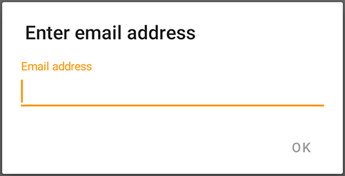
SimpleFormDialog.buildEmailInput(EMAIL_KEY)
                .title("Enter email address")
.show(this, FORM_DIALOG); |

|
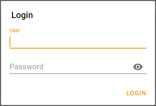
SimpleFormDialog.buildLogin(USERNAME_KEY, PASSWORD_KEY)
.show(this, FORM_DIALOG); |

|
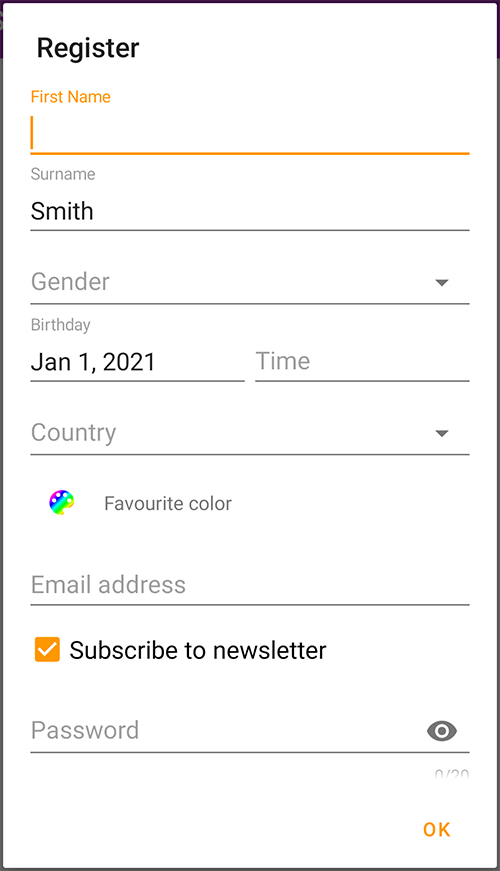
SimpleFormDialog.build()
    .title(R.string.register)
    .msg(R.string.please_fill_in_form)
    .fields(
        Input.name(FIRST_NAME)
             .hint(R.string.first_name),
        Input.name(SURNAME)
             .hint(R.string.surname)
             .required(),
        Input.spinner(GENDER, R.array.genders)
             .hint(R.string.gender)
             .required(false),
        DateTime.datetime(BIRTHDAY)
                .label(R.string.birthday)
                .max(new Date())
                .required(),
        Input.plain(COUNTRY)
             .hint(R.string.country)
             .inputType(InputType.TYPE_CLASS_TEXT
                      | InputType.TYPE_TEXT_FLAG_CAP_SENTENCES)
             .suggest(R.array.countries_locale)
             .forceSuggestion(),
        ColorField.picker(COLOR)
                  .label(R.string.favourite_color),
        Input.email(EMAIL)
             .required(),
        Check.box(NEWSLETTER)
             .label(R.string.receive_newsletter)
             .check(true),
        Input.password(PASSWORD)
             .max(20)
             .required()
             .validatePatternStrongPassword(),
        Hint.plain(R.string.form_hint)
    )
.show(this, REGISTRATION_DIALOG); |

|
Javadoc API
Screenshot gallery
Styling dialogs with themes
Fullscreen dialogs
SimpleDialog
CustomViewDialog
CustomListDialog
SimpleCheckDialog
SimpleColorDialog
SimpleColorWheelDialog
SimpleDateDialog
SimpleEMailDialog
SimpleFormDialog
SimpleImageDialog
SimpleInputDialog
SimpleListDialog
SimplePinDialog
SimpleProgressDialog
SimpleTimeDialog