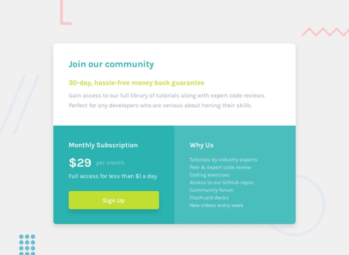
This project is a solution to the Single price grid component from Frontend Mentor.
In this challenge, I was required to build out a pricing card component as close as I could to the original design using HTML & CSS.
The user should be able to:
- View the optimal layout for the component depending on their device's screen size
- See a hover state on desktop for the Sign Up call-to-action
This challenge gave me the chance to practice responsive design techniques with singular components, while also allowing me to experiment with creating divs, objects within them, and hover states. By doing so, I was able to improve my skills in creating flexible layouts that adapt to different screen sizes, as well as adding interactivity to the application through hover states. Overall, this challenge was a valuable opportunity to practice different design techniques and improve my skills in creating responsive and engaging applications.
