- Student Name:
- Partner Name (if applicable):
- Your task is to create visualizations to help answer a few question that Northwind, Inc has about its customer's purchasing behaviors.
-
Each visualization should have a 1-2 sentence explanation about your findings.
-
You must select the most appropriate visuals to help answer your question. Options include (but are not limited to):
- Scatter plots (color coded by group)
- Bar plots of group means
- Boxplots
- Seaborn barplots, violinplots
- etc.
-
Read the Visualization Requirements section for additional instructions.
-
Question 1: Does being discounted have an effect on the quantity of a product in an order (binary comparison, discount/no discount)?
-
If so, at what level(s) of discount (multiple-group comparison)?
-
Question 2: Does the time of year total Quantities sold? (The time period analyzed is up to you: month,quarter, etc.)
-
Question 3 (Optional): think of one additional question that you can answer to give Northwind some helpul business insights.
-
You must create figures using at least 2 out fo the following ways/approaches to making/starting a figure:
- Use
fig,ax=plt.subplotsto start the figure and then useaxto do all of your plotting (e.g.ax.bar,ax.scatter) - Start a figure with Pandas and then update the axis labels and title outside using the
axobject that pandas returns combined withax.set_methods. - A Seaborn visualization that takes a whole dataframe and column names to plot(e.g.
sns.barplot(data=df,x='Discount',y="Quantity") - Use
pltfunctions to create a plot and thenplt.gca()andplt.gcf()to get the fig objects.
- Use
-
All visualizations are well labeled with:
- axes labels
- a title
- and a legend (when appropriate)
-
Don't forget about our Master Cheat Sheets (all green sheets are plotting-related).
-
Remember that Pandas outputs an
axobject whenever you use thedf.plot()method (and most seaborn plots do too).- Axes have a
ax.get_figure()method to get the Figure that goes with an Axes.
- Axes have a
-
Remember the 2 special
pltfunctions that let us grab the figures and axes we create.plt.gca()- get current axisplt.gcf()- get current figure
-
Seaborn and pandas both have options for separating your data for you using groups/color.
- Some seaborn functions accept a
hueargument the name of the column to use to color the groups. (hue='country') - Some pandas plots accept a similar
cargument (c="Discounted")
- Some seaborn functions accept a
- The data tables are stored in the
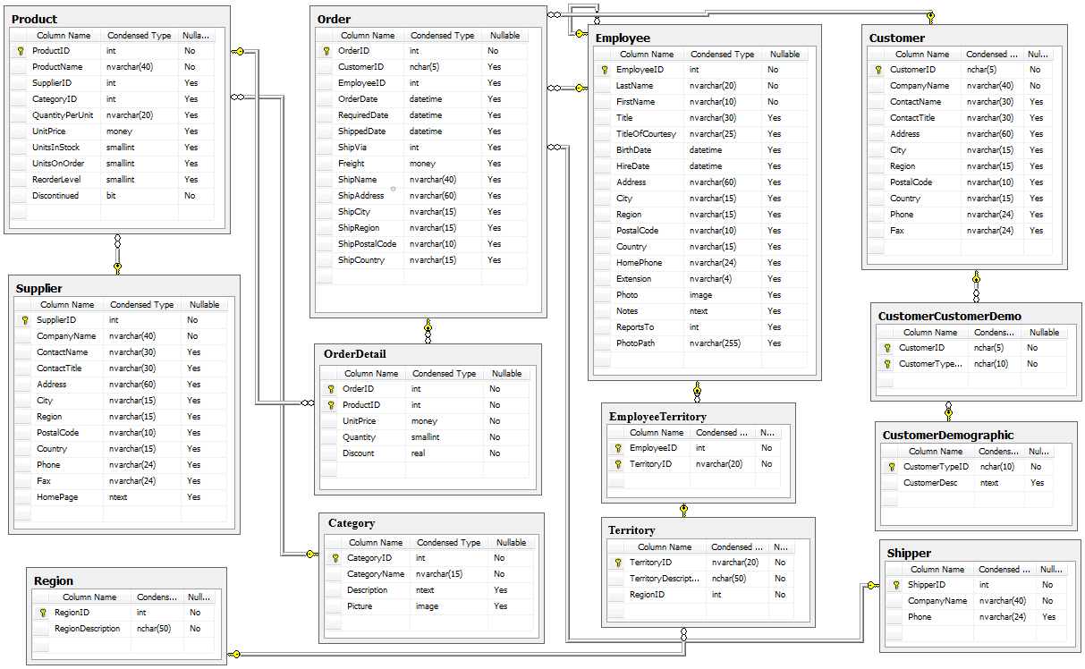
Northwind_small.sqlitefile.- Question 1 uses one table (orderDetail).
- Questions 2+3 require a join.
- To see all tables in a database:
"""SELECT name FROM sqlite_master WHERE type='table';"""- To see the information on a table:
"""PRAGMA table_info(orderDetail)"""- For more information on Pragma commands:
- https://www.sqlite.org/pragma.html
- Reminder: if a table's name is also a SQL keyword you will have to put quotation marks around the table's name.
import os
sorted(os.listdir())
['.git',
'.gitattributes',
'.gitignore',
'.ipynb_checkpoints',
'Northwind_ERD_updated.png',
'Northwind_small.sqlite',
'README.md',
'student.ipynb']
## Import matplotlib, pandas, sqlite3, seaborn## Connect to database with sqlite3## Create the empty figures dictionary for later
figures ={}- insert as many cells as you need to/would like
- Save the final visual's
Figure(fig) into the figure dictionary.
- 1-2 sentence summary of findings
...
- insert as many cells as you need to/would like
- Save the final visual's
Figure(fig) into the figure dictionary.
- 1-2 sentence summary of findings
...
- insert as many cells as you need to/would like
- Save the final visual's
Figure(fig) into the figure dictionary.
- 1-2 sentence summary of findings
...
- Recap your 3 questions and answers.