-
Notifications
You must be signed in to change notification settings - Fork 22
New issue
Have a question about this project? Sign up for a free GitHub account to open an issue and contact its maintainers and the community.
By clicking “Sign up for GitHub”, you agree to our terms of service and privacy statement. We’ll occasionally send you account related emails.
Already on GitHub? Sign in to your account
Visual parent navigation #38
Conversation
|
Hi, @tokejepsen, got a few questions for you :) If I click the I imagine this is for assembling or reviewing all the child assets of |
|
I have updated the description with how it looks before this implementation.
Yeah, you would be able to publish your work in the What this PR focuses on is the logistics of navigating such hierarchies. As you can see before it would just show a long list of assets in the database, even though they are a hierarchy in the Project Manager which supports visual parents. What might be slightly confusing now, if that the silo is still called "shots" when it contains episodes and sequences as well. |
|
@aardschok what do you think? I am not too sure about how much priority the tasks get when browsing into one of the parents. Logically it makes sense, but browsing to children becomes slower because of the arbitrary amount of tasks you need to "ignore". I am not too sure about this one. |
|
I actually prefer the previous behavior. For 10+ shots it might get a little cumbersome to navigate though, but I'm not confident solving that with more clicking is the best approach. Maybe a search field at the top? Default to any keyboard events being entries into the search field? |
We could put the children at the top, instead of the tasks? @BigRoy have you guys had a production with episodes/sequences? |
Another way of showing the shots would be similar to how the Project Manager shows it, with a tree view. Although that is a bigger rewrite of the launcher. |
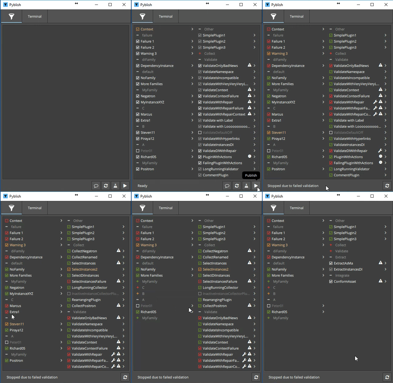
Actually I think a tree-view is what we have at the moment; they just aren't collapsible. Could it be worth looking into how Pyblish QML does it? E.g. this |
|
Or wait, now that I look at it, the "before" gif doesn't make sense at all. The sequences are in the same list as the shots, but not "parented" appropriately. Maybe it would be a bigger rewrite.. |
|
Maybe we should re-evaluate my approach here. The current main issue is that when having visual parents like in the case of
How about having a fake tree view? Maybe there are other better ways of showing this, but this would means we have a long list of assets to select, rather than diving into a hierarchy of assets. |
Expose all assets with forward slash labeling.
|
Just a note as it's been hanging here for a while. We've been using this for a while now and it's definitely more convenient than previous behavior. Especially in cases with many episodes/sequences/shots. It's impossible to find anything in the long list flat list, that it was before. |
Sorry, what version of this have you used? The traversing or forward slashed flat list? Also any comments from production? |
|
Traversing. Flat list is unusable on project with 900 shots. That being said. we only have launcher as backup option and practically no-one really uses it. All artists prefer launching directly from ftrack. |
|
How do we feel about this PR? Think maybe going back to traversing is best then merge. |
|
Now I know about |
|
Launcher 2.0 has become Allzpark, and I'll be putting together a transition guide for this next week once the first release is out. It goes a little beyond what Launcher (1.0) is able to do, and touches on a number of additional important aspect of pipeline management, like how developers distribute software to artists, and how to replicate a local environment remotely, for e.g. rendering and archiving/retrieval and perhaps most importantly how to manage a reproducible environment for projects and applications with associated libraries/dependencies/plug-ins. The way I'm picturing this visual parent to fit, is by appending a tree-view browser to the current project selection widget. |
|
@mottosso I did have a quick look at Allzpark. Seems very useful. For now I will simply stick to a 'hacked' version of Launcher 1.0 and later have a more thorough look at Allzpark. |
|
Going to close this PR now. There are talks about a launcher 2.0 which might address this problem, but also the non-QML launcher by @BigRoy has the tree widget which is much better than any of this. |


This PR implements #28
Before:

After:
