Improving design of emoji #142
Comments
|
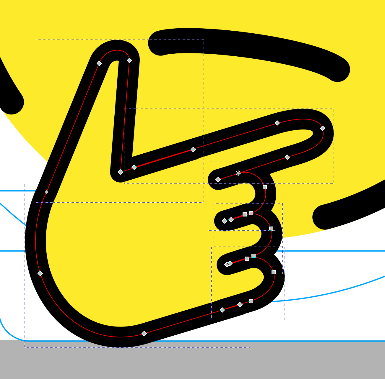
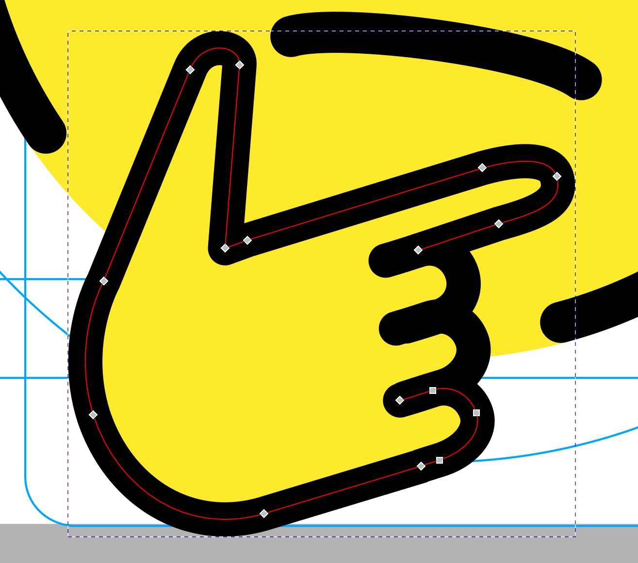
Hi! I leave here the corrections on the 4 finger ones. I also do some sutil corrections on the ones with already 5 fingers, like a hand to low and excessively big on 1F914 or a little unnatural pose on 1F92B (Although I'm not sure about this last one changes, I leave it up to you) Leave me your thougts! |
|
yes great stuff! I much prefer v2, we don't like unnecessary anchor points :) I also like what you've done with the unnatural poses. for reference:
watch out for little imperfections like this though, also we prefer if you join lines together which are part of the same shape :)
|


|
@nicdiac can you make sure you export your files following these instructions? https://openmoji.org/styleguide/#file_export it seems there's CSS attributes in your SVGs |
|
@dnlutz Do you want to add anything in terms of curve quality or OpenMoji hands and fingers? |
|
Sorry for being late to the party AND it's just a sketch … but I would be strongly in favor of going in the opposite direction. The more fingers, the more tiny fragmented elements we get. The interior spaces become too thin and don't look good. I don't think we need the fingers here at all – the main thing is to recognize the hands. What do you think? Would that be a direction you could go? |
|
sorry, i did not want to close this issue but add an image … |

|
I dont know if it is an oversimplification. But in the other hand I think thant otherwise there are a lot of useless lines. In any case I would leave it with five fingers, the difference is subtle but it looks, an it would differs much of the other emoji lines.
|


|
If we're representing fingers at all it should be five, however I think we should hint at them like |

|
I leave those here with that modifications I have to polish the anchor points, but to give you an impression |


|
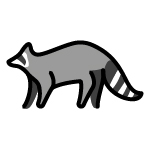
Here i leave the ones with those modifications. I also been working on the racoon one with the modifications. I still hardly see a racoon there, the shape of the body seems a lot like a lemur, so I do a reversion of it. What you think? Original / Modified / Reversion
|

|
The arch of the back is very different to what raccoons actually look like, but it's a lot better! See some of these from wikimedia commons for reference
|

|
I prefer the modified version in the middle. The reversion on the right is beautiful but it has too many details IMO. That's a problem we have with some other animals – they should be recognizable but not too realistic / detailed. |
|
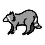
I leave the animals here with the modifications made. From the raccoon I lifted his back a little more arched at the end without getting lost in the realism. Of the bee and the sloth I leave several options, although of the sloth I opt for the last one, I believe that the problem was in the colors and in the form of the face, and of the bee those that involve the black color, the wings I would leave them equal, they are quite original.
The hippopotamus, the kangaroo and the monkey are well solved with the subtle modifications made. I focus on get clear the idea of the animal in all.
The skunk I modified completely without trying to get lost in so many lines.
I wait for your thoughts to send the final deliverables :) I also leave the svg if you want to try any mod. |


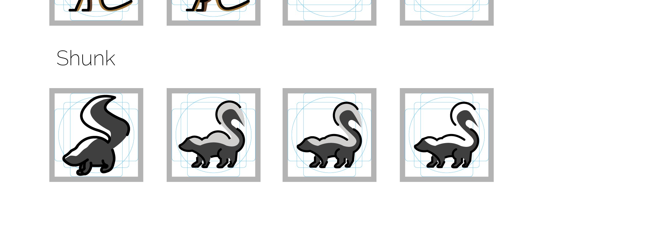
raccoonI think both options suffer from the large dip at the neck, have a look at the cat emoji for how you can do a continuous line and keep the ear beeI'd prefer sometihng like this (including legs) slothI'd say third but I think the head shouldn't be a circle and should be more accurate monkeygreat hippobetter but I dislike all of the leg options. have a look at what they look like, maybe look at our llama emoji for reference. kangarooI still really dislike this. I think it would be easier to redesign from scratch hahah like kangaroos have knees - how could that ever jump "shunk" :Pyes this is great!!I'd go with the last one |
|
I agree with @carlinmack |
|
going back to the hands for a second, I think this is preferable to your design. Could either of you send me the change? |

|
Me too, but dont follow the line of the 'no finger guys' 😂, thats why i rejected. I leave it here. In other news, i remade the raccoon. With this option the dip in the neck disappear. What you think?
|

|
Here i add the bee based on the one you said with some little variations, Im between 2 and 4
|

|
all of our insects are from a top down or side view so 4 and 5 are disqualified as for the others:
|
|
I'd just like to reiterate how important it is to follow the correct exporting rules
makes it a lot easier on my end 😀 |
|
Here are the two. On the bee I made the modification on the wing to be backward, the legs and the segmentation I dont thinks is the best to do, it makes it a lot more realistic, and more legs I tried before and does not work. Let your thoughs on the raccoon one, I remade it with a side view, like all the animal line but with a more raccoon like profile and curves on the back.
|

|
I really like that racoon!! perfect and fair enought with the bee, it's a huge improvement already! |
|
I've seen it dificult to modify the head of de sloth, and also hardly recognizible besides the originality of the concept when I focus on a real sloth pic. Again seems like a monkey like animal. I've tried a diferent aproach, with more realistic on the curves.
|

|
Could you make the adjustment to the fill like shown in the image? thanks
|

|
perfect! I'll check all the animals for that gaps and refine the sloth lines a little. thanks :) |
|
Sorry the delay, some issues comes up. Here are the hippo and the kangaroo reformulated. I have to do some refinements, but to give you the main concept. |

|
Wow good work! Can you upload the monkey, skunk, raccoon, bee, sloth, hippo and kangaroo! thanks 😀 |
|
Hi @nicdiac, Many thanks for this! Nice! But I think this could be still improved a bit ... I don't like that the black lines cluster that much. Could you try once more to further simplify the curves while avoiding clustering of the black lines?
|

|
Sorry again the impass 🙈 I don't enter to much on GitHub and the mail with the notification got buried on my inbox. Thanks @b-g and @carlinmack, I'll be doing the corrections to those last ones. It were just concept about the kangaroo and the hippo, just to see if you liked the twist from the already ones. Those things you said, the cluster of the black lines, were actually the ones I had to correct. In the next days I'll do the corrections and I'll upload the definitive ones! 💪 |
|
Hi there! I got the final ones over here, let me know I you want some modification, even if its minor. I corrected the clustering in the kangaroo and the hippo mainteining the essence of both. Also check If I exported well the svg's. I'd problems in the past with that and I want to solve it at once. 😅 Cheers and I hear you guys! 🙌 |
|
Hey! Someone is doing the improvements for the food ones? Just to take it and advance on it |
|
nope, feel free! I didn't catch that you linked the SVGs above, so I'll get to them and add them soon :) sorry about the delay |
|
|

|
hi, 😁 can I help here improving emoji? |
|
of course! I think @nicdiac is doing the food ones, but feel free to do any of the others :) |
|
@lizbravob Please! :) YAY! |
|
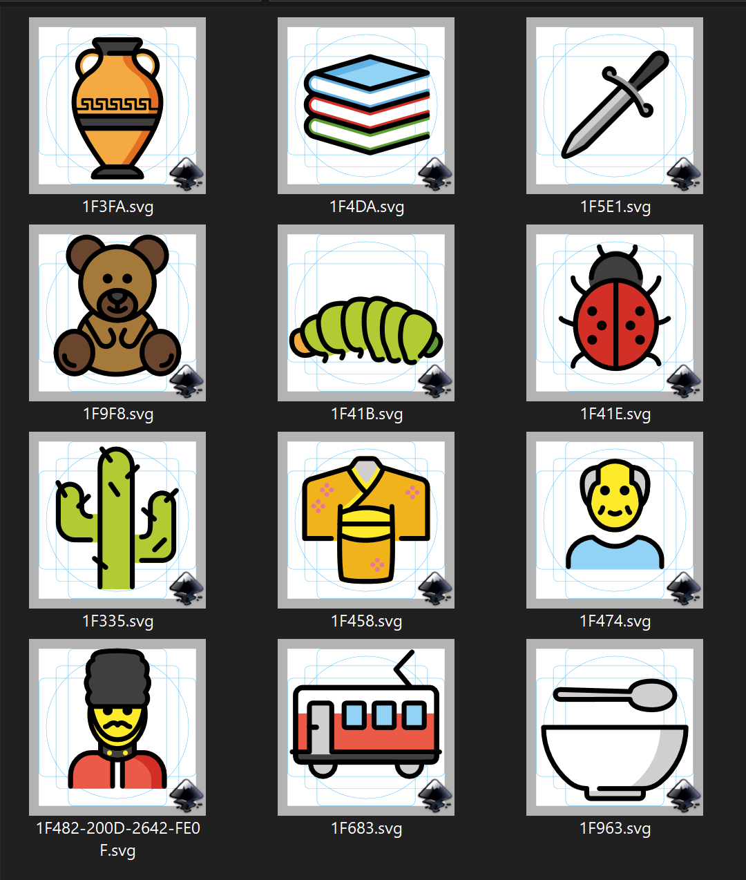
I started bottom-up :) hope it works well, and welcome any feedback. Greetings :) |
|
|


|
Oh also can you make the caterpillar body a bit bumpier? thanks!
|

|
Holaa! 👋 I fixed the bug, lady beetle & old man. And I redesigned the others :) Greetings. |
|
maybe with slightly shorter arms?
And can you fill in white for the pages of the book? I'll upload the other ones tomorrow :) |

|
Sure :) |
|
added in c6ed7af :) |
|
Really minor thing, but it bothers me a lot. The carrot emoji is messed up. It's a really easy fix. I just opened the svg with Inkscape and moved the lighter orange of the carrot to the bottommost layer and the regrouped things. Here's the new svg file |

|
@tif-calin Many thanks for spotting! Fixed with f6af300 ... please fix in the future the files of the |
|
..and also from this list :) Some openmoji are repeated in #143. I'll be pending for your feedback 😬 |
|
Wow! Nice! @dnlutz @carlinmack Comments before I merge it?
|

|
all great! would be good to preserve the old mushroom design and maybe some others |
|
Yay! I think we are done with this one. Closed. Many thanks @lizbravob and @carlinmack 🙏❤️!! |
Continuation from #106
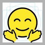
Face emojis with hands
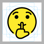
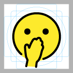
We have 5 fingers in these emoji Face With Finger Covering Closed Lips and Thinking Face and I think we should have 5 fingers in these emoji too
Animals
Food
new food issues
Others
The text was updated successfully, but these errors were encountered: