- Mobile-first responsive grid system
- Built with Compass and Susy
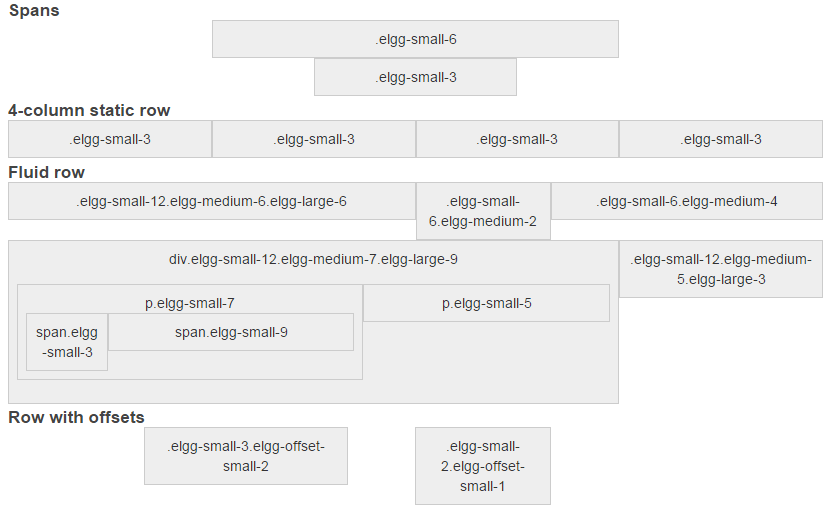
To create a 6-column span, simply add elgg-small-6 class to your element.
To make it responsive, i.e. 12 columns on small devices, and 6 columns on larger devices, use elgg-small-12 elgg-medium-6.
By default, spans are not floated. Wrap your elements in elgg-row, to float them.
<div class="elgg-row">
    <div class="elgg-small-12 elgg-medium-6">Column 1</div>
	<div class="elgg-small-12 elgg-medium-6">Column 2</div>
</div>
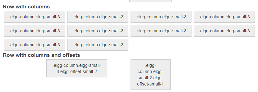
To add horizontal and vertical gutters, either use padding in nested elements, or add elgg-column class.
<div class="elgg-row">
    <div class="elgg-column elgg-small-12 elgg-medium-8">Column 1</div>
	<div class="elgg-column elgg-small-12 elgg-medium-4">Column 2</div>
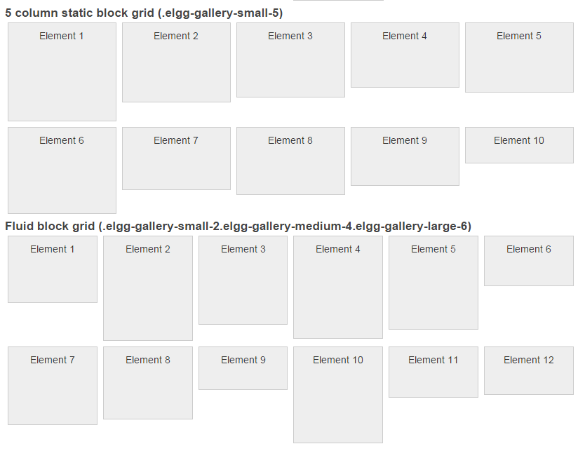
</div>You can apply elgg-gallery-$screen-$columns classes to any list. For example, create a responsive user gallery,
that has 6 columns on mobile devices, 8 columns on medium devices, and 12 columns on large devices, use:
echo elgg_list_entities(array(
	'types' => 'user',
	'list_type' => 'gallery',
	'gallery_class' => 'elgg-gallery-small-6 elgg-gallery-medium-8 elgg-gallery-large-12',
	'limit' => 48,
));


