Skip to content
New issue

Have a question about this project? Sign up for a free GitHub account to open an issue and contact its maintainers and the community.

By clicking “Sign up for GitHub”, you agree to our terms of service and privacy statement. We’ll occasionally send you account related emails.

Already on GitHub? Sign in to your account

Feature request: paired forest/risk-of-bias plot #102

Open
mcguinlu opened this issue Nov 2, 2020 · 42 comments
Open

Feature request: paired forest/risk-of-bias plot #102

mcguinlu opened this issue Nov 2, 2020 · 42 comments
Labels
enhancement New feature or request

Comments

@mcguinlu
Copy link
Owner

mcguinlu commented Nov 2, 2020

Problem
The most recent paper on ROB2, and indeed the Cochrane Handbook itself, suggest presenting risk-of-bias information as part of a paired forest plot. Risk-of-bias assessments are intended to be result-specific, and so presenting information about the potential bias in a result alongside the main analysis helps to ensure that the results are interpreted appropriately. The paired figure from the ROB2 paper is below, for reference:

This plot is something that has been requested by other users and has been on the cards for a while:

Somebody should glue this to robvis to make figures like pic.twitter.com/K87V6HWQdW

— Paul Sharpe (@paulsharpeY) September 14, 2020

Until recently, I was not sure how to do it, as the metafor::forest() function is quite restrictive in terms of matching with anything else, and aligning text tables in ggplot2 is a pain. However, @rdboyes recently shared code for producing a beautiful forest plot to Twitter. The code is available here: https://github.com/rdboyes/Forest_plot_with_table/blob/master/create_figure.R

Describe the solution you'd like
Ideally, I'd like to add a function (rob_blobbogram()) to robvis which creates these table/forest-plots/risk-of-bias plots.

The function would take two main inputs:

  • The output of a meta-analysis (e.g. an rma object from metafor::rma())
  • A risk-of-bias summary table in the same format as when passing to other rob_*() functions (for consistency)

Plus then some styling arguments, similar to the other rob_*() functions.

Describe alternatives you've considered
I have looked at packages like patchwork and cowplot to see if two disctinct plots could be aligned easily. It is possible - however ggplot2 is not great at handling text/tables. So while the forest plot and risk-of-bias plots could be aligned, adding the extra tables describing the study's results proved difficult.

Predicted issues
One important issue is that when previewing the plot created by @rdboyes, it looks scewy in the RStudio viewer but perfect once saved to a file. From a user interface point of view, this will cause a lot of issues as people email to say the graph looks wrong. I think it should be possible to address this by setting the dimensions of the RStudio viewer panel, but I haven't looked into it a whole lot. Perhaps @rdboyes, you might know?

Secondly, the current code for the forest-plot draws from a table rather than a meta-analysis object, and also does not include other aspects produced by the meta-analysis such as overall summaries or heterogeneity. However, by adding rows containing these, it should be possible to adapt the existing code to work.


Practical issues

@AJFOWLER - are you interested in having a go at this, as it might be a bit more interesting/challenging for you than refactoring the current code base?

@rdboyes - are you happy for us to reuse your forest plot code here/be involved in developing this functionality?

@mcguinlu mcguinlu added the enhancement New feature or request label Nov 2, 2020
@mcguinlu mcguinlu self-assigned this Nov 2, 2020
@mcguinlu mcguinlu removed their assignment Nov 2, 2020
@rdboyes
Copy link
Contributor

rdboyes commented Nov 2, 2020

Yes, happy to help and/or for my code to be used. A couple early thoughts:

  1. I've made the code much more robust and put it in a R package (thought it would spruce up my RStudio table contest submission😃), repo here: https://github.com/rdboyes/forestable
  2. Re: screwy viewer alignment - my current solution is to save the image, then display it to the Viewer pane using a call to plot(magick::image_read(file_path)). It's a little hacky but it works for now. Inside RMarkdown, the tables can be displayed with a call to knitr::include_graphics, which seems to work locally but not in github readmes for some reason.

@rdboyes
Copy link
Contributor

rdboyes commented Nov 2, 2020

Looking at the figure a little more, here's how I think we could build it:

  1. Using the code that I already have, we should be able to make the table from "Subgroup" to "Standardized Mean Difference" and down to "Overall" - with minor modifications to allow changing the dots and row formatting on summary rows.
  2. Using Patchwork, add a second table of blank rows to the right side with the same top and bottom values and l = 1 + the far right side of the original - this puts the column labels in and allows for a different theme than the main table (default should be blank, I think). Add the width of this new table to the output width of the image.
  3. Overlay all three traffic light plots as a single ggplot object on top of the blank columns. The y values used to center the traffic lights would be the same as the ones calculated for the forest plot, and the x values could be standardized.

I don't think it's possible to align the plots correctly using patchwork if they're three separate objects, but I could be wrong

@rdboyes
Copy link
Contributor

rdboyes commented Nov 2, 2020

IMHO the "statistical tests as rows" design is kind of distracting. It should work no problem, but I wonder if there's a better place to put them

@mcguinlu
Copy link
Owner Author

mcguinlu commented Nov 2, 2020

Thanks for your feedback/thoughts @rdboyes!

I completely agree with points 1/2 - this all seems very doable. I think one of the most time-consuming bits will actually be parsing the output of functions like metafor::rma() into a table that can be then passed to our function, as at the moment, it seems like a lot of manual set-up of the data in the input table is required (e.g. blank rows must be manually specified with NA)

Re: point 3, what is the advantage of producing three different plots rather than just having one, with a logical "show" variable which sets the point colour to "transparent" if a point does not need to be plotted for that row? This would also serve to negate the current "Removed 8 rows containing missing values" warning if applied to the main forest plot ggplot2 object, as the points would be plotted but be invisible.

Using this approach, I've managed to make a start by adapting your inital code, just as an initial proof of concept (the two-dotted ROB image on the right is all one ggplot2 object):

final_plot

My adapted version of your code is available here: https://gist.github.com/mcguinlu/621461bb511a8c73534c07df139e1220. Line 57 defines the "show" variable, while Lines 101-108 create the ROB plot.

Finally, while I think we'll have to produce an option to produce plots with "statistical tests as rows" design, as this is what users most frequently wish to see, we could also offer an alternative opinionated version of the plot - for this version, out of curiousity, where would you put the results of the statistical tests instead?

@rdboyes
Copy link
Contributor

rdboyes commented Nov 2, 2020

Sorry, I didn't see this response until just now. I've implemented a pretty good version of the required function that processes output from metafor::rma() automatically. It needs expanding to increase the number of formats that it is compatible with, but I think its a good baseline. I've submitted it as a pull request.

#104
forestable_plot

@rdboyes
Copy link
Contributor

rdboyes commented Nov 2, 2020

And re: "why not just have one ggplot object?" - we agree on this, I just phrased it in a confusing way.

@AJFOWLER
Copy link
Contributor

AJFOWLER commented Nov 3, 2020

Thanks for the tag @mcguinlu, looks like you guys have this covered - the plots look really great!

@mcguinlu
Copy link
Owner Author

mcguinlu commented Nov 4, 2020

The inital version of this function is now in the blobbogram branch of mcguinlu/robvis, thanks to @rdboyes! Ideally, there is more I'd like to implement before merging into the main branch as a central function. I've put together a summary below:

Functionality

  • Allow for generic subgrouping by any categorical variable in the dataset (e.g. country). Currently this is limited to the risk-of-bias levels for the ROB2 tool only, and is hard-coded into the function.
  • Allow users to pass metafor::rma() arguments as a list, so that these options can be applied to each subgroup analysis too.
  • Allow optional addition of presenting statistical tests (heterogeneity/overall) as rows.
  • Overall summary effect estimate is optional

Documentation

  • Add example to function roxygen
  • Improve descriptions of arguments

Test

  • Add tests of rob_blobbogram() using vdiffr

Look and feel

  • Change default font to something a bit nicer (but I have a feeling this might cause cross-platform issues!)
  • Ensure colours are consistent across robvis and allow for different palettes
  • Explore adding symbols to each risk of bias point
  • Change to diamond for subgroup and overall summary measures
  • Add column for weights
  • Add caption with interpretations of each RoB domain
  • Align headers of risk of bias domains with rest of header row.
  • Decrease opacity of boxes around risk of bias judgements

Misc To Do

  • Add @rdboyes as a contributor in the DESCRIPTION

@mcguinlu
Copy link
Owner Author

mcguinlu commented Nov 4, 2020

@kylehamilton - just saw you fork forestable which sparked a question! Is there anything in JAMOVI at the moment that does similar to what we are trying to do here that we could draw from?

@paulsharpeY
Copy link

Amazing watching this unfold!

Top of my feature list is flexible grouping and ordering and plotting.

My current use case is to convert three custom forest plots for different outcomes into a single plot. It's such a clear way to visualise and compare effect sizes, mentally moderated by the traffic lights.

@mcguinlu
Copy link
Owner Author

mcguinlu commented Nov 4, 2020

@wviechtb, tagging you here as my supervisor (Julian Higgins) suggested it would be worthwhile flagging this to you, both out of interest and in case you had any thoughts on the proposed plan/our handling of the metafor::rma() object!

@rdboyes
Copy link
Contributor

rdboyes commented Nov 4, 2020

Change default font to something a bit nicer (but I have a feeling this might cause cross-platform issues!)

Don't hate on R default mono!

Actually though the reason for choosing this font for the first pass is that a monospace font makes it much easier to troubleshoot horizontal alignment and this one is the only monospace font available in R by default. I'm working on accurately measuring width (and height, annoyingly) using systemfonts::shape_string() for forestable - I can bring that over once it's working correctly.

@mcguinlu
Copy link
Owner Author

mcguinlu commented Nov 4, 2020

Don't hate on R default mono!

Sincere apologies - I was just spoiled by the font you used in the inital NEJM figure 😄

and height, annoyingly

Never realised this would be an issue - huh.

And that all sounds great - thank you! I'm hoping to have some time this weekend myself to have a look at adapting your code to address some of the other functionality. Out of interest, is reading from metafor/other MA objects something you see forestable doing? I just want to check so that we aren't duplicating work and can hand code off between packages as needed!

@rdboyes
Copy link
Contributor

rdboyes commented Nov 4, 2020

I just want to check so that we aren't duplicating work and can hand code off between packages as needed!

I was thinking about this as well, but I'm not sure of the best way to proceed. I think it does make sense to add comprehension for MA objects to forestable - something like rma_object %>% forestable() resulting in a nice forest plot seems very useful. Maybe the solution is to have forestable handle the table, and have a function inside of robvis that attaches the ROB plot to the right side?

@mcguinlu
Copy link
Owner Author

mcguinlu commented Nov 5, 2020

something like rma_object %>% forestable() resulting in a nice forest plot seems very useful

Just to flag that metafor does have the forest() function which follows this format to produce a forest plot from a rma object (see here for the tutorial):

And I think having forestable handle the plot could be a good plan (in which case I can move my wishlist in the comment above across to an Issue on the forestable repo) - my only concern is that the output of the forestable function will need to be in a format to which I could append the ROB figure.

As an alternative, I'm very happy to try and develop the rma-specific functionality locally as part of robvis while you work on the generalised plotting issues (working out appropriate widths/etc) in forestable, and then merge the relevant code from the two efforts?

I guess it really depends where support for rma objects falls on your priority list vs. generalised support for all-manner of forest plots, as this is something I would be keen to offer to users soon. But whichever way round we do it, very happy to contribute!

@wviechtb
Copy link

wviechtb commented Nov 5, 2020

Adding some additional colored points could be done as follows. If you want them to the right of the annotations (estimates, CI), then you can use the (currently undocumented) textpos argument to specify the position of the study labels and annotations and add some space to the right of the annotations by using an appropriate xlim value. Then just add points in the desired color using the points() function (and text() if you want to add +/?/- accordingly).

library(metafor)

### copy BCG vaccine meta-analysis data into 'dat'
dat <- dat.bcg

dat$bias1 <- sample(1:3, nrow(dat), replace=TRUE)
dat$bias2 <- sample(1:3, nrow(dat), replace=TRUE)
dat$bias3 <- sample(1:3, nrow(dat), replace=TRUE)
dat$bias4 <- sample(1:3, nrow(dat), replace=TRUE)

### calculate log risk ratios and corresponding sampling variances (and use
### the 'slab' argument to store study labels as part of the data frame)
dat <- escalc(measure="RR", ai=tpos, bi=tneg, ci=cpos, di=cneg, data=dat,
              slab=paste(author, year, sep=", "))

### fit random-effects model
res <- rma(yi, vi, data=dat)

### forest plot with extra annotations
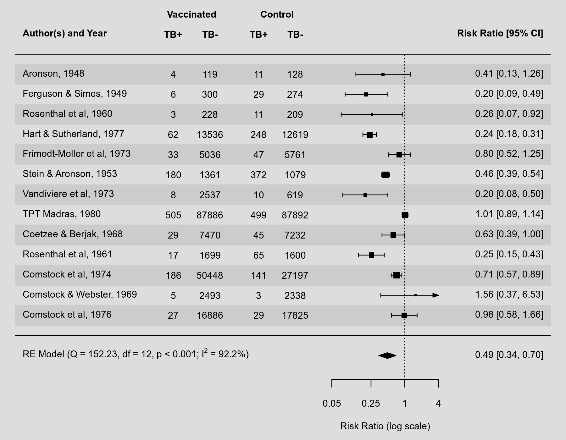
forest(res, atransf=exp, at=log(c(.05, .25, 1, 4)), xlim=c(-16,11),
       ilab=cbind(dat.bcg$tpos, dat.bcg$tneg, dat.bcg$cpos, dat.bcg$cneg),
       ilab.xpos=c(-9.5,-8,-6,-4.5), cex=.75, header="Author(s) and Year",
       mlab="", textpos=c(-16, 6))
op <- par(cex=.75, font=2)
text(c(-9.5,-8,-6,-4.5), 15, c("TB+", "TB-", "TB+", "TB-"))
text(c(-8.75,-5.25),     16, c("Vaccinated", "Control"))
text(7:10, 15, c("B1", "B2", "B3", "B4"))
par(op)

### add risk of bias points
cols <- c("green", "yellow", "red")
syms <- c("+", "?", "-")
points( rep(7,13), 13:1, pch=19, col=cols[dat$bias1], cex=2)
text(7, 13:1, syms[dat$bias1], cex=0.8)
points( rep(8,13), 13:1, pch=19, col=cols[dat$bias2], cex=2)
text(8, 13:1, syms[dat$bias2], cex=0.8)
points( rep(9,13), 13:1, pch=19, col=cols[dat$bias3], cex=2)
text(9, 13:1, syms[dat$bias3], cex=0.8)
points(rep(10,13), 13:1, pch=19, col=cols[dat$bias4], cex=2)
text(10, 13:1, syms[dat$bias4], cex=0.8)

### add text with Q-value, dfs, p-value, and I^2 statistic
text(-16, -1, pos=4, cex=0.75, bquote(paste("RE Model (Q = ",
     .(formatC(res$QE, digits=2, format="f")), ", df = ", .(res$k - res$p),
     ", p = ", .(formatC(res$QEp, digits=2, format="f")), "; ", I^2, " = ",
     .(formatC(res$I2, digits=1, format="f")), "%)")))

This would then look like this:

forest_plot

@mcguinlu
Copy link
Owner Author

mcguinlu commented Nov 20, 2020

Thanks everyone for pitching in on this! A few updates for those watching out of interest.

Having thought it over for a while now, I have decided to take the approach of being over inclusive, so that >1 option available to users, depending on what set-up they are most comfortable with. The result is that the "blobbogram" branch of robvis now contains two new functions:

  • The first, rob_append_to_forest(), is a wrapper for the metafor::forest() function which appends on a risk-of-bias plot to the output of that function. @wviechtb was very forward-looking when writing the metafor::forest.* functions, in that they invisibly return information about the resulting plot which rob_append_to_forest() then updates to allow for the risk-of-bias plot to be appended. All arguments that can be passed to metafor::forest() can be passed to this function (one important thing to note is that if not specified, the header argument of metafor::forest() is set to TRUE). At present, the function only supports assessments done using the RoB2 tool, but the internal infrastructure is in place to expand it to other risk-of-bias tools soon.
# Perform meta-analysis using BCG dataset

  dat <-
    metafor::escalc(
      measure = "RR",
      ai = tpos,
      bi = tneg,
      ci = cpos,
      di = cneg,
      data = metafor::dat.bcg,
      slab = paste(author, year, sep = ", ")
    )
  
  res <- metafor::rma(yi, vi, data = dat)

# Set-up risk of bias dataset to have 13 studies (same as in the dat.bcg data), and a
# Study column that is used to match to the res data

  dat.rob2 <- rbind(robvis::data_rob2, robvis::data_rob2[1:4, ])
  dat.rob2$Study <- paste(dat$author, dat$year)

# Create figure

  rob_append_to_forest(res, dat.rob2)

gh-append-simple

  • rob_blobbogram() implements a different approach to rob_append_to_forest(). It takes the same two core arguments as above, but automatically sub-sets the studies by "Overall" risk-of-bias judgment and performs a meta-analysis within each level (the rma() call is stored in the res object, and this function extracts it and applies it to each data subset). It then presents this as a composite ggplot/gridExtra::tableGrob plot, in line with @rdboyes's forestable package. Please note: this function is still in the early stages of development, and will need extensive testing across different meta-analytical outputs before being deployed.
rob_blobbogram(res, dat.rob2)

gh-blob

There is still much work to be done on both functions, including adding support for more risk-of-bias tools and improving the look/feel of the output of the rob_blobbogram() output (as per the checklist in one of the previous comments in this chain), but I wanted to update everyone on the progress so far!

Finally, any and all feedback/thoughts/comments are very welcome!


Other notes

@wviechtb - as rob_append_to_forest() function is just a wrapper for the existing metafor::forest() function, I though it was appropriate to add you as a contributor to robvis. Please let me know if you are unhappy with this!

@rdboyes - I spent a lot of time trying to work out how best to do the testing for the rob_blobbogram() function which is powered by the same code as your forestable package. The relevant lines are here, in case it is of use! They don't play nice with GitHub Actions for reasons I haven't worked out yet (I think it is to do with the threshold set across different platforms). Great to hear if you have found an alternative solution!

@wviechtb
Copy link

Very nice! I didn't really do anything with respect to robvis so not sure if contributor is applicable, but also fine if you want to keep me listed.

@rdboyes
Copy link
Contributor

rdboyes commented Jan 11, 2021

Sorry to leave this so long - other projects took priority, etc. I've updated the forestable package (renamed to forester) with support for the standard R fonts + Fira Sans (the original font I used). I've also added a parameter in the main forester function which takes any ggplot object and aligns and appends it to the right side of the table. My thought is that the code to process the meta-analysis and risk of bias data, as well as the creation of the risk of bias plots can live in robvis, while the code for alignment and making the forest plot itself lives in forester. rob_blobbogram() would take the same input that it does now, process it into a dataframe containing the desired content for the forest plot and a ggplot object with the risk of bias plot, then pass those to forester for synthesis.

The main thing I'm trying to avoid with this setup is duplicating my forester code across two repos - I'm not 100% set on this as the best way to do it, but it seems workable to me. Let me know what you think - happy to help reorganize the function if this works for you as well.

@mcguinlu
Copy link
Owner Author

No problem at all - I've also been a bit stretched for time recently.

rob_blobbogram() would take the same input that it does now, process it into a dataframe containing the desired content for the forest plot and a ggplot object with the risk of bias plot, then pass those to forester for synthesis.

That all sounds great - being able to do just a little preprocessing and then pass it all off to forester would be amazing. I haven't had a chance to look at your new set-up yet, but will definitely let you know if there are any snags I hit that it might be possible to address from your end.

Just to note, I have merged in your initial PR now (#109) but with the caveat that the functionality offered by forester is not yet available from robvis (functions related to it are stored in R/rob_blobbogram.R and are commented out). The reason for the pre-emptive merge is that I needed to get the other work on the intergration with metafor that I foolishly included in #109 into the main branch, as I am presenting it later this week at the Evidence Synthesis and Meta-analysis in R conference. But hoping I'll get a chance to build up the forester -> robvis integration towards the end of this month 🙏🏻

@rdboyes
Copy link
Contributor

rdboyes commented Jan 23, 2021

Making progress on this! I've uploaded my current code in a vignette (which is absolutely not useful to anyone else yet) here: https://github.com/rdboyes/forester/blob/master/vignettes/Adding_Custom_GGPlots.Rmd but the punchline looks like:

forester::forester(left_side_data,
     estimate,
     ci_low,
     ci_high,
     null_line_at = 1,
     font_family = "serif",
     x_scale_linear = FALSE,
     add_plot = rob_plot,
     xlim = c(0.09, 7),
     xbreaks = c(.2, .5, 1, 2, 5),
     arrows = TRUE,
     arrow_labels = c("Low", "High"),
     nudge_y = -0.2,
     estimate_precision = 2)

forester_plot

@paulsharpeY
Copy link

Just what I've been looking for :)

@rdboyes
Copy link
Contributor

rdboyes commented Jan 27, 2021

Ok! A reasonably effective version of the function that does generally what we originally wanted (subsets by any column, supports all major tools and colour schemes, and depends on forester as a backend) is in my fork of robvis. I haven't made a pull request yet because I'm currently getting a lot of failed tests - not sure exactly what's going on. Here's how it looks so far though!

Robins, serif, cochrane

forester_plot_robvis_robins

Quadas, sans, cochrane

forester_plot_robvis_quadas

ROB2, serif, colourblind

forester_plot_robvis

@earcanal
Copy link

This is great @rdboyes. I'm trying to apply the vignette to my own data. At the moment you can't do ROB2 and ROBINS in the same plot. Is there a methodological reason why you should include RCTs and non-RCTs in the same meta-analysis?

@rdboyes
Copy link
Contributor

rdboyes commented Feb 14, 2021

I don't have any intention of adding support for two different tools in the same plot, but you can probably modify the code to make that happen if it's important to you. I'd suggest just making two separate plots as a simple workaround. Your last question is outside my specific expertise, but I would say yes, there are situations where RCTs and non-RCTs target the same estimand and could be shown in the same plot, though there are many assumptions involved to make it make sense

@mcguinlu
Copy link
Owner Author

[Hi both, I'm going to respond to you two seperate comments]

Hi @earcanal,

Gald you are finding this amazing work by @rdboyes helpful. Re: putting RCTs and non-RCTs on the same plot, I would echo Randall's point about there being some situations where this is appropriate. However, these situations are quite rare, and adding standardised support for them in robvis would be a substantial undertaking (though could happen in the future) - your best bet is definitely to create two different plots.

@earcanal
Copy link

Hi both,

Thanks for your thoughts on this. I'm going to keep my RCTs and case-controls as separate plots. I am going to attempt to adapt the vignette to work with brms. I'll aim to produce a PR for this when things stabilise.

@mcguinlu
Copy link
Owner Author

mcguinlu commented Feb 16, 2021

@rdboyes sorry for the delay - this is all looking superb! There are a couple of small additional aesthetic tweeks I'd like to make, but I can do this myself and I think it's worth getting the function into use as is.

Two things I wanted to query that I think are currently handled from with forester:

  • Is it possible to move domain headers in add_plot to be in line with the headers in table? I tried doing this manually by adjusting the y for the domain headers (i.e. changing the domain header y to y+1, as each row is "1" high), but it didn't appear to work and so wanted to check if forester adds the table headings in a different manner before spending too much time on it!
  • Is it possible to reduce the whitespace between the table and the add_plot so it is slightly more flush ? I think this is calculated within forester

I haven't made a pull request yet because I'm currently getting a lot of failed tests - not sure exactly what's going on. Here's how it looks so far though!

I had a look at the test suite on your fork and it looks like everything is passing now, barring the test coverage check (which is a minor issue) and the Ubuntu devel where it can't find forester as a dependency. I'm not 100% sure what the issue here is as it passes on the Ubuntu release version - maybe rerunning the tests now it has been a few days might magically fix it as the devel version becomes more stable?

Very happy to review a PR whenever you have time to open one, and as always, thanks for your work on this! 😁

@rdboyes
Copy link
Contributor

rdboyes commented Feb 16, 2021

The whitespace is easy (he said, foolishly) - it's currently there because the axis on the left side is being drawn but is transparent. I should be able to instead not draw it with element_blank() and reduce the whitespace.

Aligning the titles is more problematic. The way the alignment currently works inside forester, neither ggplot object goes all the way to the top, so you won't be able to easily get it there inside the current function. The only way I can think to do it is to have a separate ggplot object that contains the titles and use patchwork::inset_element and some math to line it up right.

For what it's worth, personally I prefer the labels where they are over having them aligned with the table :)

@mcguinlu
Copy link
Owner Author

The whitespace is easy (he said, foolishly)

Ha, I sense a kindred spirit! But great that it is relatively easily solvable!

Aligning the titles is more problematic. . . . For what it's worth, personally I prefer the labels where they are over having them aligned with the table :)

Ah I thought there was something else going on. Personally I think both options (where they are currently vs aligned with the table) look a bit odd - incredibly unhelpful I know, but I can't think of where I'd actually like to put them. So in absence of a personal preference, I'm going to agree with you and say leave them where they are (which happily is computationally easier too!)

@rdboyes
Copy link
Contributor

rdboyes commented Feb 17, 2021

Great! I've fixed the whitespace issue and submitted what I have so far in a pull request. My feeling is that this function is still "development" status - not ready for prime time, but progressing towards it!

@paulsharpeY
Copy link

My fork of @rdboyes fork has a functional implementation of Bayesian forest plots using brms. Various hacks (notably hard-coded model, priors, and interval function), but they should be easy to fix.

forest

@mcguinlu
Copy link
Owner Author

mcguinlu commented Mar 2, 2021

Hi @rdboyes

I am loving this new functionality. Have been working hard on it recently to try and get it ready for formal release. As part of this, I have some thoughts/questions:

  • Do you think it could be possible to allow forester to accept two vectors of numbers, one to define the size of each point (which will be based on the weights extracted from the meta-analysis) and the second to define different colours/shapes to differentiate between the study vs overall points?

  • Would it be possible for forester to not clip the main forest plot (i.e. use coord_cartesian() rather than scale_x - see bottom right hand corner of the second page of the ggplot2 cheatsheet)? The reason for this request is that if a user specifies x limits that are lower than the upper confidence interval for a study, the error bars for that study are removed - see Comstock and Webster in the image below:

rob_blobbogram(rma, dat.rob2, xlim = c(-2,5))

erros

  • On a related note, would it be possible to implement an arrow that indicates when the confidence interval extends beyond the limits of the plot?

[Of interest, rather than implementing the above yourself, it might be easier to allow users to replace the default central ggplot2 graph in a similar fashion to add_plot. I'd be happy to try and address the issues listed above locally as part of rob_blobbogram() but then wouldn't be able to port those fixes into forester based on the current set-up. On my understanding, it would also allow for modifications like what @paulsharpeY has done (but I could be wrong!). By allowing users to alter the default plot, both new users (who will likely want the default) and more finnicky user (i.e. me 🤦‍♂️) are happy.]


  • I hit a small issue regarding the column headings. I wanted to implement some functionality to allow users to produce a standard paired plot without the subsetting functionality. However, this results in either (a) an empty row where the risk-of-bias judgement (e.g. "High" was previously) or (b) if you get rid of this row, the headers of the ROB plot are cut-off. Any suggestions?

headers

  • forester() is currently quite noisy, e.g. running the standard forester() function produces a lot of text output as the scales are replaced and NA values are excluded (see below). Is there anyway this could be reduced?
Scale for 'x' is already present. Adding another scale for 'x', which will replace the
existing scale.
Scale for 'y' is already present. Adding another scale for 'y', which will replace the
existing scale.
# A tibble: 1 x 7
  format width height colorspace matte filesize density
  <chr>  <int>  <int> <chr>      <lgl>    <int> <chr>  
1 PNG      679    470 sRGB       FALSE        0 236x236
Warning messages:
1: Removed 9 rows containing missing values (geom_point). 
2: Removed 9 rows containing missing values (geom_errorbarh).
  • Is your plan to put forester on CRAN? There will (eventually) be a new release of robvis, but CRAN does not allow dependencies on development pacakages. If you aren't planning on a formal release, we will have to port over the functionality into robvis (with appropriate attribution/upgrade from "ctb" to "aut" of course 😁)

Hi @paulsharpeY,

Looks interesting! My plan is to get it up, running and fully supported for metafor before (maybe) branching out in other MA packages. But great to know if works 👍

@paulsharpeY
Copy link

FWIW, I use forester() to generate the LHS of the plot. I just calculate the values using brms rather than metafor.

@rdboyes
Copy link
Contributor

rdboyes commented Mar 2, 2021

@mcguinlu Just noting that I've seen this and will respond when I have time (i.e. not right now)

@rdboyes
Copy link
Contributor

rdboyes commented Mar 2, 2021

Do you think it could be possible to allow forester to accept two vectors of numbers, one to define the size of each point (which 
will be based on the weights extracted from the meta-analysis) and the second to define different colours/shapes to differentiate 
between the study vs overall points?

Yep, I can add that functionality no problem.

Would it be possible for forester to not clip the main forest plot (i.e. use coord_cartesian() rather than scale_x - see bottom 
right hand corner of the second page of the ggplot2 cheatsheet)? 

This should be easy as well

On a related note, would it be possible to implement an arrow that indicates when the confidence interval extends beyond the 
limits of the plot?

A little trickier but doable

 Custom plots

Yep, I can do that

 the headers of the ROB plot are cut-off. Any suggestions?

This is the trickiest one. I think the easiest way to fix this is to blank the actual title row (just colour it white) and create a fake header row in the first row

forester is chatty

Probably a good idea to quiet it down, yep

CRAN

I've never submitted to CRAN before, but assuming it's reasonable to get it done, I'll likely do it

@mcguinlu mcguinlu added this to the Version 1.0.0 [CRAN Release] milestone Mar 19, 2021
@rdboyes
Copy link
Contributor

rdboyes commented Mar 28, 2021

Progress made on a few of these issues! The newest version supports point_sizes and point_shapes as options, either as a vector the same length as the data or as a single value, fixes the ci clipping, and adds an arrow if the ci goes out of bounds. Give it a try - still working out the kinks in it

@rdboyes
Copy link
Contributor

rdboyes commented Mar 28, 2021

Forester is now version 0.4.0! Chatty-ness fixed and support for custom plots have been added (use center_ggplot option). That's everything but the headers, which is a problem for another day ... here's what the "out of bounds" ci's look like now:
limit_breaks

@rdboyes
Copy link
Contributor

rdboyes commented Mar 30, 2021

Hey @mcguinlu - I think I have a working fix for the final issue (this one)

  • I hit a small issue regarding the column headings. I wanted to implement some functionality to allow users to produce a standard paired plot without the subsetting functionality. However, this results in either (a) an empty row where the risk-of bias judgement (e.g. "High" was previously) or (b) if you get rid of this row, the headers of the ROB plot are cut-off. Any suggestions?

Do you have somewhere where the data/code for that example lives already? Just so I don't have to recreate it

@mcguinlu
Copy link
Owner Author

mcguinlu commented Apr 1, 2021

Hi @rdboyes, this all looks amazing - hoping to have some time over the Easter weekend to run through it all properly.

Re: the column heading example, essentially, I have added an additional ifelse statement to metafor_object_to_table() which, when subset_col = NULL, creates a table that is not subset and so does not have any level headings (e.g. "Low risk of bias"/etc.):

robvis/R/rob_blobbogram.R

Lines 268 to 314 in 65737f1

if (!is.null(subset_col)) {
# Clean level names so that they look nice in the table
table[[subset_col]] <- stringr::str_to_sentence(table[[subset_col]])
levels <- unique(table[[subset_col]])
if(!(is.null(subset_col_order))){
levels <- intersect(subset_col_order, levels)
}else if(rob_tool %in% c("ROB2", "QUADAS-2", "ROB2-Cluster") & subset_col == "Overall"){
levels <- intersect(c("High", "Some concerns", "Low", "No information"), levels)
}else if(rob_tool == "Robins" & subset_col == "Overall"){
levels <- intersect(c("Critical", "Serious", "Moderate", "Low", "No information"), levels)
}
# Work out if only one level is present. Passed to create_subtotal_row(), so
# that if only one group, no subtotal is created.
single_group <- ifelse(length(levels)==1, TRUE, FALSE)
# Subset data by levels, run user-defined metafor function on them, and
# recombine along with Overall rma output
subset <-lapply(levels, function(level){dplyr::filter(table, !!as.symbol(subset_col) == level)})
names(subset) <- levels
# This takes the same metafor::rma function (including args) and runs it on each subsetted dataset
subset_res <- lapply(levels, function(level){metafor_function(rma, data = subset[[level]])})
names(subset_res) <- levels
# This binds the table together
subset_tables <-
lapply(levels, function(level){
rbind(
create_title_row(level),
dplyr::select(subset[[level]], Study, .data$est, .data$ci_low, .data$ci_high),
create_subtotal_row(subset_res[[level]], single_group = single_group, add_tests = add_tests)
)
})
subset_table <- do.call("rbind", lapply(subset_tables, function(x) x))
} else {
levels <- ""
subset_table <- rbind(
create_title_row(""),
dplyr::select(table, Study, est, ci_low, ci_high)
)
}

So having loaded that version of the function, running the following code will produce the figure I included in the comment above.

dat.bcg <- metafor::dat.bcg

dat <-
  metafor::escalc(
    measure = "RR",
    ai = tpos,
    bi = tneg,
    ci = cpos,
    di = cneg,
    data = dat.bcg,
    slab = paste(author, year)
  )

rma <- metafor::rma(yi, vi, data = dat)

dat.rob2 <- rbind(data_rob2, data_rob2[1:4,])
dat.rob2$Study <- paste(dat$author,dat$year)

rob_blobbogram(rma, dat.rob2, subset_col = NULL)

Hopefully this is what you were looking for, but let me know if I can provided anything else useful!

@arthur-albuquerque
Copy link

Hi @mcguinlu, this function looks very nice. Yet, I wasn't able to download it.

Could you please help me? Thanks!

@Franckazevedo
Copy link

I need making a rob_append_to_forest, but I can´t do this.
Can you help me? Thanks!

Sign up for free to join this conversation on GitHub. Already have an account? Sign in to comment
Labels
enhancement New feature or request
Projects
None yet
Development

No branches or pull requests

8 participants