Exploration of the multi modal fuyu-8b model of Adept. 🤓 🔍
Try yourself in colab!
The colab uses the original model from Adept and a modified (sharded) model, both via huggingface integration.
The original blog post about fuyu-8b can be found here.
Prompt (original model):
Perform OCR to extract text contained within the image. The extracted text in combination with the image represent a joke or funny situation. Explain why it is funny.\n

Model output:
The image features a bald man sitting with his hands covering his face, seemingly covering his eyes. The caption below him reads "I CAN'T EVEN," which is a common expression that is often used to imply a sense of disbelief or surprise. This combination of the man's facial expression and the words "I CAN'T EVEN" creates an amusing and lighthearted scene, making the scene particularly funny and entertaining.
Disclaimer:
This is a cherry-picked example.
Opinion:
However, I think it's pretty good and it shows the models potential. It has not been explicitly trained to evaluate memes, you could fine-tune on memes and the quality of this cherry-picked example might be in reach (not tried yet).
Prompt (original model):
Perform OCR to extract text contained within the chart. Based on the extracted text and the chart itself, describe what you see and point out relations and interesting interconnections.\n

Model output:
The graph depicts the distribution of the "NDP" and "Vacant" positions in Canada as of May 19, 2005. The "NDP" positions are represented by blue, red, and orange segments, while the "Vacant" positions are represented in blue, red, and orange segments. The "NDP" positions occupy 133, 138, and 139, respectively, while the "Vacant" positions occupy 134, 135, and 136
Disclaimer:
This is not a cherry-picked example.
It is the first result by searching for 'chart' in google images. Also the prompt has not been engineered but is the first shot.
Result:
Fail case.
Another Prompt (original model):
What stake does the liberal party have and how does that relate to the conservative party?\n
Model output:
The liberal party has a stake that consists of "conservative" values, such as "social egalitarianism" and "free market conservatism." This stake is represented by the graph, which divides the pie chart into red and blue segments. The conservative party, on the other hand, has a stake that consists of "social conservatism" and "traditional values." This stake is represented by the graph, which divides the pie chart into red and green segments. The conservative party's stake is represented by a smaller segment compared to the liberal party'
Opinion:
Mostly a fail case, as it is describing knowledge from the train data (liberal and conservative values) instead of the charts distribution. The last sentence is correct.
Another Prompt (original model):
Extract the text from the pie chart. Based on the pie chats distribution, explain how the liberal parties stake relates to the conservative parties stake.\n
Model output:
The "Liberal" party stake is represented by 133, while the "Conservative" party stake is represented by 98. The "NDP" party stake is represented by 19, while the " Bloc Quebecois" party stake is represented by 34. The "Conservative" party stake is represented by 98, while the "NDP" party stake is represented by 19. The "Liberal" party stake is represented by 133, while the "Conservative" party stake is represented by
Opinion:
Much better than before but with a strange repetition. Also the relation is missing.
However this suggests that there is more potential with some prompt engineering and a better understanding of the model.
Prompt (original model):
Perform OCR to extract text contained within the chart. Based on the extracted text and the chart itself, describe what you see and point out relations and interesting interconnections.\n
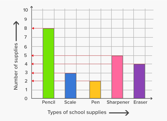
Model output:
The graph displays various types of school supplies, including pencils, which are represented by green and pink bars, and other types of school supplies, such as erasers, represented by purple and yellow bars. The graph shows a sharp increase in pencil supplies, while other types of school supplies show a steady increase. The graph also displays a sharp decrease in the number of school supplies related to other types of supplies, such as pencils and erasers. This suggests that pencils and erasers are the primary subjects of interest, while other types of supplies have decreased over time.
Disclaimer:
This is not a cherry-picked example.
It is the first result by searching for 'graphs' in google images. Also the prompt has not been engineered but is the first shot.
Opinion:
A few things are not correct (color, description, etc.), overall it is not too bad, considering that it is the same prompt as in the fail case example above.
Another Prompt (original model):
What is the number of supplies for type pen?\n
Model output:
There are four supplies for the type of pen.
Result:
Fail case.
Prompt (original model):
Perform OCR to extract text contained within the image. Describe what this image is about so that a 5 year old understands.\n

Model output:
The image features a graph that displays two intersecting circles. The graph's center is labeled "Relation in graph" and "1". The graph's outer circle is labeled "1-5". The graph's inner circle is labeled "2-5". The graph's outermost circle is labeled "1". The graph's innermost circle is labeled "3".
Disclaimer:
This is not a cherry-picked example.
It is the first result by searching for 'relation' in google images. Also the prompt has not been engineered but it the first shot.
Opinion:
Fail case.
Prompt (original model):
Explain what objects are in this image.\n

Model output:
In the image, there is a boat floating on the water, surrounded by waves. The boat is surrounded by an orange sun, which adds a vibrant and visually appealing touch to the scene. The waves in the ocean create a dynamic and lively atmosphere, while the sun's orange hue adds a pop of color to the scene.
Disclaimer:
This is not a cherry-picked example. \
Opinion:
Fair enough, actually I'd have expected more the objects side (cloud, sun, ship).
Overall the model didn't perform very well on the given examples.
However there can be really good results with the right prompts. Also the model was used as is and fine tuning on a specific use case could push the performance by a lot, so the model has a good potential.