=====================
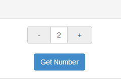
A directive used for picking number by using -/+ button, instead of typing the number directly.
This is an angular directive designed in mobile-first concept. Which means you would have better user experience while in mobile development.
While running on mobile device, you would increase/decrease the number continuously by long tap the -/+ button.
Try it: plunker
- angularjs (1.4.3+)
- bootstrap (3.3.5+)
bower install angular-number-picker --savenpm install angular-number-picker --save- Include
angular-number-picker.jsinto yourindex.htmlby usingscripttag, or you have other way to import dependency(For example: requirejs), like following:
<script type="text/javascript" src="[location]/angular-number-picker.js"></script>- Add
angularNumberPickermodule as your angular app's dependency
var demo = angular.module('demo', ['angularNumberPicker']);- Use
h-numbertag in your html
<div ng-controller="DemoController">
    <h-number value="input.num" min="2" max="10" step="1" change="onChanged()"></h-number>
</div>- Writing
DemoController
demo.controller('DemoController', ['$scope', function($scope) {
   $scope.input = {
            num: 0
        };

   $scope.getNumber = function() {
       alert('The number is: [' + $scope.input.num + ']');
   };

   $scope.onChange = function(){
       console.log('The number is Changed ', $scope.input.num);
   };
}]);| Attribute | Type | Required | Description |
|---|---|---|---|
| value | expression | Yes | Expression to evaluate as the input number |
| min | Number | No | The minimal point to limit the operation. 0 by default |
| max | Number | No | The maximum point to limit the operation. 100 by default |
| step | Number | No | The step value for the operation. 1 by default |
| singular | String | No | Label to be included after value when value is 1 |
| plural | String | No | Label to be included after value when value is not 1 |
| change | Function | No | Function to be called while number is changed |
The wrapper class for the h-number element
The wrapper class for +- operator
The wrapper class for the number area at the center
The active class will be added to the input-group-addon button, while touching them. So it's possible to implement your own behavior.
It's easy to implement those classes to achieve your own UI
npm installbower installgulp demo


