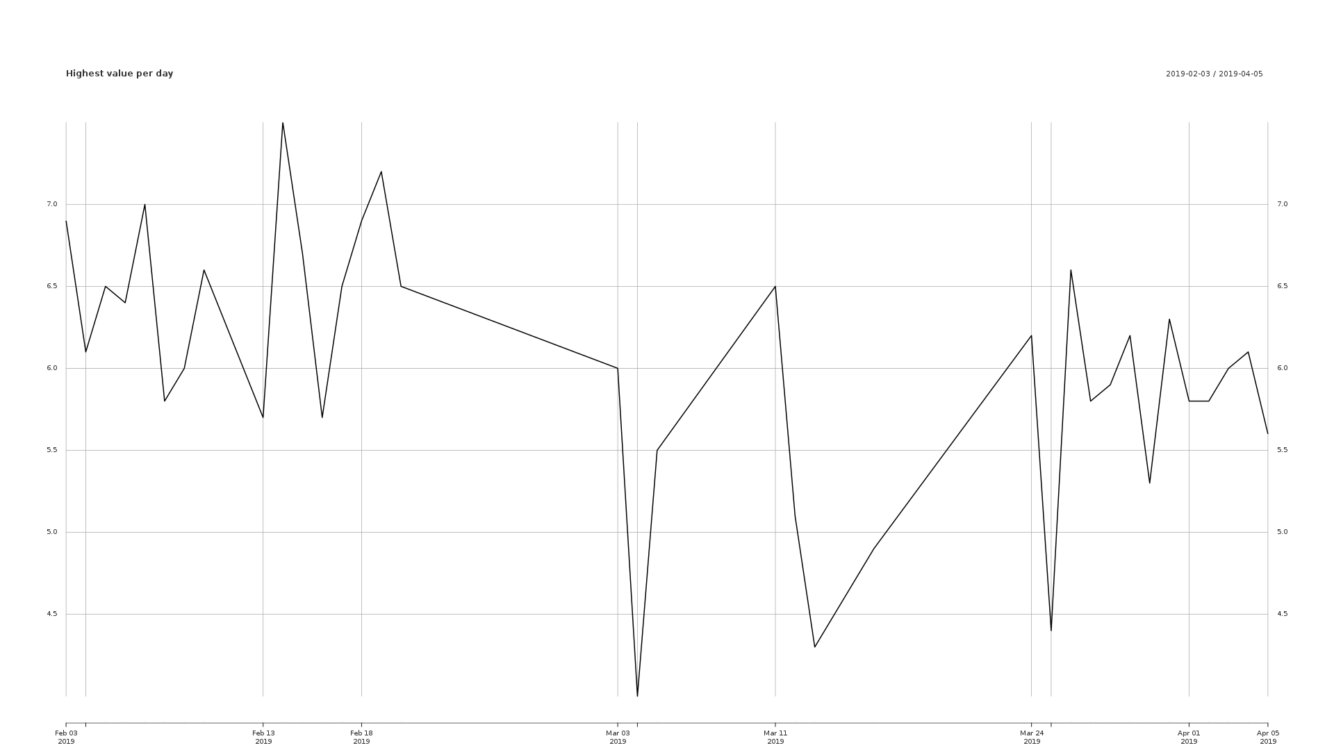
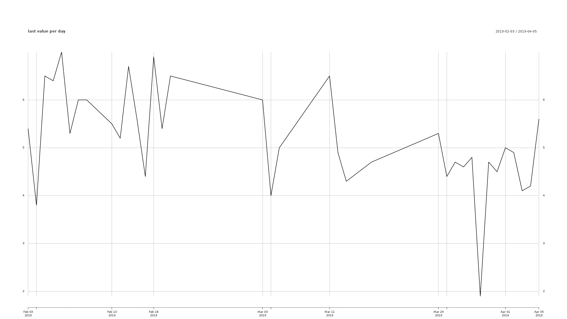
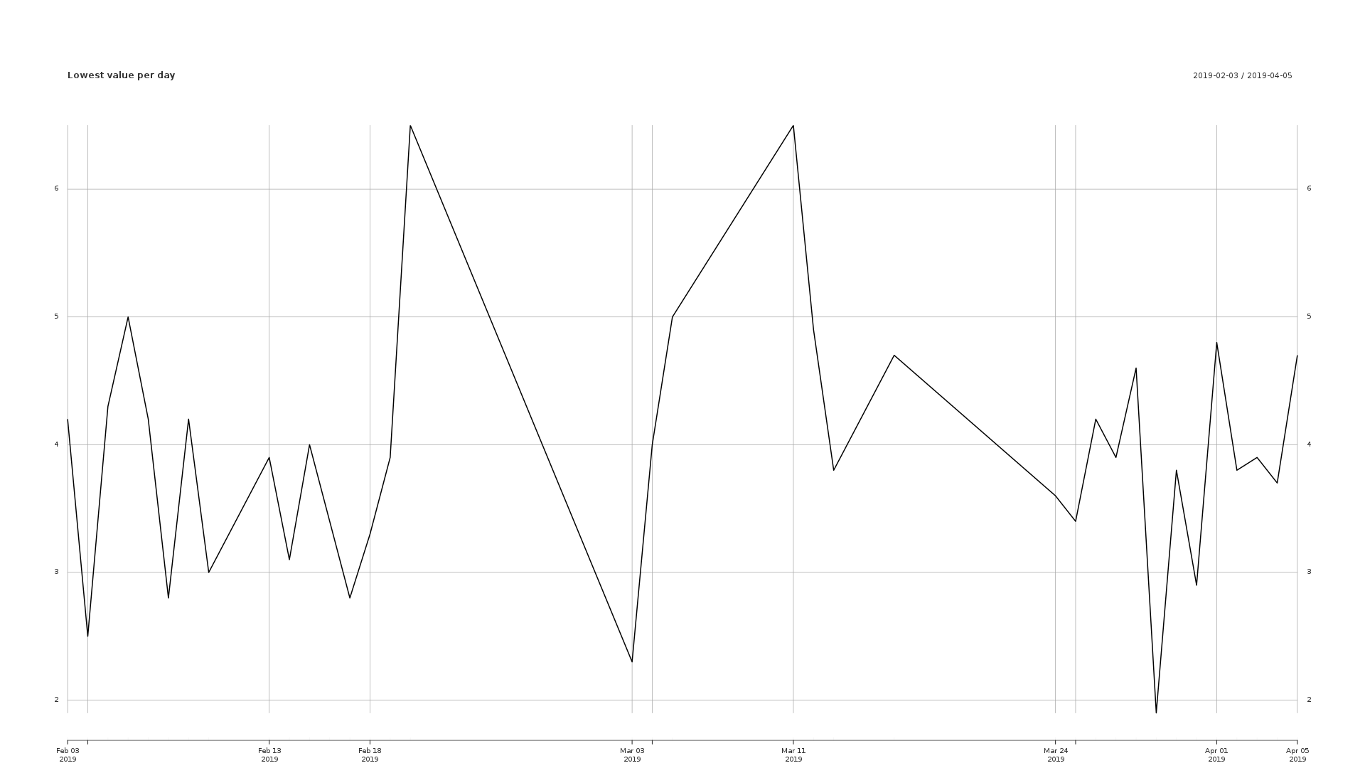
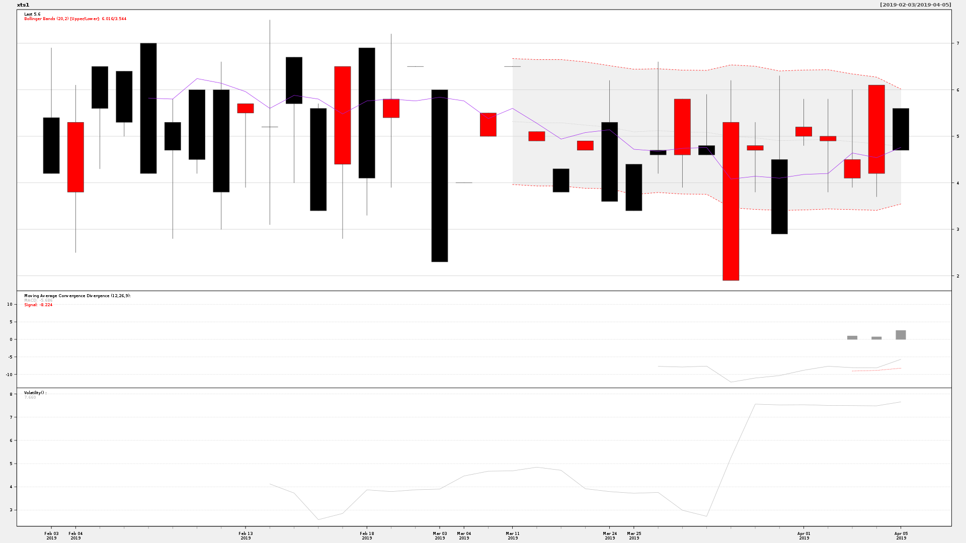
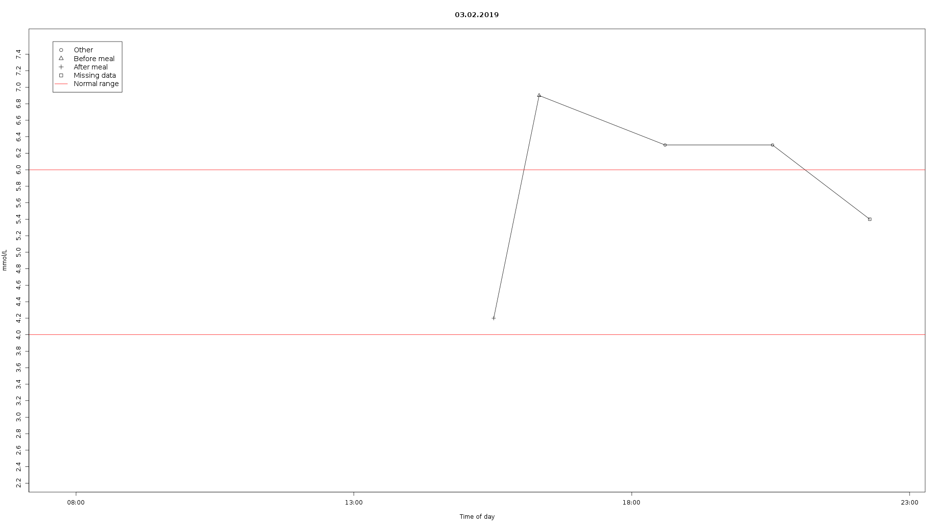
For analysis of blood glucose data from an Accu-Chek Mobile.
Keep in mind that not everything can be plotted if you have too few data points. The minimum to plot everything is 163 data points. The legend will still refer to the lines that may be missing if you have too few data points.
- Colors alternate between days to allow for easy differentiation between one day and another.
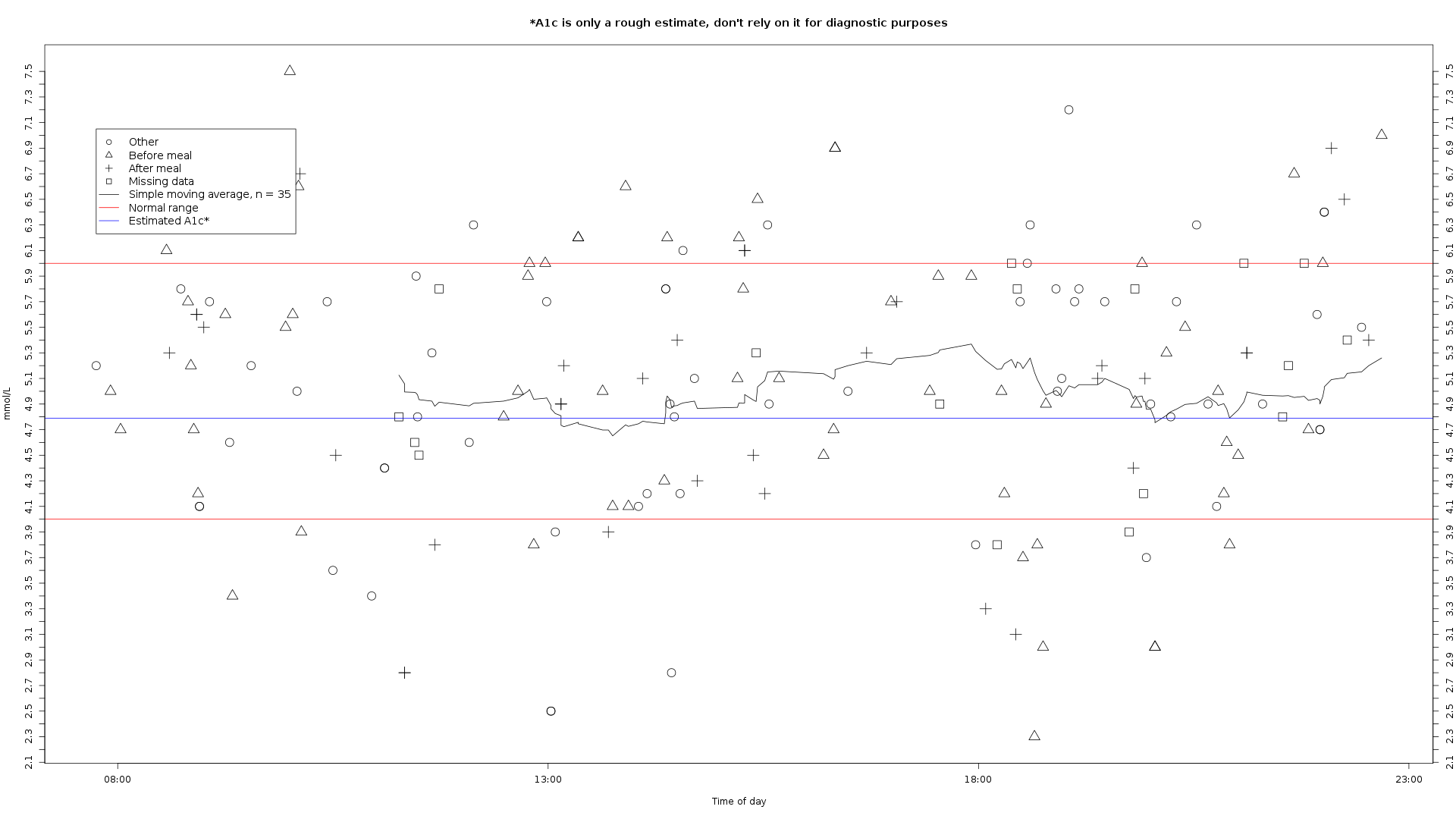
- If the user correctly marks each blood glucose measurement it will show in the graph, see the sample graph for an example. This makes it easier to spot potential patterns.
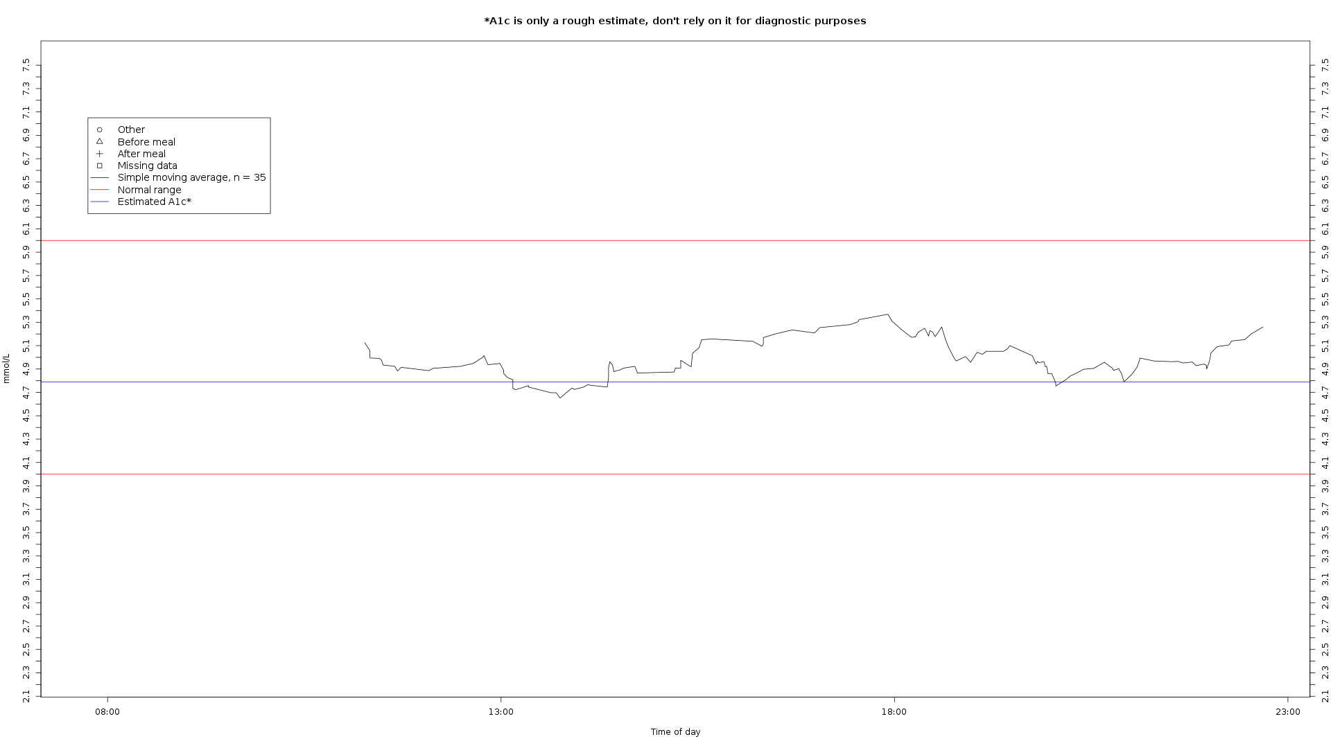
- 24h plot can reveal general trends from eating habits.
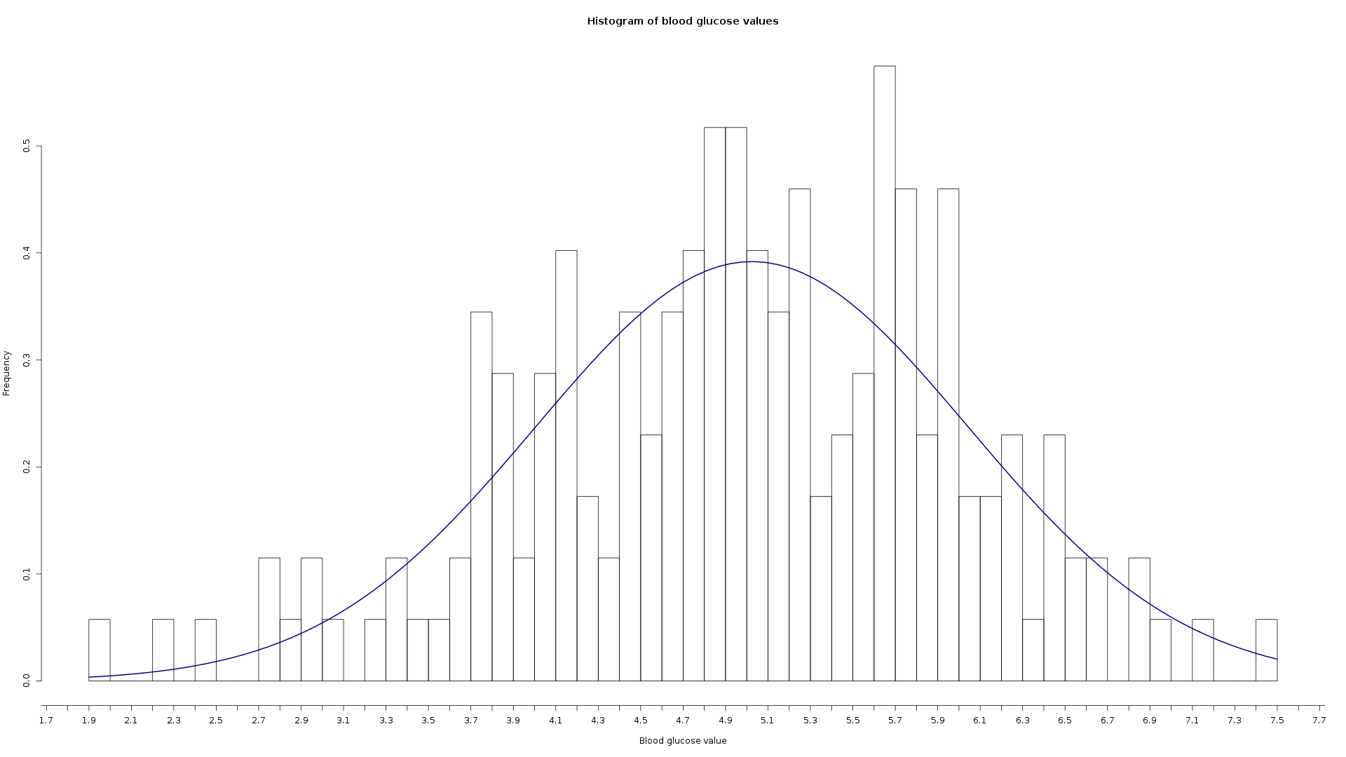
- Histogram can tell if the readings lean more to the upper or lower range.
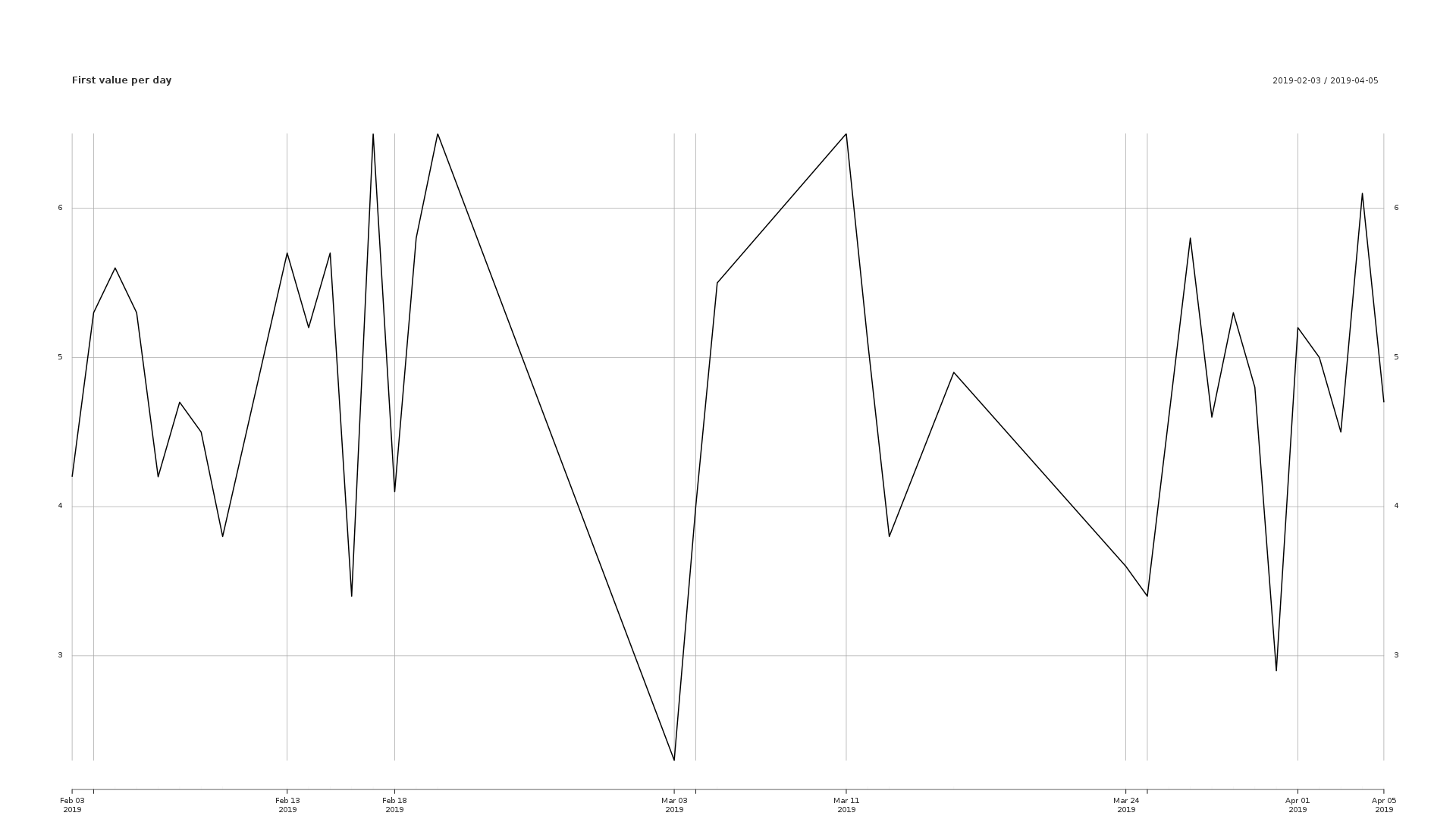
These example graphs were generated with normally distributed random data.
Install instructions for docker: https://docs.docker.com/install/
- Put your csv file in the Inputs directory
- Either name it
test.csvor edit the Snakefile and change the name in the first rule. - Run
./start-script. The docker image will download automatically the first time you run the script. - After successful execution the graph is found in the Outputs folder.
At the moment the first snakemake rule is nonsensical since it only copies a file from the Inputs directory to the Outputs directory, it's there because I use it to copy files straight from the Accu-Chek meter.


