-
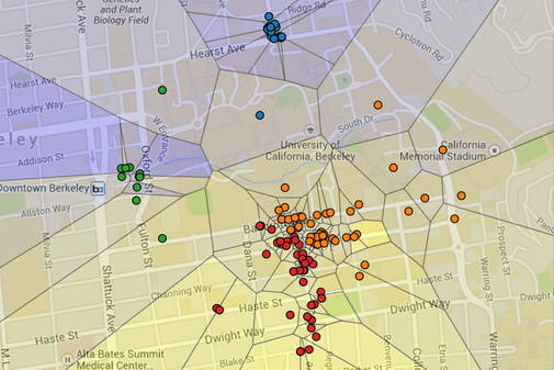
This project is a visualization of restaurant ratings using machine learning and the Yelp academic dataset. In this visualization, Berkeley is segmented into regions, where each region is shaded by the predicted rating of the closest restaurant (yellow is 5 stars, blue is 1 star). Specifically, the visualization you will be constructing is a Voronoi diagram.
-
In the map above, each dot represents a restaurant. The color of the dot is determined by the restaurant's location. For example, downtown restaurants are colored green. The user that generated this map has a strong preference for Southside restaurants, and so the southern regions are colored yellow.
-
A visualization of K-clustering algorithm
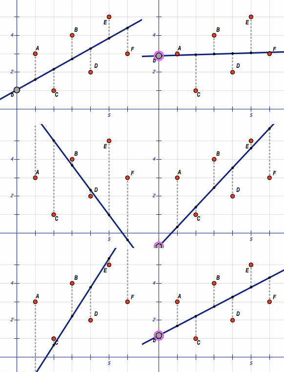
- A visualization of least-squares linear regression
The preferences of user is in the folder maps/user
For example, the following command visualizes all sandwich restaurants and their predicted ratings for the user who likes_expensive restaurants that has sandwiches with 2-means clustering :
python3 recommend.py -u likes_expensive -k 2 -p -q Sandwiches
(source: cs61a summer 2018)

