BlockDescriptionMarkup
Block description markup table of contents
The block description markup allows a user to specify a high level description of a block. The description documents functionality, parameters, and other information used by the GUI to render the block and configuration parameter window. Check out the descriptive examples below:
Inline markup can be specified inside a C++ source. The CMake function POTHOS_MODULE_UTIL will parse the sources to find markup, convert the markup to JSON, and build the JSON block documentation into the module to be retrieved at runtime.
/***********************************************************************
 * |PothosDoc The Name of the Block
 *
 * A multi-line description of the block.
 * With more stuff on this line.
 *
 * And another paragraph can begin here.
 *
 * |category /My/Category
 * |keywords each word is searchable
 *
 * |param paramKey0[Parameter0 Name] A helpful description of parameter0.
 * The description may continue on to this line as well.
 * |default 0
 *
 * |param paramKey1[Parameter1 Name] A helpful description of parameter1.
 * This parameter will not be visible in the GUI's graph editor page.
 * |preview disable
 *
 * |param paramKey2[Parameter2 Name] A helpful description of parameter2.
 * This parameter demonstrates enumerated options.
 * |option [Option 1] 1
 * |option [Option 2] 2
 * |default 1
 * |tab Advanced
 *
 * |factory /path/in/the/block/registry(paramKey0, paramKey1)
 * |setter setParam1(paramKey1)
 * |setter setParam2(paramKey2)
**********************************************************************/When not specified, the entry widget for a given property will appear as a line entry widget in the block properties panel. This can be modified with the "widget" field in the parameter description.
* |widget ComboBox(editable=true)
* |option [Option 1] 1
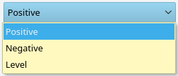
* |option [Option 2] 2ComboBox widget (aka drop-down) displays an enumerated set of options. The list of options comes from the user provided option fields. If the user provides option fields, but does not specify the widget field, then the ComboBox() widget will be automatically chosen. Optional parameters: editable=true, or editable=false. When not specified editable is false. When editable is true, the ComboBox can be edited by the user to provide additional custom values.
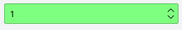
* |widget SpinBox(minimum=–2147483648, maximum=2147483647)SpinBox provides an integer entry widget with increment and decrement buttons. Optional parameters are minimum and maximum which impose a limit on possible integers entered into the widget. When not specified, the minimum and maximum use the full signed integer range.
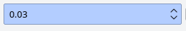
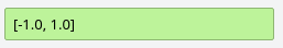
* |widget DoubleSpinBox(minimum=-1e12, maximum=1e12, step=0.01, decimals=2)DoubleSpinBox provides an floating-point entry widget with increment and decrement buttons. Optional parameters are minimum, maximum, step, and decimals. The minimum and maximum control the range, step controls the increment and decrement step size, and decimals controls the displayable precision of the floating-point number.
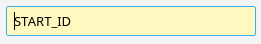
* |widget StringEntry()The StringEntry widget allows the user to edit a string-type parameter without enclosing the contents in quotes. If the user enters bob, the actual value that gets passed into the evaluator is "bob".
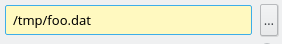
* |widget FileEntry(mode=open)The FileEntry widget allows the user to enter a string-type parameter that represents a file path. Like the StringEntry widget, the FileEntry entry widget handles quotes without displaying them in the entry box. Also, the FileEntry widget provides a button that launches an "open" or "save" file browser dialog. Required parameters: mode=save or mode=open to control the type of file dialog.
* |widget LineEdit()The LineEdit widget creates a single editable line which can contain any expression string. This is the default widget when the user does not specify the widget field or any options fields.
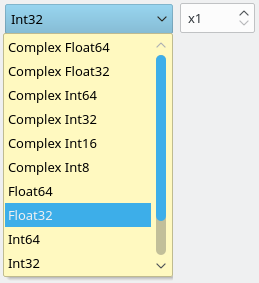
* |widget DTypeChooser(float=1,cfloat=1,int=1,cint=1)The DTypeChooser widget creates a ComboBox to selected from standard data types. The optional keys provided to DTypeChooser control what options are made available. Currently, 6 different keys are supported. Simply specify keyName=1 to enable the types associated with the key.
- float - float and double
- cfloat - complex float and complex double
- int - all signed fixed width integer types (8, 16, 32, 64 bits)
- cint - complex signed fixed width integer types (8, 16, 32, 64 bits)
- uint - all unsigned fixed width integer types (8, 16, 32, 64 bits)
- cuint - complex unsigned fixed width integer types (8, 16, 32, 64 bits)
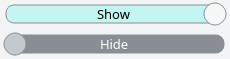
* |widget ToggleSwitch(on=On Text, off=Off Text)The ToggleSwitch widget creates a slider-like widget for representing a boolean. Use the on and off keywords to set the appropriate label for the switch in its on and off positions. This is the default widget when the user does not specify the widget field and only two boolean (true/false) options are specified.
* |widget ToggleButton(on=On Text, off=Off Text)The ToggleButton widget creates a button with two modes (depressed and sticking out) for representing a boolean. Use the on and off keywords to set the appropriate label for the button in its depressed and off positions.
* |widget CheckBox(on=On Text, off=Off Text)The CheckBox widget creates a check-box widget and a label for representing a boolean. Use the on and off keywords to set the appropriate label for the box in its checked and off positions.
* |param paramKey1[Parameter1 Name] A helpful description of parameter1.
* This parameter will not be visible in the GUI's graph editor page.
* |preview disable
The preview control specifies whether or not the parameter gets displayed on the graph editor block. When not specified, the parameter preview is always visible. Possible values for preview:
- enable - always show the preview (default when unspecified)
- disable - never show the preview
- valid - only show when the value is non-empty/non-zero
- invalid - only show when the value is empty/zero
- when - a conditional preview based on other parameters
In the following example uses the when keyword for a conditional preview. It takes a key word argument "enum" which specifies the name of another parameter; and takes a list of arguments which represent values for the enum parameter for which the preview will be visible.
The modArg parameter will only have a preview shown when opType is set to the values "FOO" or "BAR", and will be hidden when the opType is set to "BAZ": :
* |param opType [Operation] Some operation enumeration.
* |option [Foo Operation] "FOO"
* |option [Bar Operation] "BAR"
* |option [Baz Operation] "BAZ"

* |param modArg [Modifier Arg] An optional argument for Foo and Bar modes.
* |preview when(enum=opType, "FOO", "BAR")* |factory /path/in/the/block/registry(paramKey0, paramKey1)
* |initializer setParam1(paramKey1)
* |setter setParam2(paramKey2)A method call on the block can either be an initializer or a setter.
- A initializer method can only be called once. Changing a parameter passed into an initializer would constitute a critical change, and the block must therefore be recreated from the factory, and then the initializer applied.
- A setter method can be called an arbitrary number of times. When a setter's parameter is changed, the block is not re-created, rather, only the setters that have changed parameters are called.
Many of the markup fields use special character tokens, like brackets, to separate out the sub-fields. To use a literal bracket in bracket-delineated field, simply escape the bracket with a backslash.
Example escaping a literal bracket: :
* |option [Option \[1\]] 1
* |option [Option \[2\]] 2
The JSON markup is the intermediate format that stores all of the block description information in a highly structured manner suitable as input to the GUI.
{
    "args" : [
        "paramKey0",
        "paramKey1",
    ],
    "calls" : [
        {
            "args" : [
                "paramKey1"
            ],
            "name" : "setParam1",
            "type" : "setter"
        },
        {
            "args" : [
                "paramKey2"
            ],
            "name" : "setParam2",
            "type" : "setter"
        }
    ],
    "categories" : [
        "/My/Category"
    ],
    "docs" : [
        "A multi-line description of the block.",
        "With more stuff on this line.",
        "",
        "And another paragraph can begin here."
    ],
    "keywords" : [
        "each",
        "word",
        "is",
        "searchable"
    ],
    "name" : "The Name of the Block",
    "params" : [
        {
            "default" : "0",
            "desc" : [
                "A helpful description of parameter0.",
                "The description may continue on to this line as well."
            ],
            "key" : "paramKey0",
            "name" : "Parameter0 Name"
        },
        {
            "desc" : [
                "A helpful description of parameter1.",
                "This parameter will not be visible in the GUI's graph editor page."
            ],
            "key" : "paramKey1",
            "name" : "Parameter1 Name",
            "preview" : "disable"
        },
        {
            "default" : "1",
            "desc" : [
                "A helpful description of parameter2.",
                "This parameter demonstrates enumerated options."
            ],
            "key" : "paramKey2",
            "name" : "Parameter2 Name",
            "options" : [
                {
                    "name" : "Option 1",
                    "value" : "1"
                },
                {
                    "name" : "Option 2",
                    "value" : "2"
                }
            ],
            "tab" : "Advanced"
        },
    ],
    "path" : "/path/in/the/block/registry"
}
JSON Overlays are a markup provided by the block to dynamically alter parameter widgets in the GUI. Overlays work by overwriting the fields for an existing parameter, and the block's parameter dialog will replace the widget to match. Some uses for JSON overlays include:
- Supplying a list of available options for a combo-box
- Changing the ranges for a widget based on hardware limits
- Changing the parameter preview mode or tab association
In the example below, the existing deviceName parameter will have fields for options, widgetKwargs, and widgetType replaced with the specified values. The parameter will be displayed to the user as a ComboBox with two options.
{
    "params": [
        {
            "key": "deviceName",
            "options": [
                {
                    "name" : "Option 1",
                    "value" : "1"
                },
                {
                    "name" : "Option 2",
                    "value" : "2"
                }
            ],
            "widgetKwargs": {
                "editable": true
            },
            "widgetType": "ComboBox"
        }
    ]
}To support JSON overlays in a particular block:
- Register the "overlay" call in the constructor of the block
- Implement the overlay method that returns a JSON string
MyBlock.cpp :
class MyBlock : public Pothos::Block
{
public:
    MyBlock(args...)
    {
        this->registerCall(this, POTHOS_FCN_TUPLE(MyBlock, overlay));
    }

    std::string overlay(void)
    {
        //return JSON markup here...
    }
};Formatting JSON can be done with regular strings or one of the many JSON libraries out there. As an example, the PothosAudio blocks use a header-only JSON parser from nlohmann. Since this library is a dependency for PothosCore, it should already be installed by default.
- See AudioBlock::overlay() in AudioBlock.cpp for a simple example of overlays.