- HTML is a Hypertext Markup Language used to structure content on a web page(images, text,forms etc).
- We structure content using HTML tags.
- Example:
          <html>
            <body>
              <p> Content </P>
              <a> link </a>
            </body>
</html><!DOCTYPE>Defines the document type.<html>Defines an HTML document.<head>Contains metadata/information for the document.<body>Defines the document's body.<h1> to <h6>Defines HTML headings.<p>Defines a paragraph.<br>Inserts a single line break.<hr>Defines a thematic change in the content.<!--...-->Defines a comment.
<blockquote>Defines a section that is quoted from another source.<a>Defines a hyperlink.<em>Defines emphasized text.
<form>Defines an HTML form for user input.<input>Defines an input control.<button>Defines a clickable button.<select>Defines a drop-down list.<label>Defines a label for an element.
<img>Defines an image.<svg>Defines a container for SVG graphics.
<a>Defines a hyperlink.<link>Defines the relationship between a document and an external resource (most used to link to style sheets)<nav>Defines navigation links.
<ul>Defines an unordered list.<ol>Defines an ordered list.
<style>Defines style information for a document.<div>Defines a section in a document.<span>Defines a section in a document.<header>Defines a header for a document or section.<footer>Defines a footer for a document or section.<main>Specifies the main content of a document.<section>Defines a section in a document.
For more reference https://www.w3schools.com/tags/default.asp
Video:https://youtu.be/hu-q2zYwEYs
<Title>: This tag is used to add title for the page. If we open the page in a browser, this title will be there in the tab.<p>: This tag is used for paragraph<small>: It reduces the size of the text.<em>:emphasises the text.<h1>to<h6>chagnes the size of th text from high to low.<strong/>: Makes the text bold.<ul/>: Unordered list. It has a different syntax than above tags.
        <html>
          <body>
            <ul>
                <li>Ritheesh</li>
                <li>Tony</li>
                <li>Emmanuel</li>
            </ul>
          </body>
        </html>
Result:
- Ritheesh
- Tony
- Emmanuel
<ul>Video reference : https://youtu.be/mbeT8mpmtHA?list=PL4cUxeGkcC9ivBf_eKCPIAYXWzLlPAm6G&t=259
<ol>: Ordered list. Syntax is same like unordered list. use ol in the place of ul.
        <html>
          <body>
            <ol>
                <li>Ritheesh</li>
                <li>Tony</li>
                <li>Emmanuel</li>
            </ol>
          </body>
        </html>
Result:
- Ritheesh
- Tony
- Emmanuel
<ol> Video reference : https://youtu.be/mbeT8mpmtHA?list=PL4cUxeGkcC9ivBf_eKCPIAYXWzLlPAm6G&t=310
<div>: Defines a division or a section in an HTML.
        <html>
          <body>
            <div>
                <div>Hi </div>
                <div>Hello</div>
                <div>Welcome</div>
            </div>
          </body>
        </html>
<div> Video reference : https://youtu.be/mbeT8mpmtHA?list=PL4cUxeGkcC9ivBf_eKCPIAYXWzLlPAm6G&t=372
<span>: Used for grouping and applying styles to inline elements. The<span>tag is used with inline elements whilst the<div>tag is used with block-level content.<br>: Used for line breaks. If our content should go to the next line, use<br>tag.<img>: Used to place images.
<img src ="image.jpg" alt ="a picture for testing" > Syntax:
-- Required attributes. Here we have used two attributes.
-- src: Source attribute[path of the image]. The path of the image has to be added inside of the quotes.
-- alt: Initially anything what we write in this alt attribute not going to be diplayed anywhere. But if the
image is not displaying at the html page, the content in the alt will be displayed at the place of image.
<img> Video reference - https://youtu.be/mbeT8mpmtHA?list=PL4cUxeGkcC9ivBf_eKCPIAYXWzLlPAm6G&t=620
<form></form>- Form tag is used to make forms in html.
<input> - Input field is used to take the input from the user. This would be the are where the user going to type.
<id> - Id has to be defined to identify the the particulr form's input for the further use of input data.
       <html>
          <body>
            <div>
                <form>
                <input type ="text id ="username">
                </form>
            </div>
          </body>
</html>-
Video reference:https://youtu.be/YwbIeMlxZAU?list=PL4cUxeGkcC9ivBf_eKCPIAYXWzLlPAm6G&t=167
-
<label>- This tag defines the label for the element.
       <html>
          <body>
            <div>
                <form>
                <label for ="username"></label>
                <input type ="text id ="username">
                </form>
            </div>
          </body>
</html>-
We have to specifically say which label belongs to which input field. So that the id of the input name is we are using in "for" of the label to identify the corresponding input field.
-
Video reference:https://youtu.be/YwbIeMlxZAU?list=PL4cUxeGkcC9ivBf_eKCPIAYXWzLlPAm6G&t=352
-
Different types of inputs are availble -
"email"-"password"-"radio" -
<textarea>- This is an another tag used to create a form on a particular area. By allocating the rows and columns, the size of the textarea can be changed. -
<textarea id ="bio" cols ="30" rows ="10" placeholder ="about"> -
Video reference: https://youtu.be/YwbIeMlxZAU?list=PL4cUxeGkcC9ivBf_eKCPIAYXWzLlPAm6G&t=1276
-
palceholder- Place holder can use every input filed to make the input more specific. -
required- Adding required attribute, this will check the input filed has values. Otherwise, an error message or colour will be appeared over the input field.
-
Cascading Style Sheets, fondly referred to as CSS, is a simple design language intended to simplify the process of making
web pages presentable. -
CSS handles the look and feel part of a web page. Using CSS, you can control the color of the text, the style of fonts, the spacing between paragraphs, how columns are sized and laid out, what background images or colors are used, layout
designs,variations in display for different devices and screen sizes as well as a variety of other effects. -
CSS stylesheet: A set of CSS rules/ rule sets
div{color:red} -
We create a seperate file line
styles.cssfile inorder to write the css property. Then we will link this css file with the HTML file. To do that, we should link that file in the header of the HTML file.
       <html>
             <head>
             <title>basics</title>
             <rel ="stylesheet" href ="./styles.css">
             </head>
          <body>
            <div>
                <form>
                <label for ="username"></label>
                <input type ="text id ="username">
                </form>
            </div>
          </body>
</html>-
color- This css property is used to change the color of the text -
background- This property is used to change the background colour of the body. -
background-image- Sets the background image -
display- Display behavior. -
width- Element width. -
hegiht- Element height. -
min-width- Minimum Width. -
min-height- Minimum height. -
max-height-Maximum height. -
margin- Outter margins property. -
padding-Inner margin property. -
video referece:https://youtu.be/D3iEE29ZXRM?list=PL4cUxeGkcC9ivBf_eKCPIAYXWzLlPAm6G&t=1992
-
border- Border property. -
border-color- Border color. -
border-width- Border width. -
border-radius- Radius of the border. -
font- Font properties. -
font-family- Defines the font. -
font-style- Font style. -
font-weight- Thickness of the font -
position-Type of positioning used for an element. -
z-index- Sets the order of overlapping elements. -
text-decoration- This is used to add decorations to the text. -
text-align- This changes the alignment of the text. -
Video referece: https://youtu.be/D3iEE29ZXRM?list=PL4cUxeGkcC9ivBf_eKCPIAYXWzLlPAm6G&t=479
-
Inline Elements- Do not take up any more room than their content needs - span, img, strong, em, a and more.... -
Block-level Elements- Take up the whole width of a page regrdless of content - p,div,h2,h3,ul,li and more...
- Using classes and selectors, we can perfectly arrange and style anything in the html usin the css properties.
- Classes make very simple the process of choosing a particular item or group of items together to apply common property.
       <html>
          <body>
            <div class ="heading>
                Hello
            </div>
          </body>
        </html>
-
.class : example-
.intro: Selects all telements with calss ="intro". -
#id : example-
#firstname: Selects the element with id ="firstname". -
- : example -
*: Selects all elements
- : example -
-
element: example
p- Selects allelements.
-
element,element : example div,p - Select all
elements and allelements.
-
Ingeritance -HTMl elements can inherit CSS properties that are applied to theri parents.
      p{
        border: inherit;
        margin: ingerit;
      }
- What is semantic tag: Semantic HTML is the use of HTML markup to reinforce the semantics, or meaning, of the information in webpages and web applications rather than merely to define its presentation or look.
<article><aside><details><figcaption><figure><footer><header><main><mark><nav><section><summary><time>
-Elements such as
, ,- Video reference :https://youtu.be/kGW8Al_cga4?list=PL4cUxeGkcC9ivBf_eKCPIAYXWzLlPAm6G&t=276
- Page reference :https://www.freecodecamp.org/news/semantic-html5-elements/
-
static:Here the positon is not specifically mentioned. The elements get arranged by the default properties. -
Relative:The position of the item can be changed to anywhere if th position property is selected as relative. -
Fixed: Here, the position of this item will not be changed and it will be there forever even the page is scrolled. -
absolute: The position of the child can be perfectly arranged by taking the space of the parent. -
sticky:Once the sticky property applied, we can stick anything to the page while its scrolling. -
Video referece: https://youtu.be/XQaHAAXIVg8?list=PL4cUxeGkcC9ivBf_eKCPIAYXWzLlPAm6G
- Style elements when they are in a particular statw. - hover,focus,first child of a prent. - :hover :focus :first-childg
   .container:hover .overlay {
   opacity: 1;
   }
   nav li a:hover{
   text-decoration: underline;
   }
-A CSS pseudo-element is used to style specified parts of an element. For example, it can be used to:
Style the first letter, or line, of an element
Insert content before, or after, the content of an element
selector::pseudo-element { property: value; }
- ::after - Insert something after the content.
- ::before - Insert something before the content.
referece: https://www.w3schools.com/css/css_pseudo_elements.asp
- Creates responsive desgins.
- Tell the browser how to style an element at particular viewport dimentions.
- Tells the browser what width the viewport should be
- Only load smaller images for mobile devices.
  @media screen and (max-width: 1400px) {
    width:80%;
  }
-
The max-width selects the screen width. If the width if beyond 1400px, the css writin inside of this media query wont be
work. -
What we write inside of this media query can rewrite the old properties.
-
Video reference :https://youtu.be/Xig7NsIE6DI?list=PL4cUxeGkcC9ivBf_eKCPIAYXWzLlPAm6G&t=495
- FLexbox is a CSS display type designed to help us craft CSS layouts much easier
- Controls the position, size and spcing of each other
- Works great responsively
- Apply adisplay type of flex to the parent continer. The children element in that parent directly become flex items.
- There is how we can maked them to grow and shrink accordance with our need.
- Navigation bars & menus
- Grid laouts
- Bar charts
- Equal height columns
- Modernizr should use for those browsers do not support flex box.
display:flex
- When using display as flex, the all children get stacked from left to right.
flex-grow: 1 or flex-grow: 100
- This means the the children grow the full space of the parent.
- Each element can assign different frow values. So based on that each one take different space on the screeen. video reference: https://youtu.be/yPK8cwBEOmg?list=PL4cUxeGkcC9i3FXJSUfmsNOx8E7u6UuhG&t=126
- Adding flex-grow value is like a ratio how to grow the childre with the parent.
flex-shrtink: 1
- Just opposite of flex-grow.
- As browser gets smaller, the shrinking rate of the child based on the value set for each. Bigger the number of flex-shrink shrinks more than others.
video referece: https://youtu.be/tSdq8amjMso?list=PL4cUxeGkcC9i3FXJSUfmsNOx8E7u6UuhG&t=93
flex-wrap: wrap
-
If in the css we have specified a minimum-width for the parent or any other part, we can see that while we reduce the
browser's width, after reduced the minimum-width, there will be a scroll bar appear at the bottom to preserve the width of
that body. -
Instead of appearing the bottom scroll bar, we need to wrap the end element in the flex to the next line. So the remaining elements can take the remaining space and can avoid bottom scrolling.
-
The size of the remaning children will be based on how the flex-grow property assigned to each one.
-
Without even using the media query, we can change the position of the children based on the availble space.
flex wrap: wrap-reverse
-
Wrap reverse does opposit of flex wrap. When the width of the browser goes down to the minimum width, instead of going the last element of the flex to the next line, it will go the upper line and remaining elements will become under the last element.
flex wrap: nowarp
- Using this, we can avoid the wrapping. By setting the value of flex wrap into nowrap, it will not wrap when size reduced.
flex-basis: 500px
- Flex basis is like minimum width of the flex box.
- The application of use of flex basis is, even the size of the children become reduced below the minimum pixel value, intead
of displaying bottom scroll bar, it will shrink again. - We can add the value of felx grow, flex shrink and flex basis together like below.
flex: 1 0 200px
flex: 1 Basically what happens here is, the flex grow property is 1, flex shrink property is 1 and flex basis is zero.
justify-content: center
- This property is used to align the all children to the center of the main body.
justify-content: flex-end
- This property is used to align the all children into the end, probably the right side of the main body.
justify-content: flex-start
- This is the default behaviour of flex box. Items get arranged to the left side of the main body.
justify-content: space-around
- Each side of each element gets spaced.
flex-flow: column and flex-flow: row
-
When we use flex box, there are two axis.
-
Main axis(x) and
-
Cross axis(y)
-
When we change the value of the flex flow, we are chagning the direction of the axis.
-
flex-flow:rowmain axis is the horizontal axis. The children line-up on the main axis. The down vertical axis will be
the cross axis. -
flex-flow: columnmain axis is the vertical axis. The children line-up on the main axis. The horizontal axis will be the cross. -
If we use
flex-flow: columnand sets the value ofjustify-content:center, the items wil be aligned to the center horizontally. The reason is, main axis is horizontal. -
If we use
flex-flow: rowand sets the value ofjustify-content: center, the items will be aligned to the center vertically. The reason is, main axis is vertical. -
justify-contentalways works on the main axis. When we change the flex flow into column and row, we change the main axis.
flex-flow: row-reverse and flex-flow: column-reverse
- As per the names, they can be used to reverse the order of the rows and columns. The items order will be reverse. Not only
just the position.
align-items: center
-
Here the
align-items: centeraligns the items center to the cross axis instead of main axis.justify-content: center -
Here the
justify-content: centeralign the itesm center to the main axis. So using align-items and justify-content, we
can position the items perfectly center inside of the parent space.
<article> Tag: This tag contains independent content that doesn’t require any other context. So the
placed inside the main content. But each of the articles will contain independent content within it.
<section> Tag: This tag is used to split a page into sections like Introduction, Contact Information, Details, etc and each of
these sections can be in a different
transition: flex-basis 0.2s : This is used to make transitions very soomthly. The time mentioned will be taken to happen from
one transition to another.
order:0 order:1 : By assigning orders, the position can be shuffled based on the order values of the elements.
- CSS GRID just read the web page as a grid. Box of rows and columns.
display:gird is used to select the grid display.
-
grid-templated-columns: 30% 30% 30%: Using this, the columns width are begin set to 30%. If there any other elements are present more than column numbers, here that is 3, the nex items will be moved into the next row and each column will get
30%. -
grid-template-columns: 1fr 1fr 1fr: We are making the columns into the same fraction width. -
grid-template-columns: repeat(5, 1fr): Here we are delcaring 5 columns with fraction of width as 1fr.
-
grid-auto-rows: minmax(200px. auto);: If the row is not detecting a height, take the minimum height of 200px. If it
detects more thatn 200px of height, then automatically set the height.
- Video reference :https://youtu.be/MDQG6LSS8l8?list=PL4cUxeGkcC9itC4TxYMzFCfveyutyPOCY&t=112 -
gird-template-rows: 200px 300px 400px 200px: As the value is being assigned, each row will have each height of pixels.
- Video reference :https://youtu.be/MDQG6LSS8l8?list=PL4cUxeGkcC9itC4TxYMzFCfveyutyPOCY&t=249 -
grid-template-row: repeat(3, minmax(200px,auto): Repeat 200px and auto three times for each row. -
grid-column-gap: 10px: Adding 10px gap between the columns. -
grid-row-gap :10px: Adding 10 gap between the rows. -
To combine both the row and column gap property,
grid-gap :10px: This makes gap around so combined gap of column and row formed.
-
grid-template-columns: repear(6, 1fr);grid-template- rows :repear(4, minmax(150px,auto));.one{ grid-column-start:1; grid-column-end: 3}-
Here, the each box width and position can be adjusted. The grid column start of the element one is beign set as 1 and the width will extent till the coloumn line 3. So the starting and ending position can be set.
-
It can be simply written as
grid-column: 1/3;: 1 sets the starting point and 3 sets the ending ponit of the column. -
Video reference: https://youtu.be/J5GWyiWU2H8?list=PL4cUxeGkcC9itC4TxYMzFCfveyutyPOCY&t=322
-
- We can create a grid inside of anothe grid. Create a new div like wrapper inside side of the parent grid and add the items
to make as the child grid.- Example.
display: gird;grid-template-columns: 1fr 1fr;grid-gap:10px`
- Example.
grid-column: span 3:We can increase the width of the child.
-
align-items: start- All go to the top of the row along with the height of the element and padding. -
Video reference : https://youtu.be/X2-x-4wA9V4?list=PL4cUxeGkcC9itC4TxYMzFCfveyutyPOCY&t=109
-
align-items: end- All go the bottom of the each row along with the height and padding of the element. -
Video reference: https://youtu.be/X2-x-4wA9V4?list=PL4cUxeGkcC9itC4TxYMzFCfveyutyPOCY&t=133
-
align-items: stetch- This is what actually the default value. The element gets streteched with the flex box. -
Video reference: https://youtu.be/X2-x-4wA9V4?list=PL4cUxeGkcC9itC4TxYMzFCfveyutyPOCY&t=142
-
justify-itmes: start- We get the content with the width of the element and positioned at the start of each column. -
Video reference: https://youtu.be/X2-x-4wA9V4?list=PL4cUxeGkcC9itC4TxYMzFCfveyutyPOCY&t=163
-
justify-items: end- We ge the content with the width of the element and positioned at the end of each column. -
Video reference: https://youtu.be/X2-x-4wA9V4?list=PL4cUxeGkcC9itC4TxYMzFCfveyutyPOCY&t=179
-
align-items: start;justify-items: end;- Start of the actual rows top and end of each column. -
Video reference: https://youtu.be/X2-x-4wA9V4?list=PL4cUxeGkcC9itC4TxYMzFCfveyutyPOCY&t=186
-
align-self: centerjustify-self: center- Put the element right in the center. -
Video reference: https://youtu.be/X2-x-4wA9V4?list=PL4cUxeGkcC9itC4TxYMzFCfveyutyPOCY&t=255
grid-template-columns: repeat(12, 1fr)- 12 times , each column with 1 fraction.- Video reference: https://youtu.be/WmwGpjg580o?list=PL4cUxeGkcC9itC4TxYMzFCfveyutyPOCY&t=96
grid-template-areas:"header header header header""aside aside aside aside""nav nav main nav"- Here, visually we are placing the tages. The grids will be formed exactly like this order of that
particular tags.
Positioning allows you to take elements out of the normal document layout flow, and make them behave differently; for example
sitting on top of one another, or always remaining in the same place inside the browser viewpor
- Box model (When laying out a document, the browser's rendering engine represents each element as a rectangular box according
to the standard CSS basic box model.) - Normal document flow (Document flow is the arrangement of page elements, as defined by CSS positioning statements, and the order of HTML elements)
- Floats (The float CSS property places an element on the left or right side of its container, allowing text and inline elements to wrap around it.)
- Position property (The position property specifies the type of positioning method used for an element (static, relative, absolute, fixed, or sticky).
- Stacking order and Z-index (The z-index property specifies the stack order of an element. An element with greater stack order is always in front of an element with a lower stack order)
- Overflowing Content (The overflow property specifies what should happen if content overflows an element's box. This property specifies whether to clip content or to add scrollbars when an element's content is too big to fit in a specified area.)
- Text columns (The column-count property specifies the number of columns an element should be divided into.)
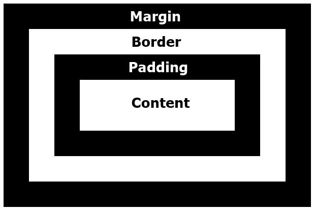
- Every box is composed of four parts (or areas), defined by their respective edges or area: the content are, padding are, border are and margin area.
- If the box-sizing property is set to content-box (default) and if the element is a block element, the content area's size
can be explicitly defined with the width, min-width, max-width, height, min-height, and max-height properties. - The padding area, bounded by the padding edge, extends the content area to include the element's padding. Its dimensions are the padding-box width and the padding-box height.
- The thickness of the padding is determined by the padding-top, padding-right, padding-bottom, padding-left, and shorthand padding properties.
- The border area, bounded by the border edge, extends the padding area to include the element's borders. Its dimensions are the border-box width and the border-box height.
- The thickness of the borders are determined by the border-width and shorthand border properties. If the box-sizing property is set to border-box, the border area's size can be explicitly defined with the width, min-width, max-width, height, min- height, and max-height properties. When there is a background (background-color or background-image) set on a box, it extends to the outer edge of the border (i.e. extends underneath the border in z-ordering). This default behavior can be altered with the background-clip css property.
- The margin area, bounded by the margin edge, extends the border area to include an empty area used to separate the element from its neighbors. Its dimensions are the margin-box width and the margin-box height.
- The size of the margin area is determined by the margin-top, margin-right, margin-bottom, margin-left, and shorthand margin properties. When margin collapsing occurs, the margin area is not clearly defined since margins are shared between boxes.
- Finally, note that for non-replaced inline elements, the amount of space taken up (the contribution to the height of the line) is determined by the line-height property, even though the borders and padding are still displayed around the content.
  <head>
      <title>Css positioning</title>
      <link href="style.css" type="text/css" rel ="stylesheet">
  </head>

  <body>
      <p>Test1</p>
      <p>Test2</p>
      <a href="">Test3</a>
      <a href="">Test4</a>
  </body>
  </html>
-
Here, the p elements take entire width of the screen. So that the Test1 takes entire width of the display. Height will be relative to the font size. Test2 will be on the next line and that will also take the entire width. The reason is p tag is a block level element. Block level elements are being placed as blocks
-
Test3 and Test4 will be on the same line. The reason is the property of tag a is inline. They are not blocks. So they will only take the space of their size.
- Document flow is the arrangement of page elements, as defined by CSS positioning statements, and the order of HTML elements. this is to say, how each Definition takes up space and how other elements position themselves accordingly.
- So, what does this mean exactly? Well, let's break it down. There are three main ways elements are positioned:
- Display types
- Floats
- Positioning
HTML elements are initially positioned by their display type. This display type determines things like whether other elements are able to sit beside them, and how padding, margin and other CSS properties affect it. The two most important display types are:
-
Block
-
inline
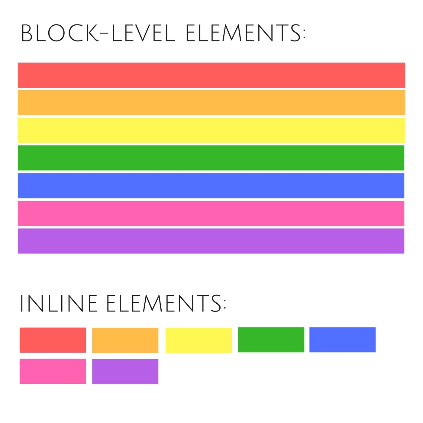
In a block formatting context, boxes are laid out one after the other, vertically, beginning at the top of a containing block. The vertical distance between two sibling boxes is determined by the ‘margin’ properties. Vertical margins between adjacent block-level boxes in a block formatting context collapse.
In an inline formatting context, boxes are laid out horizontally, one after the other, beginning at the top of a containing block.
Horizontal margins, borders, and padding are respected between these boxes. The boxes may be aligned vertically in different ways:
their bottoms or tops may be aligned, or the baselines of text within them may be aligned.

-A float is a box that is shifted to the left or right on the current line. The most interesting characteristic of a float (or
“floated” or “floating” box) is that content may flow along its side .
-
float:right;Using this property, the item can be moved or floated over the right side of the view. -
After once floating property is applied, if we need to prevent this floating property to take place the remaining spaces, we should use
clear:bothproperty.
-
Applying
clear:bothcompletely removes the float property from the unwanted area. -
clear:leftclear:rightandclear-bothare the available options. -
Video reference : https://youtu.be/nE9lIRbIfI0?list=PL4cUxeGkcC9hudKGi5o5UiWuTAGbxiLTh&t=168
- Float can be used to create columns for the contents
- After we formed our sections, use
display:blockandclear:bothproperty to create the column. - Video reference :https://youtu.be/bJJ7jgfSvZY?list=PL4cUxeGkcC9hudKGi5o5UiWuTAGbxiLTh&t=32
- Without using floats, we can create text columns.
- If we have a content, we can create text columns by applying these css properties
   .content{
    -webkit-column-count:2;
    column-count:2;
    -webkit-column-gap:50px;
    column-gap:50px;
    -webkit-column-rule:1px solid red
    text-align: justify
}-webkit-column-count:2;says how many column should be there.-webkit-column-gap:50px;says the gap between the columns.-webkit-column-rule:1px solid redsays the border of the columns.
The position property specifies the type of positioning method used for an element.
-
Different types of position values:
- statics
- relative
- fixed
- abosolute
- inherit
-
static- Elements by default use the in-flow value of “static“. This means they behave normally, as per their display type
layout.They also don’t interact with out-of-flow elements. They are unaffected by position offset properties (top, right, bottom, left). -
relative- position is very similar to static, but the major difference is that they’re able to interact with out-of-flow elements. A relatively positioned element can be used as a container for out-of-flow children elements. The out-of- flow positioned elements will respect the box boundaries of the relatively positioned element.
 css
  content{
    position:relative;
    left: 50px;
    right: 40px
  }
- We can use
nth-chlid(1){}property to change the properties of the particular child in the column list. - Video reference: https://youtu.be/YBJqKWXL2vg?list=PL4cUxeGkcC9hudKGi5o5UiWuTAGbxiLTh&t=201
- In the absolute positioning model, a box is removed from the normal flow entirely (it has no impact on later siblings) and assigned a position with respect to a containing block.
- Video reference: https://youtu.be/2JMGG_8T-vY?list=PL4cUxeGkcC9hudKGi5o5UiWuTAGbxiLTh
- Fixed positioning is a subcategory of absolute positioning. The only difference is that for a fixed positioned box, the containing block is established by the viewport.
- If I want to keep the navigation bar always on the top of the screen even if we scroll the screen, fixed position is the option.
- Video reference: https://youtu.be/8fQWx-d5qc8?list=PL4cUxeGkcC9hudKGi5o5UiWuTAGbxiLTh&t=132
-
By setting the value of Z, we can change the stack order of the elements.
-
It is exactly like the 3D view perception to understand the stacking order of the items.

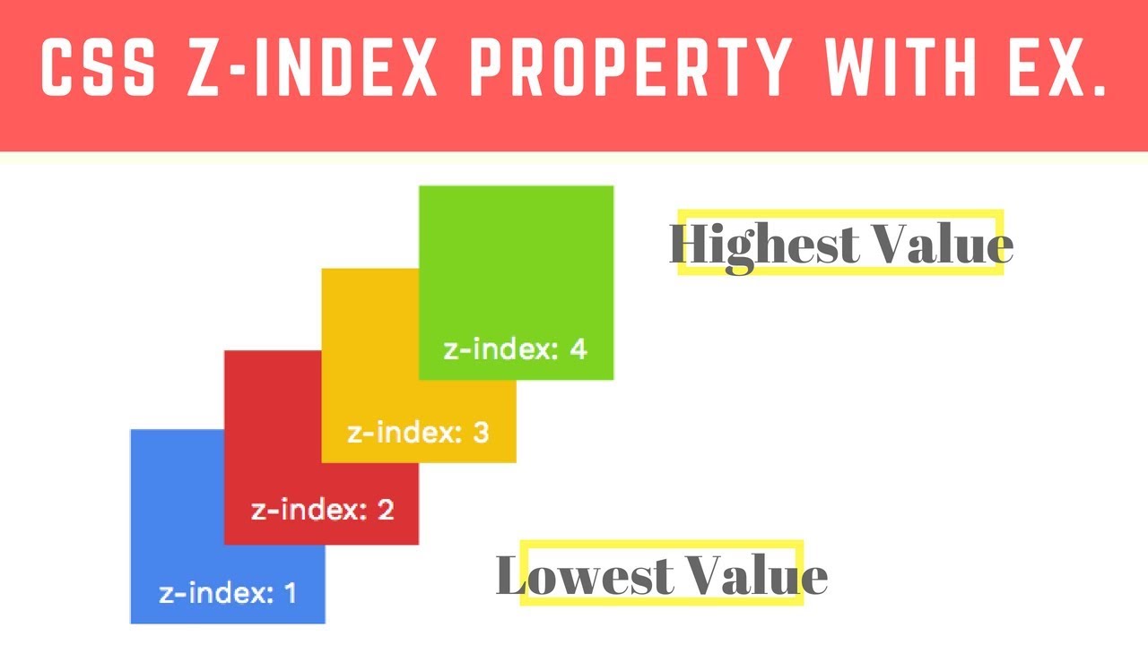
- As per above image, highest value of Z index comes top over the lowest values.
- Video reference: https://youtu.be/k4taTzkhzHc?list=PL4cUxeGkcC9hudKGi5o5UiWuTAGbxiLTh&t=194
- We can clip the contents by using some properties together. We can set a maximum height. The area which overflows that area can set as overflow.
   example{
   max-height: 150px;
   overflow: hidden;
}- Here in this above example, the area overflows above 150px becomes hidden.
- Video reference: https://youtu.be/ED1mhlAVAGU?list=PL4cUxeGkcC9hudKGi5o5UiWuTAGbxiLTh&t=69