Foody is a progressive web app that is a cross between tinder and yelp, where nearby people with similar food preferences could meet up with each other to grab a bite. We have all been in that situation where it’s the middle of the day and you are craving a specific type of food. You text all of your friends and of course everyone is busy. Wouldn’t it be great if you could just connect with someone nearby that also wants the same food as you do, and you can make a new friend?
This is the problem that our application Foody solves.
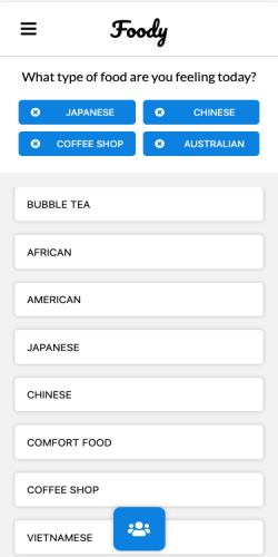
Our mobile application Foody provides an easy way for users to select what food they are in the mood for and match them with users with similar food preferences.
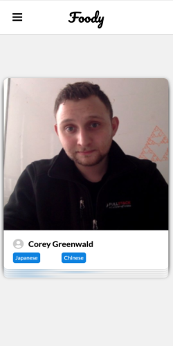
We implemented tinder-style swiping using the react-spring animation library. Our matching algorithm matches two users have swiped right on each other. Once matched, both users will see a map of all possible food options. We focused a lot of our time making sure that users would have a seamless experience connecting with others.
Here is a demo of the flow of our app:
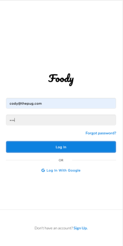
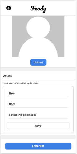
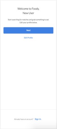
Login, OAuth, Navbar functionality
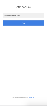
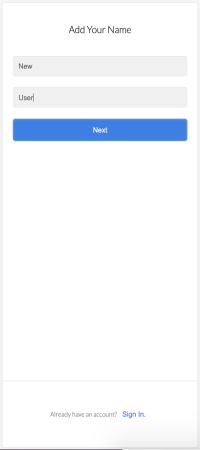
Sign-up Pages
When the user gets to the matching page, Foody would suggest all the users that are nearby with similar food preferences. The swiping cards come in a stack of five, and we implemented our own location based, suggestive, matching algorithm that ranks the list of matchers based on:
- The match's geographic proximity to the user.
- The similarity of the match's food preferences compared to the user's.
- Whether the match has swiped on the user.
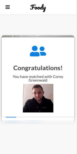
The user could decide to swipe left (reject) or swipe right (accept) on the matches shown. Once both parties swiped on each other, they are taken to the Restaurant Selection page when they would see a list of nearby restaurants that meet their common food interets.
Challenges
For each hungry spirit, we wanted to find others with similar preferences and prioritize them based on location. We originally used geographic coordinates in the database to calculate the distance between the requesting user and all of the other users with matching preferences. The problem with this was that we envisioned Foody to have both a high volume of concurrent users and have a smooth user experience. As you can imagine, repeatedly calculating the relative distance of thousands of users is not very performant, leading to quite a laggy UX and probably a database brought to its knees.
We made the decision to implement location calculations using the PostGIS database extension, which allows for storage and indexing of spatial data, in this case, geographic coordinates. Because we want users find a buddy as quickly as possible, for a particular user we also prioritize those who have already chosen to match with them. Now our algorithm is very performant, it quickly finds the nearest users who share the same preferences.
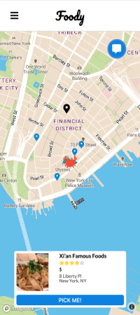
On this page, the user could swipe through the different restaurant options near the user that meet the user and the user's match's food preferences. Or the user can click on the pin of the venue that is geographically closer, and the correponding restaurant would show up at the center of the screen.
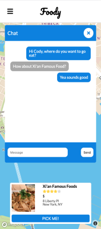
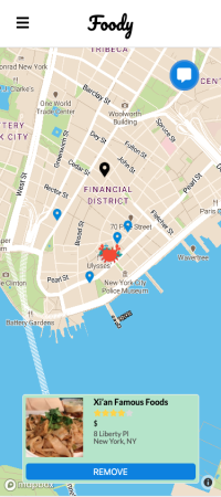
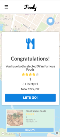
The user can utilize the chatroom functionality to discuss restaurant choices with the user's match. The chatroom bubble will vibrate if the user get any new messages. The restaurants the user ends up picking would turn green, the user have the option to remove that particular restaurant from his or her chosen restaurant list. Once the user and the user's match pick the same restaurant, the user will be taken to the navigation page.
Challenges
-
Getting the Mapbox API and Foursquare API to work and the information to show! We heavily relied on the React-mapbox-gl and Deck-gl library to render the map, and the layers on top of the map. Since doumentation on integrating React with Mapbox-gl and Deck-gl is limited, we had to go through a lot of trial and error to get the page to render the way we want them to. Our teammate Sasha actually wrote a simple guide on Medium for future developers who intend to user React with Mapbox-gl and Deck-gl, check it out: https://medium.com/@sashakayola/map-layering-using-mapbox-gl-js-deck-gl-react-ba0ece89aaef
-
Managing Loading Sequence. We utilize five different technologies and libraries for the map component, which we use for both the Restaurant Selection and the Navigation page:
- Mapbox API for the map, Foursquare API for the venue details.
- React-mapbox-gl and Deck-gl libraries for the rendering layers on top of the map.
- React-swipe library for the venue display carousel.
- React-modal for the chat room and popup boxes.
- Socket.io for message communication and storage.
Since there are a lot of moving pieces on the same page, another technical issue we had to tackle is to get the app load up in the sequenze we intended it to. We edned up turning a lot of actions into Promises, and moving the location fetcher and match identifier into an earlier stage of the app. Now, when the user is at the preference page, the user's device should propmt a popup window asking for the location of his or her current location. This ensures a smoother user experience.
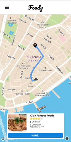
The navigation page will navigate the user to his/her chosen restaurant, clicking on the HERE button will notify the other party that he/she has arrived. We implemented the navigation using Mapbox GL JS and deck.gl.
Mapbox GL JS is a Javascript library that uses WebGL to render maps and deck.gl is Uber’s data visualization library that is built on top of Mapbox GL. Using these in conjunction allowed us to add a layer on our map of restaurants.
One challenge with using Mapbox GL is that it relies on HTML canvases for a lot of its functionality and React was not built to play nice with HTML canvases. Conveniently, Uber has another library called React-Map-Gl which serves as a React wrapper around Mapbox GL JS. Even more conveniently, React-Map-Gl integrates well with deck.gl.
To create the actual navigation path from point A to B, we used a data layer overlay called PathLayer. We supplied an array of coordinates (to indicate how to get from point A to B) to deck.gl which was responsible for actually rendering this layer on top of our map.
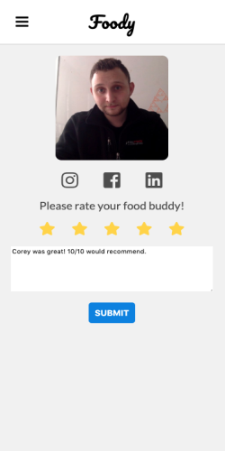
Once the user is done with his/her meal, the user can connect with the user's match on different social media, and leave a review for the other party.
In order to run this app on your device, ....
npm install
npm run dev
- Express
- React
- Redux
- React-map-gl
- Deck-gl
- React-modal
- React-swipe
- React-spring
- React-transition-group
- React-use-gesture
- Typy
- Sequelize
- Progressive-web-app
- Socket.io
- MapBox API
- Foursquare API
- PostGIS
- OAuth
- Cloudinary
- PostgreSQL
https://github.com/jasonclevine


